Trending
Opinion: How will Project 2025 impact game developers?
The Heritage Foundation's manifesto for the possible next administration could do great harm to many, including large portions of the game development community.

Featured Blog | This community-written post highlights the best of what the game industry has to offer. Read more like it on the Game Developer Blogs or learn how to Submit Your Own Blog Post
We have a strong tendency to judge a book by its cover. It takes but a split-second for our opinion of a visual design to be tinted. Positively or negatively. Here are 3 paths you can explore to improve your game's graphics and its appeal.

This article was originally written for the GameAnalytics blog

We have a strong tendency to judge a book by its cover. It takes but a split-second for our opinion of a website or any visual design to be tinted. Positively or negatively. Coming up with both an appealing art direction and some efficient UX design is no easy task. When someone discovers your game, his first experience is shaped by your art. He likely first sees a picture of it. Be it from a screenshot, a video, or your game in action.
So if you ever wondered why studios bother spending big money on polished art, now you know.
But what are we talking about exactly? Resonant visuals are more than just detailed graphics. They have to be both beautiful and meaningful to players. In practice, your game’s aesthetics encompass both the principles of design and your overall art style. In other words, everything that may increase the appeal of your game’s visuals.
There are many aspects of game art that we need to carefully hone as artists. In order to breathe unity in our designs and provide a pleasant user experience, we have to:
Establish strong compositions or layouts to effectively guide the players’ eyes.
Come up with appealing color palettes and shapes for our assets.
Ensure that our choices work, thanks to user feedback, analytics and the A/B testing method.
How can we do all of that? In this article, I want to share with you some trails to improve your game’s visuals. The techniques exposed below are also useful to better understand your artist’s job and to communicate efficiently with them.
The power of any piece of art boils down to a strong understanding of the visual language of design. On one end, it is composed of the visual elements, a form of vocabulary. They encompass colors, shapes, shading… On the other end, we have the principles of design, which are similar to grammar rules. They give us flexible tools to assemble our elements into strong compositions.
Clear compositions boil down to a correct use of the principles of design. There are more or less 6: Scale and Proportion, Repetition and Contrast, Balance, Emphasis, Hierarchy and Harmony or Unity. It is interesting to understand them all. Each principle offers you powerful lenses to analyze your creations bit by bit, and improve them. CtrlPaint covers each of them in greater details in a 7 part video series.
Here, we are going to focus on the balance of our layouts. It takes a good use of space and proportions to create clear visual arrangements that guide the viewer’s eye as intended. We tend to associate layouts with web design and interfaces in general. But the concept is relevant in all artistic domains.
A layout is a composition of graphic elements. It may be a game’s GUI for example, but not only. In the animation industry, layout artists actually establish the position, the scale and the proportions of every element in a movie shot. They stage shots. The layout is a solid foundation that will come to life later, with the addition of lighting and colors.
 2 sample layouts from Marcelo Vignali on Disney’s Mulan
Strong compositions guide the viewer’s eye to elements that matter. They create a path for the player to follow, a coherent hierarchy among various elements. Each and every graphic asset in your game bears a certain visual weight. That weight depends on each asset’s position on the canvas, its size, its contrast and luminosity… It relies on many factors. Overall, big, bright or colorful objects have a high weight, provided that they contrast with their surroundings. Such objects attract the eye.
Spacing out elements properly is key for your interfaces and levels to be easy to read. I want to stress out the fact that leaving some room between and around elements is as useful and level design or storytelling as it is in your UI. A play button in the center of the screen is like a throne in a Kings room: the way it is placed, you know how important it is. It calls for your attention.
The player needs to monitor variables from the game, and to interact with UI elements. That is why an interface is often sharp, contrasted, bright, and placed on top of the game world. GUI are generally drawn as if they were placed against the screen, to separate them from the game world.
You can treat your gameplay related assets the same way: if you leave some space between them and their surroundings, they will look key and unique.
There is another aspect of an image that creates a hierarchy between graphic elements: the use of depth. We can use the size and proportions of our visuals in combination with depth to give the players a sense of the game world’s scale. Depth both relies on and affects the use of multiple principles of design at the same time. It creates contrast between the foreground and the background. It helps to unify the game world with ambient lighting.
Depth is achieved in 2 ways: by overlapping assets and with lighting. The first way is straightforward. If we overlap a graphic element on top of another, it feels closer to us. For instance, the UI looks like it is placed against the screen because it sits on top of the game world, in another layer. Through the use of glowing outlines, many games like the Witcher 3 offer a way to create some overlap between interactive and background elements. It makes them look prominent.

Using your Witcher’s senses, you can see trails and loots surrounded by a glow.
The other way to achieve depth requires a certain understanding of lighting. As light rays travel through space, they encounter dust particles, which scatter them. The farther the travel, the more particles they encounter. And the more their color shifts. When we look at some hills or mountains far away, they look gray. Their colors do not look as vibrant as other objects near us. Analyzing and replicating that effect in our graphics helps to make our worlds feel like they have a 3rd dimension.

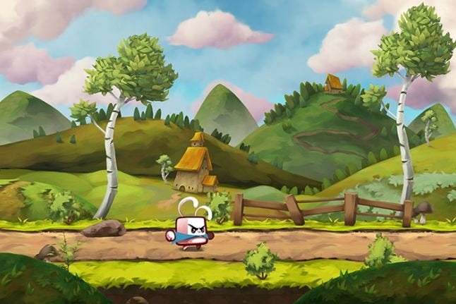
A screenshot from a game I worked on last year. Notice the difference of saturation and contrast between the road and the hills in the background.
The elements of color, lighting and shape are the 3 main components that define your art style. That style can give your game a unique identity. The freshness and the ability of your graphics to attract the eye make up their appeal, a common concept in the world of animation.
The idea of appeal is to create a connection between your creation and your viewers. Be it thanks to charismatic character or an awe-inspiring scenery. It requires a solid use of all of the principles of design in conjunction as well as some artistic experience. That is one of our targets as designers: to come up with an art direction that will resonate with players.
Again, appealing art doesn’t mean detailed drawings. Your visuals can be clean, simple, yet attract people. We have numerous examples of mobile games with efficient art styles. Even simple yet lovely assets take time to create and polish. And creating appealing worlds requires some experience. But, there are still 2 elements we can concentrate on to create appealing art efficiently: silhouettes, and colors. I could add lighting in here, but it is not relevant to all games. If you have a flat kind of design or a very simple cel-shaded art style in a 2d game, there isn’t really much lighting involved.
Silhouettes can make or break visual compositions. When I was studying animation, my classmates and I had to repeat a quick, but not so simple exercise. We had to pose characters to represent a certain action or emotion. But we could only show their silhouettes. And the final viewer had to be able to tell what was happening. I failed. Many times!
The thing is, if the silhouette doesn’t work, most of the time, the lit pose doesn’t work either. This experience showed me the importance of strong silhouettes. Often, if you can’t understand intuitively an object’s characteristics with its silhouette, its design won’t mark you.
When we evolve in a game world, we discover numerous objects, monsters and characters. Friend or foe? Interactive, or part of the background? Your art is meant to answer those questions. Our brains process what we see and feel extremely fast. We unconsciously judge and react to the object we stumble upon in an instant. Silhouettes contribute greatly to that.

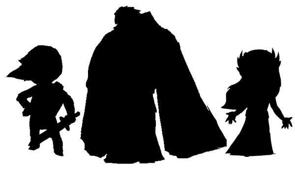
Who are they? Hint: some of the character designs I love the most. Doesn’t help? I knew I should have used Mario and Sonic…
Did you recognize Link, Zelda and Ganondorf? You can take characters from Disney movies, but also weapons and other buildings, and try again. A good sword’s silhouette looks like it depicts a sword. It is sharp on the blade side, often with a more rounded pommel. We know instinctively that something spiky or sharp like that may be dangerous. On the other hand, round or fluffy animals look cute and friendly.
In order for a silhouette to read well, you need to leave space around it, you need some negative space between the arms of a character and his body, or between his legs. It is the same thing we talked about in the first part of the article. It is key to give some space to important elements of our composition for them to look clear and clean. This principle is still true at the scale of a single character or object. Link’s silhouette above offers a great example of that.
Colors are our best tool when it comes to provoking emotions with images. We qualify bright and saturated colors as vibrant. Colors vibrate. They bring life to our paintings. James Gurney dedicated more than half of his wonderful Guide for the Realist Painter to colors. And for a reason. A single touch of color on a monochromatic picture has the effect of a pinch of salt or spice in a dish. It enhances the image’s story.
The appreciation of color is subjective, so there is no definite formula we can follow to create good color schemes. All I can give you is a few notes and references to come up with your own color palettes.
Strong, saturated colors, used throughout your entire game worlds, are good for broad audiences. They feel cheerful, positive and lively. That is why most casual game creators choose to go with saturated palettes. Pastel tones, which are a bit fainter, tend to create a more moody ambience. They feel light and soft. They are ideal for a game with an ethereal world like Monument Valley for example.

Charming.
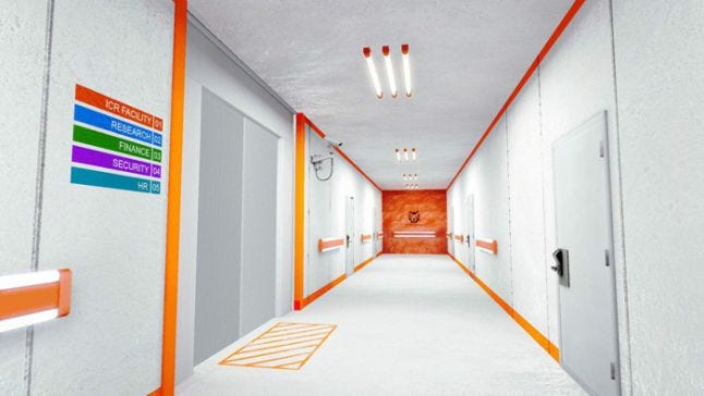
More realistic schemes with vibrant touches of colors also attract the eye. Guild Wars 2’s artworks offer great examples of that. Such palettes feel mature, yet full of life. They possess a strong contrast, a great tool for the artists to tell a place’s story. Mirror’s Edge uses vibrant colors to guide the player through its intricate levels. In that case, the colors are used to indicate a clear path to follow.

They may not look like much, but those orange bars placed along the walls instinctively tell us where to go. Similar rectangles of paint are often use in hospitals to guide people.
All in all, the key with both silhouettes and colors is to analyze other games and pieces of art. And to observe their behavior in nature.
Now, it is time to get to the most important part of becoming better at our craft. An all too often overlooked aspect by young creators. Feedback.
“It’s good.” “It’s great!”
It is always pleasant to get such positive feedback. It feels rewarding. And it may be true as well: maybe we have done some good work. Yet, it’s not constructive. Such feedback doesn’t tell us what works and why. And more importantly, what doesn’t. Chances are we can improve some, if not many aspects of our game’s art.
A constructive critique outlines the qualities and defects of your art. A good critic should even come with advice or notes to help you fix issues. It is rare to get detailed feedback like that. It often comes from close peers, or teammates. People who have a solid understanding of the craft are often pretty busy. And good critiques take a lot of time to formulate right.
Yet, we need fresh pairs of eyes to ensure that our creations meet their goals or that we are headed the right way. And not only from our peers! We have to know how our visuals affect our players as well. On top of our coworkers’ insights, we can get continuous, objective feedback thanks to testing and game analytics.
We are going to use a method called A/B testing. It is an intuitive technique. The idea is to check the funnel or CTR (Click Through Rate) of a given interactive asset in the game. That is test A. Then, we run test B. We replace the graphic element and track its CTR again. And we compare the results with the first test. Did a higher percentage of people interact with it before or after the change?

Which version got the highest rate of engagement? A or B? Yes, it’s as simple as that… yet it’s not easy to know why that is exactly.
It is a test web designers exploit all the time. It is very useful for interfaces and UX design in general. It may not seem like it until you try, but improving a social share or play button can significantly increase the proportion of players who push it. A/B tests are most useful when you are looking to get engagement through an interaction with a graphic element.
But it is also useful to see if players use a menu more or navigate through a level better with a graphic change. The style of your gameplay related assets can make or break their clarity. Buttons work better if they look thick. If they look like they can be pressed against. In particular on mobile devices, where we use our fingers to interact with them.
Each topic runs deep, thus a single article obviously can’t cover too much ground. You can find a lot of complementary resources on digital art and design on Matt Kohr’s website CTRLpaint.
All in all, here are the 3 steps you can take to improve your game’s graphics:
Work towards solid compositions first. It gives a strong foundation for your visual style to thrive.
Focus on your art’s appeal. Clear silhouettes and vibrant touches of colors are powerful tools for that!
Ensure that you are headed the right way, using analytics and A/B testing.
This article was originally written for the GameAnalytics blog
Read more about:
Featured BlogsYou May Also Like