Trending
Opinion: How will Project 2025 impact game developers?
The Heritage Foundation's manifesto for the possible next administration could do great harm to many, including large portions of the game development community.

Featured Blog | This community-written post highlights the best of what the game industry has to offer. Read more like it on the Game Developer Blogs or learn how to Submit Your Own Blog Post
Our resident artist discusses his techniques for taking a 2D sprite from concept to playable. Also, explosions.

(or: How I Learned to Stop Worrying and Love the Explosions)
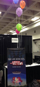 Sky Tyrannosaur's booth at GDC 2014. We were very proud to be the only booth with balloons.
(This blog has been reposted from our homepage at www.skytyrannosaur.com)
You might have recalled me mentioning in an earlier post that we went to the Game Developers Conference (GDC) in San Francisco last year. It was quite a milestone for us as it was the first time we were representing our company at a big games convention -- we had gone to Appsworld a month earlier but that was much smaller and quite lacklustre by comparison, though it was free to participate and we got a feature on Blowfish Meets Meteor (a brick-breaker for iPhone and iPad) on Alhurra Tech, an Arabic-language tech news channel. It was also the first time I had been to San Francisco and met Muir, as bizarre as that might seem considering at that point we had already been working together for almost three years (this is somewhat more understandable if you consider the fact that I'm normally based in Bristol, England, which is a bit more than a stone's throw away).
At GDC we were promoting BMM as it had just been launched, and a lot of people mentioned that they were drawn to our booth because of the game's art (and perhaps also its over-the-top trailer that was put together by our friend Kevin from Vsauce2). I spoke with several other game artists who were intrigued about my work process and they were quite surprised when I said I was simply working with Photoshop and Illustrator, so I thought an interesting topic for today's post would be to go into more detail about that.
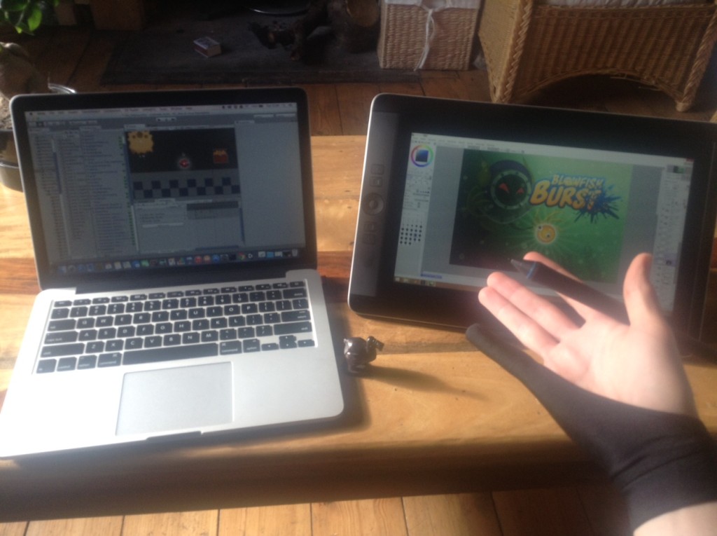 My tools of the trade: A Macintosh computer-thingy, a Wacom Cintiq Companion, a Mauritian wooden dodo figurine (for moral support), and a ridiculous Michael Jackson glove.
We start a new game with a design document that serves as a general overview covering the premise and descriptions of the characters, worlds, accessories and power-ups, music, etc. We share it as a Google Doc which we can edit together whenever we come up with ideas or refine existing ones. In it Muir provides a brief description of what he has in mind. These can be quite simplistic, such as for the sea urchin character that features as the most basic enemy (the Goomba, essentially) in Blowfish Burst (which I'll be using as the example here), for which the description reads thus: "A spherical sea urchin covered in spines. It moves horizontally or vertically, popping any player foolish enough to come in contact with it." The spiky sea urchin pervades the game from the very beginning because it's antithetical to the blowfish protagonist, which is portrayed as little more than a goofy-looking balloon with fins. If the blowfish touches the sea urchin, it pops.
With that in mind I start with the concept sketch stage. I find a particularly good program for this is PaintTool Sai, a fairly obscure Japanese painting software (although it's unfortunately not available for Mac, just Windows, at least as far as I'm aware). I like it because it's fast and simple with an intuitive interface and a very handy tool that steadies your brushstroke if you want smoother lines, but it lacks some basic features that can at times be frustrating, such as the fact that there's no easy way to make circular/elliptical shapes or selections (fortunately it saves files as PSD so you can transition quickly between it and Photoshop, the latter of which is renowned for its (over)abundance of tools but I still find it to be an awkward program for actual drawing).
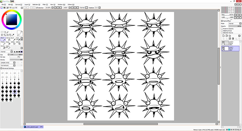 The interface for PaintTool Sai. Not only is it my go-to program for sketching but I've also used it for almost all the final non-sprite artwork in BMM and Blowfish Burst (title screens, cutscenes, backgrounds, etc.). Here you can see some different ideas for expressions for the Sea Urchin character.
Once we arrive at the right design I'll do some colour briefs. At this point if we have any background art for the game it's wise to lay the sketches over them to see how well the characters will stand out from their environments (which is important to bear in mind especially for an enemy that will kill you instantly upon contact). In this case we found that a strong purple grabbed the eye the most and was not a dominant colour in any other enemy, which would help it to stand apart.
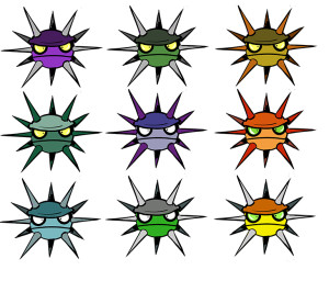 Alternate colour schemes for the Sea Urchin.
I'll then import the sketch in Illustrator, dim it to about 30% opacity, and draw it up as vector shapes. I find working with vectors useful not only for the obvious reason that I can scale it up without losing image quality, but also because they're easily editable. They are, however, fairly counterintuitive for a beginner and it's a steep learning curve before you reach a stage where you're comfortable with them. I can look back and remember how many frustrating problems I encountered while designing the humpback whale boss in BMM (the first character I had ever created in this manner), which could have been avoided had I been aware of features like being able to draw shapes inside other shapes (extremely useful for contour shadows and highlights) and the Pathfinder tool which gives you a lot more versatility in the shapes you're able to create quickly (through intersections with other shapes, for instance). Back then even drawing up vector shapes with a sketch as reference could be a chore, but now I'm confident enough to be able to draw in Illustrator from scratch.
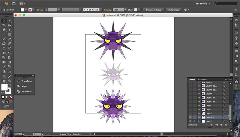 The original sketch and a couple vectorised variants.
Many of you might think, "That's all well and good now, but why did you decide to start working with Illustrator at all instead of something you were already much more familiar with?" After all, I was working on animations and Illustrator isn't particularly known as an animation program. My reasoning had to do with the very first design sketches for Blowfish Meets Meteor, which weren't drawn up by me but rather another artist, Jared Repchull, whom Muir and I knew from the game design message board we used to frequent, and had been recruited to work on concept art for the game before I joined the team. Jared's unique, recognisable style involved a lot of very thick line-work and basic geometrical shapes (particularly its enormous, chibi-style, rounded heads), which was well-suited for the small screen on the iPhone as characters would be easily identifiable even at such small scales.
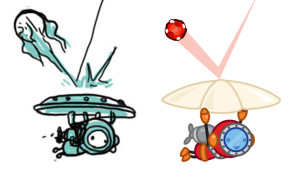 Jared's initial concept for the Diver character in BMM (left) and one of the early vectorised renditions I made based on that (right).
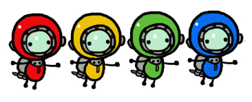 More deep sea diver cuteness courtesy of Jared.
As that had been established as the style for the game's characters, it seemed to me a natural conclusion to work with vectors despite my early frustrations with them. That said, there is a trap that one can easily fall victim to if they take this approach, which you can often see with animations created with programs such as Flash, and that has to do with flatness. After having designed your character as a set of overlaying shapes, there's this temptation to animate it solely by repositioning and rotating these constituent shapes (its limbs and head, for instance) without actually drawing anything again throughout the sequence. This might save you a lot of time, but the result is that your characters will look like they're little more than stiffly animated cardboard cut-outs. Assuming you're not animating this way intentionally (you might want to be if you're working on a South Park game, or a long-awaited sequel to Parappa the Rapper), then it's important to give your characters a bit of depth as they move. Even just a little of it can make a huge difference. In the case of the sea urchin, whose movement is confined to up-and-down or left-and-right, animating it so it turns towards and away from the viewer can help to bring it to life, despite the limitations of its limbless design.
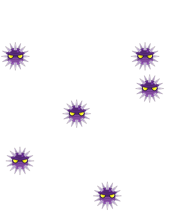
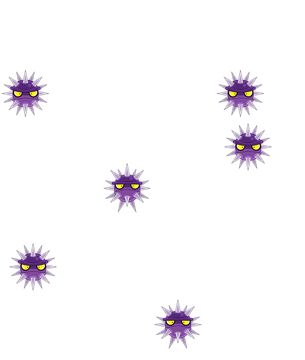
To the left you'll notice the sea urchin above simply moving along the screen with no inherent animation to its sprite, but below you'll see that giving it even just a subtle turn as it moves can help to give the character some depth. This of course means more careful work with editing existing shapes, repositioning them relative to each other, and drawing up new shapes, but the end result pays off because it makes your characters feel less flat, and it's important to bear that in mind even if the character and its animation are very simple.
When working on the animations for BMM, as I created frames in Illustrator I'd often need to transition between it and Photoshop, since it's always useful when tweaking an animation to actually be able to see it in action. This was probably the main issue I had with this approach since it required an extra step, seeing as Illustrator doesn't have an animator built into it. Now that we work with Unity for Blowfish Burst, this poses less of a problem because I ultimately skip the step where I animate in Photoshop and directly animate the sprites in Unity. In this case Photoshop is used only to convert the frames en masse into individual PNG files through an extremely handy script (and sometimes to add subtle effects like glows or lighten individual frames, because in Unity's sprite renderer you're only able to darken colours rather than lighten them).
The sea urchin's frames are put into Unity and animated there. This way I can test the animation in the context of the game immediately (which was not the case in BMM where I'd often have to wait for weeks to actually see it in a build of the game).
In Unity I animate the sprite simply by dragging the frames' files into the animator's timeline. Here I'm also able to employ standard animation techniques like squash-and-stretch and bounce through the use of the Scale, Position, and Rotate parameters. In addition, through the use of its animation curves I can ease in and out of movements to create the effect of momentum (for instance if a character rotates the speed of the rotation would start off slowly, then accelerate, and slow down again as it ends, to makeit look more natural). In a sense this means that once an animation's frames have been created it's only half-complete, because there's so much more that can be done through Unity's animator to give the animation more exaggeration and flair. This is particularly useful for characters like the blowfish, whose balloon-like nature allows for a goofily enormous amount of squashing and stretching. For example, in the picture below I show one of the frames for when the blowfish slams into a wall. While a fair amount of that squash and stretch needed to be designed in the frame itself, playing around with Unity's Scale parameter allows me to exaggerate it even further.
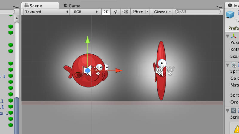 The blowfish's regular shape (left) and the squash and stretch that occurs when it slams face-first into a wall (right)
 The sea urchin exploding. Because everything explodes. It's an inevitability of life. Death by explosion (and taxes).
Particle effects are another extremely useful feature in Unity. As I've mentioned many a time, in my line of work it seems almost as inevitable as the heat death of the universe that after having designed a character I'll eventually animate it exploding. This means animating a lot of pieces flying out in all directions. In BMM I had the misfortune of having to do this the hard way: animating each individual piece as it flies outward from a central point and scales downward until it eventually disappears. Not only was this burdensome in terms of how much time it'd take, but it meant that the frames would end up expanding to very large sizes to account for the outward movement of all the blood, guts, and debris. Larger images beget greater demands on a device's memory, so in the interest of optimisation they ought to be avoided whenever necessary. And in the case of all these exploding characters it felt like quite a waste of space considering there was an ever-expanding amount of empty space in between the pieces flying in all directions that had to be baked into the image. In the case of BMM this put a restraint on the intensity of the explosions because we couldn't afford to have the debris fly out too far if we wanted the game to run smoothly, but using particle effects in Unity avoids this issue entirely.
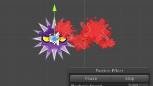 A blood splatter effect created with the particle effect tool. Now you too can make your own death sequences inspired by Mortal Kombat Fatalities (if you're a bit touched in the head).
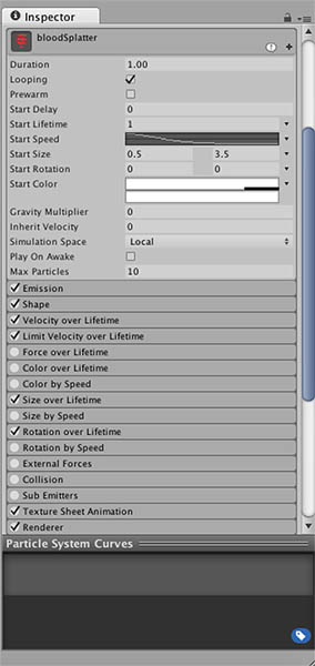 There are so many variables you can adjust for a particle effect that it's almost intimidating (and makes you wonder briefly if this is what being a god feels like).
The beauty of the particle effect tool is that it'll take an image (for example, an individual piece of debris) and let you adjust the direction in which it moves, as well as its speed, sizing, rotation, and a whole manner of other variables. This means you can have tens (or even hundreds) of these particles flying across the entire screen in all directions with very little burden on memory, as it's ultimately employing very tiny images. In the image above you can see a blood splatter effect applied to the urchin, which I could potentially have spraying out as far as I want (suddenly I'm having flashbacks of playing Vandal Hearts). Moreover, if you know how to create a sprite sheet (where several sprites are placed in a single image and spaced evenly apart so the program can read them as frames of an animation) then you're able to have each piece of debris animate as well. This has basically let us go crazy with special effects, which can be dangerously addictive seeing as you still don't want there to be too much action happening on-screen that might distract from the content you should be focusing on (case in point: the average Hollywood blockbuster).
Animating can be tedious, but the joy you feel as you witness your creation come to life more than compensates for that. I originally majored in animation because ever since I was a child I was fascinated by the process of it (almost to a fault considering I spent so much of my time in primary and secondary school drawing flipbooks of increasing complexity instead of actually paying attention in class), but I entered into it at a time when 2D animation was dying out in favour of 3D and I felt increasingly out of touch with that. When I discovered that many of my fellow animation majors lacked even basic traditional drawing skills I realised it was time to flee from a sinking ship and I reoriented towards illustration. Given that, it's certainly by some stroke of serendipity that I forayed into the games industry and my love for animation was rekindled. After all, those characters aren't going to explode themselves.
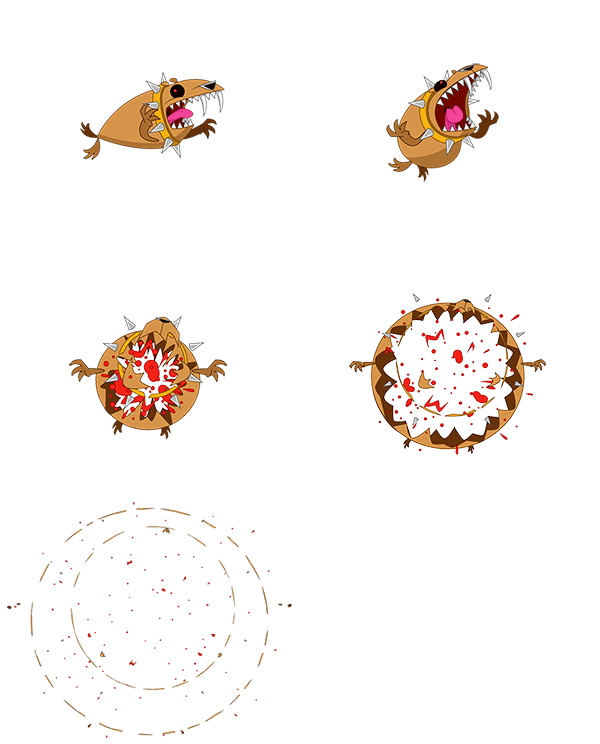 I've noticed a recurring theme to my posts...
- Ian
(If you want to be kept abreast of our shenanigans be sure to follow us on Facebook and Twitter!)
Read more about:
Featured BlogsYou May Also Like