Trending
Opinion: How will Project 2025 impact game developers?
The Heritage Foundation's manifesto for the possible next administration could do great harm to many, including large portions of the game development community.

Featured Blog | This community-written post highlights the best of what the game industry has to offer. Read more like it on the Game Developer Blogs or learn how to Submit Your Own Blog Post
An overview of the elements and principles of design and their application to level art

Great looking models, textures, and ambiences and lighting are very important to making our games look as good as they can. Yet without a solid composition to build upon, the visual structure of our environments will be never as compelling or attractive as they can be.
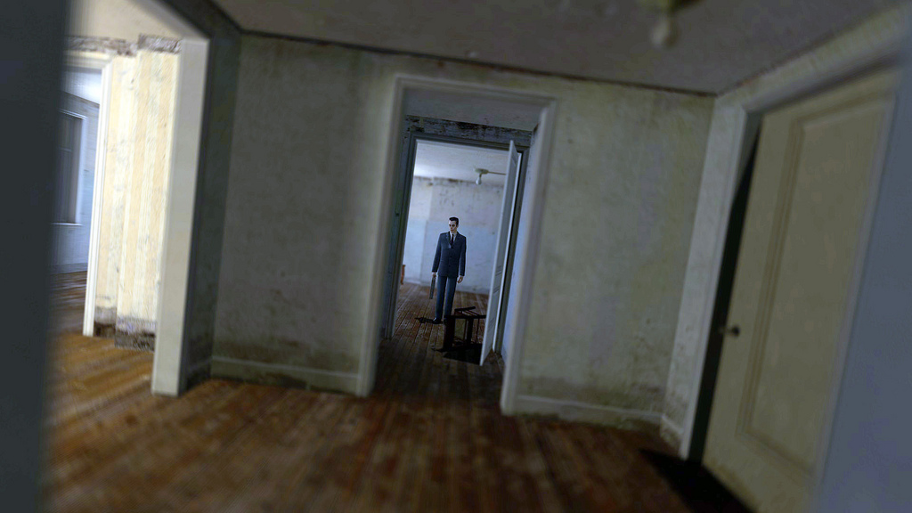
compostion
The Challenge: Creating compositions in a real time game environment is different from static images such as a photograph or painting in the sense that the camera or the player’s frame of reference is always moving. The player moves through a 3 dimensional space, which effectively creates a brand new composition with every frame.
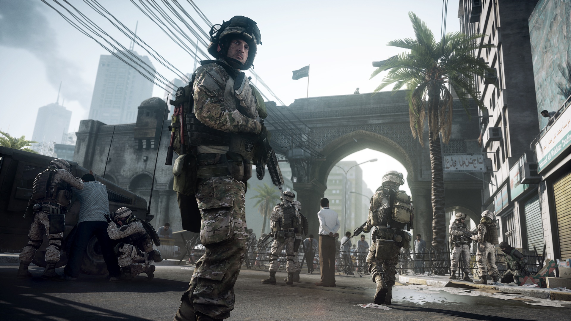
3dspace
This is similar to film, but can differ if there is a ‘free camera’, where the player has physical control over what the camera is looking at. If this is the case there are no guarantees that the player will be looking where you want them to, when you want them to. With a free camera the artist needs to persuade the player’s eye (and camera) to the places they want them to look, or go.
Due to the complications created by an ever-changing frame of reference and an unpredictable camera, level composition should be looked at as the sum of many smaller compositions instead of one large one. All possible viewing angles and player/camera positions should be considered and then the appropriate compositions built from these starting points.

open_world
Creating compositions: elements and principles:
The “elements of design” and the “principles of design” have been called the language of art, or the building blocks used to create art. For the environment artist, they are the modular pieces, tile sets, prop objects, and lights we have to build our levels.
1. The Elements of Design:
The elements of design provide a tool set to the artist similar to visual Lego pieces with which images can be constructed. There are 7 types of elements...
Line
shape
size
space
colour
texture
value
Line: Line is anything that is used to define a shape, contour or outline. It communicates length and direction, and can have an emotional impact on the viewer depending on its angle. The 4 different types of lines are horizontal, vertical, oblique, and curved.
Here are some examples…
Horizontal lines: These imply calm and rest. 
horizontal_line
vertical lines: communicate power and strength.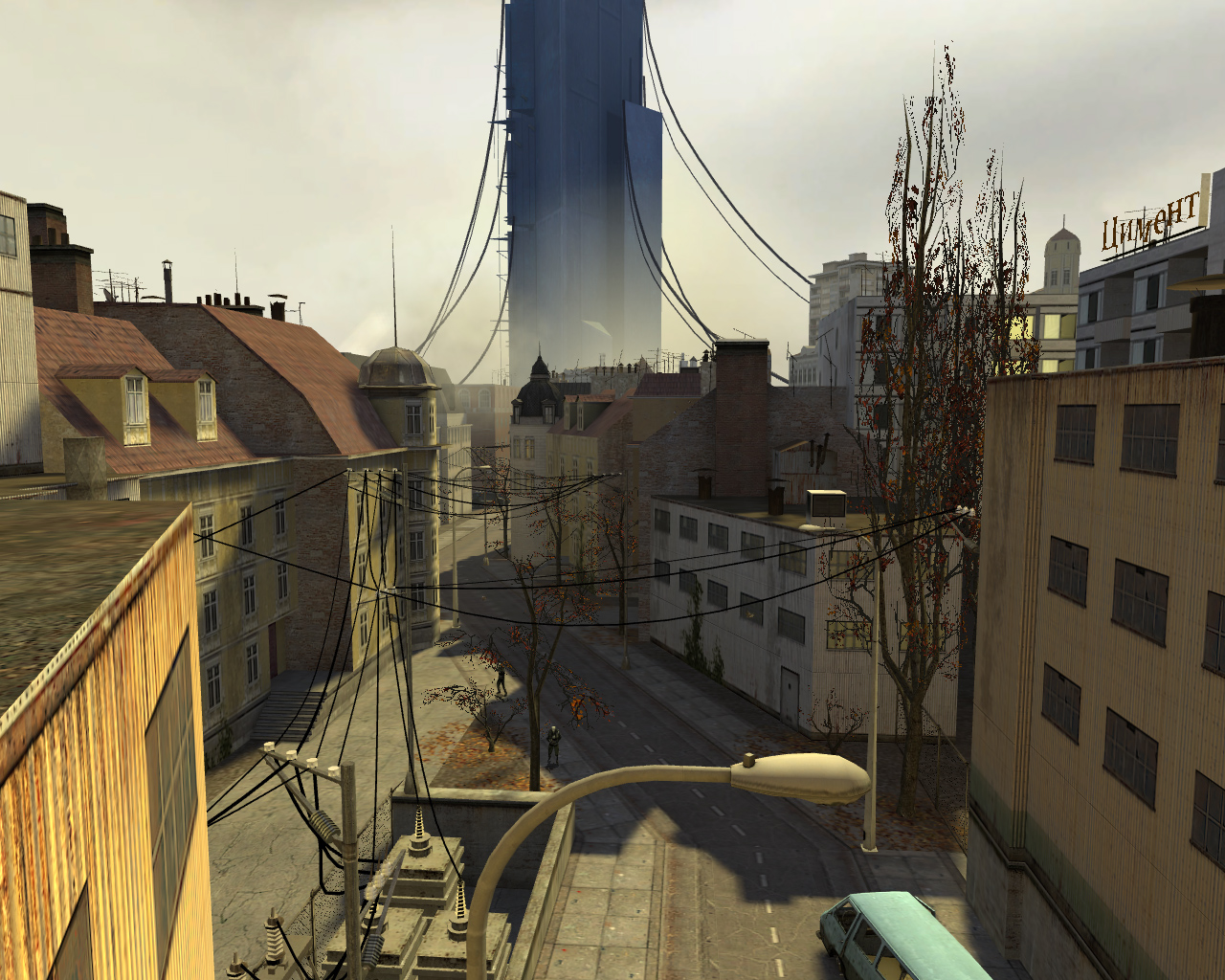
vertical line
Oblique lines: suggest movement, action, or change 
oblique
Curved lines (S lines): portray quiet and calm 
curved_line
Lines are a very useful for leading the eye of the player to a desired location, or in the direction you want them to travel.

thisway
Shape: shapes are created through combinations of lines, but can also be made by a change in colour or tone. The following are the different categories of shapes...
Geometric – architectural shapes, manufactured or ‘inorganic’ 
geometric_shapes
Organic – natural shapes, or those created by curved irregular lines 
organicshapes
Positive/Negative – the shapes created by the physical objects that occupy space, or lack thereof. 
pos_neg
static – stable and immobile shapes
dynamic – shapes that imply movement or activity
Size (scale): Size is the relationship between the proportions of shapes, since you don’t know how big anything is until it’s placed in reference of something else. Differences in size will place a visual emphasis or lack of emphasis on a shape 
home01
Space: This is the negative space (or negative shape) created through the arrangement of negative shapes. 
negativespace
Colour: The subject of colour would be a whole separate paper, or book even, so I’ll define it very briefly. Simply put, every colour is the result of mixing a Hue, a Value, and an Intensity. Colours can be warm or cool. A wide range of contrasts can be created using colour. For a more thorough explanation, refer to Johannes Itten’s “Art of Colour”
Texture: Environment artists are well acquainted with textures. As an element of design,' texture' refers to the way a surface looks. Matte, shiny, bumpy, etc. are all textures.
Value: The final element is value. This is also sometimes called ‘Form’. Value refers to the lightness or darkness of an object, a shadow, or a colour. Value can be increased or decreased by adding white or black, or increasing/decreasing the intensity of its lighting. The location of light sources and their intensity has a huge influence on a appearance of the scene and on the emotional response of the player.

lighting_and_value
2. The Principles of Design:
The “Principles of design” are the techniques used for the effective arrangement and distribution of elements into a composition. The principles are...
Balance
direction
emphasis
proportion
rhythm
economy
unity
Just as multiple elements can be combined together, so can multiple principles. Artists are definitely not limited to one principle per image. By understanding and applying these principles to our levels we can be more effective in achieving our visual goals, and communicating our ideas to our audience.
Balance: Balance is a result of the fact that the player’s eye will unconsciously use the middle of the screen as a fulcrum, a center point of the left and right side. Balance is achieved by arranging elements so that neither side is visually overpowering or heavier than another.

fulcrum
All the elements an artist has to work with have a visual weight associated with them, depending on their colour, value, and size. Dark elements weigh more than light elements, large elements weigh more than small elements, etc. Maintaining visual balance requires consciously distributing an appropriate number of ‘heavy’ and ‘light’ elements on either side of this fulcrum, at appropriate distances. There are 2 ways to balance elements on the screen, symmetrically, and asymmetrically.
Symmetrical Balancee is pleasing to the eye and has an emotional effect of peace, calm, and tranquility. There are 3 different types of symmetrical balance… Translatory, Rotational, and Axial.
Translatory Symmetry is where elements at the same height in the Y axis are copied from right to left. 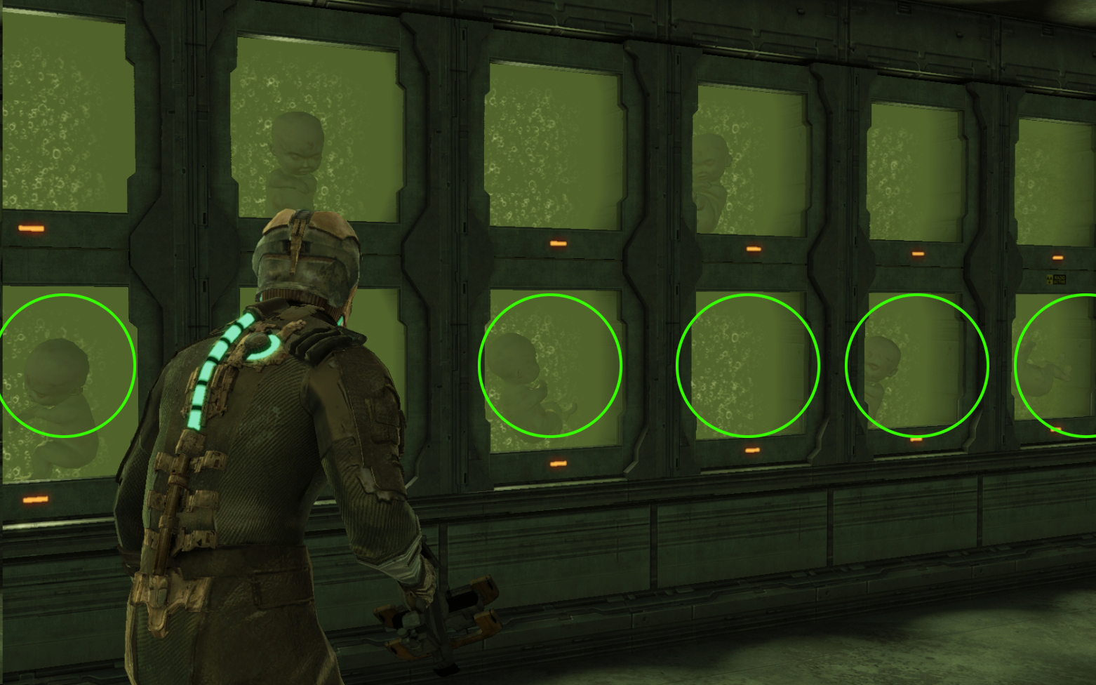
translatory
Rotational (Radial) Symmetry is the rotation of elements from a common pivot 
radial
Axial (Mirror) Symmetry is where elements are balanced equally on both sides of the fulcrum 
axial
Asymmetrical Balance: Asymmetrical balance is achieved by arranging elements of differing size and weight unevenly around the fulcrum so that they balance each other respectively. 
assym
Another asymmetrical balance is one large dominant element offset by many smaller/lighter elements. 
assym2
Asymmetrical compositions generally have a greater sense of visual tension and have an opposite emotional effect on the player than symmetrical balance. They instil a feeling of excitement, curiosity, or anxiety.
Direction: Direction is given by the arrangement, angle, and distribution of elements. The visual flow created by direction is used to lead the player’s eye through a composition, or even more literally, used to physically lead the player where the designer wants them to go.
Direction can be used to emphasize depth and the scale of a location or area. the placement of dark and light values are very powerful tools for creating direction. 
direction

direction2
Emphasis: The emphasis in a level is the environmental focal point of a location. This is also known as a ‘center piece’ or a ‘hero object’.
Direction can be used to lead a player through an area, but you don’t stop them with emphasis points of interest, the area will not be interesting and they’ll run past all your hard work. 
emph1

emph3

emph4
Proportion: Proportion in composition refers to the size relationship of elements versus each other, and vs. the world as a whole. Structural proportions (like the distance between a ceiling and floor) are used for a number of things. They can create visual emphasis and importance, and can have an emotional effect on player such as power, intimidation. Proportion also refers to the Golden Mean and the Rule of Thirds.
In videogames our dynamic and player-controlled camera’s make it difficult to implement these aspects of proportion into our compositions, but in certain circumstances they can be a used. These proportional ‘rules’ have been studied for hundreds of years, and are very important in composition due to the emotional response it brings from the viewer. The golden mean is 1 : 1.618, or this…

golden_mean
The rule of thirds is the division of screen into 3 equal sections vertically and horizontally. When elements are placed at these intersections the composition will be more pleasing to the viewer.

thirds

thirds2
Rhythm Rhythm is the repeating occurrence of visual elements. Rhythm is visually soothing to our eyes and people instinctively will follow a rhythmic pattern. In a composition, Rhythm can be used to create depth in a scene. It can create a sense of movement, or place emphasis on an object. 
rhythm1

rhythm2

rhythm3
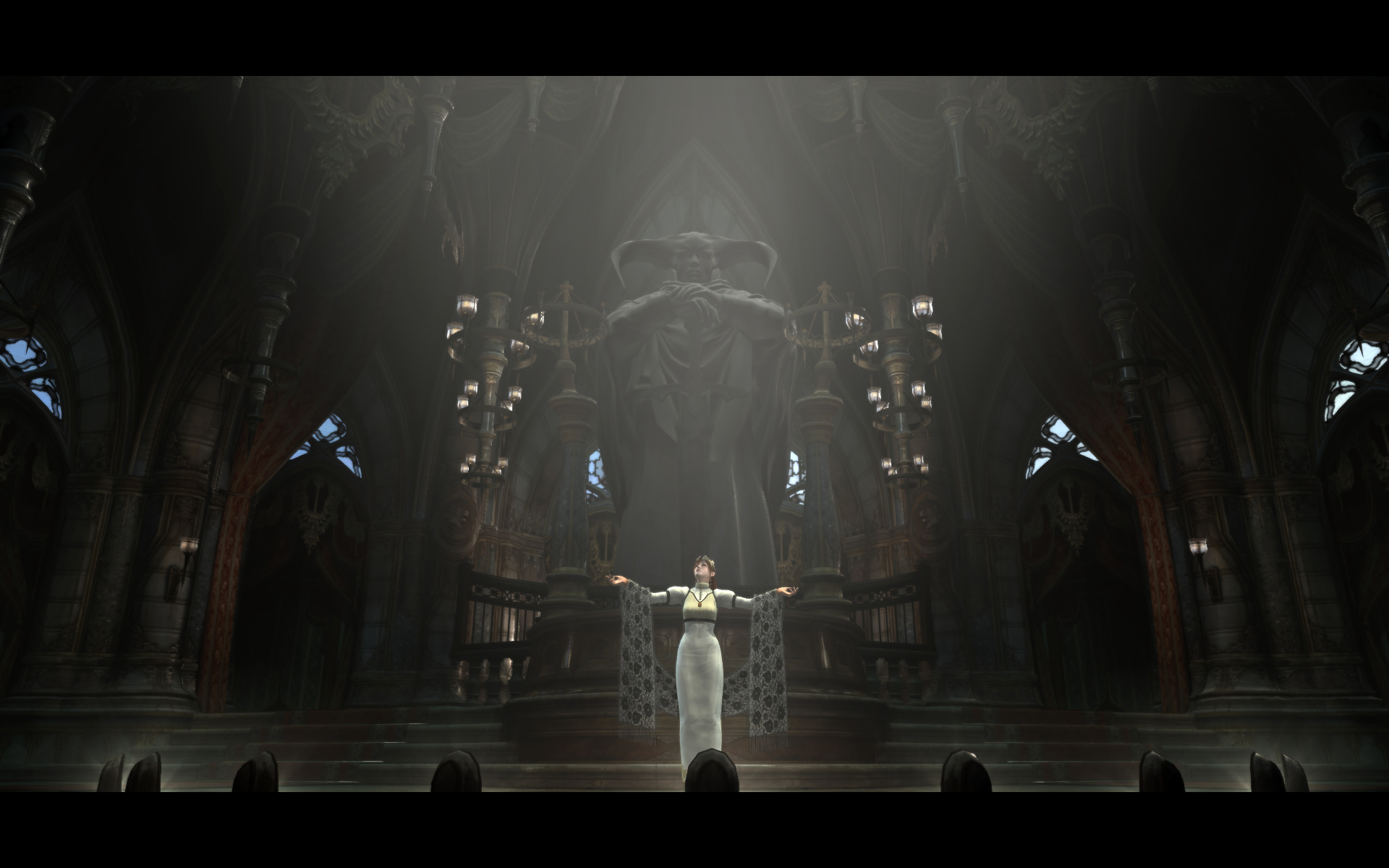
Economy A level in a videogame is typically filled with movement, VFX, sounds, and maybe a little too frequently someone trying to shoot you. With all of this action (and distraction) a composition needs to read very quickly and clearly. If it is too complex, cluttered, or subtle, it will be missed and lost. This is where ‘economy’ comes in.
If you can remove an element within a design and the design still works then you can communicate your composition more efficiently. When creating a composition there is no need to offer more than what is required. Use what you need, optimize where you can. (Just like polygon modeling:)
The following are different examples of economy, using symmetry, direction, rhythm, and size, and emphasis.

econ1
econ2

econ3
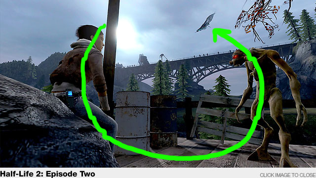
Unity: The last of the principles of design is Unity, also called ‘unity within variety’. Unity is the relationship between all the separate elements of a scene or level. It creates a feeling of ‘wholeness’ to a scene, the sense that everything is tied together visually.
One method of achieving unity is through proximity. When placing props for example, small clusters or groups is more aesthetically pleasing to a composition than randomly scattering them about. 
prox2
Repetition also results in unity. This can be the repetition of colour, shape, texture, or other elements. 
rep1
Continuation is a more subtle technique involving controlling the eye movement and intentionally leading it back into a composition. 
cont1
cont2
-jeremy price
Read more about:
Featured BlogsYou May Also Like