Trending
Opinion: How will Project 2025 impact game developers?
The Heritage Foundation's manifesto for the possible next administration could do great harm to many, including large portions of the game development community.
"Every moment in-game should be screenshot-worthy and be an art piece in itself."

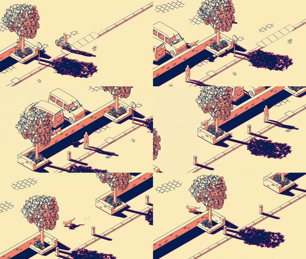
There's something irresistible about Schim, an isometric platformer about a bright-eyed soul trying to reunite with its owner by hopping between shadows like a sprightly salmon.
By contrasting light and shadow with Dutch-inspired animation and vibrant levels, each of which contains its own small story, Schim developer Ewoud van der Werf is hoping to create a platfomer that challenges and delights in equal measure.
Intrigued by what we've seen of the project so far, we caught up with van der Werf to learn how he blended art and animation to create an abstract aesthetic that demands your attention.
Game Developer: What design considerations went into conceptualizing and implementing Schim's decidedly abstract visuals?
van der Werf: All objects need to have a recognizable silhouette to be viewed from an isometric perspective, and only need just enough detail for how far away the camera really is.
There haven't been silhouettes that need too much iteration, mostly just checking if detail should be modeled or should be added to the outline texture.
I also thought I should mention our specific criteria points that we came up with when we are designing a Scheme level. We call them "lenses". Each lens is a point of interest that we can rate a level on:
Art Piece/Framing
Every moment in-game should be screenshot-worthy and be an art piece in itself.
Realistic
The world should be believable and logical (and Dutch).
Platforming Fun
Moving around should always be fun.
Puzzle/Solving Fun
The player should have eureka moments.
Living Plays
Characters and the world should show plays that are fun to watch and to interact and change.
Story
Each level is part of the overarching story of the player's character and the world.
Exploration
It should be fun to go off course and interact. Hidden things can be found.
Diverse/Contrasting
Each screen and level should be different and fresh. (unique colors, sounds, and 3D models)
This is how we review levels, based on these lenses. Not every level needs to be a ten in every category, some levels could even only focus on one specific lens.
How did you iterate on Schim's art style throughout production? Did it take a lot of tweaking and refinement to get to this stage?
Yes it took a lot of refining, mainly because I was still learning how to make shaders at the start of the project. At the start of production all of the objects used silhouette outlines, using the infamous method of duplicating the mesh and pushing it along the normals to display outlines. Now we render outlines with a custom shader in post, so we can display more detail on each object.
I'm curious to know how lighting and animation feed directly into gameplay, and how you approached blending the project's visual elements with interactive mechanics?
The project has two key lighting options, directional lighting and point lighting. The former represents the sun, and is thus based on an angle. As opposed to point lights, which radiate light from a given position. Changing the angle of directional lights or moving point lights, change where and how the shadows are drawn.
Animation is also very important, since it directly influences the shadows. Whether it's the object casting the shadow or the light source being animated. Tiny movements in characters are also a lot more noticeable in the shadows that they cast for the player.

What was the most challenging aspect of realizing such a heavily stylized 3D world, and how did you overcome it?
The most challenging part is probably developing all the custom shaders used by objects that cast shadows. The ground also uses a specific shader to receive those shadows. Developing the shaders for Schim was an iterative process, with lots of trial and error.
The first version of the shaders that I made could only use directional based lighting and only cast shadows on an even ground (also mostly because of the player code that detects shadows).
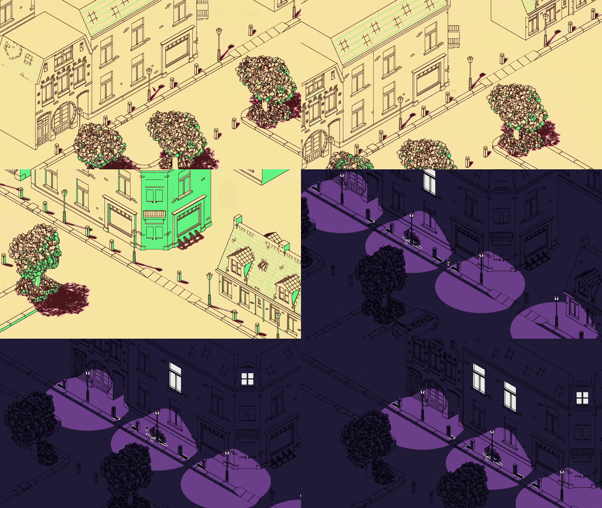
One valuable thing I should have used earlier is global variables, because the game only uses four colors, those four colors are now stored as global variables. This makes it possible to suddenly switch from palette when needed, which is also useful for us to experiment which palette to pick. It also greatly reduces the amount of materials the project contains.
I've included a gif (below) of the same scene with different lighting and palettes to show how we use colors. The day level uses directional lighting and the night level uses point lighting.

How did you decide what colors to use when developing the palette and overall tone of each level?
Most levels are either a directional lighting level (usually set outside during the day) or a point lighting level (these usually take place at night or inside a building). That's one of the first things we look at. The latter for example uses a lot more contrasting colors to better indicate how a place is lit. A directional level usually has two less contrasting colors for shading.
We also look at what is going on in the scene, if the tone of the level reflects the palette, and what time it is in the world. Some levels are set in the same place but at a different time of day, also influencing the lighting.
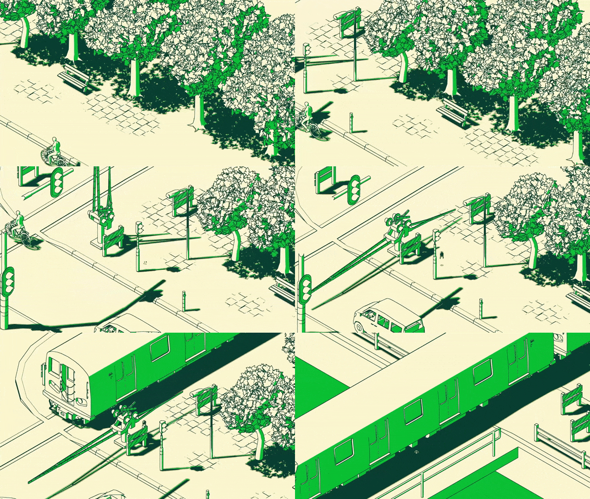
There seems to be quite a bit going on in each of Schim's levels. Joggers breeze through bustling parks, trees sway in the breeze, motorists go about their day, and there are even animals like birds, cats, and elephants. How did you handle animating such a diverse array of assets and their all-important shadows?
One of the pros of the art direction of Schim is that it uses realistic proportions without too much texture work, which would have made it easy to use publicly available assets that don't clash with the overall picture of the game. Yet most of the assets are custom made specifically for Schim, we want the game to carry a recognizable dutch identity.
Aside from the human characters, all the animated animals are pre-made, fully animating such a diverse group of assets would cost a lot more development time.

What art production software and hardware did you lean on throughout development? Was there a specific tool that proved particularly invaluable?
Personally I have always been a fan of Blender, it's also what got me into game development, it's a program I can always rely on when I need it. I not only use blender to make assets, but also to mock up levels. Unity supports .blend files, so it's easy to quickly edit something and see it directly reflected in the engine.
Schim is still in-development, but what's the most important lesson you've learned so far where art and animation in concerned?
The important lesson I've learned is making use of concept art and using placeholders before the finalizing phase. Even then it's hard to tell when something is "final" [and if] we'll have to iterate upon it later again.
Read more about:
FeaturesYou May Also Like