Trending
Opinion: How will Project 2025 impact game developers?
The Heritage Foundation's manifesto for the possible next administration could do great harm to many, including large portions of the game development community.
UFO 50's creators reveal the creative inspirations behind the ambitious faux-retro compilation.

When I first heard about UFO 50 (at this year's Day of the Devs broadcast), I was astounded. A compilation of 50 full games evoking the 8-bit era, styled as a library from a long-lost fictional studio, created by the real-world developers who have given the world projects like Spelunky, Skorpulac, Catacomb Kids and Downwell? Without exaggeration, that sounds like a retro player (and pixel art enthusiast)'s dream come true.
While that sounds hyberbolic, the team appears to have truly pulled it off. The game launched on September 18 to plenty of acclaim (and currently, overwhelmingly positive reviews on Steam).
Now that I've played a bunch of the games in the collection (and watched dozens of hours of streams), I've been most taken by the marriage of design decisions that play with old-school and retro convention and the team's full commitment to striking 8-and-16-bit pixel art. I had the opportunity to send along a few questions to developers Derek Yu, Tyriq Plummer and Eirik Suhrke, focusing on the project's style holistically, the challenges of getting the 8-bit era's multitude of looks just right, and the utter delight of the UFO 50 color palette.
First off, I know this was a huge collaboration (and undertaking!)—to create 50 games with a coherent visual language, style, and connective threads among them. While I am mostly going to ask about the visual aspects of the project, I want to start off with a basic production question. Did you produce the games individually as separate projects, or share assets/code across the spectrum while you were developing each title (and the meta elements?)
Tyriq Plummer: From a technology standpoint, the games were all made as sort of sub-projects in a larger overarching project which provided some essential shared infrastructure, including handling textboxes and certain particle effects, collision code or movement engines and such. There are also just generally a decent number of shared assets across the games; you’ll notice if you play for instance: "Oh hey I remember that rock from Velgress" or “This enemy in Caramel Caramel looks really familiar" and stuff.
While it may have largely been a side-effect of just being efficient in terms of not wanting to make unnecessary work, it’s also pretty fun to be able to connect those dots and have a feeling sometimes that certain would-be-inconsequential enemies and tiles and such get to take on a certain "cameo" quality, sneaking in where you might not expect them and getting to go: "You again!"
Derek Yu: Early on, the technical limitations of our resolution, palette, and color rules were probably the main unifying factors, since we worked separately a lot (in parallel is maybe more accurate). We did end up sharing quite a bit of tech, as Tyriq mentioned, but I always thought it was funny that the final collection has three different platform engines in it, for example. Some things you just want to be a certain way for your own comfort!

Via Mossmouth
The further we got into development, the more everyone worked on everyone else’s games and the more sharing it felt like we did. And we were all looking for ways to connect the games together visually, thematically, narratively, etc.
Regardless of the overall approach, how did you manage to work with a very consistent look and feel, even across genres/styles (and truly, the evolutionary epochs that were present in the comparatively short time of the 8-bit era)? Each game here (that I have played thus far) feels like a lost NES game, which I can only imagine was a huge undertaking.
Plummer: I can't speak to the early process since I joined once all of those restrictions and stuff were already kind of laid down, but I mostly took my cues from what was already extant in the games when I started working on them, and just kind of made judgment calls as to what seemed like a reasonable thing on a case-by-case basis.
I think there were a couple times when someone (Eirik) pointed out that I should pull back on the particle effects or something because the number of sprites on screen drifted out-of-spec, but for the most part I think there’s great value in these sorts of aesthetic restrictions that can actually make things easier than not having them, because you don’t have such a paralyzingly vast possibility space. When you know where the bounds are and they’re clearly defined, you can immediately rule out a lot of dead ends and get closer to something workable much faster.

Via MossMouth
Yu: I think starting with a consistent set of limitations and then everyone being very open to following each other's lead is what led to the final collection feeling so unified. A game that one person started would eventually go through multiple passes by multiple different people, and you pick up a lot of cool things from each other that way. We all have our own distinct styles and it was important to keep that intact, but over eight years of working together this way I’m sure that we’re all a little more similar to one another than when we started
There are a few cases of fairly direct homages—both in the spritework and in genre/mechanics—to existing NES games, and some cases where I can't find a direct predecessor. Did you mine trusty sources like MobyGames/VG Museum etc. for inspiration, or rely more on existing memory/other inspirations here in creating the various games? Were there any particularly weird or interesting inspirations in the bunch? Did anyone have a beloved obscure game from the era they got to highlight in the course of creating UFO 50?
Yu: We have a Slack channel called "coolstuff" where we share inspirational screenshots, box art, flyers, playthroughs, etc., that we come across. I think Eirik and I both spend a lot of time following accounts that post those kinds of things. NES was certainly a big inspiration, but we were also influenced by arcade games, PC Engine, MSX, and PC-88… a lot of which we experienced only through the internet. Jon and I grew up digging through troves of freeware and shareware games on DOS and Windows, as well.
During development, I did look up NES title screens to get a sense for how they were put together and what the possibilities were there—title screens weren’t something I thought about deeply as a kid, particularly the details of the text and the transitions to and from. VGMaps was also a helpful resource and I remember looking at Ninja Gaiden II in particular to try and understand how they made their levels feel so dynamic and three-dimensional given the limitations.
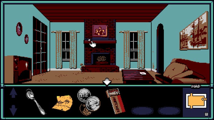
A lot of times the best inspiration comes from some fleeting encounter, though. For example, I’ve never played Otocky or King’s Quest V on the NES, but seeing a few screenshots here and there has really stuck with me over the years. Both games have a compelling style that’s out of my comfort zone—Otocky with its vibrant, geometric shading and King’s Quest at the opposite end with its muddy and messy texturing. UFO 50 was the perfect opportunity to learn from everything we could and experiment.
Eirik Suhrke: One thing I would do while helping massage our palette into shape was to pull in screenshots of other exciting, cool or curious looking games from all kinds of different 8- and 16-bit systems to see what they would look like truncated down to our specific color set. This helped highlight some of the strengths we could lean into as well as illuminate some of the shortcomings we might want to iterate on still. I think a lot of 80s and 90s pixel art and tiling idioms also could have rubbed off on me as I was scrutinizing it like this as well.
On that note, were there cases where specific visual design elements impacted gameplay or mechanics? Did something ever just look so cool/fun/weird that you felt the need to make a game out of it or go a particular direction with a mechanic/feature?
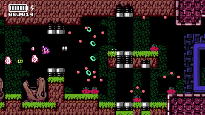
Suhrke: Campanella 3, a rail shooter of sorts, definitely grew out of a fascination with 2D-based pseudo-3D in general and a question of what that could look and feel like within our framework. For example, we chose not to allow sprite scaling which meant here every enemy had to be manually rendered out for every applicable distance. Once the art and the depth perspective code was in and feeling cool it was just a matter of designing a game that was fun to play around that.
Plummer: I think when I first played an early version of Valbrace my immediate thought was "this is rad and also these enemies super need to be able to jump into the background." The strong perspective of the classic first-person dungeon crawler necessarily leads to a kind of visual depth, and that depth carrying over during fights immediately made me want to make that extra visual space be mechanically relevant in combat as well.
.png?width=700&auto=webp&quality=80&disable=upscale)
Via MossMouth
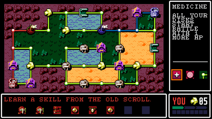
In Bushido Ball the presence of the referee also made me want him to have a more active role than just as a background character, so I made him give penalties for things like letting the ball rest for too long or hitting your opponent directly with your sword and stuff. I think that really made the game feel more alive and characterful, in addition to all the actual gameplay implications. Like—now you can imagine that this is a sport with a governing body that actually makes these rules, and suddenly there’s a small bit of a torn edge to the page instead of a clean cut, where you can fill in for yourself what lies beyond. I love that kind of stuff.
What went into creating the UFO 50 palette (which is a fun one to play with!)—did you have original NES constraints in mind, or were you instead going after a sense of "how you might remember" these colors looking?
Yu: My initial goal was to create a pretty broad palette of colors that included "useful" colors like greens for vegetation, blues for water and sky, etc., but also splashed some "fun" colors like pink and turquoise. I read up on how other people theorycrafted palettes and studied some of the more striking-looking NES games… at one point I believe Eirik posted some beautiful screenshots of Kickmaster and Low G Man as a reference for what he liked. But we also examined the palettes of other consoles, too.

Via MossMouth
Eventually I passed the palette over to Eirik and he adjusted it quite a bit to turn it into what we have today.
Suhrke: I believe some of the pink/peach tones as well as the slime green were definitely influenced by the NES palette directly, whereas our sour yellow was more inspired by the MSX palette.
But, at a certain point it became more about tweaking it to serve the specific needs we were seeing as we were developing the games. Specifically, we were happy with our mid tones but needed more dark colors for backgrounds and bright colors for highlights so we started nudging some around until the right compromise was made.
You May Also Like