Trending
Opinion: How will Project 2025 impact game developers?
The Heritage Foundation's manifesto for the possible next administration could do great harm to many, including large portions of the game development community.
Developing a minimalist look meant maximizing the use of internal tools, particularly for lighting and water effects.
August 20, 2024

Game Developer Deep Dives are an ongoing series with the goal of shedding light on specific design, art, or technical features within a video game in order to show how seemingly simple, fundamental design decisions aren't really that simple at all.
Earlier installments cover topics such as how GOG perfected the imperfect with the re-release of Alpha Protocol, how Ishtar Games designed a new dwarf race in The Last Spell, and how Krillbite Studio cooked up a palatable food prep experience in Fruitbus.
In this edition, Point N' Sheep lead programmer Antônio Rivero describes in meticulous detail the deliberations behind the simple but sharp art direction of the pacifist ronin game, Bloodless.
I'm Antônio Rivero, lead programmer at Point N' Sheep, working on Bloodless, an action adventure game about a pacifist ronin with non-lethal parry-based combat and a unique limited palette art style. It is our first commercial game as a studio, even though most of us have worked together to make mobile games for different companies, and participated in many game jams together. We knew a bunch of things about making games, but we had to learn together how to make a game this big, this ambitious, and this pretty.
Bloodless started out as a game jam project for the 45th edition of the Ludum Dare. The Jam's theme of "Start with nothing" inspired us to make a game about a swordless samurai. As a team we had participated in many game jams together, and we were used to making gameplay and visual decisions to make our work easier in the limited development time given to us for events like these.
One of these decisions was to make the character have the same action for dodge and parry, to save on animation and coding time. Another such decision was to have a 1-bit-ish aesthetic, with only black, white, and red on the screen, so that the artists could produce environments and animations quickly.

Image via 3D Realms.
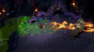
This 3-color palette style is very different from what we ended up with in the game. Characters in Bloodless still keep the black-white-red palette for the most part, but the scenery has completely changed. I think the term "hi-bit," which I've seen a few times to refer to modern pixel art games, really encapsulates what we went for with Bloodless. It has an extreme palette limitation, with a maximum of 12 colors on the screen at once. Still, the dynamics of the visuals make it instantly noticeable that this is a modern game with fancy effects going on.

Image via 3D Realms.
So how and why did we get from one to the other? When we finished the game jam version, we were by no means dissatisfied with its visual style. We had a positive reception to the game from the community, and one of the most recurring feedbacks we got was that the visuals were very striking. I think that the reason was that, as with many things in this game, we, at some point, developed a vision of what we wanted, and sort of decided that we couldn't do without it.
After Ludum Dare, we were all on board with turning that small game jam prototype into a full 5-ish hours-long game (it ended up with nearly twice that playtime, though). We knew that to turn it into a full game, we had to flesh out all areas: more enemies, a deeper story, and improved visuals. We were really happy with how the game looked and thought of just having more detailed scenery and animations, maybe using some extra "accent" colors, like the pink in a sakura tree (which we had made for an expanded version after the game jam).
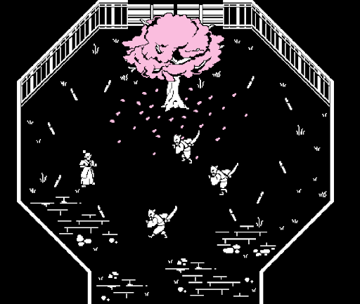
Image via 3D Realms.
But then I saw Return of the Obra Dinn, and everything changed. I knew we had to do something like that. Our game had a great, more traditionally retro visual style, but we wanted to elevate it somehow. That striking style of two-color shading instantly felt like the correct inspiration to me. Luckily, the creator of Obra Dinn, Lucas Pope, even had some blog posts on how he made the art style work, so I studied them quite a bit.

Image via Lucas Pope.
The style of Return of the Obra Dinn uses a technique called dithering quite a lot, where you create the illusion of multiple shades between two colors by alternating between them via a pattern. Instead of transitioning from a light color to a dark color via the intermediate color, you use less and less of the light color and more of the darker one. There are many patterns you can use for dithering. Obra Dinn uses a more noisy pattern that makes it feel more natural, but we ended up using a classic Bayer pattern, which makes it very "pixel-y."

Here’s what a gradient looks like when rendered in Bloodless. Image via 3D Realms.
The rest of the team liked this idea of exploring dithered lights, so they agreed to have me work on this evolution of our art style. We didn't know exactly what we would do, so it was a very exploratory process. I also had very little experience writing shaders, especially 2D shaders. I had to juggle trying to figure out what we wanted to do, how to do it, and if it was even possible. The first thing I could do was just use lighting to alternate between black and white pixels. It was a really cool effect and gave us more certainty that this was a good direction.

Image via 3D Realms.
The really tricky thing was where to go after that. Since I was championing this, and it was gated by my skills and the limitations of Unity's 2D Renderer and lighting system, I tried making some prototypes, exploring what I thought would be interesting ways to push the tools we had from Unity's lighting system. I remember a tech demo I made where I tried using the three color channels to make different colors of light and blend them. A lot of those ended up looking pretty bad, and the whole endeavor was driving me crazy.

Image via 3D Realms.
That was when we took a step back and went back into looking for references. One particularly cool indie game that our art director showed us that used some of the same dithering techniques we were trying out was Hell is Other Demons. It had a 4-color palette and used lighting to blend between those colors with dithering on the borders. Our game was previously defined by just being black and white (with a bit of red), so each color added had to be thoroughly discussed. I started experimenting with the lighting having a Game Boy Color-esque limited palette, and the results were really promising.

Image via 3D Realms.

Image via 3D Realms.
We iterated on this style while other aspects of the game were also being improved. The first region of the game was a forest on the outskirts of the Old City, where a lot of the story happens. We went back and forth on the color palette, shader parameters, and features to decide things like how dither-y the shading would be, how much each light would illuminate, and how the lighting effect would vary from object to object. Even quite later on in the project, we would still keep adjusting how the palettes worked, how the texture assets themselves were shaded, and how the parameters of the light sources were set up to get everything right.

An early illuminated scene. Image via 3D Realms.
So the system we ended up with was: we had the scenery, which was illuminated with a palette of seven colors that served as the shades from lighter to darker in environment objects, plus five "accent" colors that were not affected by lighting. Characters were always flat black and white, with some details using the accent colors, while environment objects had materials that used a subset of the seven colors and had different lighting parameters. Each environment object has up to five colors from the seven, with two of them usually being black and white, with this limitation being very useful for building a visual hierarchy.

Here’s what a palette looks like in the game assets. This is the one for the bamboo forest. Image via 3D Realms.
Once we had fully embraced lighting as a core aspect of the game's visuals, light sources became very important, so we started adding more of them: braziers, lamps, light beams from the sky, and fireflies. Our game started feeling oddly… realistic? Not exactly realistic, but grounded in a way. We started experimenting with normal maps and shading in the assets themselves to add more and more to this vibe, and anything that didn't quite match that felt odd. Preserving this grounded feeling proved to be quite a challenge as we added the next big aspect of the game's visual style: water.

Image via 3D Realms.
Having water in the game was not only important to add variety to the scenery but also central to the worldbuilding of Bloodless. Bakugawa, the place where the game is set, is an island, and the central deity that its people worship is a god of rivers, so we had to have rivers. I remember trying to delay doing this quite a bit back then because I was just very scared of it, and in the end, making the water effects of this game was almost as difficult as building that first version of the lighting style and probably even more stressful.
It took a little more than a month from starting it to when we got the first version of the water and reflections we were happy with. It was a very stressful period and full of frustration, partly because this kind of stuff is generally hard to achieve and was unfamiliar to me, and also because there were a lot of specific aspects of our game that made it even harder.

Image via 3D Realms.

It took one month to get from the first to the second image. Image via 3D Realms.
Oftentimes, reflections in 2D top-down games are done by simply having an upside-down copy of the sprite rendered only where there is water. That would not be good enough for our game for a bunch of reasons, the most important being the lighting. Because the lighting was so crucial to how every single object looked in our game, having an object be lit differently on the top than the bottom felt weird, so we had to have the same sprite render on the original and the reflection in different passes and use the lighting information from the original on the bottom one.
There were a lot of little details like this that took some time to get right with the water: objects in the water needed to be submerged, and we had water of different depths, so that also had to be taken into consideration. The fireflies go up and down, so they should get closer and further from their reflections during this animation. We had to power through all of this stuff because if anything were out of place or missing, it would stick out like a sore thumb. Thankfully, we managed to do everything we deemed necessary, and I'd say it paid off because the water effects are an integral part of the visuals now (and one of the things I'm personally the most proud of in the game).

Image via 3D Realms.
All of these visual systems ended up requiring a lot of internal tools. Because the reflections were quite expensive, we wanted to disable them for objects that weren't near water. So we made tools to detect the water near the objects and change the object material, saving some precious draw calls to make our game run smoothly. One of the things I'd probably do differently in this project was to test out the performance of all these features earlier. For example, the normal maps in Unity's 2D pipeline are very costly, and we might have been able to avoid using them.
Developing Bloodless was an experience that included a lot of iterations, learning, and pushing ourselves to do new things. We pushed ourselves a lot because we knew the game we wanted to make, and we would not be satisfied until we saw it meet the level of quality we knew it deserved. Everyone brought their best to it, and I couldn't be more proud of what we, as a team, made. The combat, worldbuilding, sound design, level layouts, and everything else were made with loads of care and a little bit of obsession, and I hope it comes across to anyone who plays our game.
You May Also Like