Trending
Opinion: How will Project 2025 impact game developers?
The Heritage Foundation's manifesto for the possible next administration could do great harm to many, including large portions of the game development community.
UI is an organized visual representation of a game's underlying systems. Here's a simple approach that can be implemented quickly while supporting an established art direction.

Game Developer Deep Dives are an ongoing series with the goal of shedding light on specific design, art, or technical features within a video game in order to show how seemingly simple, fundamental design decisions aren’t really that simple at all.
Earlier installments cover topics such as how camera effects, sound FX, and VFX created a smooth and high octane movement system in Echo Point Nova, the technical process behind bringing The Cycle: Frontier to Unreal Editor for Fortnite, and how the developers at ROAR Games designed three distinct, overlapping game worlds within one cohesive narrative in Tenet of the Spark.
In this edition, Wandersong developer Greg Lobanov explains basic techniques and design principles that shaped the clear, concise visual language in the UI of his upcoming game, Beastieball.
In my time as a game director, I’ve created a few indie darlings that are known for their bold styles and creative UI, including Chicory: A Colorful Tale, Wandersong, and soon-to-be Beastieball. I work in very small teams and do all of the UI for my games myself. It’s something I’ve grown to love very much, and I’ve developed a few basic principles for how I approach things that I’d like to share. These techniques straddle the border between visual design and tech because that’s my skillset, and they’re mostly designed to create something acceptable as fast as possible. If you specialize in UI/UX, you may even be offended by my low-brow approach! But I hope you can forgive me and we can still be friends.
When I’m looking into a new project, art direction is one of the first things I establish, and the art direction naturally guides the appearance of the UI as well. Once I have a general idea of how the game will look, I usually program a few helper functions/shaders to make certain effects or shapes as easy as possible to drop in anywhere. Then, for years after that, I use those little helper functions everywhere… all of the time… for everything.
That’s the entire trick, but we can look at it in practice with Beastieball.
Images via Greg Lobanov/Klei Publishing.
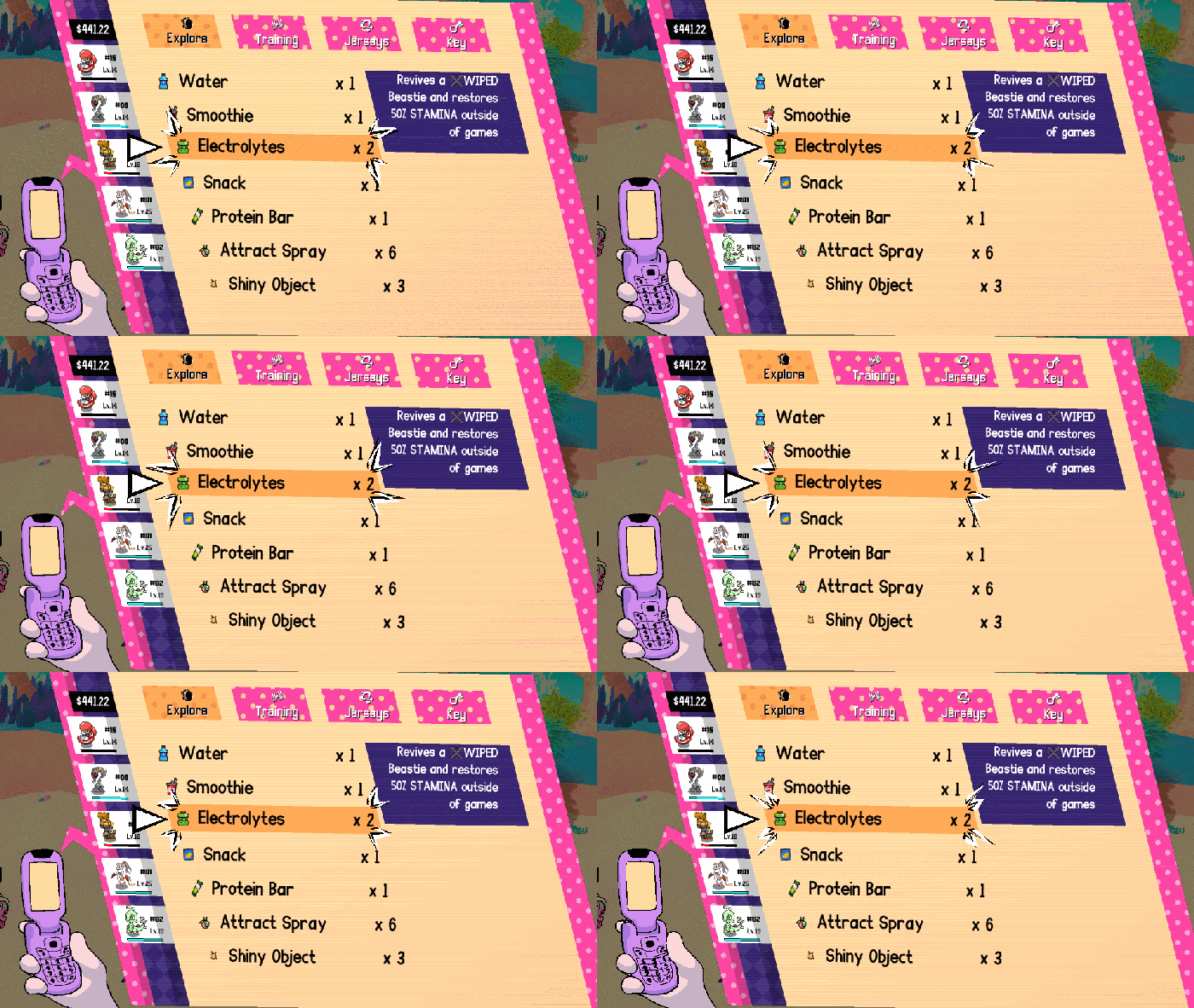
In Beastieball UI, the key theme is all parallelograms because they are the sportiest shape. (I think ESPN did this). The game is an RPG with a lot of UI, numbers and lists, so this basic style works great because it’s just barely a twist on the most boring, simple layout style you can do, which is just putting text in rectangles. The slight skew, and arranging things on an angle rather than straight up and down, makes the game feel infinitely more stylish. In the biz, this is what we call "art direction."

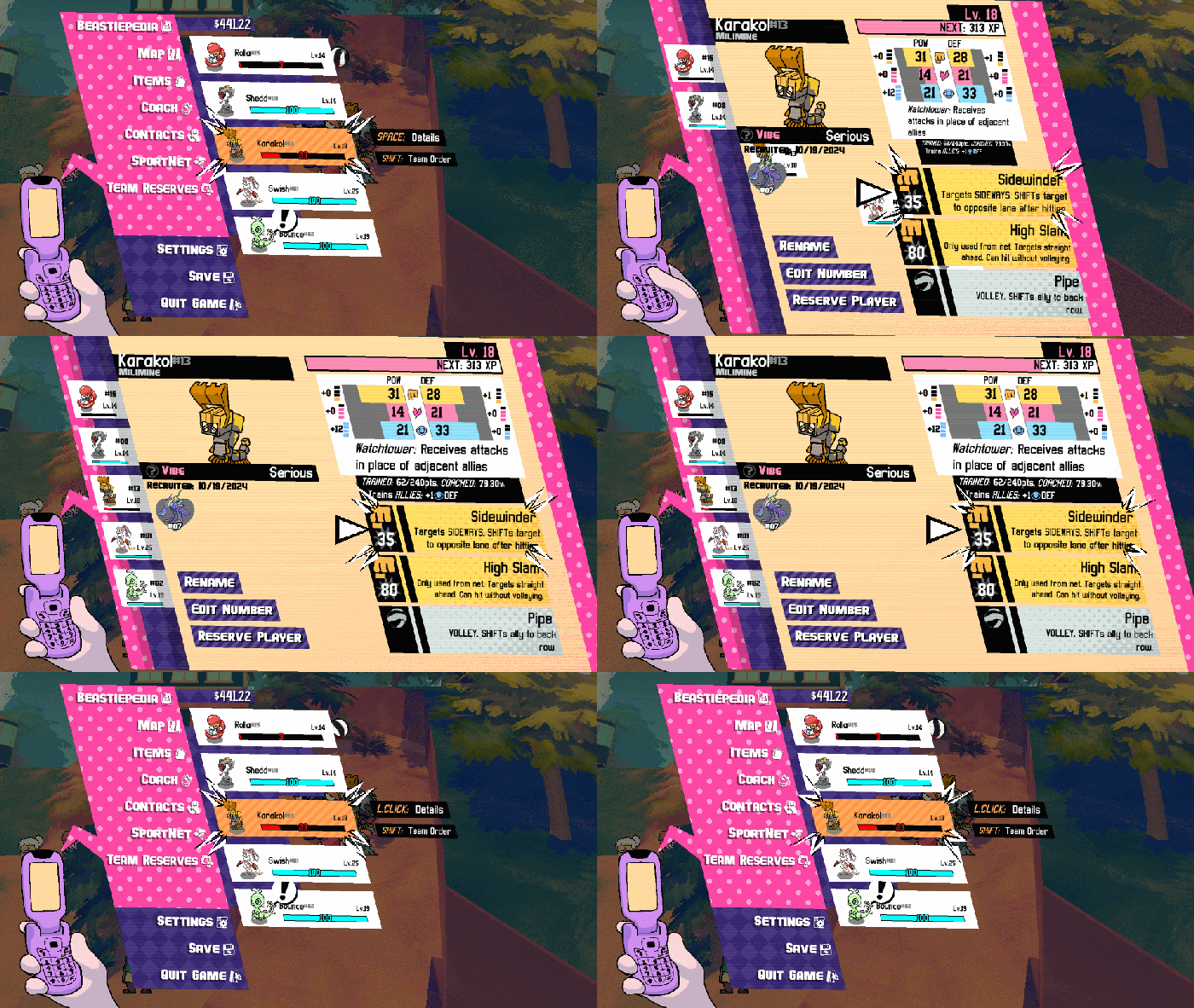
The other main repeating visual motif are the looping shape patterns (dots, lines, diamonds) which scroll ambiently. Images and captions via Greg Lobanov/Klei Publishing.
All of these were supported by very simple one-line functions, which I used everywhere, brainlessly.
draw_pgram(x1,y1,x2,y2) was the first of these I wrote. It just draws a parallelogram within the specified boundaries. The angle of the tilt is determined by a universal macro/global number which I basically never changed.
shader_set_scrollpattern(graphicAsset, color) was another one. I created a shader which would take an input texture (like a scrolling dot pattern) and overlay it on whatever was rendered after that, with the texture position slowly scrolling over time. So for example, if I set this shader to use a dot pattern and a yellow color, then rendered a pink parallelogram, the result would be a pink parallelogram with scrolling yellow dots on it.
That’s pretty much it. The entire UI style of Beastieball was founded on basic one-line functions like this. Some of the cleverness comes in the consistency of application; by using these visual motifs for EVERYTHING, I sometimes ran into problems conveying the info I needed. But I persevered and made everything work without ever breaking the boundaries I’d set. As a developer, this can be seen as a sort of laziness, but to players I think the effect is also one of the game having a very clear and consistent visual style.
I need to credit my college professor Jervis Thompson for this one. I use it so many times per day, I sometimes forget that it might(?) not be common knowledge to everyone. It’s basically a braindead method for having stuff move around the screen in a pleasing way, using as few codelines and states as possible. This is it:
Position += (TargetPosition - Position) * Speed;
Where Position is the current position of a UI element (this could also be its angle, scale, opacity, or any variable, really).
TargetPosition is the intended final resting place of that element.
Speed is a value above 0 and below 1. My favorite value for Speed is 0.3 but maybe you’ll find your own which you like even more!

Images via Greg Lobanov/Klei Publishing.
This simple sort of code is what drives a ton of tiny UI animations in the game, like the scale and position of elements animating when you open and close a menu. It’s really easy to add this anywhere, and it always makes things look better, so it’s a good habit to get into if you’re a complete hack (affectionate) like myself and Jervis.
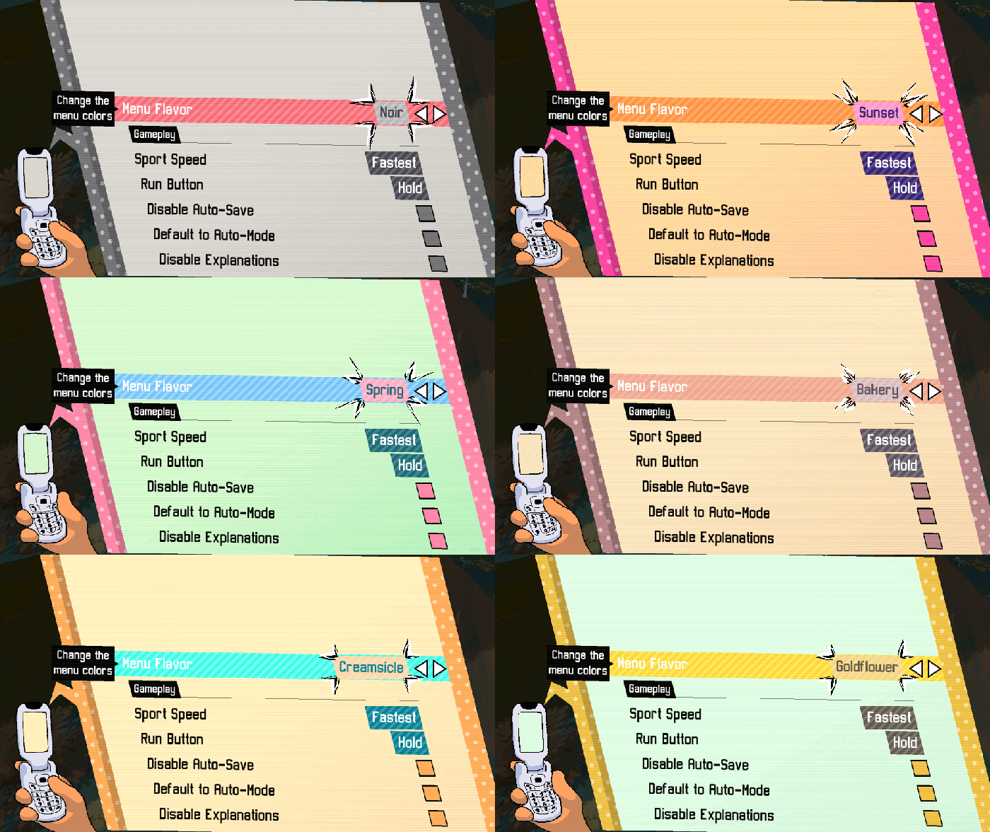
I use this technique everywhere I possibly can, not just in UI. But, basically: I define a small list of colors, and then every UI element gets its color by referencing one of those pre-defined colors by index (i.e. color 1, color 2, color 3…). I do this rather than defining the colors for each asset, or using imported image assets with colors already on them, because it makes it very easy to adjust the colors as I go, and also ensures that every visual element is harmonious.

I can also swap out the list of colors easily to create visual theme options for players that work across all menus. Images and captions via Greg Lobanov/Klei Publishing.
This is the part where I get more annoying and philosophical about UI design like I’m some kind of sage.
I think it’s really important to recognize that UI is the player’s window into the soul of your game. The things that you choose to show them, and NOT show them, entirely define their understanding of your world. So be careful about overusing or underusing UI… think about where you want the player’s attention to be and where you want them to look to find certain information. A classic example of overwrought UI would be when maps in games are easier to navigate than the game world itself, leading players to navigate purely by UI and ignore all your amazing environments, etc.

Images via Greg Lobanov/Klei Publishing.
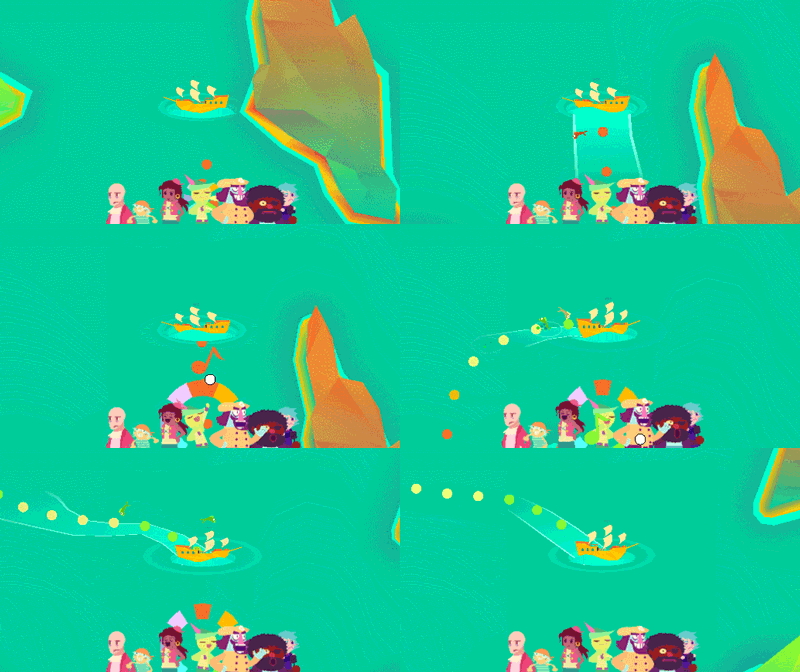
I’ll share one specific example where I avoided UI overuse (in my opinion). In Wandersong, there’s a section with a bunch of different islands you can visit, each containing parts of a larger puzzle/quest so the player has to navigate around between them. Generally, the game is a side-scroller, and my initial plan for navigating the islands was to add some sort of quick menu that would let the player fast travel between them.
But when it came time to implement, the menu idea seemed incredibly boring for an over-the-top adventure like Wandersong. I wound up adding a special screen that was unlike anything else in the game, wherein you used singing to steer a pirate boat around instead. It does feature a map of the islands, which you can quickly bring up with a button press (that’s a lazy tween…), but you can’t move while looking at the map, so it invites you to plan a route and then sing your way there. (Also, we hid a secret bonus island under the character’s thumb). Mechanically speaking, it’s very shallow, and it certainly added a lot of extra travel time. But it also remains one of the most popular segments of the game and one players frequently comment on, I think in part because of the way it breaks with expectations.
The lesson here isn’t that all fast travel menus should be replaced with a musical pirate boat, but more that it’s worth taking the extra time to consider your approach to game elements and to be intentional about how and when you use different interfaces. A fast travel menu is convenient, but it also invites players to look at your world in a more utilitarian way, and takes away the simple pleasure of moving yourself from point A to point B. It’s a great fit for lots of games, but maybe not all of them.
OK, last point to make from way up here on my high horse.
You know how I said UI is the player’s window to the game’s soul? Well, it’s also yours as the developer. It’s an organized visual representation of the chaotic, dark inner world of the thing you’re making. And when your game has problems, sometimes those will first surface in the UI. Because of this, it can be helpful to actually design your game’s underlying systems in such a way that they support the UI (!).
This was an idea that was crystallized really well in Into the Breach’s design post-mortems, which I think all designers could stand to learn from.
I’ll say this has come up all the time in a million tiny ways while designing Beastieball, and I’m sure any designer who’s worked on a tactics or RPG-style game can relate. To improve the clarity of UI, we put all sorts of restrictions on the design, such as how many status effects a move can apply. Sometimes, we’ll have a great idea for a new play or a new Beastie game mechanic, but it gets tossed out in the planning stage because we realize there’s simply no easy way to explain it to players. And, to be clear, I don’t think that compromises the quality of the game design… the fact that our ideas are too complex to communicate via UI means they are inherently confusing and unnecessary! The UI is just always our first clue to that realization.
In many ways, the design of the UI is the game design, too. Even on larger teams that segment those into separate roles, I’d recommend that teams foster good communication and let UI designers have a voice in broader design decisions.
Thanks for reading, I hope you go make some awesome video games!
You May Also Like