Trending
Opinion: How will Project 2025 impact game developers?
The Heritage Foundation's manifesto for the possible next administration could do great harm to many, including large portions of the game development community.
"It's been so exciting to play in the space between printmaking and games and where they can visually overlap."

Game Developer Deep Dives are an ongoing series with the goal of shedding light on specific design, art, or technical features within a video game in order to show how seemingly simple, fundamental design decisions aren’t really that simple at all.
Earlier installments cover topics such as how art director Olivier Latouche reimagined the art direction of Foundation, how the creator of the RPG Roadwarden designed its narrative for impact and variance, and how the papercraft-based aesthetic of Paper Cut Mansion came together with the developer calls the Reverse UV method.
In this edition, art director Hannah Kennedy explains the art pipeline of Pentiment and the team's approach to various visual challenges during development.
I’m Hannah Kennedy, art director of Pentiment, a 16th-century narrative adventure game by Obsidian. Our game is set in Upper Bavaria, where you play as Andreas Maler, a journeyman artist that gets caught up in a series of murders and scandals in Kiersau Abbey and the town of Tassing over the course of 25 years.
The concept for Pentiment has been a passion project of game director Josh Sawyer’s for a long time, though his vision of how it might look has changed a lot since its inception. Other recent narrative adventure games like Night in the Woods, Oxenfree, and Mutazione set the precedent that a rich narrative experience could be crafted in a less traditional RPG format, and that opened up the option to really experiment with the art style of the game. While our game has RPG and mystery aspects to the gameplay, the core of the game’s identity has always been focused on the impact of the story experience and a setting/environment founded in history that incorporates the visual language of real art from this time into the style of the game itself.
When Josh initially approached me with the pitch that this would be a 2D game, potentially with an art style evoking European block prints, I was thrilled. As a concept artist coming from an illustration background, it’s been so exciting to play in the space between printmaking and games and where they can visually overlap.
Our team was small and focused (around 13 developers at peak production) so everyone adjusted to a dynamic where being flexible and able to iterate quickly was a big advantage. My role on the team was focused on defining the visual language of the game and creating a base of assets for the rest of the team to reference, plus ongoing collaboration with our animation team and supporting concept artists during production. With a team this size, most of us were able to communicate directly with each other, and each person learned to fill the spaces where we had a need but were missing a dedicated team member to perform that role. Working on something experimental is challenging because there isn’t a blueprint for how things should proceed, but that is also extremely freeing! I’ll share some examples of these highs and lows and how they impacted the final look of the game.
The broad narrative vision of Pentiment was anchored early. We had specific moments in the story and cinematic touchstones in mind, but how they connected narratively and how they integrated with the gameplay was unclear for a lot of development. On a larger team, there may be more budget for the narrative team to have dedicated pre-production time to lock down more story specifics before art gets involved with creating specific assets, but on a team this size, both narrative and art had to be moving forward on these things at the same time.
Some characters we knew early to be the main cast (Andreas, Caspar, Magdalene, Piero), and so we worked on them first to set the standard for the rest. Otherwise, the art team would be provided with a short bio explaining their age and build, who they are related to within the town and a brief description of their personality. Beyond that, we didn’t necessarily know much about what else they would be doing in the story, how much screen time they’d get, and if they were going to be significant to the plot or just present as set dressing to make Tassing feel more alive.
Our final (rigged) character count in-game is 157. We couldn’t afford to work every character up to the finish standards of the main cast until we knew how much they’d be featured… which we couldn’t know until the narrative had a complete pass. Until then, the concept team had to work from simple descriptions on a first pass with no emotions or specific person gestures and send them to animation for rigging. Since all our facial emotions are hand-drawn for each character and expression, we needed to budget that much later once we knew more specific info about story moments for each character.
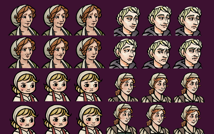
Emotion states for various characters.
This situation created a unique opportunity for the narrative team to use the in-progress art of characters to inform a character's tone and personality before all (or sometimes any) of their dialogue had been written. It was fun to see this circular relationship between the art and narrative teams. One of the risks of this is that we’d get the character’s vibe totally wrong for their final role in the game and need to revisit the design later. My first pass of Father Thomas’s design is a great example. I understood from his bio out of context that he needed to have a trustworthy look and feel more open and “for the people” than the abbot. I didn’t fully realize his significance to the overall story, and that he’d also need to be stubborn and intimidating in moments where he felt the church was being challenged. This is a great example of the story developing further and impacting the character designs.
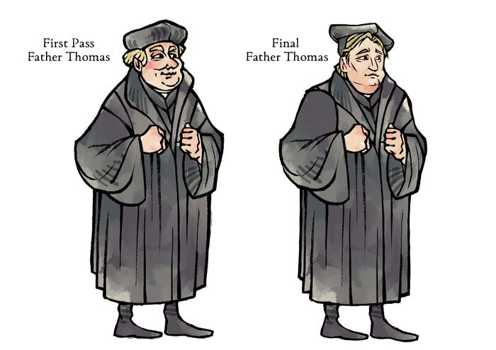
First pass (left) vs. final design (right) of Father Thomas.
Inversely, there were narrative moments that began as a small artistic detail included in a character design (e.g., Andreas and Bert’s hats moving between characters over time) which ended up evolving into their own little conversations and cutscenes.
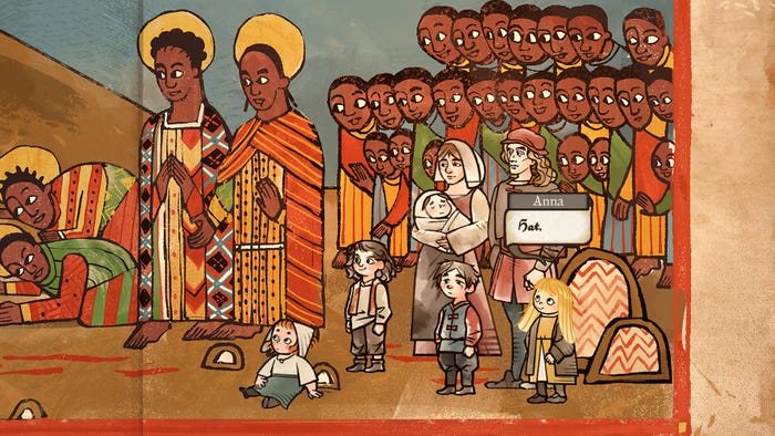
A hat thief.
Another challenge we encountered early was how to make a world that feels expansive and that you can really explore, where navigation is also clear to understand and feels good. Again, the priority of the scene art is to serve the story and mood of the world, this isn’t a puzzle or combat game. Without those systems to define the visual structure of a scene, our first tests mimic the layouts of how a scene looks in a book.
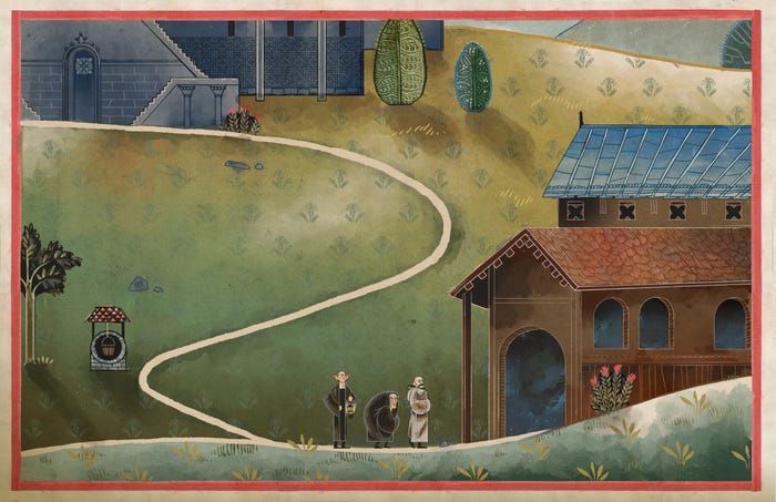
An early scene art test, featuring characters from Name of the Rose.
In order to pull off the extreme stylistic flattening that we wanted, we decided early that restricting player movement to tracks was the right call. It provided more control over the camera framing in different scenes and also allowed us to play around with depth without getting too spatially confusing. However, tracks can end up being very time-consuming to walk along, and we were concerned by how much we would need to populate along a path in order to not make the experience incredibly boring. There are also angles that end up being particularly difficult to show clearly, like walking “up” into a scene to reach something further away. In the historical woodcuts we were referencing, people are almost always shown in front or ¾ view. We considered scaling the characters to represent distance from the camera to solve this, but I didn’t like how this would vary the weight of the character detail size against the fixed world around them, and just ended up avoiding paths laid out in that way entirely.
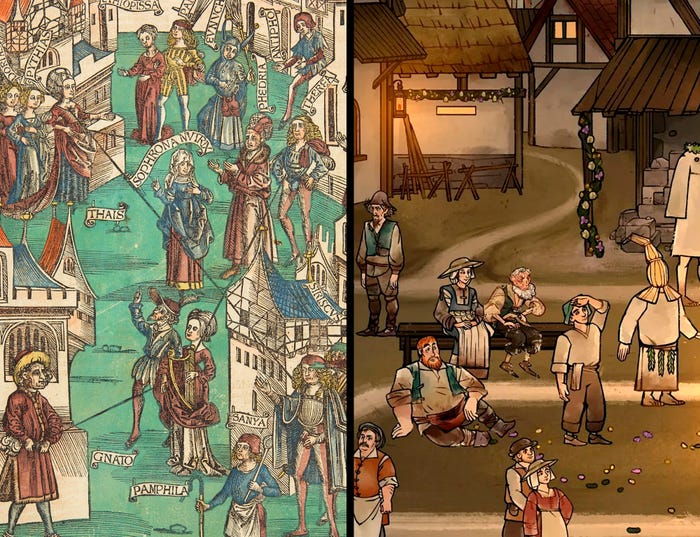
Terentius, Comedies. Strasbourg: Johann Grüninger, 1 November 1496
Another thing we noticed early was that it was easy to become confused by how different scenes connect to each other, especially inside the abbey building. You can’t rotate the camera around in 2D space in order to get your bearings, so to help make transitioning between scenes feel more natural, we chose to almost always face the camera orientation to “north” in our world. This eased some of the disconnects between the in-game cardinal directions and stage left vs. stage right on the camera.
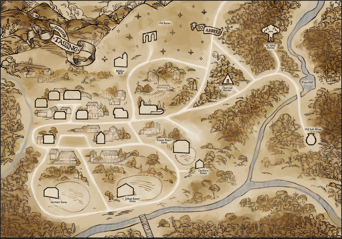
The map of outer Tassing.
These ended up being the “level design” factors we needed to consider when creating scenes in Pentiment, but the hand-drawn style of the final art was way too time-consuming to revise repeatedly in response to story and design changes. We needed to work out a way to greybox that would still feel bespoke for each scene without taking too much time. The compromise was implementing simple, uncolored roughs of each scene and playing with them in-game as we worked out the quest structures and story. By prototype, we had a handful of scenes that were visually finished, but the majority were still rough sketch versions.
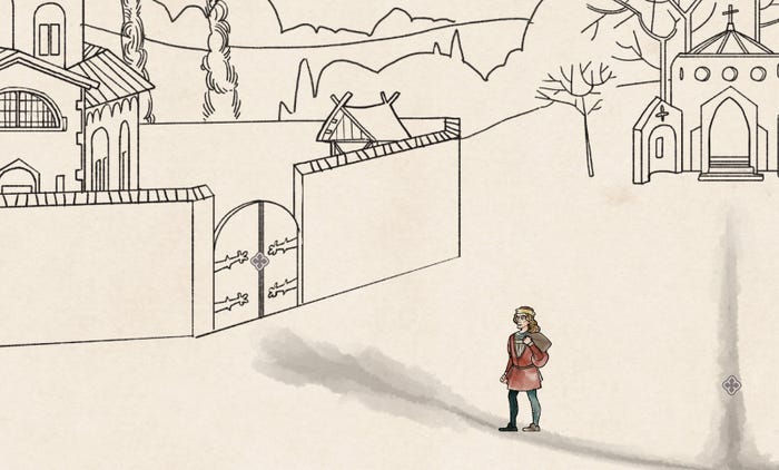
Actual prototype gameplay.
Being this informal and flexible about our development did sometimes feel like we were taking a big risk. It made it take a lot longer to understand what the time cost of a finished scene was and to budget in the final schedule accordingly, but the benefits outweighed those risks. I believe we would not have been able to cover the breadth of content we did had we been more structured and precious about our pipeline too early with such a small team. I’m really proud of what everyone was able to pull together for the final game, and it’s been so exciting to finally see players exploring the world we brought to life in Pentiment.
You May Also Like