Trending
Opinion: How will Project 2025 impact game developers?
The Heritage Foundation's manifesto for the possible next administration could do great harm to many, including large portions of the game development community.
Eastward's Tommo Zhou discusses why a 2D pixelated aesthetic was perfect for Pixpil's debut adventure game.

Eastward, a 2D action-adventure game that debuted back in September on Steam and Nintendo Switch, has won over a small but passionate fanbase in the world of top-down pixelated games. It's an adventure story that deals with anxiety over the end of the world, and offers players a large beautiful world to explore.
The game was developed by the two-person team at Pixpil, and published by Chucklefish. We reached out to them for a quick chat about what inspired Eastward, and what other developers might want to know about making top-down adventures inspired by classic games. Lead programmer and Pixpil co-founder Tommo Zhou was kind enough to take our queries. Here's our (lightly edited) chat with him about the making of Eastward.
So what are the origins of Eastward?
Eastward has been a huge project for an indie team of our size, and has been in development for over 6 years! The idea came about when our lead artist, [Hong] Moran, sketched some weird monsters in an area reminiscent of the Kowloon Walled City.
We instantly got excited about the concept and started coming up with a game design to fit around the aesthetic, which soon turned into the game you see today!
Eastward is a big adventure story that uses a top-down, pixelated 2D perspective that used to be the standard for the Game Boy era. Now that most action/adventure games are in 3D open world perspectives, what do you think the top-down 2D genre has to offer to make your story and world stand out?
Interestingly Eastward is a 3D game with a 2D perspective! We love games like Dragon Quest, Earthbound, and the Legend of Zelda series, and wanted to tap into the nostalgia of those titles whilst bringing in contemporary game design to flavor the experience for players. For example, we use shader textures and lighting systems in our custom engine (Maoi) to help convey atmosphere, and things like the weather and the time.
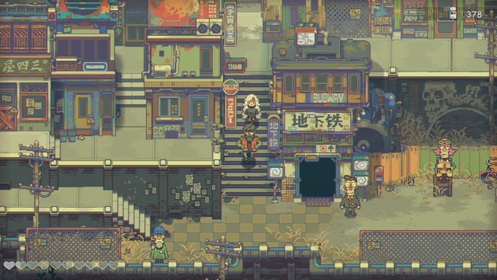
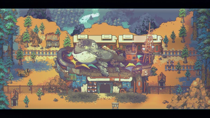
As you play you'll notice intricate fog layers and sunlight beams breaking through the landscape during dawn and dusk. It took an incredibly long time, but we handcrafted every single detail in Eastward and hope players will notice these bespoke details.

Eastward features some incredible pixel art and animation—animation that probably took a ton of time for such a small team. How did Pixpil manage the process of animating different sprites, attacks, and movements?
Using Aseprite, our artist Moran creates basics art assets for the game which we then process one by one. First, we divide the single assets into different parts according to their natural structure; like separate a building rooftop and the wall into two layers.
Then we're able to rebuild all the assets in a 3D environment, ready to be hand painted in the bump map one by one to ensure they have the correct lighting performance in-game. After that, we import assets into our engine! Everything we do is bespoke, but having our own custom engine has allowed us to create Eastward in a way that suits us.
"Societal collapse" is a big, resonant theme lately as anxiety about climate changes continues to rise. What did you tap into to tell this game's story about a collapsing world?
Like a lot of people we care very much for the planet we're living on and have concerns about the future we're building for our children. We wanted to convey our feelings of hope, that all is not lost, even in the face of those who tell us otherwise. Sam and John's adventure, at the heart of it, is about compassion for humanity.
What do you think other developers should know about working in this genre of building sprawling worlds in top-down, two-dimensional environments?
In 2D, the fixed perspective of the camera becomes both a big asset and a challenge. It allows you to carefully control exactly what the player will see, and allows you to push detail uniformly across that, but it also forces you to adjust the world so the player is never unintentionally obscured behind the environment, and so navigation maps well to the screen directions.
One trick you'll often see in 2D top-down games is having a lot of verticality, as it can prevent elements in the foreground from occluding elements further in the background.

Some quick tips: In terms of mood, making the world feel like it's bigger than, and exists beyond just the player; this makes a world feel lived in and with a history. In terms of navigation, making the player path through the space feel appropriate to the type of world: does the player just walk through a straight line or wind throw more narrow paths? Are they always visible or do they clip behind objects or other buildings? And what does all of this suggest about the world or city itself?
And lastly, in terms of particular tips, in 2D top-down environments, elevation is your friend to make an area feel dense! Staircases in a bustling city let the player move behind buildings without being totally obscured.
For more on the incredible pixel art of Eastward, check out their interview from earlier this year from our Road to the IGF series.
Read more about:
FeaturesYou May Also Like