Trending
Opinion: How will Project 2025 impact game developers?
The Heritage Foundation's manifesto for the possible next administration could do great harm to many, including large portions of the game development community.
Artist Alice Li walks through her process from initial idea to finalized asset in Beacon 38, Mobius Digital's upcoming mobile game where players navigate through a dangerous, beautiful alien garden.

This post was orignally posted on Mobius Digital's blog.
Hello friends! It’s Alice, your favorite Mobius Digital artist, with a little post about my art process. So here we are!
If you haven’t noticed, the art in Beacon 38 is pretty out there. We wanted to create a world that contained creatures and objects far beyond the realm of what was normally expected in a fantastical outer space setting. The creature we’ll go through today is actually on the tamer side of my designs, I would say, hehe.
The first step is to have a discussion with Loan, the Creative Lead, about what the creature is and what components it has. He also throws in a few ideas about how it could look. Then, he leaves me alone, and I get to work!
I start out with some sketches. Here we have the Switchgate Plant:
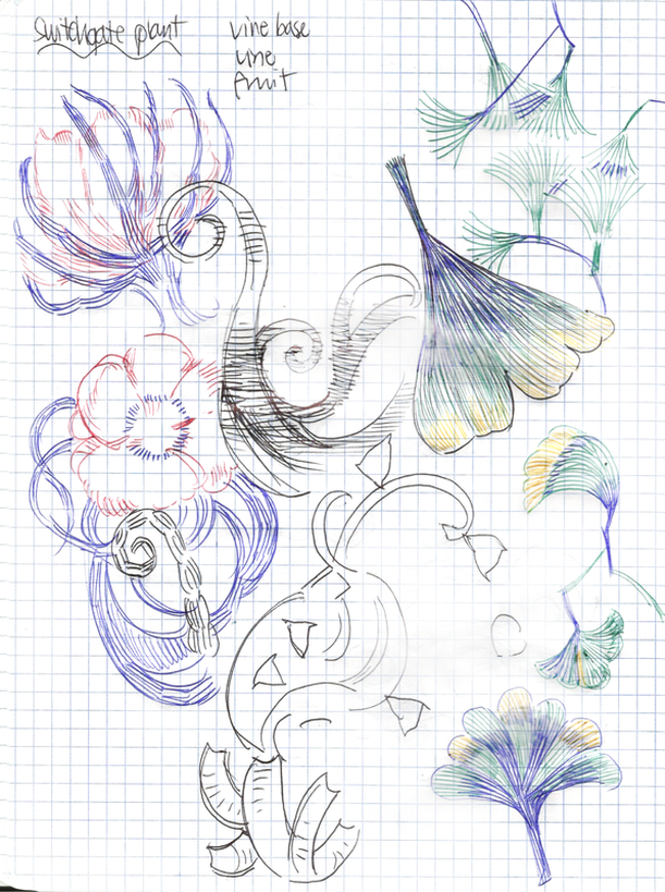 As you can see, I’m drawing a combination of how I imagine the plant to look like but also exploring some of the plants I’m inspired by. There's a couple studies of the leaves of the ginkgo biloba plant and also the Dutchman’s-Pipe Cactus.
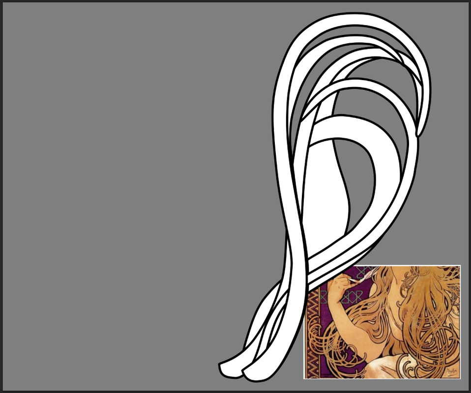 Then, I start developing the aesthetic for the main portion of the creature. For this creature, the long, flowing parts are not harmful, so I’m using a piece of Art Nouveau artwork as reference to get a gentle, organic feel. In the beginning, I create all my assets as white shape vectors with a black outline. I will later use layer properties to decide all the colors.
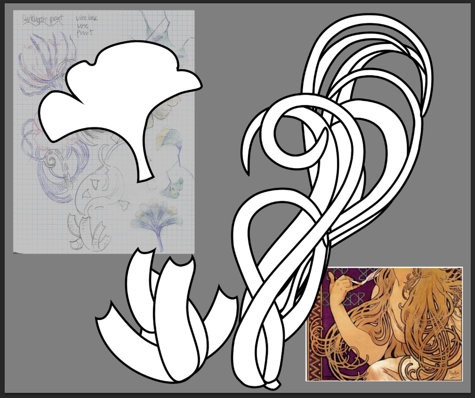 Now it’s getting to the good stuff! I’ve created the base, from which the flowy stuff will sprout from. I was thinking about the chambers of the heart for the structure of that part. I also start to work on the “flowers” that will function as danger signals for the player.
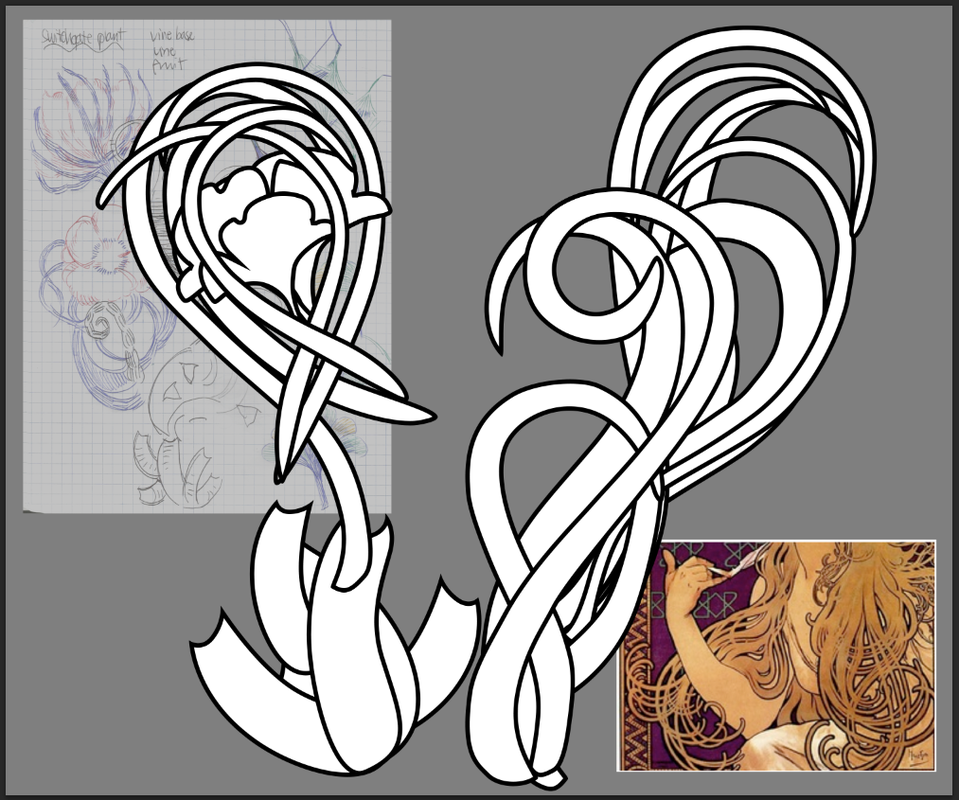 Here are all the finished components that make up the plant’s different functions. My original sketches are there in the background to remind myself of the feeling that I’m going for. Now, I will bring all the pieces together…
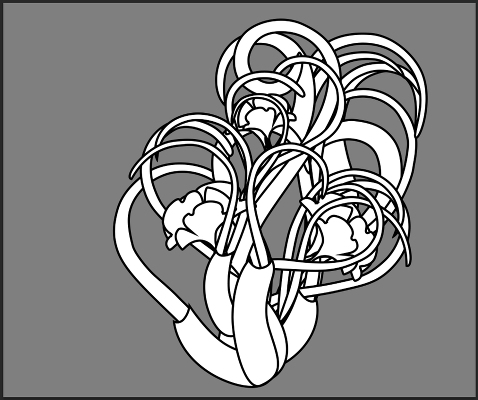 I’ve combined all the different parts together. This step seems simple, but once I combine the parts, I usually end up going back and re-shaping a lot of pieces to get the flow of the whole plant creature correct. In particular, there was a lot of rearranging to do on the tendrils and tweaking on the proportions of the flowers. Now, on to color!
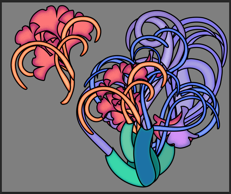 I’m going to be honest here; color is one of my weaker areas, and I have to take a particularly systematic approach to it. I started with the base as a green color and built the other shades off of that. The blossoms are warmer since they are meant to stand out, and become fiery when activated. This version is then shown to the designers, Loan and Alex, for approval.
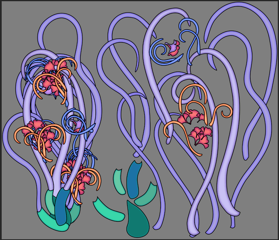 Here is the final mockup and asset reference sheet that I send to the programmers so they can see how the plant is broken down and how the parts fit together. As you can see, the final version is a lot longer and the proportions are more exaggerated.
And with that, the Switchgate Plant design is done! Next, it’s up to Loan to animate it and bring it to life in the game. Thanks for reading!! 'Til next time~ ♪(・ω・)ノ Alice
Read more about:
BlogsYou May Also Like