Trending
Opinion: How will Project 2025 impact game developers?
The Heritage Foundation's manifesto for the possible next administration could do great harm to many, including large portions of the game development community.

Featured Blog | This community-written post highlights the best of what the game industry has to offer. Read more like it on the Game Developer Blogs or learn how to Submit Your Own Blog Post
How to get artwork in your indie game without being a professional. This post describes how I was able to add some reasonably passable coder art to our RPG Immortal Empire.

This post originally appeared at http://tacticstudios.blogspot.ca/
I'm not an artist, but I need art in my game.
This is part 3 in a series of articles describing how I approached each aspect of creating Immortal Empire as an independent developer. Read the whole backstory here.
Artwork is the area I relied most heavily on outsourcing to a number of individuals, most notably Mat Chambers (characters), David Baumgart (spell icons, fx), Zenobia Homan (tiles, environment objects), and Eric Vedder (illustrated characters). A few other artists (Sergei Churbanov, Cecilia Santos, Jasmin McGahan, David Scott) helped out as well to which I am eternally grateful.
Of course, trying to coordinate so many different people was difficult, and in some cases I needed to fill in some gaps with artwork myself. In my previous article where I discussed the music to Immortal Empire, I pointed out that I have some formal experience with music, making that aspect of the game much easier to tackle. When it comes to artwork however, I have literally no experience to draw upon. (moar puns!!1)
In the end, I deigned to create some affectionately termed coder art, much of which can be seen in the final product. This article describes the process I went through and includes some tips I picked up which are hopefully useful to other artistically barren programmers like myself who need art in their indie games.
I'm very proud of many things in Immortal Empire, but let's face it, the artwork is not exactly cutting edge. At a fixed 800x600 resolution and consisting almost entirely of hand-drawn 2D pixel art, Immortal Empire's artwork lands somewhere between X-Com and Warcraft II, meaning it would feel right at home if it were released in 1995. Alas, it was released in 2013.
Click for full-size |
Many games have managed to be very successful in recent years despite not having advanced graphics, often employing a minimalist style to great effect. Unfortunately I feel as though minimalism just wouldn't have worked for the game design of Immortal Empire, so instead I attempted to mimic a style that is very nostalgic for me: early 90s PC games.
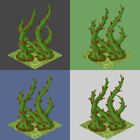
Onto the artwork. I contributed in a number of areas, but I'm going to focus on a couple images I drew that will best describe the process. Here is the animation for the entangle spell on the left, and the idle pose for the Elder character on the right.
For the pixel art, the process I eventually settled on went something like this.
0. Compare against a couple different neutral colour backgrounds, never change your opacity, and always work on a separate layer. Accidentally using alpha or manually blending into a fixed colour background looks terrible in game, and it is a very easy mistake to make. Using separate layers for each step lets you restart when you make mistakes and do A/B comparisons easily.

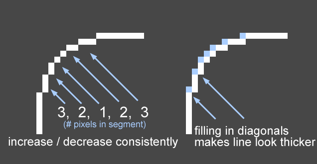
1. Start with an outline. When drawing lines (without alpha transparency), I found it almost always looked better to leave diagonals open rather than filled in like the image on the right. 
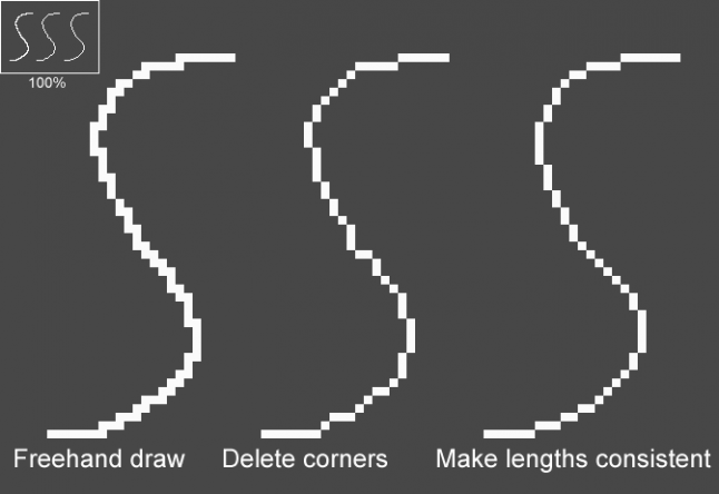
When creating rounded lines, decrease or increase the number of straight-line pixels consistently, rather than doing something arbitrarily. I'll often draw the line free-hand at first, delete the diagonals, then touch up the curve to keep line lengths consistent.

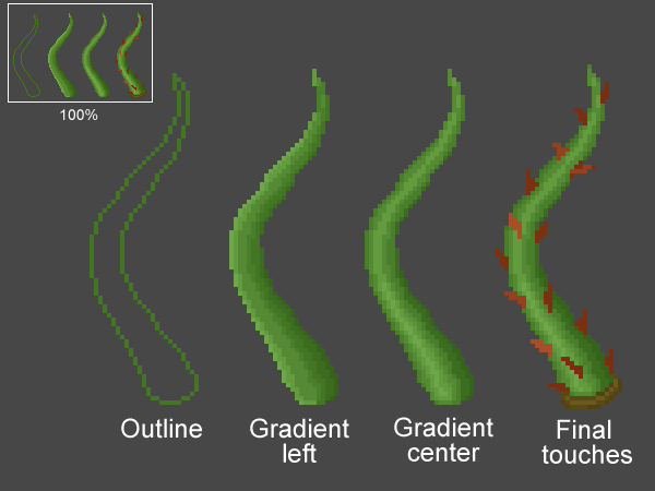
This might sound obvious but you really don't want to move onto the next step until you have finished this one. At this stage, a silhouette can work as well, but I prefer an outline so you don't lose interior details.
2. Add shading to your outline.
As with the lines widths, be consistent in how you gradient the colour. By that I mean gradually increase or decrease the luminosity rather than flipping back and forth or skipping a shade. I try to avoid adding detail in this step, instead I just shade uniformly. When creating rounded things like the tentacles below, I found it often looked best to put the brightest section near the center, not right on the edge. Keep a palette of distinct colours you have used on a separate layer for future use.

3. Add detail to the shading. This is where you can put creases in clothing, make things appear rough or shiny, or add dithering if that is your art style. I try to avoid introducing new colours here, and instead would refer to the palette that I created in step #2.
Click for full-size |
4. Add final touches. Here I add little doodads like the buckle on the Elder's sash or the thorns on the tentacles. When doing this step, I found I often had to go back and adjust the shading. For example, creating a little shadow underneath the buckle made it feel less flat. Only when I am 100% happy with the look of this one frame will I start another frame of animation or attempt to draw more of the same element (such as the multiple tentacles in the entangle spell).
That's it! My preferred setup is to use two windows, one zoomed in very close where I edit the pixels, and another zoomed out to 100% so I can actually look at the results. I check the actual zoom distance frequently, as I found that things sometimes look great zoomed in, but from afar look totally wrong. In fact, the opposite can also be true!
Like most things, art of course takes years of practice to improve. But here's hoping these few tips can help other artistically challenged independent developers like myself create some medicore but passable artwork for their games. If you have anything to add about your adventures in this regard, or tips you can suggest, please comment below!
Read more about:
Featured BlogsYou May Also Like