Trending
Opinion: How will Project 2025 impact game developers?
The Heritage Foundation's manifesto for the possible next administration could do great harm to many, including large portions of the game development community.
Season: A Letter to the Future developer Scavengers Studio explains how it conceptualized and refined the title's hazy, painterly visuals.

This interview has been edited for clarity
Season: A Letter to the Future is a meditative third-person adventure that asks players to consider their place in the world, and the legacy they might leave behind.
Set in a world on the brink of a mysterious cataclysm that threatens to wash everything away, Season frames time itself as a central antagonist, asking players to catalogue the places and people they meet using an instant camera and recording device before the present becomes the past.
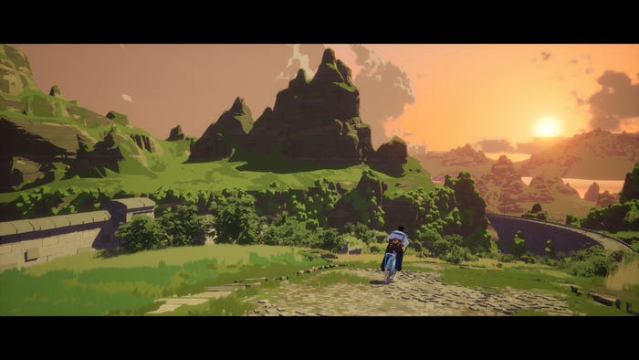
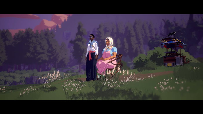
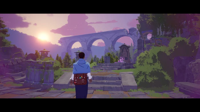
Given the core mechanics hinge on players feeling compelled to document the spaces around them, Season employs a hazy, painterly art style to immerse them in the world. Sunsets shimmer in purple and gold, while lush expanses stretch into the distance, almost demanding players take a breath to contemplate how they might frame the perfect shot. There are small details, too. Music boxes whirring in an ornate stone plaza. Posters paying homage to noble figures. Strange graffiti referencing the times before. An era of war, when the furnace of industry burned bright.
Fascinated by how Season developer Scavengers Studio managed to create a universe that feels both familiar and foreign, we caught up with the art team to learn more about their process.
Game Developer: Could you discuss how you conceptualized and iterated on Season's art style during the early stages of production?
The Season art team: We started developing the high-level world building of Season while working on the studio's previous game, Darwin Project. At first that meant gathering reference pictures that we liked, from movie stills to illustrations, photographs, paintings, and more. We just had a massive folder where, from time to time, we saved anything that would trigger inspiration.
At some point, those references began coalescing into a common vibe/mood and slowly we were able to discern things that felt "Season" from things that didn’t. A mix of fantasy and mundane. Things that felt familiar but oddly strange. We then created concept art that might capture that same feeling and tried to figure out what exactly this world was. Why does it look this way? Who inhabits it? While the world building and narrative elements evolved quite a bit from those initial references, the art style and what we defined as the Season "mood" remained pretty consistent.

How did you realize those ideas in-engine? What were some of the technical challenges of bringing the title's ethereal aesthetic to life and how did you overcome them?
We faced a lot of technical challenges when trying to get the 2D/illustrative look from the concepts to the engine. A lot of tools and shaders from Unreal needed to be changed to achieve the desired aesthetic; the material, light, cloud, and fog shaders were reworked. When pursuing photorealistic rendering (which Unreal is very good at, and is also what we tried to stay away from) the physical property of material and light determine the look, therefore we already had math equations to achieve that result. But for the aesthetics of Season, we need to quantize some of the equations. Season has full scenes stylized with sharp shadows and dense foliage. This is extremely computation heavy. Optimizations are extremely tricky and limited. All in all, it required a lot of iteration and teamwork between our concept artist, 3D artist, and technical artist to make the art of this game possible.
Why did you land on that specific look for Season? What sort of feelings did you hope it would evoke?
We knew we wanted something that instantly looked warm, beautiful, and comforting. It was always a pillar for us to create a game that would have these big contemplative landscapes. We knew the setting of this game would take place in a sort of end of the world or end of an era, so we wanted that sense of "impending doom" to be balanced out by the visuals. Despite the narrative premise being somewhat dark, we didn’t want the game to look gritty or gloomy. We wanted it to give players the feeling of watching one last sunset before the end of the world—one last moment of beauty to capture.
We initially took a lot of inspiration from the cinematography of the movies of Terrence Malick, and some of those movies shot almost entirely during the golden hour. We ended up diverging a bit from that look in the final product, having some lighting that felt a bit less naturalistic and a bit more illustrative. From a pure visual standpoint, we were highly influenced by the art of the early 20th century poster artists–leaning heavily on the work of Norman Wilkinson. His particular approach was a perfect balance of stylization and simplification, and in our opinion he was able to depict landscapes and scale in the most elegant way.

Season asks players to document the world around them using a polaroid-style camera and microphone. How did you imbue the game's contrasting environments—which include windswept mountaintop villages, rust-bitten wetlands, and grassy plains–with photogenic qualities to keep players fixated on those environments?
We felt having a variety of environments would be one of the key ways of encouraging players to use their tools. We tried to ensure each location felt unique in how in terms of their look, feel and lighting so players would feel compelled to stop and record the world around them. Both the player and our protagonist are discovering this world for the first time, so it was important to layer stories and culture into each environment so that, even if you are just cycling through, you can tell people lived here and experienced transformative events.
We wanted players to have the sense that this world is bigger and richer than it might first appear. With that in mind, we used a combination of level design and level art to guide them towards points of interest that might be worth capturing, and worked to create interesting frames and compositions that might facilitate a stunning vista or moment of awe.
Did you create a set of guidelines that you could fall back on when shaping Season's wide range of environments to ensure they'd remain cohesive? Was there a part of the world that proved particularly challenging to realize?
The guidelines for Season mainly focused on how the look of individual objects and environments should be translated to fit with the overall art direction. The strictest rules were those devised early on during our art direction "R&D" process: how do we simplify a bush? How would Norman Wilkinson approach the amount of detail in a tree seen from a distance vs seen from up close? What are the rules of our lighting to keep this illustrative look? Once we had those more or less figured out, that sense of cohesion was achieved by translating each environment and object with those guidelines in mind.
The lighting proved to be challenging in some areas of the world, given that we had a minimal light shader (everything was either light or in shadow). Having no secondary or bounce light proved to be a bit of an issue and made some volumes harder to read in areas covered in shadows (such as forests and dark pathways).

Is there one aspect of Season's visuals that you're especially proud of? Something you feel the team knocked out of the park?
The overall visuals of the game are satisfying to see. The team managed to be pretty faithful to the initial intentions and pulled a creative and illustrative look that fit with the tone and mood of the narrative and gameplay. There is always stuff you want to fix, but it's a nice feeling when you travel across a landscape you have seen every day for the last years and still find spots you want to take a picture of.
Has working on Season changed how you'd approach art direction in future projects?
Season didn't really change the way we want to approach art direction in the future, but it comforted us that we were doing something right. Darwin Project, our previous game, while very fun to work on, was much more of a "generic cartoon game." We knew at the start of Season pre-production that we wanted to do something more unique.
One of the first rules we implemented was to try and avoid referencing any visuals from another video game. We wanted to see what was inspiring to us in other mediums, then find our own way to translate that into the 3D game space. There are a lot of things that we would like to improve in a future game—be it from a pure visual standpoint, performance, process, etc—but we learned a lot on the project and are very happy with the feedback its art has received.
Read more about:
FeaturesYou May Also Like