Trending
Opinion: How will Project 2025 impact game developers?
The Heritage Foundation's manifesto for the possible next administration could do great harm to many, including large portions of the game development community.

Featured Blog | This community-written post highlights the best of what the game industry has to offer. Read more like it on the Game Developer Blogs or learn how to Submit Your Own Blog Post
A broad overview of the modeling and texturing process of a stylized character, using the Robot from the upcoming game by AtomJack as an example.

[Re-posted from the AtomJack blog]
-------
One of the many reasons I enjoy making character models is because the process is a bit different each time. Similar to people in our everyday lives, each character has its own unique quirks, presenting its own set of challenges and puzzles to solve. So I wanted to share with you all an overview of the process by which I brought our Robot from 2D concept to 3D asset.
This particular model started with a pretty clear-cut concept, and even before then a well established outline of what we wanted the character to be. Depending on who you work with, sometimes your art director gives you a fully completed concept like I had for our Robot. Other times, though, you may just be given a rough sketch, and your teammates are looking to you to pour your own influences into filling in the details. I’m lucky enough to be working with some pretty talented folks here, so the concept I was given by our art director was already imbued with a ton of appeal.

Here at AtomJack, we’re a pretty small, tight-knit group, which makes it much easier to throw ideas around and come to a consensus on things. Upon receiving the concept, I sat down with our art director, animator, and lead designer to get an overview of the character and specific needs for the model. How do his leg joints connect? What are the extents of his movement range? What material is this made out of? The discussion continues until we all feel like we’re on the same page, at which point it’s time to dive into production.
The exaggerated nature of our game’s art style was utilized in the Robot’s design to push the traits of his character. For example, the Robot’s large torso, shoulder pauldrons, and hands exude strength, but his color scheme and wide, green eye belied a nature that is more curious than menacing. The design David came up with already provided so much definition, so my task became ensuring that as much of the character as possible was maintained when transitioning from 2D to 3D.
When it comes to actually constructing the model, I tend to make two general passes. The first pass is centered entirely around trying to nail down the feel of the character. At this stage I’m not worried about any technical limitations, but instead focus on major design elements: silhouette, exaggeration of important features, overall aesthetic appeal, and so on. My goal is to make sure the 3D version looks and feels as much like the 2D concept as possible, while still maintaining the physicality of an object in three dimensions. Since I’m not concerned about restrictions, I tend to go back and forth between Zbrush and Photoshop, sculpting in high resolution and comparing to the concept as I go.
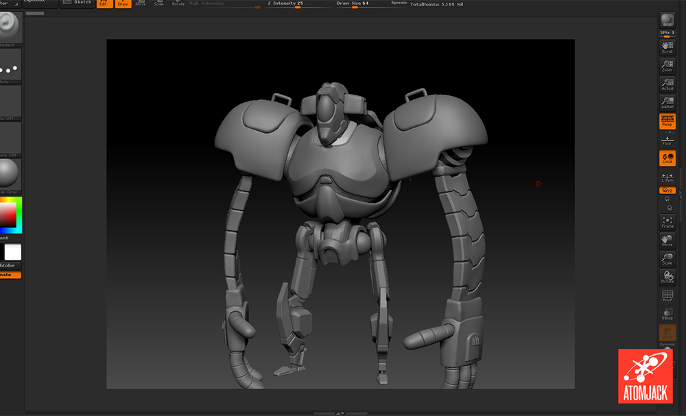
Once I’m happy with the feel of the character, it’s time to switch gears. As I mentioned before, each character tends to be unique in its creation process, but one aspect all of them share is the need to find a balance between form and function. Games, though constantly evolving, still come with a fair amount of restrictions. For example, most modern games strive to maintain a runtime speed of 60 frames per second. For those who may not have experience with the inner-workings of game development, this means the game engine is gathering all information from the player (inputs to your gamepad or mouse/keyboard), as well as anything else happening at the same time (physics, graphics, animation, etc.), calculating all these interactions, and rendering all the results on your screen, 60 times every second. If you’re not mindful of the way you’re handling your systems and art assets, these calculations can quickly get out of hand and interfere with the players’ game experience, whether it be lag, lowered frame rate, game crashes, or any number of other problems. This is why balance is so important. I can make the characters as beautiful as humanly possible, but if the game doesn’t run it’s all for naught.
My second pass, then, becomes one of feasibility. One of the questions answered in the initial discussion between myself, the art director, and our designer is the estimated size of our polycount budget for the character. Polycount refers to the number of polygons - usually triangles - that will be used to construct the model. Each polygon adds to the calculations that need to be made on the model when it’s being rendered in the game. So, generally speaking, the lower the polycount, the lower the stress on the engine. In games where there are potentially a lot of characters on the screen, it is important to be economical in the way you distribute polygons amongst your characters.
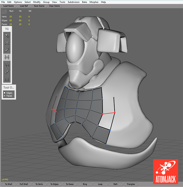
I usually do a straightforward retopologization of the model in Topogun, trying to be efficient and economical in my distribution of polygons. Sometimes, however, I still end up over the polygon budget and need to go back and strip out polygons. The tricky part comes in how many polygons to cut, and where to do so. To make this decision, I usually stick to three criteria:
Silhouette - Are the polygons in question helping to strengthen the silhouette of the model?
Deformation - Are the polygons in question required to allow for smooth deformation when the model is rigged, skinned, and animated?
Ease of Texturing - Will these polygons make it significantly easier for me to hide texture seams or differentiate between different parts in the texture?
If the answer to these questions is “No,” then the polygons are removed. I continue to cut polygons until the model falls roughly into the budgeted polycount. Since the Robot is a main character - and therefore spends a lot of time on screen - and quite large, we allowed him a much higher polycount than we’d give other character models.
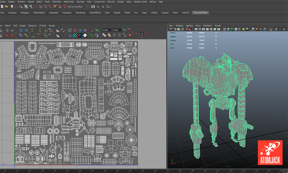
In addition to polycount, I need to consider how much texture space to allow for the character. Depending on your game engine and what the rest of your tech is like, textures can often be a larger tax on processing power than the amount of polygons in your scene. To determine the size of the texture I’m going to use on a character, I again weigh the costs and benefits of form versus function. I can free up a lot of processing power by making the texture maps smaller, but how large of an impact will this have on the fidelity and appeal of the character model (and ultimately the overall aesthetic appeal of the game)? Again, with the Robot, his size on screen and role as a main character gives him priority. This simply means that if resources are tight, corners will have to be cut in other areas. Not necessarily a problem, but something to be mindful of all the same.
Again, given the stylized nature of the game, some distinct choices were made in terms of the textures and materials on the characters. The Robot, as with our other characters, is using an unlit surface shader, which means it derives its color and lighting information solely from the texture and is not influenced by lights in the scene. This comes with its own set of challenges, but what is gained is the ability to completely control the hue, saturation, and value of the textures to help them more closely match the concept (and, more importantly, its surrounding environment in-game).
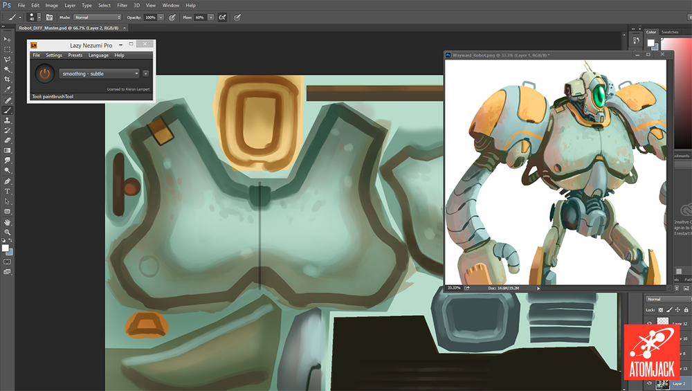
Lately I’ve been using a program called 3D-Coat to paint our character textures - along with a slew of other features, it allows you to paint directly on the model - but the Robot was one of our first fully textured characters and was painted in Photoshop. During the painting process I’m frequently comparing the concept art with how the textures are looking on the model. In addition, I’m trying to be mindful of how the Robot is looking in the in-game environment, even if it means simply overlaying a render of the Robot on a piece of environment concept art. It’s incredibly easy to become too focused on how a model looks in isolation, only to find out it sticks out like a sore thumb when placed in the engine.
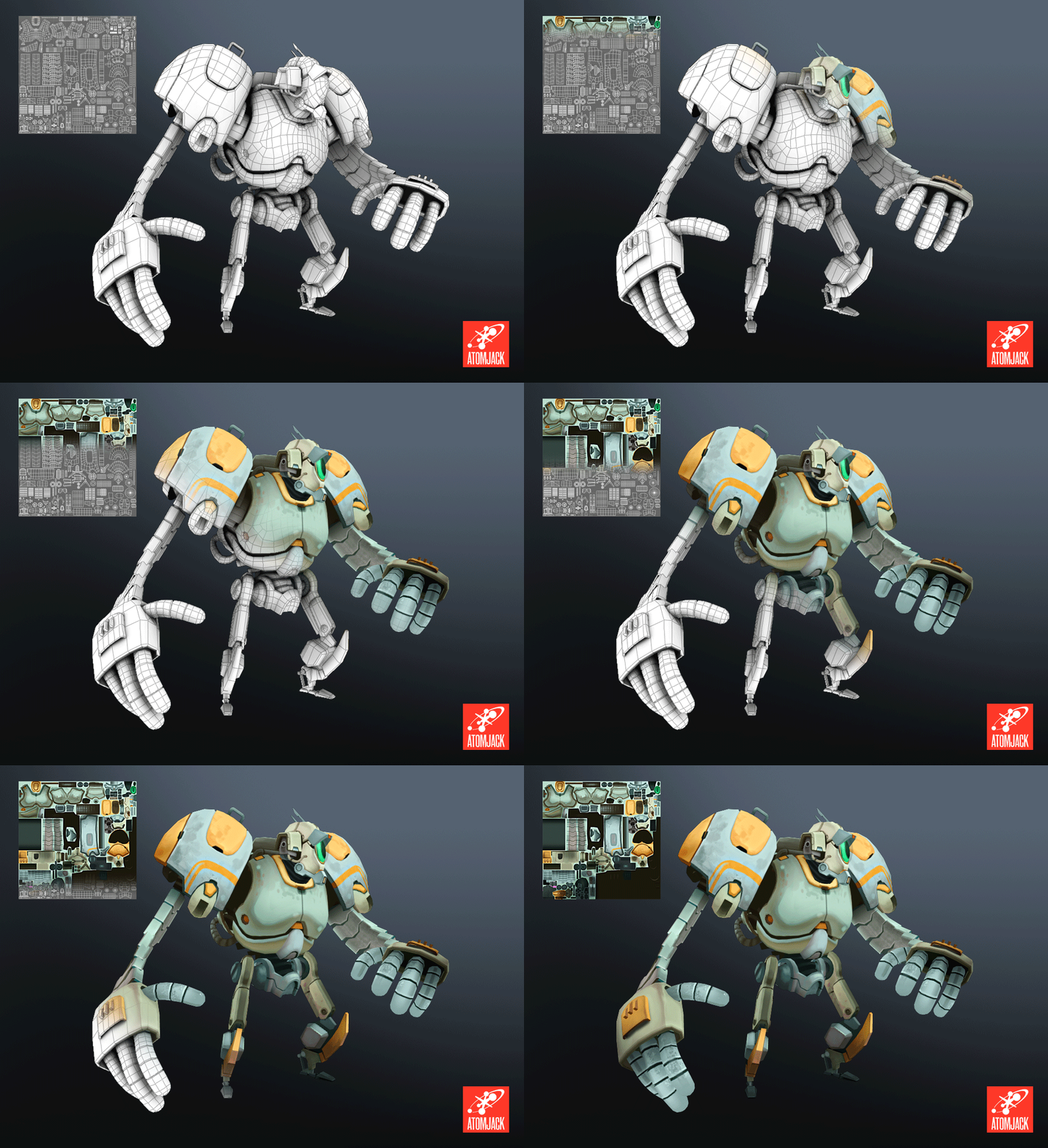
I should mention that, throughout this entire process, I’m constantly checking in with the art director and making minor adjustments based on feedback. This ensures that the model is staying on course and remaining true to the initial concept. At the end of the process, it’s good to gather everyone and give the model another final once-over, just to make sure everything is as it should be before the model is handed off to the animator.
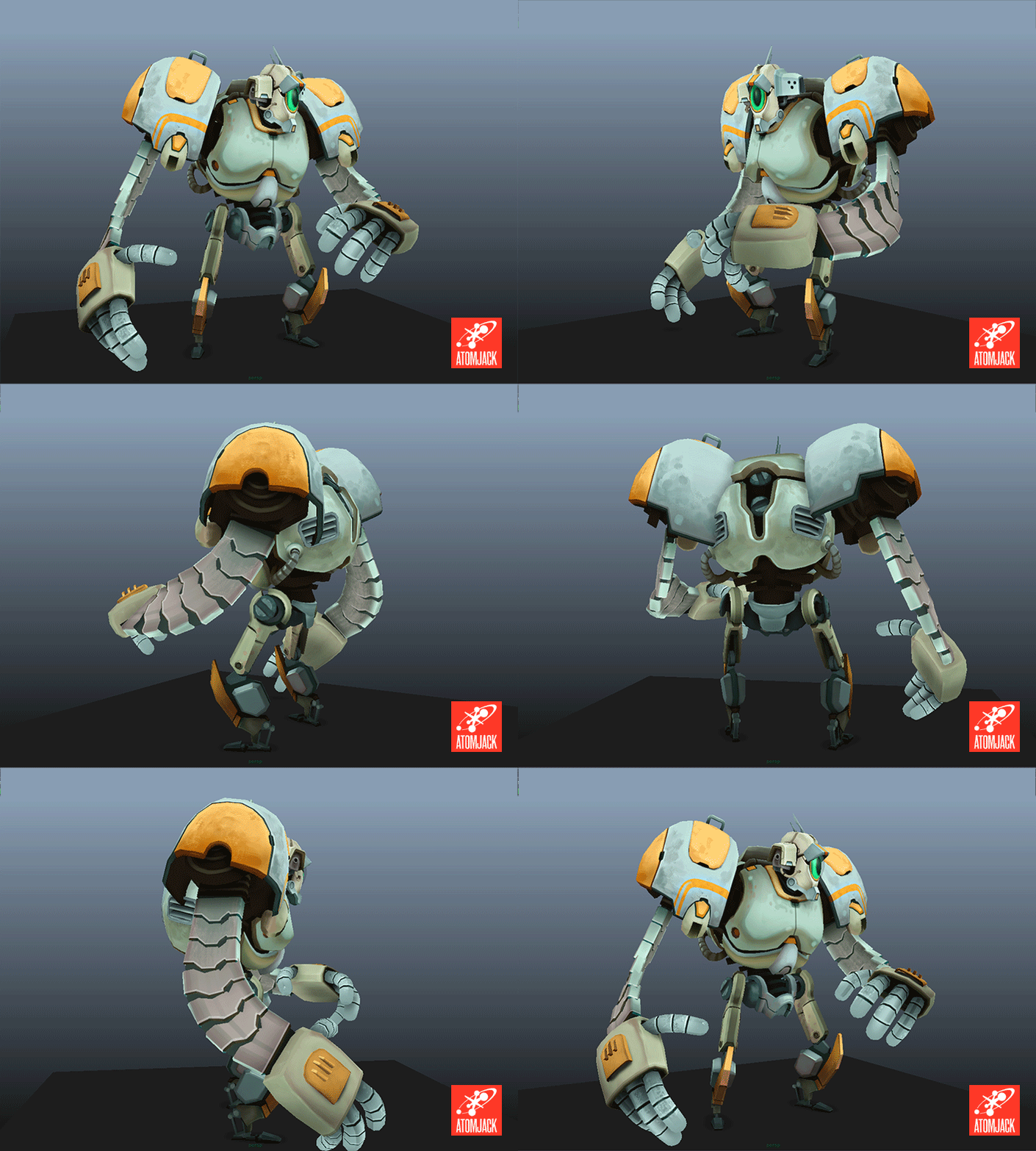
Having maintained the course, and suffering no major catastrophes, the Robot is finally all modeled, textured, and ready for animation!
Read more about:
Featured BlogsYou May Also Like