Trending
Opinion: How will Project 2025 impact game developers?
The Heritage Foundation's manifesto for the possible next administration could do great harm to many, including large portions of the game development community.

Featured Blog | This community-written post highlights the best of what the game industry has to offer. Read more like it on the Game Developer Blogs or learn how to Submit Your Own Blog Post
Here I explain some of the techniques, animations and shaders I used to recreate some of the VFX from the game Zelda Breath of the Wild in Unity.

The Zelda game never looked so great as now, and, as a game artist, it caught my attention. I look at those effects, and the way they looked cartoonish and stylized was something that I wanted to incorporate to my work. I ended up trying to replicate those effects as a challenge to myself.
Here I'll talk about how I recreated the Guardian's beam, the explosions and the Ancient Arrow effects. It is important to note that all textures, models, shaders and animations were made by me, and that I don`t work for Nintendo, and I`m also not selling none of those assets anywhere. This article is also featured here. But, ok, here we go:

After watching some gameplay footage many times, I analyzed the shapes used in the textures of the original effect and tried to replicate that on Photoshop. They are basically circular shapes and star/cross shapes. Here is a comparison between the original effect and my particles:

Those particles are mostly simple standard Alpha Blended textures, but I had to do something a little bit fancier for that energy arc with the bright lines inside. For that, I used two smooth steps on the texture alpha, one with a slightly bigger min value as the other, with a sharp falloff, and then subtracted one from the other, while shifting the min value using vertex color information from the particle system. These lines are added to the texture color in the end. The result is as follows:

The stripes of energy use another custom shader. They use a simple geometry with the shape of a curve, and I alternate the scale on a different axis and the rotation to create variety. For the shader, I created a mask using its own UV’s to erase the borders, then used a scrolling noise to erode the particle, again using smoothstep and vertex colors.
I found a simple solution for the shape of the beam. I use a sphere with scale animations, still using the particle system, positioned strategically to look like it’s going towards the target. For the positioning, as it was only for the video, and not for an actual game, positioning everything by hand was doable. However, in an actual implementation of the effect, you can subtract the position of the particle by the target’s position to get a direction, and then use the distance as the scale on a given axis to do the correct positioning. The particles rotation can be also set by using the direction previously calculated.
Here is the scale animation of the beam:

To create that final erosion effect on the beam, I use a similar shader as used on the energy stripes, but as the sphere has a different UV layout from a plane, I had to use a Fresnel multiplied by the noise texture to erode the opacity. Here is the breakdown:


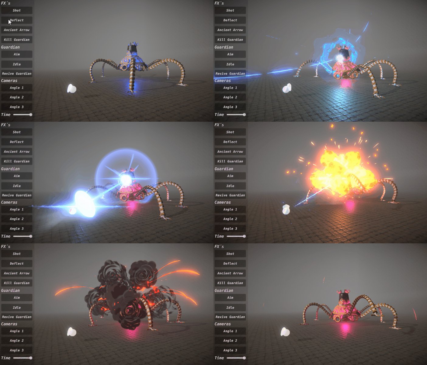
I do the same trick for the beam deflection, but with a slightly different curve for the scales. I hold the sphere with a small scale on the direction of the target longer and make it wider, to give a sense of being compressed by the shield bash, then I increase a scale quickly and make it thinner, to give a sense of acceleration.

The lens flare has a tricky shader. I spent some time doing it as It is one of the main parts of the Ancient Arrow effect, and just used in a smaller scale in this case. But it is basically a mask made using a quad’s UV layout, added by a caustics texture with scroll, again masked by the UV’s, but with different opacity values. The trick to making it appear in front of the opaque meshes is to use the negated view direction to offset the vertex in the direction of the camera. It looks like it’s in place, but it’s actually coming towards you, avoiding clipping on the guardian. Here is the lens flare isolated from the rest of the effect:

And here is the atlas for the Guardian Beam effect:

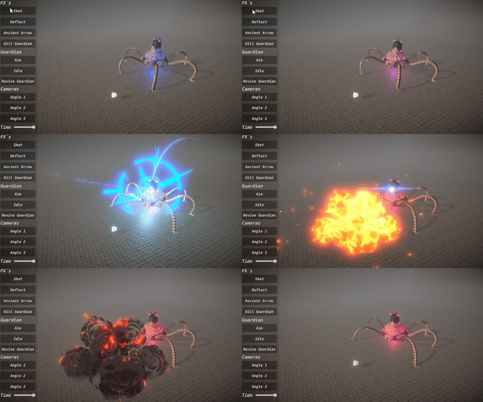
Most of the explosion particles are simple textures with alpha erosion using scale animations. There are five stages of the explosion: the spiky ball that grows; The shockwave, which are parts of a circular mesh facing the camera, and scaling fast; the fragments or debris, to give the sense of the punch, as fast particles are ejected from the bright ball at the beginning; the heated smoke; and the dissipation of the smoke. The first 3 stages happen really fast, whereas the two last stages drag more, making an easy-out sensation. Here is a comparison between the original explosion and mine, showing the stages:

There are two tricks for the smoke, one with the emission, and other with the shaders. Somehow, on the original effect, the smoke stretches away from the center and then starts behaving as a billboard. My approach for replicating this was using stretched billboards together with regular billboards. The stretched billboards must not be emitted in the direction of the camera, so they won’t look as thin as paper. So, I use two semi-thorus that is always facing the camera via script as emitters:

The smoke was all hand-drawn, including the noise for the erosion. The texture for the smoke uses 4 channels alongside with a custom shader, which are: a color gradient on the reds to set the shading of the smoke, that lerps two colors and then multiply it by the vertex colors; a hand-drawn noise on the greens to make the fire, which is multiplied by a color and a value for the brightness, and then added to the particle`s color; another hand-drawn noise for the erosion on the blues; and finally, a mask for the opacity, with the shape of the smoke on the alpha.

Another texture is used to create the tornado effect on the smoke’s dissipation. For that, I use a flow map with a twirl, made with photoshop, to distort the UV`s of the noise at the blue channel. In order to rotate only the noise, I must use two samplers for the texture.
All the controls of the fire, erosion, and distortion are done using custom data and custom vertex streams. Unity’s particle system gives you the option to create your own data stream, by passing particles data to the shader using UV data. In this case, I use the TEXCOORD1.xyzw to control each part of the effect: X controls the fire erosion, which I use to start the particle as a fireball, then create the effect of cooling down as the fire fades away; Y controls the cutout of the shading, which means I control how much shadow the smoke has on its color; Z controls the alpha erosion; and W controls the angle of the rotation of the erosion noise.


After watching gameplay footage a lot of times, I broke down the effect into 4 major parts: the arrow charging, making an anticipation; a giant lens frame with caustics; a portal that opens abruptly and closes slowly; and the stuff that is swallowed by the portal.

For the lens flare, I used the same shader I described before for the Guardian’s beam lens flare. To make the effect of a bright core, I used two lens flare, one in front of the other, but one on them with a small scale on the Y-axis, while the other covers almost the entire screen.
The portal opens up in a similar way of the explosion. I actually reused most of the particles from the explosion for that. When it opens up, I use the same shockwaves and debris, with a different color, to create that punch effect together with the lens flares.
Then, I reused the energy stripes from the Guardian Beam effect, and the ambers from the explosion (again, changing the colors) but this time moving to the center of the effect, instead of being ejected. In contrast with the portal opening, the swallowing effect runs more slowly. The slow particles moving to the center work together with the portal shader, that has a texture scrolling to its center. I also modeled a vortex shape, that also has a scrolling texture moving to the center. Here is the geometry used for the portal and the vortex:

The climax moment of the opening followed by the slowly end with the vortex are completed by the anticipation created by the arrow charge effect. It consists on the moment when the proper arrow charges before being launched towards the Guardian.
For the scale of the effect, I used as a reference to the sphere representing Link. It has 1 unity of diameter, and with that in mind, I set the scale of the Guardian on the scene. I tried to make the effects with a scale as close as the original, so I watched footage of beams being deflected to see the explosions happening on the Guardian. That gave me a better notion of scale, that I replicated on my effects.
For the animations, I tried to create, for each effect, a climax curve, with anticipation, followed by the highest climax, and ending on a slowly pace. Aside from the deflection effect, that has two climaxes, all the effect followed this pattern.
I also animated the time scale in some moments, to draw the attention of the viewer to some particular event. For example, when the Guardian Beam is deflected, there is a brief moment when the shield hits the beam, where there is a slow-motion effect. It emphasizes the shield bash, giving it the feeling of weight on the hit. The movement of the guardian also helps with the overall flow of the sequence. When he gets hit, he is thrown back, stays some time recovering and then walks back to its original position.

If you want to see more stuff, as the 3D model with all the animations, you can find it on my Artstation.
And that all, thank you for reading!
Read more about:
Featured BlogsYou May Also Like