Trending
Opinion: How will Project 2025 impact game developers?
The Heritage Foundation's manifesto for the possible next administration could do great harm to many, including large portions of the game development community.

Featured Blog | This community-written post highlights the best of what the game industry has to offer. Read more like it on the Game Developer Blogs or learn how to Submit Your Own Blog Post
This is an art deep dive about the methods Butterscotch uses to create environments.

As the lone artist in a game studio I have to handle animation, UI's, promo art, social media assets, characters, props, and environments. Anything that has a slightly artistic PIXEL in it is mine to handle. And that means that I'm frequently feeling the pinch of having all this stuff to do, which means I also frequently ask myself:
Today I'd like to dive deep into the way we develop the 2D environment tiles in games like Levelhead and Crashlands, to show a method we've used to save some time and increase environmental asset flexibility. This has also made it easier to create organic feeling terrain types that mash into one another nicely. While I'd never propose using just this method when developing your environmental tileset, it's a great addition to any artist's toolkit.
This method is called THE SPLATTER TILE!

I'm always looking for ways to work faster and with more flexibility. In working with traditional tiling methods like 9-slices and tile maps, I found that the process frequently produced results that felt far too rigid. It was as if the grid was burned into the environment in a way that I just couldn't shake.
As I dove more into the creation of these tiled environments, I found that the best way to create more lively, organic feeling tilesets required not a change in technique, but an increase in the number of tiles produced. I quickly jumped from a simple 9-slice to larger and larger sets that conveyed all the twists, turns, nooks, and crannies I wanted. For an example of how many tiles are required to make things look lively and bendy, checkout this example from craftpix.net:

That's 57 separate tiles for your designer to choose from as they're laying in a level. From an art standpoint, once you remove duplicates and mirrors, you're looking at ~17 different tiles.
After pursuing this method I found myself needing to make a change to one of these tilesets and nearly tore out my hair as the work across 17 tiles compounded. And that got me THINKIN'!
How do I make tiles that create an organic feel for a world and don't feel like they're on the grid? And is there a way to do that without having to go through the tedious process of making the tiles themselves tileable with all these sliced up variations?
It turns out that these two questions are related. In short, making highly organic tile sets requires either producing a large volume of traditionally tiled assets or changing the method altogether.
The heart of that method relies on the difference between the computational bounding box and the art itself, and it's at the core of how Splatter Tiles work. Let's take a look under the hood.

The TILE space. This is the actual grid space the computer uses. If you built a tileset that stopped at these edges, your artist would make some traditionally tiled, clearly gridded assets.
The ORGANIC SPILL! This is where the magic happens. Extend the tile into this space to create shapes that are reminiscent of whatever the tile is trying to represent - if it's stone, make it 'blockier' on the edges. Mud is curvy and splotchy, grass is sharp with lots of pointed edges, etc (you'll see all these shortly).
The BOUNDARY LINE! This is the edge of the tile, artistically. If you cross this line then parts of this tile will be drawn when the neighboring tile is rendered, which will look bad. Keep all your goodies in here.


You can see how splatter tiles let you very rapidly get that feeling of organic chaos without having to do much work. While you will notice a griddiness to the environment, the blend of the shapes, thanks to their splattery nature, make it a bit more lively.
Taken a bit further, a set of splatter tiles, much like the idea of a traditional tileset, can be used to create a variety of organic feeling forms that further feel "off-grid". In our newest game Levelhead, currently in Steam Early Access, we use a suite of splatter tiles in each biome and for each aesthetic tile set players can use. For example, here's the jungle splatter tiles: 
And what they feel like in-game: 
And an example of the Asteroids mushroomy biome, and it's accompanying splatter tiles: 

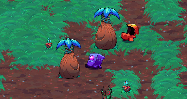
And an example from Crashlands, our open-world crafting RPG:
Make wild base-shapes for your tile. This is how you move it far away from the 'grid' feel.
Use all the colors near the edges of your tile. Your shading should go high and low at various points around the edge, such that when that edge goes against another splatter tile, they have a chance of seamlessly blending together in certain spots.
Test! Figure out how to rapidly see the changes you're making in the correct context. Whether it's through clones, hot reloads, or some templating system, this is always key for any environmental work, regardless of methodology.
Choose your colors ahead of time. Splatter tiles will overlap with one another, so you'll want to make sure your colors have harmonies and don't make people's eyes vibrate.
Set the tile depth. Mud, for example, always goes under grass. Stone goes between those two. This makes for interesting patterns where the different tiles run up against one another.
Splatter tiles are generally best suited for top-down games wherein the exact edge of a tile isn't something the player makes life or death decisions with. However, once you get good at them you can adapt them for any range of scenarios, including a highly reflexive platformer like Levelhead!
... crap!
And here we run up against the hard reality that to make an interesting, dynamic 2d environment you'll have to make a considerable amount of art. This method is simply faster at getting you to an organic feel right off the bat, and is worthy of exploration alongside traditional tile development.
If you enjoyed this post, feel free to follow me on twitter @bscotchshenani or on ArtStation for some more construction posts on 2d game art. And if you're into game dev in general, checkout the weekly podcast I do with my co-founding brothers about the intersection of gamedev and life!
Read more about:
Featured BlogsYou May Also Like