Trending
Opinion: How will Project 2025 impact game developers?
The Heritage Foundation's manifesto for the possible next administration could do great harm to many, including large portions of the game development community.
We talk to developers of Back in 1995, MacBat 64, Racing Apex, morphê, and Else Heart.Break(), whose games are designed to look as if they were made for the PS1 or the Sega Saturn.

A new sort of "retro" visual style has crept into indie development.
The flat 8-bit pixel art revival has been with us for some time now. It's sometimes employed for a self-consciously nostalgic feel, harking back to the touchstones of the developer's childhood in the 1980s. Sometimes, it's used to convey ironic detachment. But most developers employ the style because they simply love the stark simplicity of the constraints it imposes
But lately, there has been a rise in a low-poly aesthetic, similar to that of early PS1, Sega Saturn, and N64 game graphics.
This emerging trend--evident in games like Back in 1995, MacBat 64, Racing Apex, morphê, and Else Heart.Break()--may simply be a younger cohort of indie developers who want to celebrate or emulate the titles that made them fall in love with games. But like pixel art before it, it's not as simple as wanting to recapture childhood.
The deliberate choice of a minimalist low-poly art style is a movement toward making the player use their imagination. It's a way of creating a visual style that simplifies and clarifies aspects of the game. It's yet another tool that lets developers keep a clear vision of what their game should be.
We spoke to five developers who are employing this visual style to learn more about the why, what and how of it.
While the low-poly style does have many different utilities for developers, many admit to feeling a little thrill at creating games that look like the ones they used to cherish.
"My goal with the game is to make it as much of a time capsule as possible," says Marcus Horn, developer of MacBat 64, an N64/Banjo-Kazooie styled-platformer. "I want people to play the game and feel like they are actually back in the 90s and relive some of their childhood memories. I also want to introduce new and younger people to what games felt like back in those days."
MacBat 64 by Siactro's Workshop
Many players can likely remember the first time they felt that gaming be a big part of their lives. That first spark that drew players to games is often an important memory, and aspects that touch on that, such as a similar art style, can draw out that feeling from them again, creating a pleasant nostalgia.
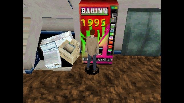
"This is the style I grew up with in my teens and I'm really fond of it." says Takaaki Ichijo, developer of Back in 1995, a mystery game heavily-inspired by the original 1990s Silent Hill's look, play style, and story.
Not only does this look back give a sense of nostalgia to these developers, but it is also an important means of conveying the history of the medium.
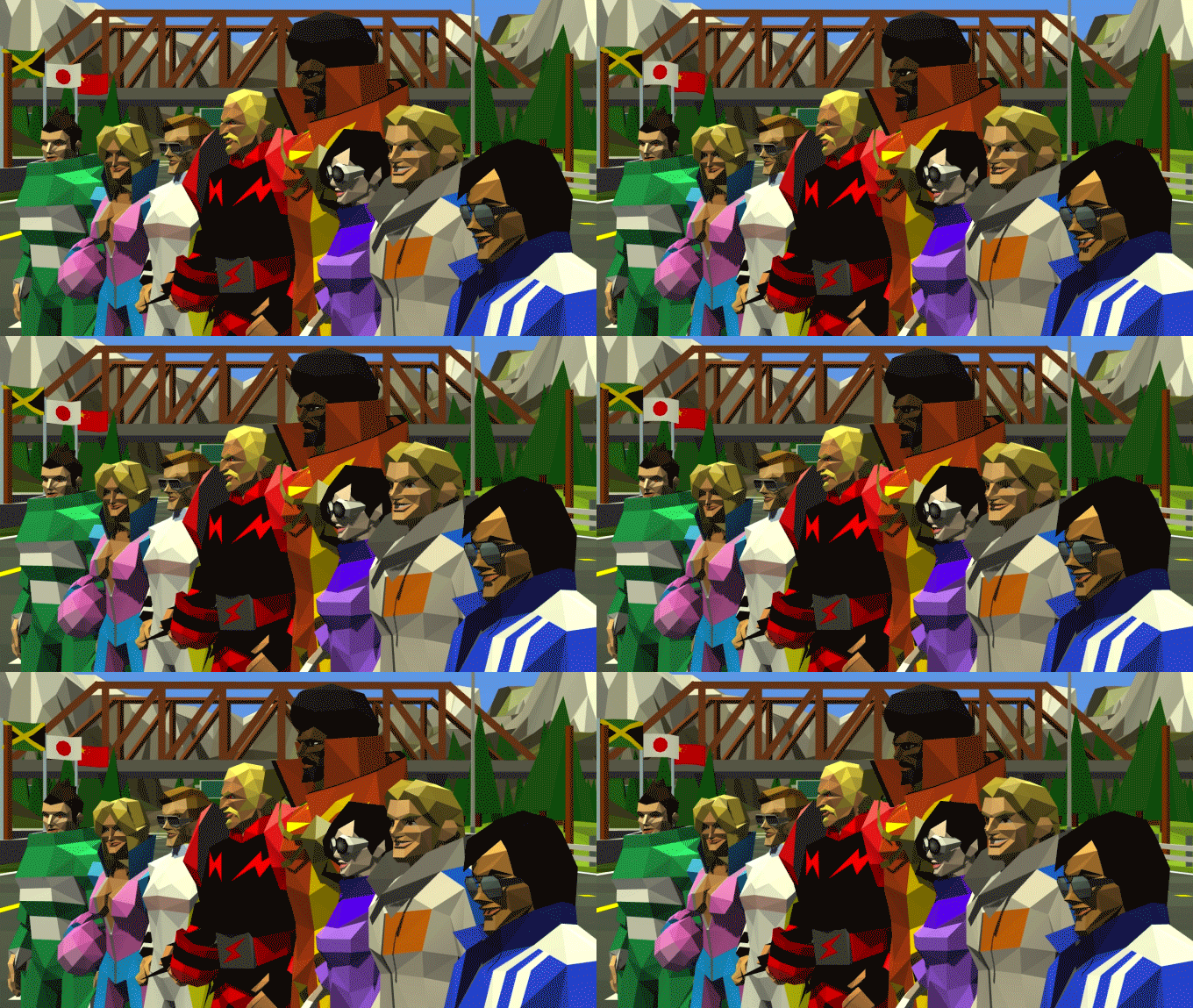
Racing Apex by Lucky Mountain Games
"Racing Apex is our tribute to some of the first 3D polygonal racing games such as Winning Run, Hard Drivin' and Virtua Racing," says Trevor Ley. "So, we wanted to be faithful to how those games were made. These were arcade machines that showed the world what was possible in 3D as racing games moved on from scaling sprites."
It must also be said that at this point in time, when a new 8-bit sidescroller seems to hit the app store every other day, the low-poly look is a retro style that feels simultaneously familiar and fresh.
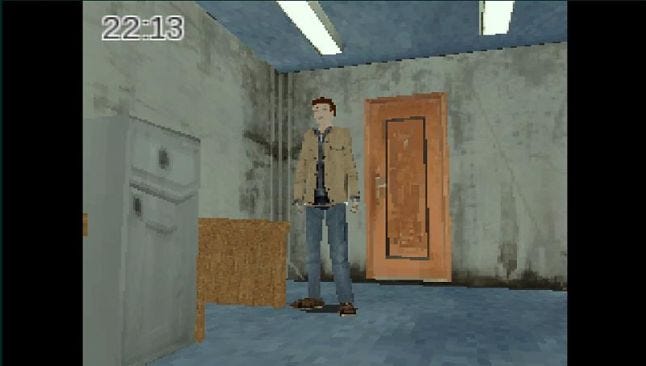 Back in 1995
"In April 2015, before I announced Back in 1995, there weren't any other indie creators using this 32 bit console style," says Ichijo. "So I decided to give it a try. The game which influenced me most was the original Silent Hill [1999]. The creatures generated a very pronounced sense of fear, much of which was due to them being created with a low polygon count." It was also a means to make his game stand out from other works.
A mid-1990s visual style also harks back to a time when players were required to smooth out the blocky textures wrapped around the spiky character models in their heads.
"For me, a very important part about games was always that they left some room for your own imagination," says Horn. "If a game tells and shows you every little detail, it's just not memorable enough. It becomes somewhat boring over time."
A game's visual style needs to convey many things. It needs to tell you what the world and its characters look like, but also hints at how the player interacts with this place. It needs to clarify what you are doing and what you are looking at. Since gaming's inception, players have needed to fill in some of the gaps.
A character made up of a few dozen polygons tasks the player in this way, though not as much as a character made up of a few dozen pixels.
"I am not saying that every game needs to look like an Atari 2600 game," says Horn, "but if there is just a tiny bit left for the player's imagination, it can add so much to the experience. For me personally, the low poly 3D aesthetics of the N64 and PSOne era are the last one to really achieve this feeling."
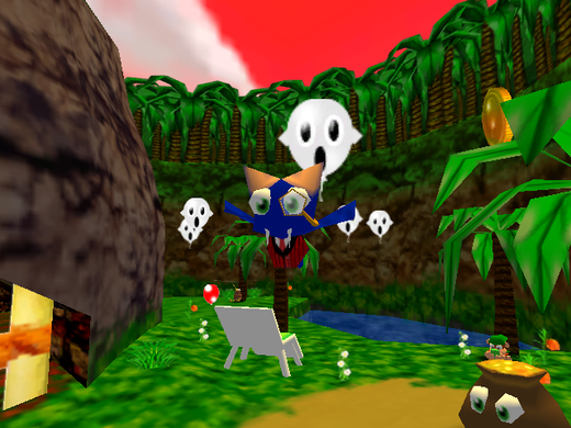
MacBat 64
The low-poly style can be seen as 3D gaming's equivalent to minimalism. It creates a visual framework where the artist, through carefully-crafted simplicity, draws out the creativity of the work's receiver. The player must do some work to fully realize what they are looking at, and in doing so, create a connection to the work that is all their own.
Pat Flannery & Micky Hulse, developers at Pixelfoot Games and the creators of morphê, agree wholeheartedly."Low-poly 3D is one of the few places in which 3D design intersects minimalism," they say. "Solid slabs of color on a 3D model are, to the eye, almost indistinguishable from flat vector graphics. For morphê, we wanted the visuals to parallel the game’s ambient music — which is audibly calming and peaceful, and the low-poly 3D is a similarly visually relaxing experience."
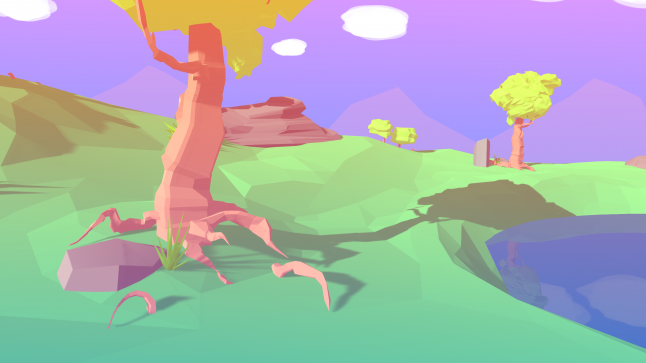
morphê by Pixelfoot Games
In morphê, players create their own music in an interactive environment. The developers wanted to focus attention on the music, and they found that this visual style aided that. "Low-poly didn’t prove to be a hindrance in any way, because the focus is more on the music than the visuals," says the developers. "Clean visuals help users focus on the sound and the overall experience."
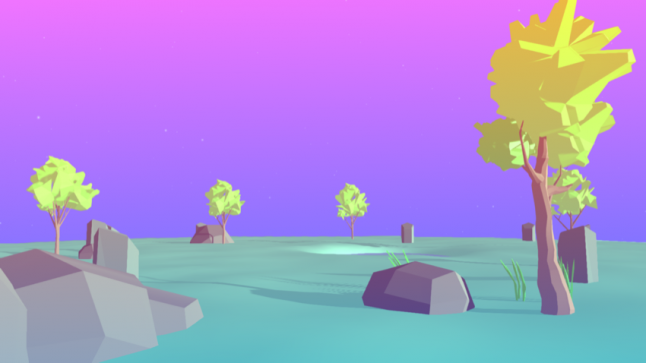
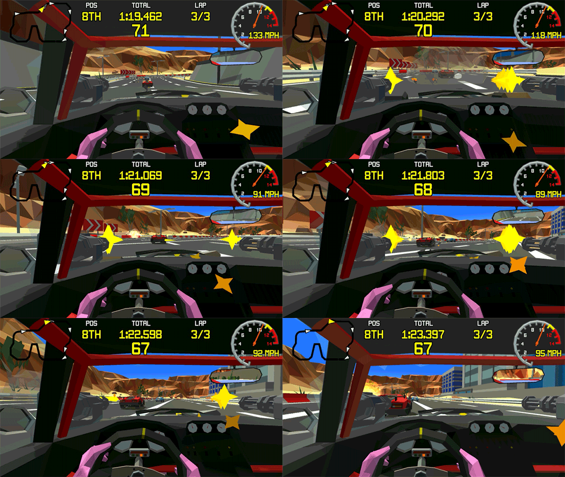
Low-poly visuals with flat textures can also create environments with little visual noise. With other styles, there can be a need to add detail, whereas many see the low-poly style as a means to create clarity through simplicity. With Racing Apex, Ley found this style let him shave away extraneous detail, crafting an experience that was immediately clear with a glance.
"This visual style is great for racing games as it provides crisp, clean definition to the race tracks and vehicles and it looks great at sixty frames per second!" he says.
Racing Apex
"As all 3D meshes are vertex colored and no textures are used, the challenge is creating detail without textures and the minimum amount of polys," adds Ley. "This involves reducing environments, vehicles and characters down to only the key aspects of shape and color. In some ways, it's quite therapeutic to remove all the extraneous details to be left with a still-recognizable form."
Crafting a game with low-poly visuals is not without its challenges, as many developers find when they create their worlds.
"As an artist, being forced to create characters and scenes within these limitations is a huge challenge." says Ichijo.
 Back in 1995
It can also be difficult to maintain just the right balance in what you wish to convey. "Minimalism does create fairly constricting limitations. Too much detail can make a work noisy--no longer minimal--while too little detail makes the work seem unfinished, lazy, and uninteresting," say Hulse and Flannery. "Keeping within strict parameters, however, is probably one of the most important disciplines a digital artist must employ."
With low-poly, developers may feel the need to add more details to create a clearer picture, or find themselves taking too many away to keep to the art style. These can create varied problems, as the developers at Pixelfoot Games point out, as it makes it difficult to be sure you've added enough details to convey what you want to, but not so many that it defeats the simplicity of the style.
Creating detail in just the right manner for a low-poly game is a challenge, as it requires a very specific amount of detail to achieve the historical look many developers wanted, and for those who sought out the simplicity and clarity of the style, it was still difficult to get the look down just right. Its limitations can help make things clearer for a developer, but that doesn't mean it's easy to use this style to communicate everything your game needs to say.
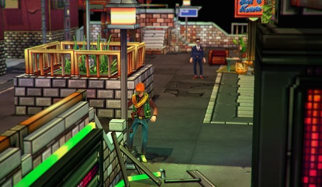
Still, the low-poly aesthetic is mainly about devs discovering how freeing self-imposed constraints can be. That's certainly the case with Niklas Åkerblad, artist for Else Heart.Break(), an adventure game where puzzles can be solved through programming skills. The game employs more detailed textures than you'd find in 1995, but the shapes and models are simple and squared-off.
"Just because we use low poly models does not mean we have created limitations," says Åkerblad. "It just means we have created an algorithm for us to use when getting to know what rules govern the metaphysical laws of our gameworld."
Else Heart.Break()
The low-poly style helped many developers create a clear vision of how they wanted their game to work. For some, that came from holding onto the gameplay limitations that came during the time period these visuals first appeared.
"It gives the game a certain limitation and that is very important, in my opinion," says Horn. "The low-poly art-style kind of acts like a canvas for me that I can start to draw on. I know how the characters will have to look, how the worlds will behave, how animations should look like and so on. In my opinion it really helps me, as a developer, a lot to when I can work with limitations like this and use them in a way to create something that ultimately looks so much better than what I would have done without limitations."
This also came about, not from creating something that felt like it would fit in a certain time period, but in creating matching visuals and play.
The nostalgic stylistic elements of Back in 1995 extend beyond the visuals. "I also adjusted my thinking regarding the game's systems to match the time period: I used tank controls, added fake loading screens and had the player's life bar on the menu screen" says Ichijo. "These are all gameplay experiences dictated by the art style."
"It is a matter of harmony between all the aspects," says Åkerblad. "People generally talk about the different aspects of making games, but I think it's more interesting to point out the perfect harmony you can achieve instead. Games aren't composed of art, design and code. Games are concocted out of harmonization between those aspects."

Else Heart.Break()
The low-poly art style suited the mysterious, programmable world that the developers were trying to create in Else Heart.Break(). The style fit with the "hi-tech" feeling the game needed to give off to feel cohesive, and so the art style fed off of what the game was trying to do during its creation. One would not exist without the other, creating a balance in development.
It's exciting to think about where developers will take this new/old aesthetic in the future. It's also exciting to think about how audiences who were too young to experience the pioneering mid-1990s 3D titles will absorb this aesthetic.
"It is interesting to see people encountering, and enjoying this particular art style for the very first time," says Horn. "After a while, it seems that the novelty vanishes and the immersion and imagination kicks in, just like it did so many years ago."
You May Also Like