Trending
Opinion: How will Project 2025 impact game developers?
The Heritage Foundation's manifesto for the possible next administration could do great harm to many, including large portions of the game development community.

Featured Blog | This community-written post highlights the best of what the game industry has to offer. Read more like it on the Game Developer Blogs or learn how to Submit Your Own Blog Post
Thoughts and observations on my 2-year solo indie game project Disastr_Blastr. Now available on XBLIG (Xbox 360 edition) and itch.io (PC edition).
Vote now for Disastr_Blastr on Greenlight: http://steamcommunity.com/sharedfiles/filedetails/?id=4656657

Disastr_Blastr is a solo indie project I started in January 2013 and released on XBLIG in February 2015. Disastr_Blastr PC Edition released on itch.io in June 2015, and I also launched a Greenlight campaign around this time (which, as of this writing, has been live for 70 days). If you aren't familiar with the game (which I assume you are not), this article will probably make more sense to you after checking out the Greenlight video: http://steamcommunity.com/sharedfiles/filedetails/?id=465665756
I have read a lot of postmortem analyses of different game projects over the years, and it seems to me that every game has an interesting (and often enlightening) story behind it. I was always grateful that the developers took the time to share what they learned and experienced in bringing their creations to life, and I promised myself that if I ever succeeded in releasing a game of my own I would do the same. So here you have it—all the best thoughts and observations I could scrape together from 2+ years of solo indie development. I hope some of you out there find this useful (or if not, at least enjoyable). Thanks for reading. :)
Game Concept and Design Goals
The high-level concept for Disastr_Blastr was essentially: an experimental arcade shooter based on randomness, with an abstract minimalist visual style. The minimalist visual approach I chose was a simple block-with-outline presentation for all game objects—everything from bullets and boss enemies to powerups, UI, and even text is represented as one or more simple boxes. From there I proceeded to flesh out the game according to a few basic rules of design; common-sense things, like "objects that look different should behave differently" and "the more visually detailed something is, the more complex its behavior should be". The end result of this approach could be described as "a radical new dimension of abstract minimalist chaos with 100+ levels of cortex-shattering cubic mayhem", or (in the spirit of simplicity) "a cube that shoots other cubes in a world of cubes".
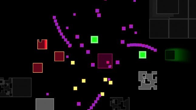
My desire to create a game combining ultra-simplistic visuals with uncompromising action was born of a rebellious impulse against the all-too-familiar formula of maximum visual polish on top of tame, substanceless gameplay. Most of the games that have made the biggest impression on me over the last 30 or so years have been of the "insanely difficult" variety (affectionately known as "NES hard") and I wanted to forge Disastr_Blastr in the spirit of the all time greats—games like Contra, Mega Man, Battletoads, Ninja Gaiden, and others that really pushed the limits of my playing skills. I always admired the visual simplicity and challenging gameplay in classic arcade shooters like Centipede, Asteroids and Galaga, and I wanted to create something that would evoke the spirit of these iconic games, but with faster/less predictable action and a more modern minimalist (as opposed to retro) aesthetic. The big idea was to place maximum focus on the action by embracing ultimate visual simplicity and total abstraction. And so the journey of Disastr_Blastr began.

Design Philosophy and Approach
From the start I determined never to be lazy in my design work, and never to compromise my creative vision in any way unless there was absolutely no other choice. Many times I repeated the words in my dev journal "stay patient, listen, keep the discipline..." and looking back on the project I still feel this was the right call. I probably could have finished faster, had I been willing to cut a few corners and leave a few proverbial stones unturned—but many ideas that came along late in the design process turned out to be some of the most fun and interesting aspects of Disastr_Blastr, and brought a lot of character and variety to the gameplay that wouldn't be there if I had tried to rush the process, or failed to explore new creative directions as they occurred to me.
The slow and careful approach was effective in the long run, but that doesn't mean I was always productive. There were plenty of design dead-ends I spent days or weeks playing around with before ultimately deciding they didn't work. This is just the way it goes with game design—it is a process of exploration and experimentation. Not everything you try is going to work, and that is ok. The most important thing is to stay patient and open to the possibility of exploring new ideas, and when necessary changing up some of the old ones.
Concerning productivity in game design, I find there is really no way to force it or to predict which design tactic will end up being most productive. A lot of the enemies, objects and levels I created in just a few minutes turned out to be some of the best in the game, and others that I spent days or weeks working on ended up being considerably less awesome. Unfortunately there is no sure path to productivity except to just keep creating. Sometimes the magic works, other times it doesn't—that's all. Feel free to tell your husband or wife this when they ask "so when are you going to finish your game?" My experience has been that there are no shortcuts. You will have to keep pouring blood sweat and tears into your project long after the point where you find yourself wishing it was done.
Randomness and Difficulty
If you have ever watched a really good Galaga player you have probably noticed that she can destroy many of the enemies immediately as they are entering the screen... This kind of predictability was one of the main design problems I wanted to overcome in Disastr_Blastr, and to solve it I needed a spawn system that would always yield the proper composition and density of enemies, and in a way that was not so simple to predict. I did not want to make a game that could be mastered by memorizing and perfectly executing a specific sequence of moves—I wanted the player to depend on her reflexes, judgment and instincts in order to win at Disastr_Blastr, and I feel I accomplished this goal quite well. Maybe too well.
One thing about randomness in game design is: a little bit goes a long way toward making a game really hard (on both the player and the designer). Basing the core gameplay in Disastr_Blastr on random enemy interactions produced the desired qualities of emergence and unpredictabilty, but also had the side effects of elevating the difficulty exponentially and making the process of game balancing incredibly tricky. When in doubt, I usually chose to err on the side of challenge, favoring occasional situations where there may be no way out over occasional situations where the player can easily breeze through a level with minimal resistance.
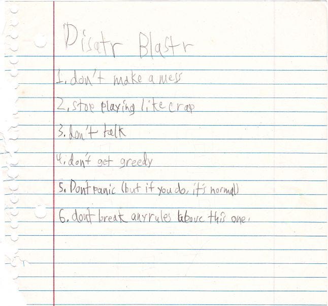
Continuing to refine and intensify the challenge as my own playing skill increased over 2 years may have been a mistake, one I attempted to remedy by implementing a cheat code allowing players to switch the game to "Easy Mode". I would say the difficulty factor in Easy Mode is about half of normal, and you would think that in a game this hard players would appreciate having the option to take it easy—but based on my observations this is not the case. To the best of my knowledge, no one has ever tried the Easy Mode cheat. Apparently the shame of resorting to a cheat code for survival far outweighs the pain and frustration of constant, brutal death.
Personally I find this a bit puzzling. I never felt any shame for using the 30-life code in Contra—in fact, I considered it a necessary part of the game! I suppose I could have made Easy Mode the default difficulty setting and labeled the normal game as "Hard Mode", and maybe I should have... But I had set out to make an uncompromisingly challenging game—and beyond that, I honestly believe most if not all players have the skills needed to succeed in Disastr_Blastr. The human brain is an amazing thing, and with unlimited attempts to clear a level I don't see any compelling reason for watering down the challenge. You can do it guys! Just remember, all it takes is one good run. And when you finally clear that wickedly challenging stage that killed you 300 times your sense of accomplishment and satisfaction will be completely genuine and richly deserved.
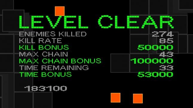
UI Design and Visual Feedback
I originally wanted the UI to be minimal and uncluttered, simple enough for players to use intuitively, and (ideally) textless. What I discovered was that UI design is incredibly difficult stuff in general, and designing a textless minimalist UI was vastly trickier than anticipated. I was eventually forced to add in a few simple text instructions in places where players consistently couldn't figure out what to do, and even with this compromise the Disastr_Blastr UI (while perfectly functional, and as usable as I could make it) is admittedly far from perfect.
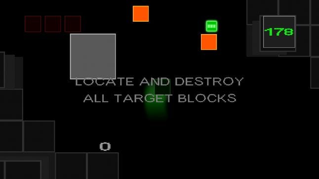
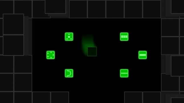
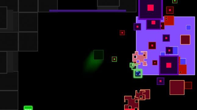
My first attempt at using animated icons to show time remaining in a level was a complete failure; no one understood that the symbol I was using was supposed to represent a clock. Likewise, players had difficulty telling the weapon pickup objects apart, and would often grab a weapon they didn't really want. This problem was never really solved—the only things the player can do are (A) remember which weapons are located at various points in a level, or (B) learn to recognize them based on the Braille-like look of the pickup icons.
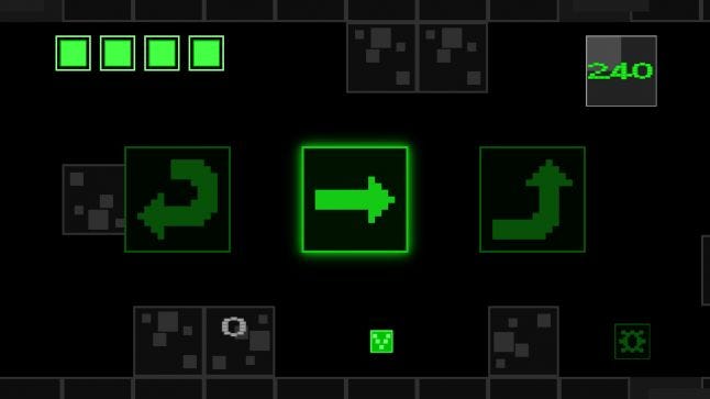
The Pause Mode icons are similarly confusing. There are 3 simple icons representing Restart, Play and Exit, which you might think is a pretty straightforward setup that most players would get... But based on my observations hardly anyone understands intuitively what these things do.
Boss health meters and visible enemy damage states were things the players flat out demanded. Even for enemies that only take a few bullets to destroy, not seeing any visible results of damage beyond just simple blinking of the enemy sprite was something most players found extremely disturbing. So the big realization I took away from all this was: players crave visual feedback on virtually every imaginable aspect of a game, and their enjoyment of said game is seriously impacted if they don't get it.
Level Design
Levels in Disastr_Blastr are arranged in a 10x10 grid of (you guessed it) blocks. I settled on this world layout for two key reasons. First, this arrangement was the simplest to navigate and most closely fit the minimalist aesthetic of the game. Second, I realized that any configuration other than a simple grid (for example an irregular arrangement with gaps in it) would only serve to limit player choice with respect to which level to play next. The Map includes 8 boss levels—all essentially just big rooms containing a boss enemy—which left 92 levels to be filled with whatever gameplay I could conjure up using static wall blocks, breakable blocks (in limited numbers), one of a handful of screen scrolling movements, a couple of special objectives, and various combinations of enemies.
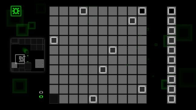
Building 100 levels was an arbitrary decision I made very early in the design process, and turned out to be quite ambitious. There were definitely times when I wished I had made a grid of 64 or 81 rather than 100... The reasons I went with a larger number of stages were mainly (A) to give the player as much choice as possible in carving a path across the map, and (B) to challenge myself to design a large number of unique, memorable levels with a minimal set of design elements. I thought a lot about the level design in Super Monkey Ball while working on levels for Disastr_Blastr—specifically how the goal in each level is the same, but the quality of gameplay varies drastically depending on how the level space is arranged.
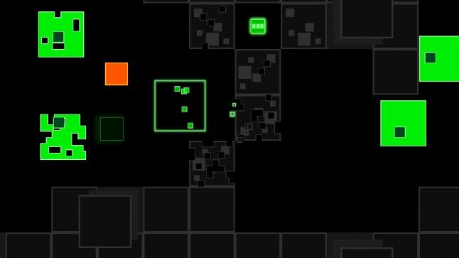
I experienced polar extremes of productivity while designing levels for Disastr_Blastr; sometimes I would build like 5 levels in 12 hours, and other times I would design every day for 2 weeks and not come up with a single usable level. I probably created and threw away 500+ levels to finally arrive at the 110 that actually appear in the game—not very efficient I know, but I don't know any way it could have been avoided without compromising the quality of the design. The creative process that goes into designing game levels is largely experimental, I never really know if a level idea will work until I build it and spend some time playing it, so naturally a lot of time went into rebuilding "finished" levels in Disastr_Blastr if I felt they weren't fun, or for whatever reason just didn't work well.
So when is a level finished? For me the answer depends heavily on intuition, instinct and cool factor: playing a level should feel energetic and engaging, and it should end before the action starts to feel stale. Basically if I am enjoying myself while getting killed 50 times and yelling curses at the monitor then it is a working level. :) Here are a few general principls of level design that I found helpful on this project—may they serve you well:
Christiansen Level Design Principles
-Begin with at least some rough idea of the kind of level you want to make
-Sketching a level on paper before building it out in the game editor is usually a good call
-Consider the size and configuration of level space before getting deep into designing the gameplay
-Avoid using the exact same level type and combination of enemies more than once
-Smaller/simpler levels often work better than larger/more intricate levels
-Sometimes a linear hallway full of enemies is the best level
-Never present the player an opportunity for infinite scoring
Boss Battles
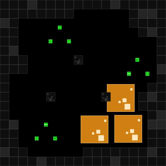
Room size (and to some extent room shape) turned out to be an extremely important factor in balancing the boss fights. My original intention was to keep room size more or less uniform for every Boss round, however testing revealed that some of the harder Boss fights verged on impossibility unless the player was given some extra space to maneuver. This and other observations led to an interesting conclusion that became a pillar of design in Disastr_Blastr: the most precious resource at the player's disposal isn't speed or power, but empty space.
The big design problem with the boss enemies is that they are relatively large (in some cases larger than the screen), and need to be able to float freely around a large space—but when the player moves into a vast open area and loses sight of the walls, an unpleasant feeling of vertigo takes hold... My solution was to place a few destructible blocks around the Boss room, but make them indestructible (indicated visually by a slow pulsing animation). Boss enemies do not collide with this type of block, thus the big baddies are able to float around and wreak havok while the player is gifted with a bit of protection against bullets/minion enemies and (most importantly) some much-needed points of visual reference to prevent getting lost in the black.
Minimalism
My 13 year old kid's analysis of the minimalist aesthetic in Disastr_Blastr was: "It's not visually impressive." And this is not an unfair assessment. The point was to make the visuals radically minimalistic, so (unless you really, really appreciate simplicity) it follows that there is not much eye candy in Disastr_Blastr. However the flip side of that coin is that the action in Disastr_Blastr is highly chaotic, sometimes throwing hundreds of randomly moving objects at the player at once. With the player's visual focus already pushed to the limit, my feeling was that adding detailed graphics on top of all that would be more distracting than enjoyable (and also would work against the core idea of total visual abstraction). Maybe I was right, maybe not—you guys will have to decide that one for yourselves.
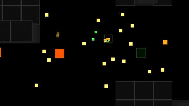
I drew a lot of inspiration for this project from influential minimalist artists like Frank Stella and Ad Reinhardt, and from Minecraft, which is a connection not many players pick up on unless I specifically mention it. If you look at some of these minimalist works and put yourself in the position of the artist, there is something delightfully rebellious there. Something that seems to say quietly, but with conviction, "This is what I choose to create. If you don't like it or understand it, I don't really care." This might come off sounding a bit arrogant, but think about it this way: it takes a lot of courage to put out an unrepentently minimalist work, knowing that a lot of people are not going to understand it, or (even if they understand) just not dig it. I admired this courage, and decided from the beginning that I was willing take the same bold creative risks as Stella, Reinhardt and Notch.

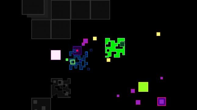
After experimenting with quite a few different visual approaches to representing the game environments, I finally determined that simple gray blocks on a flat black field worked best. The parallax wall blocks are perhaps the only game element in Disastr_Blastr that I included purely for visual style, and these turned out to be one of the things players really noticed and appreciated—so in this one case I suppose it was worth diverging from the path of pure minimalism.
One of the coolest things I noticed about total visual abstraction is that it has kind of a Rorschach-esque effect on the player's imagination. Instead of just seeing a black empty space defined by gray blocks, players would get the impression of a city, a cave, or some other real place. One video review referred to the World 1 boss enemy as a "giant block of cheese", which I think makes this point eloquently: when confronted with something totally abstract, the mind can't resist imposing some representative association on it.
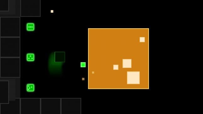
Most players seem to be of the opinion that the ultra-simplistic visual style in Disastr_Blastr is more or less ok. Nothing special maybe, but nothing wrong with it. A few really dig the clean, simple presentation and think it was a cool way to go. And one or two have made comments like "are you going to leave it like that?" and "I think I'll go play a game that has actual graphics." This is the kind of harsh criticism I braced myself for when I put the game up on Greenlight, and yeah, one or two players were a little critical of the graphics—but not to the point of being mean or unfair about it. In fact, the initial reception from the Steam community was a lot more positive, supportive, and polite than I expected. One user even thanked me for "not being an ass" in my response to his post. I took away something important from this comment: Players can sometimes be harsh and unfair in their comments. So can developers.
Sound and Music
Coming up with original sounds and music for Disastr_Blastr was a tough problem, one that I wasn't at all sure I would be able to overcome by myself. I play a little guitar, and have dabbled a bit in electronic music over the years, but I am not really much of a composer and have never taken on anything as ambitious as a full game soundtrack. I needed original sound and music, I needed it for free (or extremely cheap), and I wasn't really comfortable asking anyone else to create content for my game for nothing... so I reluctantly determined to take some time away from game design and focus on putting together a passable set of sound effects and a few simple songs.
I started playing around with a program called PulseBoy to create some simple chip tunes for Disastr_Blastr. It is a cool little web-based sequencer, you can check it out here: http://www.pulseboy.com/
After a few weeks of focusing solely on the music I had come up with maybe 10 or 12 songs, but only a couple I felt were good enough to use in the game. Getting the music to play back properly in game turned out to be tricky business as well, and there were several times during this phase of the project where I considered scrapping everything and just releasing the game with no music at all. Fortunately I was able to connect with a couple of talented techno artists who graciously agreed to contribute some original songs to the project. I ended up with a beautiful ambient track by Dave Shumway (which you can hear in game while viewing the Map), and a complete set of killer tunes by visionary audio designer Joey Schmidt.
Now let me say a few things about Joey. He is by far one of the most talented and hardest working people I have ever collaborated with on anything. He produced a ton of high-quality music in a very short amount of time, and always put the utmost care and attention into every sound. He was a wizard at working around any technical audio problem, and beyond that he is a pleasure to work with and just an all around great guy. For the PC edition of Disastr_Blastr I asked for his help with balancing the volume levels of the songs, just a quick and easy tweak to the finished material... What I got was an entirely remixed and remastered soundtrack that sounded even more mind-blowing than before.
Creators with this level of selfless dedication are incredibly rare,and I count myself extremely lucky to have met Joey and Dave. Their musical talents were absolutely vital to the successful completion of Disastr_Blastr, and it would definitely not be the same game without the contribution of these two audio geniuses. You can sample some of their work here:
Joey Schmidt audio:
http://www.joeyschmidt.pwp.blueyonder.co.uk/
https://soundcloud.com/joeyschmidt
Dave Shumway audio:
http://daveshumway.bandcamp.com/
So with help from Dave and Joey the Disastr_Blastr soundtrack shaped up beautifully, and I was able to use a few old keyboards to generate all the sound effects. Out of all the work I did with PulseBoy, only one song ended up making it into the game (you can hear it while viewing the Disastr_Blastr title sequence). It was the very first song I ever composed with PulseBoy, and I did the whole thing in like 2 hours. It is nowhere near the quality of Dave and Joey's songs, but at some point I started thinking of this tune as "the song of Disastr_Blastr", so it ended up making the cut.
Last thing—if any of you game designers out there are need good free tools for creating game music and sound effects, check these out (you are going to LOVE them):
Bfxr:
http://www.bfxr.net/
Pxtone:
http://www.gr87.com/?page_id=64
Final Thoughts
Looking back on the project, I am very pleased that I was able to stay true to the original concept and vision of Disastr_Blastr, and also very happy with the fun factor and overall quality of the gameplay. The core idea of using random interactions to produce emergent challenges worked out exactly as I had hoped (maybe even better), and the game turned out to be every bit as relentless and unpredictable as I intended.
All things considered, I am about 99% happy with how Disastr_Blastr turned out. I was able to achieve or exceed all my original design goals and resolve every major bug I ran across, and most importantly I gained a lot of valuable wisdom and confidence in the process. Good gameplay, elegance and simplicity are what makes this game work. Even after 2+ years of developing and testing Disastr_Blastr I still get a lot of enjoyment from playing it, and I hope all of you out there will dig it too.
Links
Disastr_Blastr on Greenlight:
http://steamcommunity.com/sharedfiles/filedetails/?id=465665756
Disastr_Blastr on itch.io:
http://dog-theory.itch.io/disastr-blastr
Disastr_Blastr on Facebook:
https://www.facebook.com/disastrblastr
Disastr_Blastr Trailer 1:
https://www.youtube.com/watch?v=ANhb8qn4d08
Disastr_Blastr World 1 Designer Play-through:
https://www.youtube.com/watch?v=KLSx23Qa3Tk
Dog Theory Page:
http://www.dogtheorygames.com/
Dog Theory on Twitter:
https://twitter.com/dog_theory
Read more about:
Featured BlogsYou May Also Like