Trending
Opinion: How will Project 2025 impact game developers?
The Heritage Foundation's manifesto for the possible next administration could do great harm to many, including large portions of the game development community.

Featured Blog | This community-written post highlights the best of what the game industry has to offer. Read more like it on the Game Developer Blogs or learn how to Submit Your Own Blog Post
How subtitles are presented, both visually and structurally, can have a significant impact on a player's enjoyment of a game. The difference between a good and bad experience is usually down to the same few easily fixable issues.

How subtitles are presented, both visually and structurally, can have a significant impact on a player's enjoyment of a game. The difference between a good and bad experience is usually down to the same few easily fixable issues. This article discusses the top 3 basic fundamentals and top 10 general good practices, well established principles both from within gaming and from other related industries, together with some thoughts on gathering and sharing usage data.
Subtitles (speech) and captions (speech + important background sounds) are widely relied on by gamers, more than consumers of other types of media. They are used for all kinds of reasons – due to physical hearing loss, due to low quality mobile speakers, due to a noisy environment, because of unpredictable dynamic sounds mixes, to avoid waking the baby, because localisation has been done solely through subtitles, and many other reasons too.

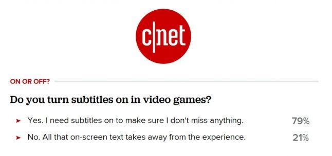
So it’s no surprise really that in a survey on subtitle use run by CNet, 79% of gamers said they played with subtitles turned on. The figure itself is pretty unscientific, but it is still an indication that subtitles are very widely used. A similar picture is painted by this neogaf thread asking who plays with subtitles turned on.
Despite all of this, they are often not given the attention they deserve. Subtitling systems are often implemented late in the development cycle, rather than being an integrated part of the UI design process. It doesn’t have to be that way, you can design a good system upfront, ready for the text itself to be dropped in later when it becomes available.
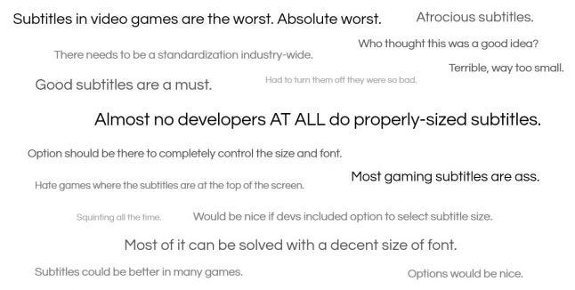
The basics are easy to get right, and failing to meet them can result in gamers who are very unhappy. A recent Neogaf thread highlighted that very clearly.

It’s clear to see from the Neogaf thread that there are a few common issues. Largely presentation related, which is in part due to some misconceptions about how to prevent subtitles being obtrusive.
Sometimes the design decisions taken in order to make subtiles less obtrusive, such as reducing the size, actually have the opposite effect – if the text is harder to read, it takes longer to read, meaning the eye spends more time on the subtitles and less on the game, therefore making the subtitles more obtrusive.
The issues throughout this article are all things that have already been solved in other industries, there’s no need to reinvent the wheel. These top three are regularly complained about not just on neogaf but also on forums and social media, and should be integrated into the design of all games.
.png/?width=646&auto=webp&quality=80&disable=upscale) Assassin’s Creed: Black Flag - white subtitles with a subtle shadow are lost against a light complex background
Assassin’s Creed: Black Flag - white subtitles with a subtle shadow are lost against a light complex background

Portal 2 - letterboxing (opaque or semi-opaque container) providing extra contrast over any background
As a minimum there should be a prominent black stroke. Drop shadow by itself is not recommended, as it leaves half of the letter without anything separating it from the background. Letterboxing, i.e. a black surrounding box, is also worth considering. Some people find full black letterboxing to be obtrusive, so semi-opaque (50% transparency) letterboxing would be a good compromise - as a default. Ideally allow it to be configured (more detail on that in the best practices).
 X-Com - A large number of lines and characters per line means much more time spent concentrating on reading the subtitles
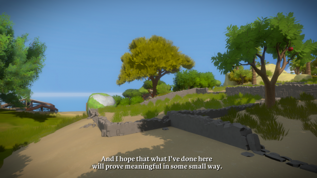
 The Witness – subtitles split up across short lines and short number of lines means they can easily be taken in at a glance
Large blocks of text can spoil events, as text appearing significantly before it is spoken can give away important information. For example:
“Hi John, my old friend. *GUNSHOT* John, why??”
Should instead be split up into three separate subtitles, one after another:
“Hi John, my old friend.”
*GUNSHOT*
“John, why??”
Large blocks of text also have a cognitive impact. The less text is present at any one time, the easier it is to take it the entire subtitle at a glance and quickly get back to looking at the gameplay.
So it is much better to split up into small chunks, with breaks according to the natural flow and punctuation of the sentence as much as possible.
From the TV industry there are set standards across many countries and broadcasters. They vary slightly from one country to another, but for HD output they all recommend a maximum of somewhere between 37 (Australia) and 40 (Finland) characters per line, and a maximum of two lines (three in exceptional circumstances only). If a subtitle does run across multiple lines, keep the top line the longest, but try to keep them roughly even length, e.g.
“We have got to get out of here,
do you understand me?”
Rather than
“We have got to get out of here, do you
understand me?”
Also don’t directly swap out one subtitle for the next – leave a gap of around ¼ of a second between them, to communicate that something has changed.
 Sleeping Dogs: Definitive Edition - tiny text, making the subtitles much harder to read, and meaning that even if you can read them, much more time and concentration is needed.
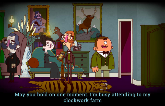
 Bertram Fiddle - large clear text, easy to read at speed
As can be seen from the neogaf thread and frequent social media mentions, text size is a common problem. Don’t go by what looks adequate when designing on a big screen close to your face – not everyone can see as well, not everyone has as big a screen, and the distance people view from varies greatly. Even if you are testing in a living room / sofa environment, remember that players often don’t research ideal viewing distances.
Again, there are well researched guidelines from other industries. Amazon’s 10 foot UI guidelines specify a minimum of 28px for 1080p UI text (14sp), and as subtitles are displayed for a limited duration, subtitle text should be notably larger than the minimum acceptable for the rest of the UI. For subtitles specifically, Channel 4 in the UK require all HD subtitles to be 46px (26px for SD).
.png/?width=700&auto=webp&quality=80&disable=upscale)
These pixel sizes match up with some currently unpublished game-specific research that one of the console manufacturers is conducting.
Games obviously have an additional constraint that other media doesn't - presence of UI elements competing for space. However if the approx. 38 maximum characters per line is kept to, this shouldn’t be much of an issue.
The following recommendations have been collated from standard practices from other industries, established by organisations such as the BBC and the FCC. Most are seen from time to time in games, but not as standard practice, seeing a large number of them implemented together is still rare.
Doing so would put your subtitles at the peak of the industry, and give examples for others to learn from. They should be considered wherever possible, particularly for dialogue-heavy titles.
Even slight typos and mis-timings are frequently picked up on. Some editing to meet a reasonable reading speed is acceptable (covered in #6). Often errors slip in due to voice actor ad-libbing, so if your text & localisation is done before the voice acting is finalised, take a quick second pass over the text once the final audio is in place, to check for any errors.
A common complaint is for one particular part of game to be without subtitles, so check that they cover cut-scenes, in-game scripted and dynamic audio, and any opening cinematic.
When doing so, remember to allow some way of the subtitles being turn subtitles on before the opening cinematic. Infamous: First Light implemented a simple solution: First light subtitle setting.
Another simple solution is having subtitles turned on by default. If developing for XB1/Android/iOS, there is a system level subtitle on/off preference that can be pulled in and applied as your default.
Position by default in the centre and at the bottom, with a gap inbetween the bottom of the subtitles and the bottom of the screen.
If a temporary UI element (e.g. QTE prompt) appears in that space at any point, temporarily move the subtitles up a little to avoid overlap. If the elements are large and would push the subtitles up into the top half of the screen, move them all of the way to the top. The following example relates to playback controls, but would apply equally to things like QTE prompts or large in-game menus: Dynamic subtitle positioning.
However, do not make allowances for the XBox One’s notifications system displaying its messages in the bottom/middle. They shouldn't be in that position, and hopefully will be patched in a future update.
Subtitles are generally only shown one at a time – when a new one appears, the previous one disappears, with a short pause inbetween. However they can also be shown simultaneously, which can be useful if they appear frequently. If doing this, add each new subtitle from the bottom, pushing the previous one up.
Some games go as far as character portraits, but the basic are to separate using different colours , and if in a situation where it is particularly unclear who is speaking (e.g. speaker is part of a crowd, their voice is coming through a speaker or phone, or they are off-screen) also display the name, e.g.
“John: Hello”
If using colours to differentiate speakers, keep them light to ensure good contrast against your dark outline/letterboxing. In particular pay attention to red, as mid red appears to be dark brown for people who have the most common forms of colourblindness.
If a sound is off-screen, add a small arrow to the side of the subtitle/caption to show which direction it is coming from, e.g.
“< John: Hello”
Assuming that the 38 characters per line is being kept to, ensure a single word subtitle is on-screen for one second, and longer subtitles are displayed for around 2 - 2.5 seconds per line.
You may sometimes need to trim some words out to achieve this. However, mismatches harm comprehension, particularly for fast readers. So trimming should not be done unless absolutely necessary, the meaning must be kept intact, and the words must match as closely as possible (e.g. trimming "No no no no no! Not now!" down to "No! Not now!", but NOT “No, later”). The BBC provide in-depth guidance on how to handle any tricky subtitle trimming situations.
Children need more time to read subtitles. The BBC recommend around 3 - 3.5 seconds per line for under 13s, and 4 - 4.5 seconds for under 7s.
Mixed-case (e.g. “Hello there”, not “HELLO THERE”, “Hello There” or “hello there”), with clear distinct sans-serif letter shapes. Full caps can be used for background sounds.
While subtitles should fit as closely as possible with art direction, this must not come at the cost of readability. If it does, the design of the subtitles has failed at a fundamental level. Customisation (see next point) can neatly solve any clash of interests.
There are distinct use cases for subtitles. Some people only glance at them occasionally and want them to be unobtrusive, others rely on them completely and want them to be as clear as possible. So allow some or all of the following to be customisable (ideally with a live preview of the results):
1. Font (art director’s choice/sans serif/dyslexia-friendly)
2. Font size (small/medium/large)
3. Current speaker indication (none/colours/names)
4. Edge effect (none/outline/drop shadow/both)
5. Letterboxing (on/off)
6. Letterboxing transparency
And again, if you’re developing for XB1/iOS/Android, there are system level preferences for most of these, and they have been made available via APIs for you to pull into your game as the default.
This degree of customising can be overwhelming, but it’s easily solved through presets – e.g. “unobtrusive”, “clear” and “custom”, with custom giving access to all of the above.
Any degree of customising would be really valuable. The most important two things would be large/small font and letterboxing on/off, just those two things would make lots of people happy.
'Subtitles' refers to text for speech, and 'closed captions' refers to text for all important sounds. Closed captioning is common in other industries but rare in games, although there are some notable game series that include it, such as Portal, Left for Dead, Tomb Raider and Dragon Age.
For some games it is fairly trivial to add. For others, there are is some extra complexity not present in other media, due to the unpredictable nature of game audio – you can end up with an unexpectedly large number of sounds playing at once. Some games, for example Dead to Rights, handle this through a prioritised queuing system. Each sound is assigned a priority level, resulting in something like this:
1. Character dialogue (Level 1 sound) starts playing, subtitle displayed for 2 seconds
2. Dog barking (Level 2 sound) starts playing, no room on screen for caption to be displayed, ignored
3. Character dialogue (Level 1 sound)'s 2 seconds pass, subtitle removed
4. Gust of wind (Level 2 sound) starts playing, caption displayed
What you have then is a system that displays whatever the most important subtitles/caption is at that exact time: at a frantic moment it might show you only critical speech instructions and life-or-death environmental prompts, but at a more sedate point it has time to show you more of the contextual background sounds.
So, to recap:
1. High contrast between text and background
2. Avoid presenting too much text onscreen at one time
3. Use a large enough text size
1. Ensure accuracy, especially for subtitles that are produced before voice acting is recorded
2. Ensure subtitles cover all important dialogue, and can be turned on before any need to be displayed
3. Position subtitles at centre/bottom, and avoid clashes with other UI elements
4. If stacking multiple subtitles, add from the bottom
5. Distinguish between speakers
6. Indicate direction
7. Allow enough time for each subtitle to be read
8. Use a clear, easily readable font
9. Allow presentation to be customised
10. Offer an additional option to display closed captions
So far everything has been related to implementation. But there is another important aspect to consider - metrics.
There is a general lack of data on subtitle/caption usage. The 79% CNet survey is obvious justification for investment in subtitles, but it is pretty unscientific, a relatively small sample and representative of people who read the article and felt strongly enough about responding, rather than actual players of any particular game.
But with the number of mobile/online games that track huge numbers of metrics, it shouldn’t be too much work to add a couple of extra hooks to track how many players play with the subtitle option turned on.
The data is obviously useful internally, especially when compared against cost to implement some of the above features, but would be even more valuable shared publicly. The same goes for any other data relating to people with disabilities, from colourblind mode to adjusting volume levels independently.
You can't be sure of who is choosing the options and why, even colourblind mode is sometimes used by people who aren't colourblind. But you can start to get a bit of feel for return on investment, just seeing whether or not a feature is seeing wide is is useful data.
Some independent studios have published data on accessibility features, which has all been both interesting and valuable for other devs. For example the 13% of The Last Door players who used their dyslexia-friendly font choice, the 13% of MUDRammer players who are blind, or Solara’s blind players spending far more on IAPs than anyone else. So any data that can be shared, whether for subtitling/captioning or any other accessibility data, would be incredibly valuable.
But even without gathering/sharing data, and even without any of the ten best practices, just taking care of size, contrast and amount of text per subtitle will allow your game to be a more enjoyable experience for many more people.
I was due to be giving a talk on subtitling at the 2016 Develop conference, based largely on this article, but also with some extra content on VR. Sadly I had to pull out due to a funeral. The VR part of the talk was due to be going online as part of a post about VR accessibility in general, but no for the benefit of the peopl who wanted to attend the Develop talk I'm including the extra content here.
------------------
There is a really significant issue with subtitling / captioning in VR - the general lack it.
A feature so close to standard throughout the games industry now conspicuously missing from so many of the first batch of VR games, with obvious dire implications for both hearing related accessibility and localisation costs. An important lesson in not taking accessibility for granted, things can so easily slip backwards like this.
So why? How could this have happened?
There’s a pretty simple answer. Captions (to a certain extent) aren’t a big design issue, you put them across the bottom of the screen. But in VR, there is no bottom of the screen. So, what to do.
You could have them floating across the bottom of your vision. To do so they need to be right up close to the player to avoid occlusion issues with objects in the environment.
Some designers worry about breaking immersion, but when considering subtitles/captions that really isn’t a concern, the negative impact of not having them is far far greater on someone’s experience. The valid concernis about vergence-accomodation conflict, explained here with far more eloquence and detail than I could by Adrienne Hunter.
So with that option pretty much out of the window due to eye strain, what else is there? Another approach is to make them contextual, attach them to the source of the audio, which most commonly is a character in the game.
No issues with vergence-accommodation conflict there. But then you run up against another problem. What if you’re looking the other way? You have no way of knowing that someone is speaking, no reason to turn around to read the text. So you end with a system that is far far inferior to systems outside of VR, which obviously isn’t going to fly.
And that seems to be about as far as the design consideration gets. No obvious solution so.. just leave them out.
It’s not an unsolvable problem though. There are answers, such as this early prototype of VR subtitling from Melbourne dev Joe Wintergreen:
It's early days for VR still, this is just an early stab, there’s plenty of room for innovation. Simple enhancements would be adding in the speaker name for when more than one audio sources are present at the same time, giving some indication of what direction the sound is coming from (aligning left/right, or adding arrows), and some of the general aforementioned subtitle presentation guidelines.
But this is the most promising approach that I’ve personally seen, avoiding vergence-accommodation conflict and making the text available even when the speakers aren’t visible.
Republished from ian-hamilton.com/blog. Includes input from Tara Voelker (Turtle Rock), Lynsey Graham (Sega), Kari Hattner (Crystal Dynamics), Megan Hammond (D.A.G.E.R.S.), Justin Cheadle (Kuju), and Mark Friend (Sony).
gameaccessibilityguidelines.com
bbc.co.uk/futuremedia/accessibility
channel4.com/media
fcc.gov/document/closed-captioning-internet-protocol-delivered-video-programming (CVAA spec)
developer.amazon.com
Read more about:
Featured BlogsYou May Also Like