Trending
Opinion: How will Project 2025 impact game developers?
The Heritage Foundation's manifesto for the possible next administration could do great harm to many, including large portions of the game development community.

Featured Blog | This community-written post highlights the best of what the game industry has to offer. Read more like it on the Game Developer Blogs or learn how to Submit Your Own Blog Post
Since initially starting SPACE COLORS as part of the Space Cowboy Game Jam, I expanded it to a full product intended for release on the iOS App Store; an integral part of this process is, unsurprisingly, getting a wide variety of feedback along the way.

I first started SPACE COLORS as part of the Space Cowboy Game Jam three-four weeks ago. Since then, I've been working on the game every free moment I have outside of work in order to expand the game into a proper game that I could release on the iOS App Store at the end of July/early August. The final game that I submitted for the SCGJ is still up and playable on the excellent itch.io over on the SPACE COLORS page. That build is now pretty outlandishly out of date, but the core principles of the game remain roughly the same. Somehow, amongst all of the supremely excellent submissions to the Space Cowboy Game Jam, SPACE COLORS got #3 for Shootouts, #7 for Visuals, and #10 Overall.
If you play the build on the itch.io page, you can pretty instantly tell that my goal was to make this game a mobile game from the get-go given the resolution/aspect ratio of the web player, but the controls are very PC-centric. Even in the current codebase, I have to maintain two separate input paths: one for PC (testing) and one for mobile (actual testing). While testing the Jam entry, I would frequently distribute Testflight builds for people to test on mobile as well as constantly updating the version on the itch.io site for anyone else to test whenever the mood struck them. The impressions, overall, were very positive, so I wanted to keep the game going. I established a few design/development tenets to guide my development process:
Don't Complicate — Everyone who played the game said the base game was fun, and I didn't want to ruin that as I looked at ways to expand the design. I could have easily added entirely new mechanics and systems; a more sophisticated character progression model, more complex enemies and enemy behaviors, more involved missions, and so on. I didn't want to do that. I wanted to be as precise as possible whenever I added new features.
Constantly Playtest — Every build of the game that I've done since the Jam has been on a more limited scale (coworkers, friends, some press friends), but I was sure to get feedback from people along the way about how they feel the game was progressing, as well as what they liked, what they disliked, and what they especially disliked.
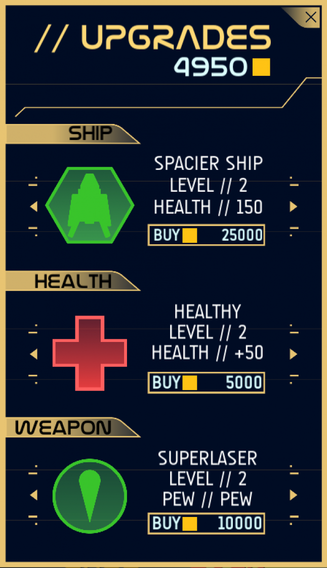
Ensure Replayability — SPACE COLORS is, essentially, a roguelike. You play and accumulate experience to level-up and increase your health, get weapon power-ups, randomly stumble across health boons, and so on. I wanted to keep the suite of possible pickups as minimal as possible because, again, I didn't think the game really needed just MORE THINGS to be more fun. At the same time, I had to make sure that people had a reason to keep playing the game after the first time they died. So, I made credits (the little gold chits you pickup from destroyed targets) persist from life-to-life, so you could accumulate enough credits to buy permanent ship/weapon/health upgrades from the shop. Each shop item only has 3-4 levels of upgrades that you can buy, but each will start you from a more advantageous point from which to progress.
Don't Develop in a Vacuum — I mean this one in a different sense than getting the game out and playable by people, I mean literally do not do development of your game in a vacuum. If it's possible, always have a friend to talk through problems and ideas with. Always. Obviously, this has to be a friend you'd trust intimate knowledge of your game with, but it's an absolutely invaluable aspect of my development process. The number of times I've caught myself while explaining something or my development buddy (a ex-colleague from my Starhawk days and one of my best friends) points out a flaw in my logic are innumerable. It saves time, it keeps my morale up, and it's just generally nice to have someone to share incremental improvements with.
Bigger, Better, and More Dynamic Explosions — I like particles. I like them a lot. And I really like the style of explosion that I stumbled upon for SPACE COLORS, but I figured they could do with some additional love to truly make them pop.
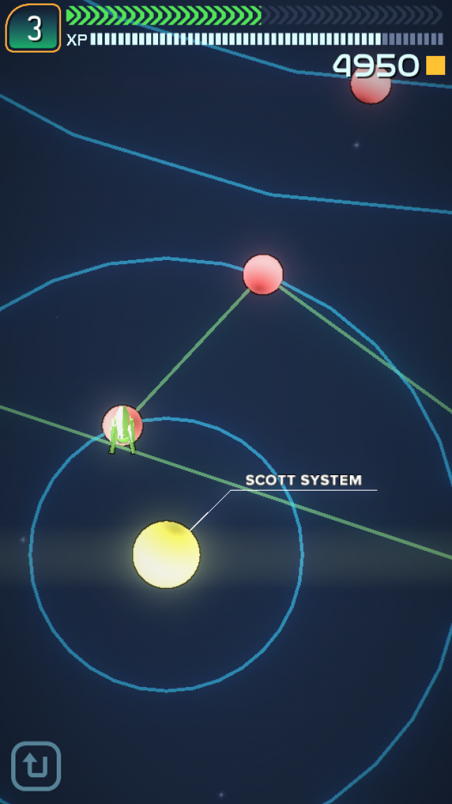
So, I started by making a simple galaxy. Each galaxy consists of 6-10 systems and each system has any number of planets, with each planet being a "level."

Each planet is a level, with the intention being that players progress from planet to planet, each planet consisting of a single mission that the player has to complete. I had a couple of missions for the Jam build of the game, but I ended up with really basic mission templates to flesh out the full game:
Destruction — Destroy some number of some type of target.
Destruction - Target — Destroy a specific target in the level.
Travel - Simply travel to the designated coordinates.
Level - Reach the indicated level.
Collect - Collect some number of credits.
Fetch - Find the "mystery box" and return it to your base.
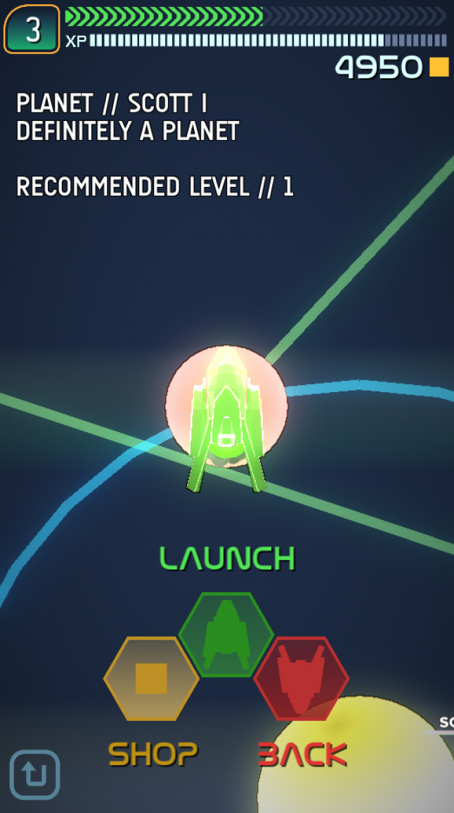
None of these mission types are particularly involved, and that's my favorite part of their integration into the game: each mission just gives you a goal for a level. It's a goal and nothing more. You get some extra experience and you can progress throughout the galaxy for completing these missions, but their real intent is to just get you out into the level and battling increasingly difficult and increasingly more complex combinations of enemies/enemy buildings. So, say you were to tap Scott I, the first planet in the pictured Scott system. You'd be taken to a zoomed-up view of the planet with some color text and basic information, as well as have access to the shop:

And if you click the Shop, you'll see a little pop-up that looks something (but not entirely, since it's still a bit of a work-in-progress) like this:

That's really all there is to the "metagame." Just traveling from planet-to-planet and system-to-system and occasionally earning enough credits to purchase long-term power-ups. It's nothing particularly complicated, but that's exactly what I wanted. It has nothing to do with any kind of thinking that mobile gamers need a streamlined game, either, I just think SPACE COLORS is a simple game with the goal of blowing things up, getting blown up, and repeating. That's the player experience I want each player to have, and the less I get in the way of that, the better the game will be.
The biggest challenge was figuring out a good one-handed control scheme for mobile devices. I chose portrait mode by default (though the game supports landscape and game controllers) because I'm personally a huge fan of games that I can play easily in one hand using just my thumb or a single finger. And mobile games tend to be very bad at doing this. Every game tries to emulate the experience you'd have if you were using a controller but, thing is, most of your players aren't going to have controllers. So games resort to virtual joysticks and buttons and all of that nonsense. That's silly, I think. That's not to say that designing a good, responsive interface for controlling your spaceship in SPACE COLORS was easy, of course. I went through about a dozen possible options, and I settled on one primary control scheme: tapping does everything.
Tap once anywhere on the screen to move to that location.
Tap and hold anywhere on the screen to fly continuously in the direction of your finger.
Tap any enemy to start auto-aiming and firing at them until they're either off-screen or dead. Ideally the latter.
Optionally: If you really want to control your aiming manually, you can move with a single tap still, but as soon as the game detects a second finger touch, it will start shooting in the direction the ship is facing. This isn't a particularly intuitive control scheme, but some people like it, so who am I to say it's invalid.
And, really, I think that's all it takes. I can play the game on my phone in the way that I want with a surprisingly degree of movement/aiming fidelity. And I can do it with one hand! My dream has been realized.
Then, of course, there are the explosions. I would be remiss to include those in this post, so instead of static screen shots, I made a video.
SPACE COLORS will be launching in about a month or so at the low, low price of $0.99. I'll probably post about it again then, but in the mean time, I hope you dig the game and some of the details about its creation.
You May Also Like