Trending
Opinion: How will Project 2025 impact game developers?
The Heritage Foundation's manifesto for the possible next administration could do great harm to many, including large portions of the game development community.

Featured Blog | This community-written post highlights the best of what the game industry has to offer. Read more like it on the Game Developer Blogs or learn how to Submit Your Own Blog Post
UX analysis of how Marvel contest simplified and resurrected classic brawler genre for mobile, applying "Supermarket" psychology of real world stores to it's digital shop, creating greater engagement and leveraging monetisation!

In the business of games, having an IP is not a guarantee for runaway hit. Get it wrong & you may lose more than credibility, get it right & reap the rewards for years to come.
Developer Kabam’s stronghold has traditionally been RPG’s which are more suited to hard core players with an appetite for empire building and penchant for battles. Marvel Contest was a new leaf in Kabam’s book. Why?...Because it lowered the entry barrier for masses of casual and mid-core players, whilst offering depth and content which it’s other strategy games are famously known for.
Many games which involve an assortment of powerful heroes usually introduce trading card mechanics which makes it easier to manage them on mobile. But Kabam went ahead with the genre of character brawler similar to Streetfighter but with controls that are so simplified that even a two year old can figure them out.
Classic brawlers from arcade machines to pc, console, hand held devices have been all about the thrill & skill of mastering varying combos and moves with swift reaction time.
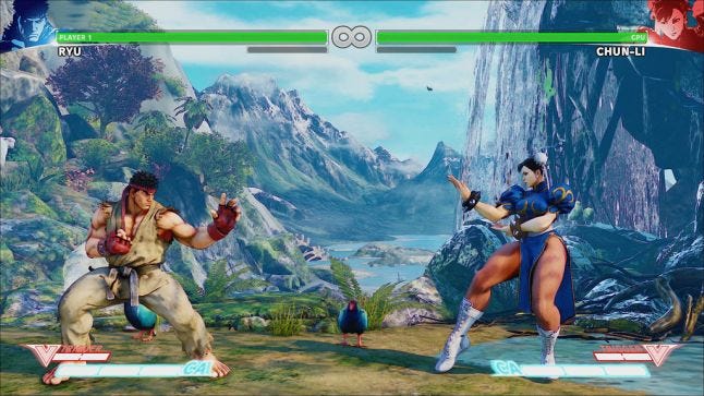
Traditional street brawlers have an assortment of moves mapped to the controller as seen below:
Just like FPS, this genre also traditionally demands high motor and sensory coordination as the fights can be in real time with an enemy who can execute 'n' number of combos and special attacks, countering them requires adapting your hero's fighting controls on the fly.
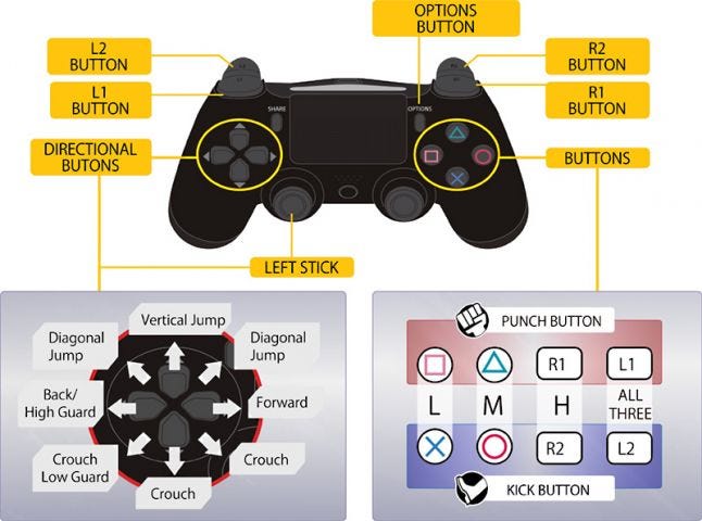 We can see above, how in classical brawlers not only player has to track character movement but also combines them with well timed combos for punching and kicking.
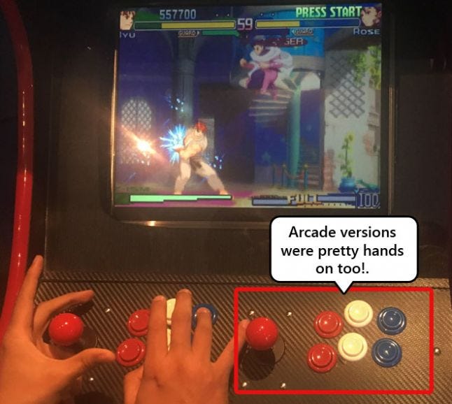
Origin of course lies in the old arcade machines, which were designed to fully engage and immerse players within the game session, without affordance for distractions. Tactile controls were designed to use and engage multiple fingers at a given time. needing players complete immersion and involvement.
In contrast to the classical definition of brawlers, Marvel contest deviates. Quiet a gamble to "dumb down the diverse combat system" which some may consider the beating heart of this genre.
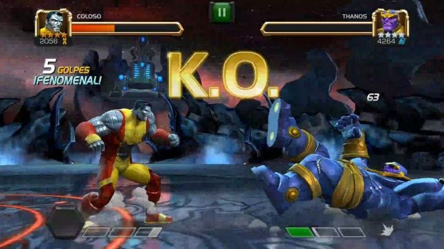
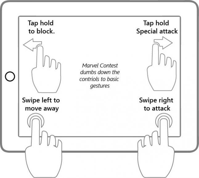
Marvel Contest, in contrast, dilutes these inputs to just few taps and swipes which is sensible for mobile devices as affordance for distractions is high and supporting muti-touch input of different fingers together is cumbersome.
.jpg/?width=646&auto=webp&quality=80&disable=upscale)
(This approach has been explained in greater detail in my article on FPS games)
In Tactical gameplay your main concerns are the moment-to-moment decisions with immediate outcomes; decisions that matter right now. Your long term goals are quite simple, and it’s getting there that takes the majority of your focus.
MCC battle system surfaces the more obvious and easy to understand tactical combat system upfront, using it as an on-boarding device, which lowers the entry barrier for casual players.
MCC combat system was designed for mobile and more importantly casual player experience from the ground up. It was a gamble indeed, but it works (kind of).
All characters share the same move set: basic attack, block, guard breaker and special attack (even though the moves are distinguished visually).
The combat is simple to learn. Swipe forward and tap to perform basic attacks, swipe backwards to dash away from your opponent, and hold your finger to the left side of screen to block and/or power up a heavy attack.
When you play the first few fights, one is left wondering, is that all?!..Did I miss a trick here?
But as you progress through the game you realise...
When pitted against 3 star & 5 star enemies, their speed & agility makes your limited moves appear like it's all happening in slow motion :(, You want to really level up your heroes if you want to survive the oncoming onslaught.
The advantage is that it perfectly suits the mobile screen experience with less to manage in bite sized sessions. This inherently is what mobile gaming is gyrating towards.
While the combat system and controls are simple and easy to remember beyond the action phase, Kabam has a whole lot more going on in the core and meta loop to keep players engaged for long duration of time.
Players looking for more depth in combat system have STRATEGIC "SYNERGIES"
But as you dig deeper in to the game the strategy element start surfacing
In contrast to a tactical game, a strategic game is one in which your long term plans and goals are more important than your moment-to-moment actions. You plan before you act, and every action conforms to the plan you make.
Between the six different classes of Champions, the relationships look like this:
Cosmic -> Skill -> Tech -> Mutant -> Science -> Mystic -> Cosmic
You should always try to be on the correct side of these match-ups, as doing so increases your attack power and reduces it for your opponent. This is also relevant in 3vs3 match-ups. Strategy players will invest in building the best roster and teams with synergies that can beat the opponent, leading to planning in advance that will affect the longterm outcome.
Core loop of the game revolves around fighting, getting reward crystals, opening them to gain evolution material, upgrading heroes and rinse repeat the cycle. It is about the "Gotcha catch em all" fever.
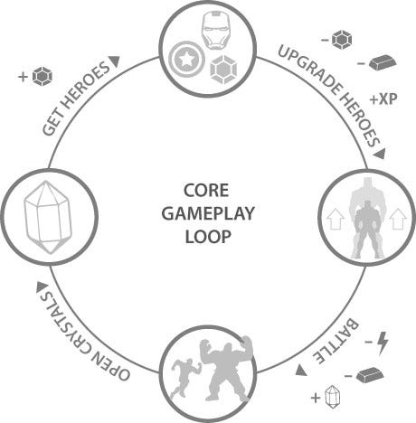
Early on, the game does a phenomenal job of teaching players this rinse and repeat cycle as you only receive 1-3 heroes via the crystal drop, who go into a cool down immediately after a fight (fights don't last more then 1-2 minutes). What can the player do in the remaining time? ?Not much really other than upgrading the champion and crystal drops.
Early session ensures that the drop rate of heroes and evolutionary materials are finely tuned and balanced so players do not end up building a large roster, spending time in just battles and not upgrading heroes.
From a players perspective there are only two major time-sinks in the game.
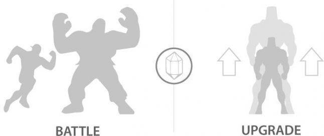
Upgrade and collect heroes (which is essentially the tycoon/base building part of your game)
Fight in battles restricted by cooldown time of your favourite heroes which push you towards the former at regular intervals
This is all tied by the reward crystals which, while excites players by dropping new heroes of different rarity and spews out evolutionary materials for upgrade rest of the time
The crystal you receive every 4 hours gives you consumables while the one you get every 24 hours gives you a two-star Champion (and more rarely, something better).
Versus crystals are earned in PvP quick matches, and they give you either Gold or Battle Chips which can be redeemed for an Arena Crystal that offers you a chance at a 4 star Champion.
The Purple crystals you find during quests can contain a variety of rewards but mostly yield ISO-8.
Last, and certainly not least, are the Premium Hero crystals that can be purchased with Units, the game’s premium currency. These crystals guarantee a two-star Champion at least and can give up to a four-star Champion.
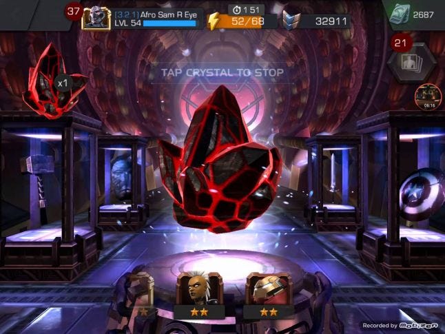
Ask gamers and developers alike, gacha mechanics which drops random loot is one of the most loved mechanics. Players enjoy the uncertainty and thrill of unlocking cool gear, anticipation and uncertainty keeps the outcome fresh for players and have them drooling for more. Usually chests are the most common form of gacha mechanics developers use in many game.
For designers, it’s the challenge of designing & balancing the drop tables & mathematical probabilities that will take players & high stake rollers through the emotional roller coaster of joys of finding epic & rare rewards and keep coming back for more.
For most gacha system RARITY of some form goes hand in hand, as the chance of getting a epic or rare rewards keeps player pining and trying for more and more. (You can see it as tiered star system in the screen shot above)
How MC taps physical retail store psychology cleverly in to it's digital version
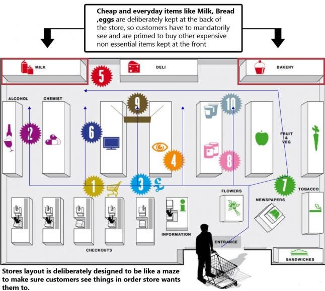
Shop/inventory design in Marvel Contest mimics the super-market layout psychology very well. It’s something we all go through in our everyday life when we go to super-markets or the shopping store. The most essential or daily use items are always kept at the back of the store so you have to go through and see all the expensive and high vanity ones which you are not planning on purchasing but end up buying.
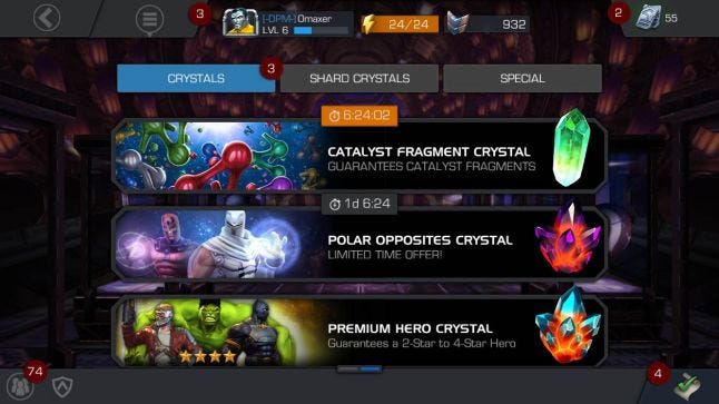
Vertical scrolling crystal inventory shows player the purchasable high vanity and visually impressive items the moment you come to this screen. (Screenshot above)
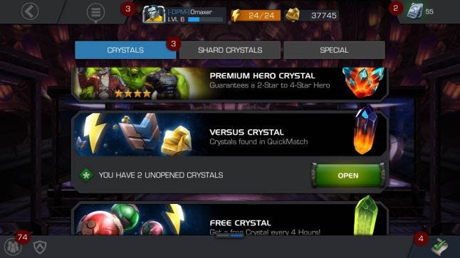
Player has to manually scroll down to see or claim the crystals s/he has won in battles
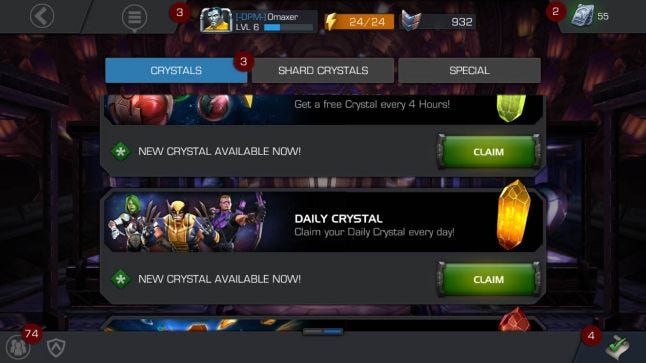
Idea is to send player as often to the shop/inventory space as possible, which is done by giving player free hourly and daily crystals. This ensures the player comes to this space frequently.
UX Take: Any UX designer would, under normal circumstances, think of making the screen more accessible by sorting the list with free or ready to open crystals at the top and not hide it under a scrolling list at the bottom so players do not have to make efforts to find it.
But in this case the flow is designed to prime players to come to this store as often as possible & notice the high vanity stuff using supermarket and retail psychology. So free stuff is deliberately hidden from players view, making them first see the premium stuff before finding their way by scrolling down to perceived low value freebies (bread & eggs)
This behaviour becomes more obvious, when player earns a reward crystal as a result of a PvE and PvP battle but is not allowed to open it directly at the result screen!
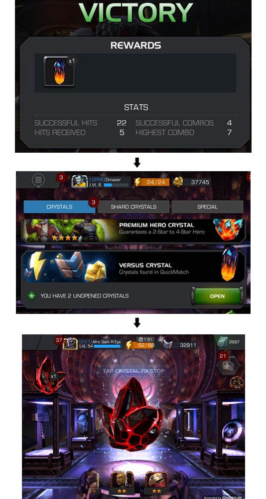
UX perspective: Allowing the player to open it directly would have led to "Instant Gratification" as desirable after a battle or such activity, but the player can only open and claim his reward crystals by going to Crystal Shop, scrolling to the bottom - An additional 3 clicks away from the result screen!
But what may seem like a mis-step from UX perspective is a clever way designed to leverage supermarket psychology: habituate & prime player to often visit the store, prime them for purchase by making them notice & walk through the aspirational items.
There is another top grossing IP game which debuted after MC but was quick to adopt a similar approach -Star Wars: Galaxy of Heroes.
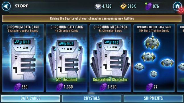
Star Wars: GOH uses a similar approach in it's gacha system
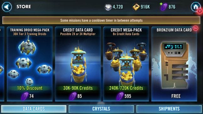
Daily/Hourly free cards are populated in the shop, buried at the end of the roster, which player need to scroll to walking past all high value aspirational offers.
Marvel Contest brings the joy of a classic brawler genre leveraging Marvel super heroes, appealing to both kids and adults (via nostalgia effect), using a super simplified Tactical combat system that can be learnt by casual and mid-core players alike, but with a underlying Strategy layer that appeals to more mature players.
Game has enough content and depth via the synergy and rock, paper ,scissor relationship between hero classes which scales the simplified tactical battle system in to offering strategic choices to the high level mid-core players
Polish and finish of the game is simply one of the best in it's genre among mobile games, delightful VFX and animations appeal to the grandeur allure of power and ambition which most players in this genre are thirsting for.
While gacha systems are known for their monetisation edge and addictiveness, Marvel contest takes it a notch higher by ensuring only way to get the most aspirational item in the game - Super Heroes is via crystal gacha.
Underlying the crystal gacha mechanics is clever supermarket psychology, that works so well in physical stores across the world and now translates to digital counterparts.
Overall Kabam's strategy of focussing on less games at a time, imbibed with deep learnings from it's hard-core games the past, catering to both casual and mid-core audiences is generating well deserved long term returns.
If you liked this post, you can check out my other Game UX Deconstructs. Feel free to connect with me for my future article.
Read more about:
Featured BlogsYou May Also Like