Trending
Opinion: How will Project 2025 impact game developers?
The Heritage Foundation's manifesto for the possible next administration could do great harm to many, including large portions of the game development community.

Featured Blog | This community-written post highlights the best of what the game industry has to offer. Read more like it on the Game Developer Blogs or learn how to Submit Your Own Blog Post
Game animation has to be both artistically interesting and functional within the constraints of games.
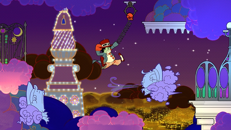
In game animation, we spend a lot of time focused on technical elements, such as the structures of rigs, animation pipelines, or AI-driven solutions for having characters respond to the player. But as alluded to in one 2017 GDC Animator’s Bootcamp talk, game industry animators have few opportunities to build lavish motions that our colleagues in the film and animation industries do. Games are simply different than these mediums: while we are “time-based” just like film, we have to think beyond visual presentation and into things like collisions or making sure our characters feel responsive.

Game animation has to be both artistically interesting and functional within the constraints of games, such as snappy controls and collision. For that reason, animators have to juggle art and tech (image source: Tenor.com)
All of this leads to a strange balancing act for game animators, who train rigorously in artistically-focused techniques meant to give a sense of life to their creations. Chief among these techniques are the classic 12 Principles of Animation, developed over many years at the Walt Disney Animation Studios and eventually published in the 1981 book Disney Animation: The Illusion of Life by Frank Thomas and Ollie Johnston.
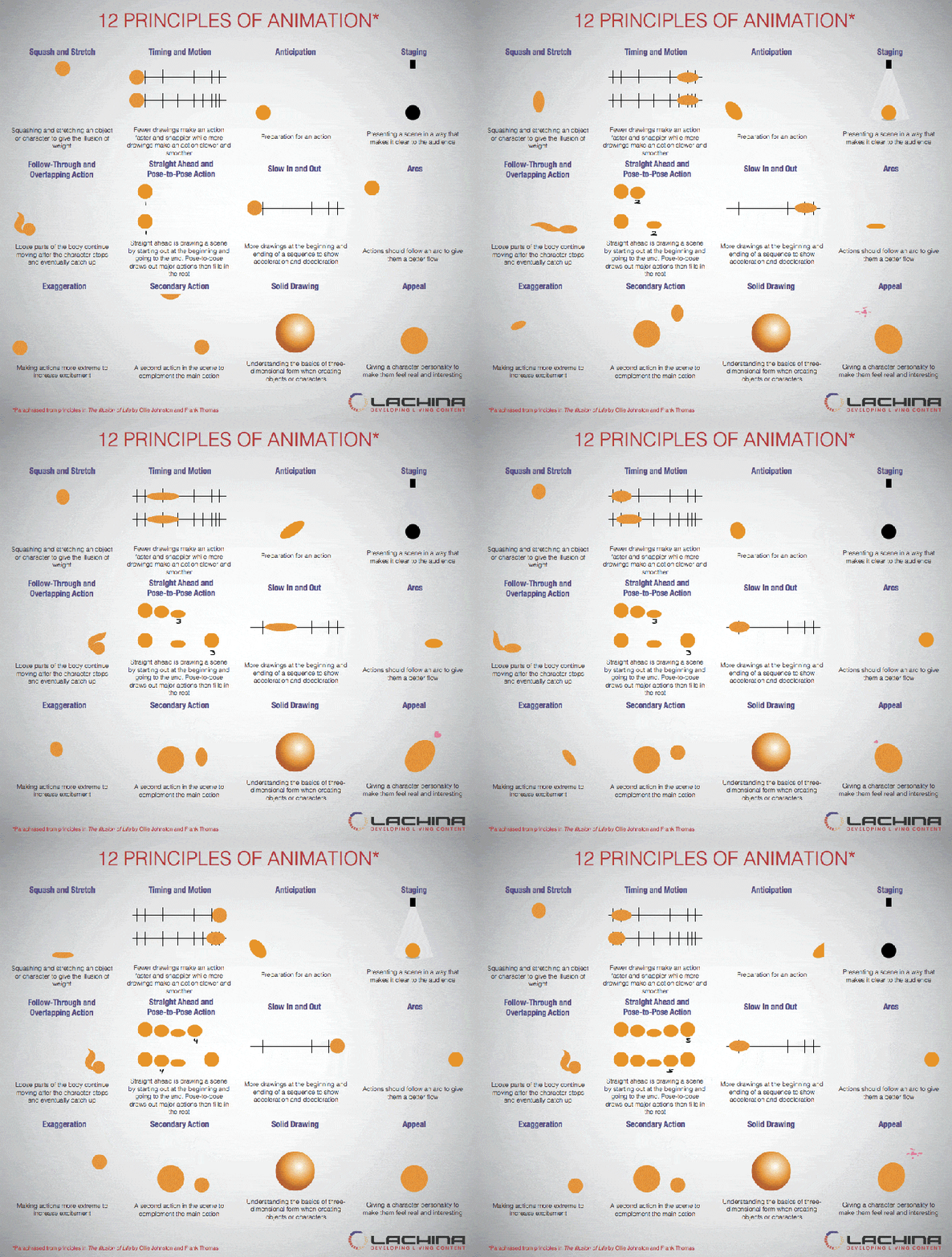
The 12 Principles of Animation describe techniques for drawing specific motions and interactions so that an animator’s drawn characters can give the impression of life through timing, expressiveness, and other qualities. (Image source – Lachina Creative: Lachina.com)
While I wear many hats in the industry, I’m often called into action as an animator, such as with my current work on Little Nemo and the Nightmare Fiends – an in-development non-linear 2D platformer based on Winsor McCay’s groundbreaking Little Nemo comics. In this role, I’ve had to make difficult choices between serving art or tech. Often, I find myself using the Principles of Animation, but bending them for use in games. I can see the same bending of principles happening around the industry as well, such as in the works of Celeste animator Pedro Medeiros (whose excellent animation tutorial gifs can be found here.)
The trailer from Little Nemo and the Nightmare Fiends March 2021 Kickstarter campaign. Our in-development game uses traditional 2D animation to build an animated comic world based on the original Little Nemo series by Winsor McCay.
When used well, I think that the 12 Principles are a great tool for game animators, but those principles developed for use in film don’t always fit 1:1. Based on some of the cheats that other animators and I have used, this article describes a reconfigured version of the classic 12 Principles of Animation that I’ve used in my work, especially in my current work on Little Nemo.
In 1927, members of the animation industry, then focused in the area around New York City, were gathered at a dinner in honor of Winsor McCay, one of the fathers of American animation and the creator of groundbreaking comic and animated works such as Little Nemo and Gertie the Dinosaur. After a few drinks, McCay stepped up to the podium and gave a speech including the line, “Animation should be an art, that is how I conceived it. But as I see what you fellows have done with it is make it into a trade - not an art, but a trade. Bad luck!”

An example of particularly egregious rubber hose-era animation (from one of Disney’s own Oswald the Lucky Rabbit films). Animation like this lacks the “solid drawing” that helps anchor a character in 3-dimensional space, and ignores any sense of mass or scale that helps the character feel more alive. (Image source: YouTube)
McCay’s comment came at the height of a style of animation referred to as “rubber hose”, aimed primarily at getting quick laughs, but which failed to help the characters transcend the ink and celluloid used to make them. While today the rubber hose look has been reclaimed thanks to Cuphead and other works that incorporate the 12 Principles into the style, at the time it was seen as flat or low-brow. This stood in contrast to the work of Fleisher Studios (Betty Boop), who pushed the boundaries of animation in that era. Disney Animation’s carefully crafted work in the 1930’s likewise was a rebellion against the rubber hose look after even they produced several examples of that form.
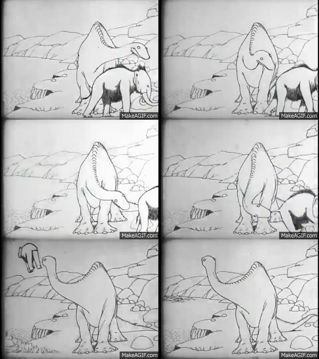
Winsor McCay’s 1914 film Gertie the Dinosaur featured far-ahead-of-its-time animation that endeared the animated dinosaur to audiences. The film is cited by Thomas and Johnston as a major influence on both the early Disney animators and the industry as a whole.
The principles are themselves are a framework through which an animator can give qualities to a character that will endear them to their audience: a sense of physical presence in their world, expressiveness, appeal, emotional depth, timing, and motion readable by viewers.
Without naming them outright, animator Ben Fiquet describes choices involving the Principles of animation in his GDC 2018 talk, “The Art of Wonder Boy: The Dragon’s Trap”. For the player’s Lion form, the sprite drags their sword behind them, which creates a more readable character shape. Previous versions though, had the lion hold their sword at their side: this served the need for a consistent collider size, but was harder to read.

Image source: TIGSource Forums:https://forums.tigsource.com/index.php?topic=50899.0
Fiquet’s talk summarizes the struggle between art and trade described by McCay nearly 100 years ago – building expressive animation often comes at the expense of serving technical aspects of the craft. The animators of the 30’s and 40’s addressed this with the classic Principles, but those film-based techniques did not predict the needs of games. They drastically change the body shape or size of a character (bad for collision) or add extra movements to motions (bad for responding to input.) This is why those cheats those other animators and I have used in our own work are so important: they can help us reframe the classic Principles for games work.
To explore this topic, I’m going to introduce each of the classic 12 Principles of Animation, describing what it is, why its important, any issues in translating the Principle to games, and proposed solutions. I will say beforehand that these principles can and should be used in both 2D and 3D games and are not confined the either format. Along the way, I’m going to enlist the help of characters from our in-development game Little Nemo and the Nightmare Fiends, in which I am implementing these reframed Principles (NOTE: anything from the game should be considered non-final and subject to change.)
Squash and Stretch

Our version of McCay’s mischievous clown Flip incorporates lots of squash and stretch in his animation.
The first Principle is squash and stretch, which is when you compress a character (“squash”) or elongate (“stretch”) them to give the character a sense of physical reality. Squash is used often when a character is hitting a surface (as in landing from a jump or reacting to being hit) and stretching occurs when a character his in motion such as during a run or jump. Importantly, you must always animate characters with this principle in such a way that they maintain their volume: when squashing you want to have the character expand in the perpendicular direction, and when stretching in one direction they should get thinner in the same way. This avoids the negative aspects of old rubber hose-style where characters would just gain or lose body mass randomly.

Squash and stretch can be applied in different amounts or in different ways to imply different materials. The ball on the left squashes/stretches a lot because it’s rubbery, but the metal lamp on the right (Pixar’s Luxo Jr.) “squashes” and “stretches” through posing so that it retains its shape.
Squash and stretch are a useful visual shorthand for giving a character the impression of physics or enhancing any physics that you may have happening within a game engine. The amount of squash/stretch you add to a character can also imply different materials: drawing your character with more squash/stretch makes them feel rubbery while less makes them feel as though they are made of harder materials. This applies to different styles as well: film animators use squash and stretch in many characters, not just “cartoony” ones, but vary the amount of it based on art style. As long as mass and volume are maintained, the effect of this principle gives motion an extra visual “punch” that is useful for building a sense of “juice” into your animations.
For game animation, squash and stretch can make collision very difficult: by expanding or contracting a character’s body size to extremes, it’s possible to create discrepancies between a character’s art and collision boundaries. Game animators looking to employ lots of squash and stretch into their work have a few decisions to make (and, if possible, to talk through with their programmers). If employing lots of squash and stretch, consider having it only occur for a few frames so that the squash/stretch frames are over quickly before any meaningful collision change has to occur. Likewise, consider giving only certain parts of the squashed/stretched characters collision – this has an added bonus of “cheating” for the player, which is something many of us do throughout our general design (coyote time anyone?)

Flip sprite with colliders set to hug the sprite’s shape
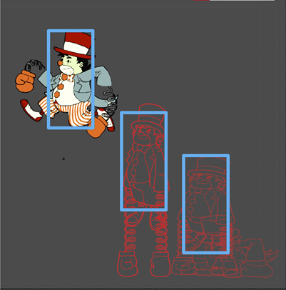
Flip sprites with consistent collider sizes
As you’ll see through many of these Principles, collaboration and compromise are key to making squash and stretch work in the context of a game.
Anticipation

Anticipation is the principle of showing a short action before a bigger one to signal to the audience that the character is about to move drastically. While this is something that humans do not normally do in their own movement, it’s important in animation so that the viewer’s brain can process the masses of ink, paint, and polygons on screens moving like living creatures. This Principle is perhaps the biggest violator in the awkwardness between film and game animation, as it adds extra time to motions, and is thus difficult to implement well in motions where the game has to react to player input.
As I said, animators use anticipation to signal to audiences that a character is about to move. When humans move, we naturally have small imperfections in the way we carry out motion that lets our brain “believe” what is happening. If a human turns their head, for example, our brains accept that head turn. However, if a cartoon character just turns their head, it can look flat and uninteresting, lacking the signifiers of “life” present in a real human.

When we see a person turn their head in real life, the brain accepts it because our brains are wired to accept the motion as natural. Image source: Pinterest

A head turn animation with no anticipation — the result looks flat despite being “technically” correct. Our brain does not accept this as natural because it’s a drawing. Image source: https://design.tutsplus.com/tutorials/animation-for-beginners-how-to-animate-a-head-turn--cms-26487
Rather than try to draw every little nuance of human motion, animators developed anticipation as a shorthand that helps viewers accept and believe characters’ motion. On our head-turn example, an animator might have a character lower their head and close their eyes before doing the head turn, as with this example by Eric Goldberg from his book Character Animation Crash Course:

Other anticipation moves might include winding up before a punch or squatting before a jump — some of which we do in real-life, but which is exaggerated in animation. The problem in games comes with inputs: putting anticipation on player characters risks creating input lag when the character winds up before doing the action mapped to a button. Here, animators and designers have a few choices. The first is to have your cake and eat it too by animating a short anticipation on movements, but having it occur as the player goes straight into their action. For the characters’ jumps in Little Nemo, we adapted a technique from Pedro Medeiros where he drew a squash frame at the beginning of a jump animation but had the player character leave the ground as it was happening. The squash gives the impression of anticipation, but the character leaving the ground right away helped the action feel snappy and immediate. We then follow up with some stretch for effect.

Solutions for other types of actions might include balancing your game around an action with windup as you see in many Castlevania series games where the pace of enemies accounts for the player character’s windup animation (in the original game, Simon even gets an extra hit frame behind him on the windup!) Alternatively, you might plan to have anticipation frames be a part of the risk/reward proposition of playing a specific character, using a specific move, or equipping a specific item. You see this in games where a player can use heavy weapons that are slow to use but hit harder, or in fighting games where powerful special attacks might have longer charge times. By thinking in this way, animation can become part of the tactics you plan into your games.
Before moving on, I should emphasize that anticipation is only a major issue on player characters. On non-player characters, animators should use it as normal to build a sense of “life” in the classical animation sense. Alternatively, anticipation is vital to enemy and boss design for warning the player when an attack is about to occur, something you can really see emphasized in games like Punch-Out!!!, Dark Souls, or Metroid Dread.
Staging
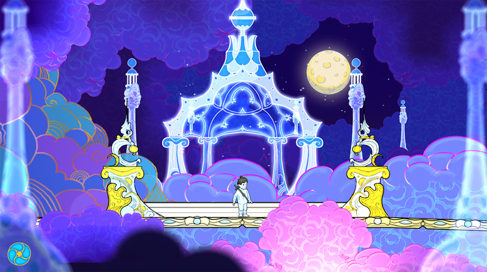
Staging is an important part of storytelling with animation, as it’s the use of scene composition and film grammar to direct the audience’s attention. Animation staging has 2 important components: composition and silhouettes.
Composition refers to how you place objects and characters in a scene and how their arrangement draws viewer attention. Without going into detail on film grammar (you can find great resources on sites like Kahn Academy), the types and positioning of the shots you choose create different effects, which imply different moods, relationships between characters, etc.

The composition of this shot instantly tells us things about the story. Both characters being off-center of the image implies motion: the girl is running from the distant zombie, who is chasing her. She’s scared, as communicated through her expression (which we can see since she’s closer to the camera), and the tilt of the camera lends a horror feel to the scene. Image source: AnimationExploration.org
Silhouettes refer to the shape of a character’s pose as it appears on-screen. If someone were to black-out a character on-screen so that they were only left with a black shadow, the character should still be readable. For this to work, the placement of all parts of the character’s body should be discernable in key poses through the animation.
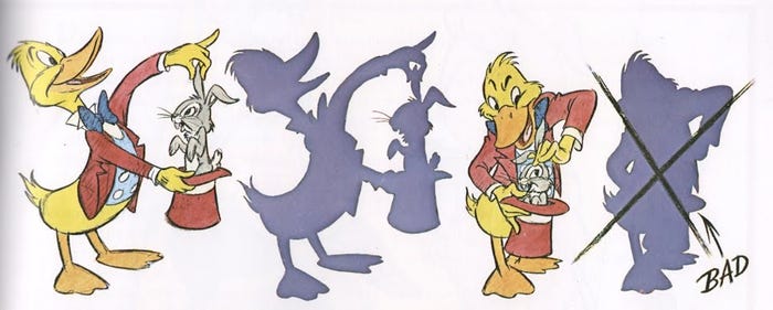
This image from Preston Blair’s classic Cartoon Animation book shows the concept of silhouette. The duck magician is pulling a rabbit of a hat. In the left image, the silhouette is clear and covering the image still allows the viewer to see what is happening. The version on the right is not as effective because the action crosses within the mass of the duck’s torso, so it’s hard to recognize what’s happening at a glance. Image Source: Cartoon Animation by Preston Blair
Staging is one area where the differences between film and games is very apparent – in games we’re handing control of character and camera placement to our players. At this point though, we also have a well-documented body of solutions in the discipline of level design (the link goes to the exquisite Level Design Compendium). Some things for animators and designers to think about when staging scenes in levels include carefully laying out approaches to important spaces or drawing the player’s eye with environment art. In terms if silhouettes, animators should take great care to draw 2D sprites so that their keyframes have readable poses or rotate 3D characters as you animate them so you can see if a pose has a strong silhouette at multiple angles. When I animate 3D characters, I even keep a viewport open that views the character from a facsimile of the in-game camera’s point of view so I can see how a character will read on-screen.
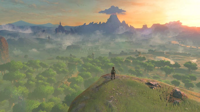
Breath of the Wild crafts approaches to important viewpoints such that players’ eye will be drawn to landmarks and "weenies" that serve as in-game goals. Taking camera control from players is done infrequently and with only a light touch.
Straight Ahead and Pose-to-Pose

Speaking of poses, the next principle relies heavily on posing, specifically as a means of managing the workflow of animation itself. Pose-to-pose animation is a workflow in which an animator establishes specific keyframes, or major poses, that become the basis for a motion, then fill in the frames between them (modern animation software does some of this automatically through a process called tweening.) The frames in the middle (both in terms of timing and positioning) of the keyframes are called breakdowns, and the the frames between those and the keyframes that smooth out the animation are called in-betweens. Keyframes are where an animator will do the majority of their acting in their animations and are the poses on which you should try to build strong silhouettes.

In Character Animation Crash-Course, Eric Goldberg demonstrates pose-to-pose drawing with this image of his earless dog character in a confident walk. Frames 1, 17, and the final frame (shown in black) are keyframes, while frames 9 and 25 (shown in green) are the breakdowns between them. Other frames (not shown but implied on the spacing charts below the dog images) would be used to complete the motion.
Straight ahead animation, by contrast, is animating by drawing frames in order. While this seems like a more straightforward method, it is much more difficult and should be used in only certain situations, such as when creating special effects, loosely tied hair or pieces of clothing flopping behind a character, or reactions such as when a character is hit. By not having a keyframe ahead of the current frame you’re drawing as a “goal”, drawing common motions like walks, runs, jumps, etc. with straight ahead is difficult (but not impossible – Bill Tytla’s “Force vs. Form” work has a lot to say about this.)
This is one principle that doesn’t have a limitation in games: these are merely workflows. Rather than offer solutions for using them, I wanted to share an example of building an animation that incorporates both pose-to-pose and straight-ahead workflows.

One of the most famous scenes in McCay’s original Little Nemo comics is the July 26, 1908 comic where Nemo’s bed grows stilt-like legs and gallops down Nemo’s street. This is one of the most famous scenes in comics and animation history, and has been recreated on everything from the cover of Batman comics, to the opening of Adventure Time, and even on Sesame Street. As you can imagine, it’s also appearing in our Little Nemo game. Animating this scene involved a 2-part process that included both pose-to-pose and straight-ahead techniques.
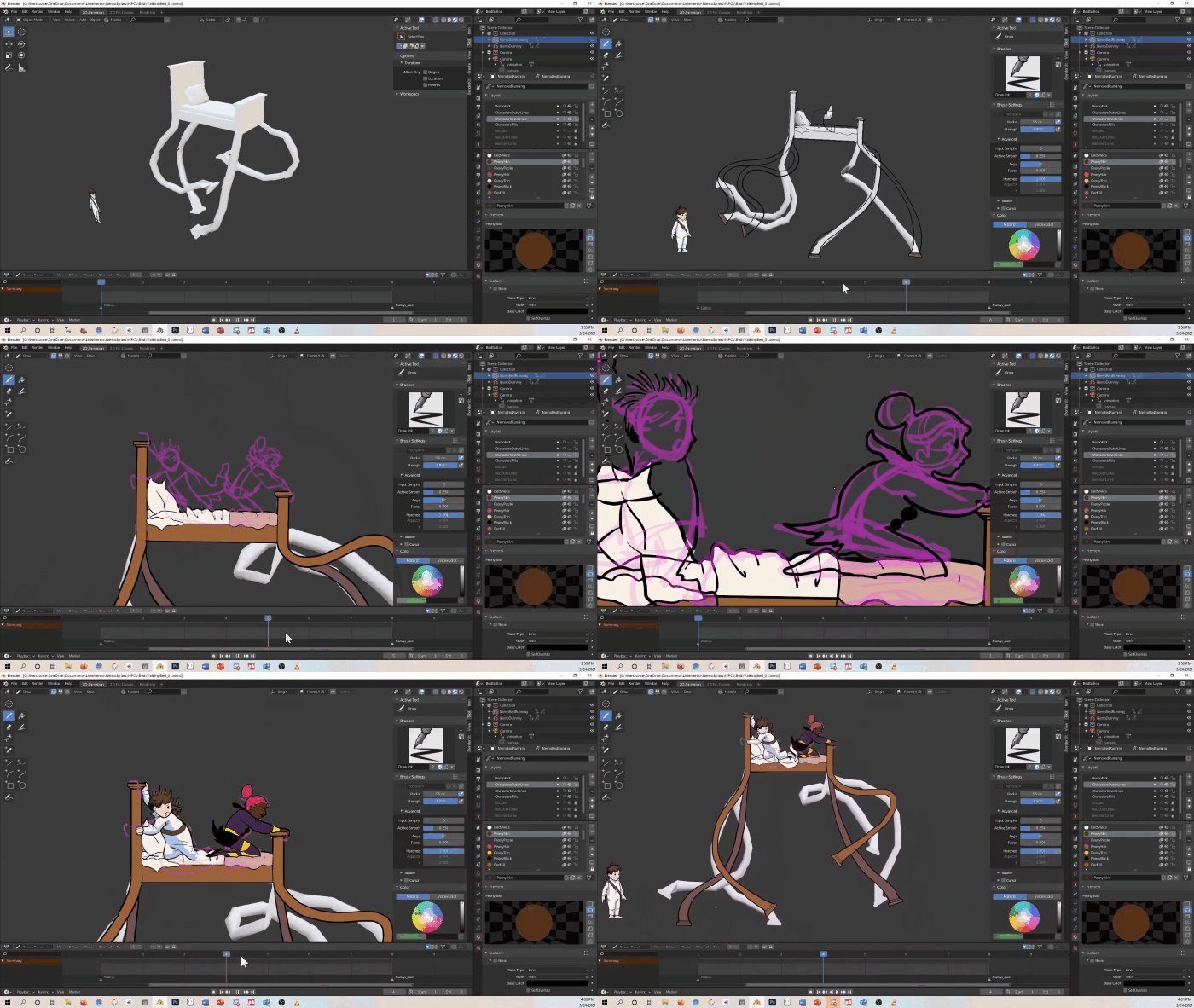
This gif shows the workflow of the bed animation, including creating a model to use as an underlay, tracing on top of it for the final artwork, then adding Nemo and Peony via straight-ahead animation (first in rough then ink/paint.)
To create the bed (without the characters on top), I 3D modeled it and put in a rough rig (which had some glitches but did enough that I had a base to work from) so that I could trace key poses using the model as a reference. Key poses were based on Eadweard Muybridge’s 1878 photographs of horses in motion, which are references that McCay would have had access to. I then drew breakdowns and in-betweens to flesh out the motion. The characters on top, Nemo and his friend Peony, were drawn by going back to the beginning of the bed animation after it was completed and drawing them in a straight ahead fashion reacting to the bed’s motion, since they are flopping around and holding on for dear life. This process was more improvisational: when the bed would dip suddenly from one frame to another, I would draw Nemo and Peony fly upward and vice versa when the bed would suddenly bound upward.
Follow-through and Overlapping Action

Working with elements that react physically to a primary motion (as Nemo and Peony were reacting to the running motion of the bed) is an example of follow through and overlapping action, where loosely tied body parts or pieces of clothing continue moving even when the body has stopped. The motion of these elements overlap one another, creating alternating rhythms of motion that produce interesting animation.

Aurora from Sleeping Beauty – animated by Marc Davis
This principle is another that gives a sense of physical reality to characters, acknowledging that hair, clothing, tails, ears, and even relaxed limbs will drag behind the parts of the body driving a character’s movements. It also acknowledges that our bodies do not move perfectly accurately: body parts do not always stop when we command them to and keep going because of inertia. Adding this follow through keeps motions from feeling stiff or stilted.
While follow through and overlapping action don’t have many limits in games (having this element in your animations always make them feel livelier), you have to be careful with how many frames you spend on these motions so you don’t slow down gameplay by stopping a player for too long. I’ve personally run into this most on attack animations, but have a few guidelines that work well in these situations. The first is making the motion quick: minimizing the amount of follow-through frames but making those frames really impactful can help you get more from less.
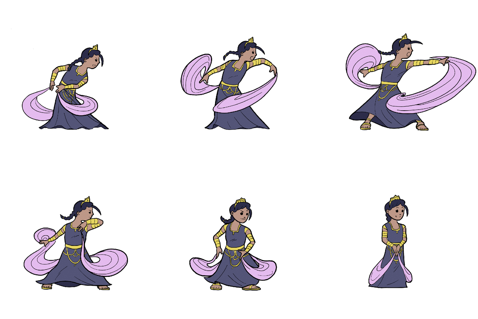
For the Princess’s attack, we made economic use of frames for the follow-through, but in-game the animation both reads well and allows you to keep moving.
Next is making a motion entirely out of follow-through. Nemo’s attack animation is entirely follow-through, the first frame of the animation is the end of the sword swing, while the rest of the animation is his recovery as the motion trail fizzles out. This gives the impression of the whole motion while not actually being the whole motion but still offering great impact (for our playable demo, we even ended up chopping 3 frames off the end of that to make it even faster).
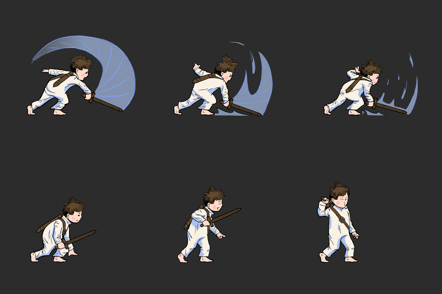
Last is making the follow-through element out of a different object. The attack animation in Hollow Knight feels very much as though this is the method they used (I didn’t work on it so I can’t directly comment). In this method, the swing object can last longer than the character’s movement, letting players gain control of the character quickly without losing the satisfying effect.
Slow-in/Slow-out

Carefully choosing frames is key to the next principle, slow-in/slow-out. For this technique, the animator draws more frames around keyframes (i.e. before and after the frame) to show that the motion easing out of its starting pose, accelerating through the motion, then easing into the end position. You want to move quickly through the frames directly in the middle, if you even show them at all. For many new animators saves them the trouble of figuring out what those frames look like, and often produces better results.
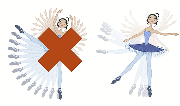
Image source: Learn.Toonboom.com
This accomplishes two things: first, it focuses more attention on the keyframes, which is where the best silhouettes and indicators of the character’s attitude are. Second, it varies timing of motion so that the result is less robotic, as it more closely resembles how humans move.
Once again, this technique has no real limitations in games, but there are a few things to think about. On one hand, an animator has to sometimes take extra steps to use this in their software: most animation tools automatically tween or interpolate frames between user-set key poses. In these cases, the animator must either add extra keys or use animation graphs to adjust the motion. On the other hand, the animator should evaluate whether they have enough frames to use this technique. In some extreme cases, like retro pixel-art games, you might have to choose frames carefully. In my GB Studio game Kudzu, I had only 2 frames that I could use to create the player’s attack animation, so I opted for a slow-out to let the attack itself feel quicker.

In my upcoming Game Boy game, Kudzu, I did not have many frames to work with for the attack animation, so I used a slow-out to emphasize the attack motion and make it feel more satisfying.
Arcs

At this point, we enter a stretch of principles with few or no disadvantages in games, but which are nonetheless important to know about. The first of these is arcs, where you animate objects or parts of a character’s body moving in arcing motions.

Robin Hood animated by Milt Kahl
Stated bluntly, our bodies and joints are made to move in arcs. Likewise, physical reactions happen in arcs, such as the parabolic arc of a bouncing ball (learning to draw this is a common animation exercise.) Follow-through motion also often occurs in arcs, so quite simply: always animate with arcs.

Little Mermaid pencil test by Glen Keane
Even small details can be enhanced with arcs, as with our Man in the Moon boss. As a character that’s only a face, we dress up his expression shifts by having them occur in arcs. The craters originally moved in straight lines on the face, but making them move in arcs as well further fleshed out the motion and gave the impression that the character is a sphere instead of a flat circle.
Secondary Action

Next is secondary action, where you have other actions happening on a character or in a scene that give it a sense of life. A classic example is running animations, where a character’s main action is moving their legs, but its developed further with the motion of the arms and other body parts – how those body parts move and how much can create different effects.

Image source: Animation Mentor
Once again, there aren’t limitations in games as this is drawn or animated into a character’s regular frames, but things for an animator to think about include whether possibilities exist for different body parts to be moving at different paces, where to incorporate follow-through elements, and whether the character can be doing other small activities while they do a main motion.

In some of our enemy and non-player character animations, we incorporate a “fidget” into idle animations or include details like turning gears, clanking mechanical parts, or wagging tails. These additions add an extra amount of visual interest to action, and should be incorporated into your animations.
Timing

Next is the principle that underlies a lot of this material, timing. Generally speaking, more drawings creates a slower action, while fewer drawings create a faster action. This is on area where we game developers actually hold an advantage over film animation: we can control the speed of our animation’s playback in our engines rather than being stuck in 24 frames per second. In this way, we have a limited ability to tweak how an animated looks in-game without having to go back and edit the animation itself.

Gregory the Goat playing at 1X speed — the animation is too fast (in-browser it may also appear very choppy and to only move sporadically)

Gregory the Goat playing at .25X speed — much better!
Two gifs of the same 2-frame goat animation, one playing at 1X speed, the other playing at .25x speed. The 1x version plays way too fast in-engine, while the .25 version plays at an acceptable rate.
There is one limitation to keep in mind, which is that more frames can become a bigger file size for your game. In film, an animator can be really indulgent with the motions they create (see the classic animation examples throughout this article), but in games we need to be efficient (especially in 2D). For this reason, I make heavy use of animation smears, which are individual frames that incorporate the visual information of several frames in one, blended together into a kind of stretched out mass. These are the frequent subject of those “terrifying paused animation” memes, but in actual work are very useful for building smooth motion with fewer drawings. Since they show up for only one frame, they don’t even need to look THAT nice, they can look rough individually, but will create a great effect in motion.

This screen capture of the Bridge Guardian character from Little Nemo and the Nightmare Fiends shows smears at work.
Exaggeration

Next is exaggeration. This isn’t a principle that acts as a tool as the others do, but is more about how much you apply the Principles themselves (according to animator Dante Rinaldi.)

As you may have seen in this article, most depictions of motion in animation are over-the-top versions of real-life motion. Much of this has to do with the issue we discussed before where animation has to work harder to express motion than real-world humans. The exaggeration helps our brain “accept” the motion on the screen, even for characters less cartoonishly. One of my favorite examples is the duo of Gaston and Lefou in Beauty and the Beast. Gaston’s art style skews more realistic than other characters in the movie, so his exaggeration is there but in a subdued way, while the cartoonish Lefou’s use of the Principles is very up front and apparent.

In Little Nemo, we used exaggeration to “push the pose” on our Moon boss’s roar animation, giving it a more fearsome appearance. While the pose on the left is more realistic, the pose on the right proved more satisfying and indeed was the most replayed part of our Kickstarter trailer according to our analytics.
For exaggeration in games, you should follow guidelines previously laid out about balancing how collision and artwork work together, as well as maintaining responsive control. However, exaggeration is in general a great way to build a sense of “game feel” or “juice” into your game through animation. The amount of exaggeration or speed in which it occurs allows you to create emphasize different effects if you’re not just going for the stereotypical “visceral” style of juice.
Solid Drawing (and Design)

The principle of solid drawing is also rather simple, as it refers to whether the animator can draw (or model) well, taking into account a character’s presence in 3-dimensions and the basic artistic principles of anatomy, proportion, perspective, and others.

Image source: https://lithub.com/how-learning-to-draw-can-help-a-writer-to-see/
Most professionals know this, but many new game artists and animators are shocked to learn that foundational concepts like anatomy and perspective, as well as fundamental skills like drawing (with pencil and paper even!) are important to creating digital games. Drawing and animating characters is dependent on a mastery of how the body moves and contorts as it moves, and these skills must be practiced and honed over time. Mastering these ideas helps you create natural and believable characters that will appeal to audiences and players. Likewise, understanding how to pose characters creatively will help you avoid twinning, where a character over-relies on symmetrical posing. Creating asymmetrical poses that respond to anatomy and treat a character as though they’re occupying a 3-dimensional plane helps give them a better sense of physical presence.
Appeal

Winsor McCay’s Flip vs. ours. We tried to use very well-defined round shapes on the character and emphasize an emotive face.
The final Principle of Animation is appeal, which describes how the design of characters let viewers connect with or care about them. This has been described as a character’s “charisma” by some animators, and involves how much a viewer can understand about a character and their personality by looking at them.
Like the past few Principles, this concept does not have any restrictions in games, but instead comes through in the design of characters themselves. Over time, animators have found that basing characters on a predominate shape or using specific color palettes help communicate a character’s personality to the audience.

Image source: http://harrietwilsongadblog.blogspot.com/2015/11/thinking-about-character-designs.html?m=1
Whether a character has an expressive face or can otherwise communicate their emotional state through body language (helped by being able to draw dynamic poses via solid drawing) helps here too. The cast of Undertale really shines in this regard, as each has both a predominate body shape that gives us hints about their personalities and expressive features that help them emote clearly, and it’s one area where we’ve been repeatedly complimented on our game. This lets you create characters that players can really fall in love with (fan art anyone?)

Some fan art we received of the Little Nemo and the Nightmare Fiends player characters, by Nick Clary.
While not the entirety of animation, the 12 Principles of Animation go a long way in giving us a way to bring more expressive, believable, and beautiful motion to our games. Rather than tossing out ones that don’t work immediately in interactive media, some tweaking allows us to rebuild these concepts for use in games. As we’ve seen, many of these don’t have limitations in games, but still deserve examination lest we forget they’re there and have to reinvent the wheel.
Happy animating!
Read more about:
Featured BlogsYou May Also Like