Trending
Opinion: How will Project 2025 impact game developers?
The Heritage Foundation's manifesto for the possible next administration could do great harm to many, including large portions of the game development community.

Featured Blog | This community-written post highlights the best of what the game industry has to offer. Read more like it on the Game Developer Blogs or learn how to Submit Your Own Blog Post
In this article, we'll talk about developing a user interface in Unity based on states and markup of elements.

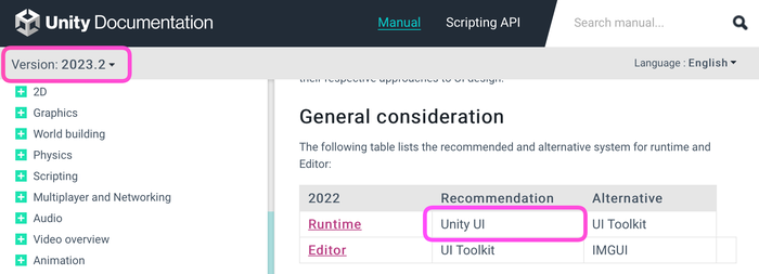
First of all, it should be noted that we'll be talking in the context of the Unity UI (uGUI) technology, which is still recommended for Runtime according to the documentation. The approach described is not applicable to UI Toolkit, IMGUI, or other UI building systems.
Most often in Unity projects, you'll come across UI implementation built on View classes inherited from MonoBehaviour and peppered with a large number of SerializeField fields. This approach provides full control over the behavior of the UI, but it also makes it necessary to write a large amount of code at the View and Presenter levels (depending on the architecture used).
Often, as project development continues, these classes swell to incredible sizes, and the components on GameObject themselves are covered with a huge number of links to internal objects:
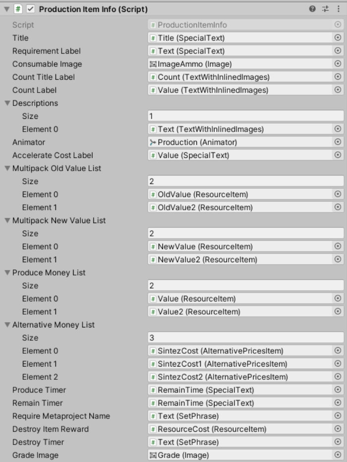
Modifying components like this is also not enjoyable: to get a reference to a new element in a class, you need to add SerializeField, recompile the code, find the new field in the prefab component, and drag the necessary object into it. As the project grows, the compile time, the number of fields, and the complexity of organizing prefabs also increase in turn.
As a result, we end up with bulky and overloaded subclasses of MonoBehaviour (or a large number of small ones, depending on your preference).
It's also worth considering that any changes to the behavior of such a UI is a task for the programmer, and that task comes with all the associated costs: code review, resolving merge conflicts, code coverage with tests, and so on.
First, any change in the window state occurs using code. To change the color of text, change an image, play an animation, move an object on the screen — all the involved objects and parameters require a corresponding SerializeField, and then a large amount of code is written to make it work according to the requirements. Naturally, only a programmer can handle this, and the implementation turns out to be lengthy, expensive, and super-efficient (often much more efficient than anyone can notice).
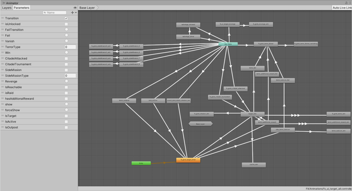
Another approach can be described as the “all-powerful Animator”. In addition to the View class, an Animator Controller is created and controlled through parameters. A new Animator appears in the new window, and so on, until the FPS when displaying windows begins to drop.
Now that we've highlighted some of the difficulties of working with uGUI, I would like to talk about a different approach to solving this problem.
During my work on one of my pet-projects, I developed a library for structured UI development in Unity. Later, my team and I tested it on production and we were pleased with the results.
The source code for the library is available for download on GitHub.
The key element of the library is the StatefulComponent component. This component is placed on the root GameObject of each screen and contains all the necessary references to internal elements, distributed across tabs:

Each link is named based on its role. From a code perspective, the set of roles is a regular enum. Separate sets of roles are prepared for each type of UI element (buttons, images, texts, etc.):

Roles are generated directly from the component, and there is no need to manually edit the enum. Waiting for recompilation when creating a role is also not necessary, as these enum elements can be used immediately after creation.
To simplify merge conflicts, enumeration values are calculated based on the names of the elements:

This allows you to avoid breaking serialized values in prefabs if you and your colleagues happen to simultaneously create new roles for buttons in different branches.
Each type of UI element (buttons, texts, images) is located on its own tab:
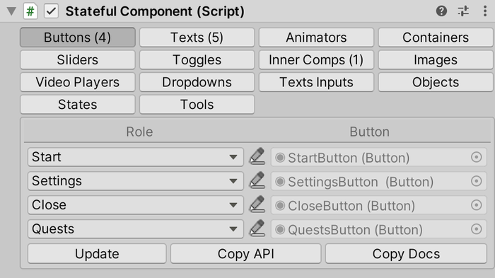
By using roles, the complete markup of all elements inside the prefab is achieved. Sets of SerializeField are no longer needed to access images and texts, and it is enough to have one reference to StatefulComponent and know the role of the desired image in order to, for example, replace its sprite.
Buttons, Images, Toggles, Sliders, Dropdowns, VideoPlayers, Animators
Texts, including UnityEngine.UI.Text and TextMeshProUGUI
TextInputs, including UnityEngine.UI.InputField and TMP_InputField
Objects — for references to arbitrary objects.
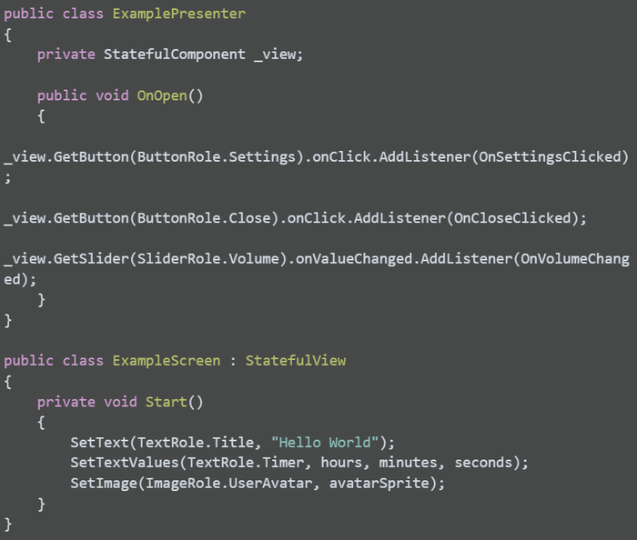
There are corresponding methods for working with annotated objects. In the code, you can use a reference to StatefulComponent or inherit the class from StatefulView:
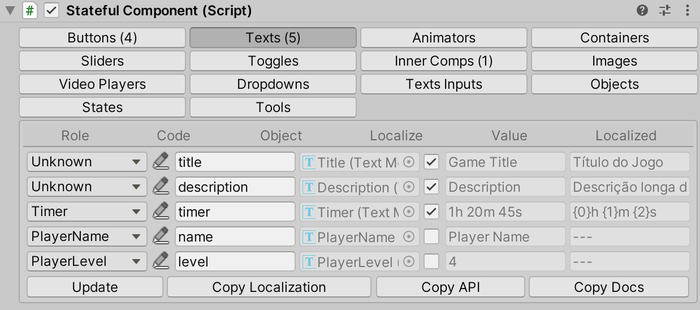
The tab with texts, in addition to the role and link to the object, contains the following columns:
Code: a text key for localization
Localize checkbox: an indicator that the text field is subject to localization
Value: the current text content of the object
Localized: the current text found by the key from the Code field
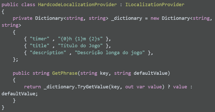
The library does not include a built-in subsystem for working with translations. To connect your localization system, you'll need to create an implementation of the ILocalizationProvider interface. This can be constructed, for example, based on your Back-end, ScriptableObjects, or Google Sheets.
By clicking on the Copy Localization button, the contents of the Code and Value columns will be copied to the clipboard in a format suitable for pasting into Google Sheets.
Often, in order to facilitate reuse, separate parts of the UI are extracted into separate prefabs. StatefulComponent also allows us to create a hierarchy of components, where each component only works with its own child interface elements.

Configured roles can be used in code similarly to other types of elements:

To create a list of similar elements, you can use the ContainerView component. You need to specify the prefab for instantiation and the root object (optional). In Edit-mode, you can add and remove elements using StatefulComponent:
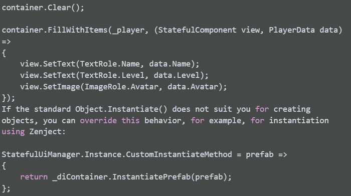
It's convenient to use StatefulComponent for marking up the content of instantiated prefabs. In Runtime, you can use the methods AddInstance<T>, AddStatefulComponent, or FillWithItems to populate the container:

Internal Components and Containers provide static and dynamic nesting for StatefulComponent, respectively.
We've considered the markup of prefabs, localization, and instantiation. Now it's time to move on to the most interesting part — developing UIs based on states.
We'll consider the concept of state as a named set of changes to a prefab. The name in this case is a role from the StateRole enum, and examples of changes to the prefab can be:
Enabling and disabling a GameObject
Replacing sprites or materials for Image objects
Moving objects on the screen
Changing texts and their appearance
Playing animations
And so on — you can add your own types of object manipulations
A set of changes (State Description) can be configured on the States tab. A configured state can be applied directly from the inspector:
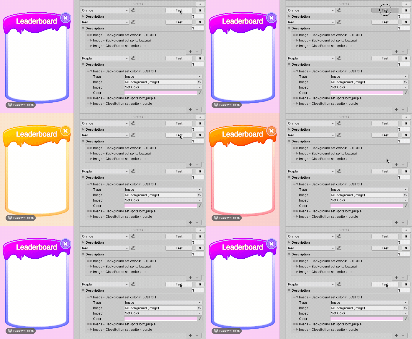
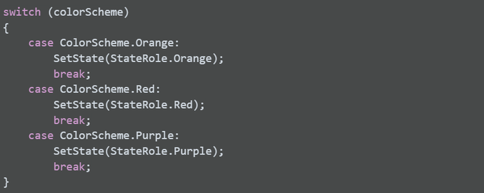
A configured state can be applied from code using the SetState method:
On the Tools tab, when the Apply Initial State On Enable parameter is enabled, you can configure the State that will be applied immediately upon object instantiation.
Using states allows for a significant reduction in the amount of code required at the View class level. Simply describe each state of your screen as a set of changes in the StatefulComponent and apply the necessary State from the code depending on the game situation.
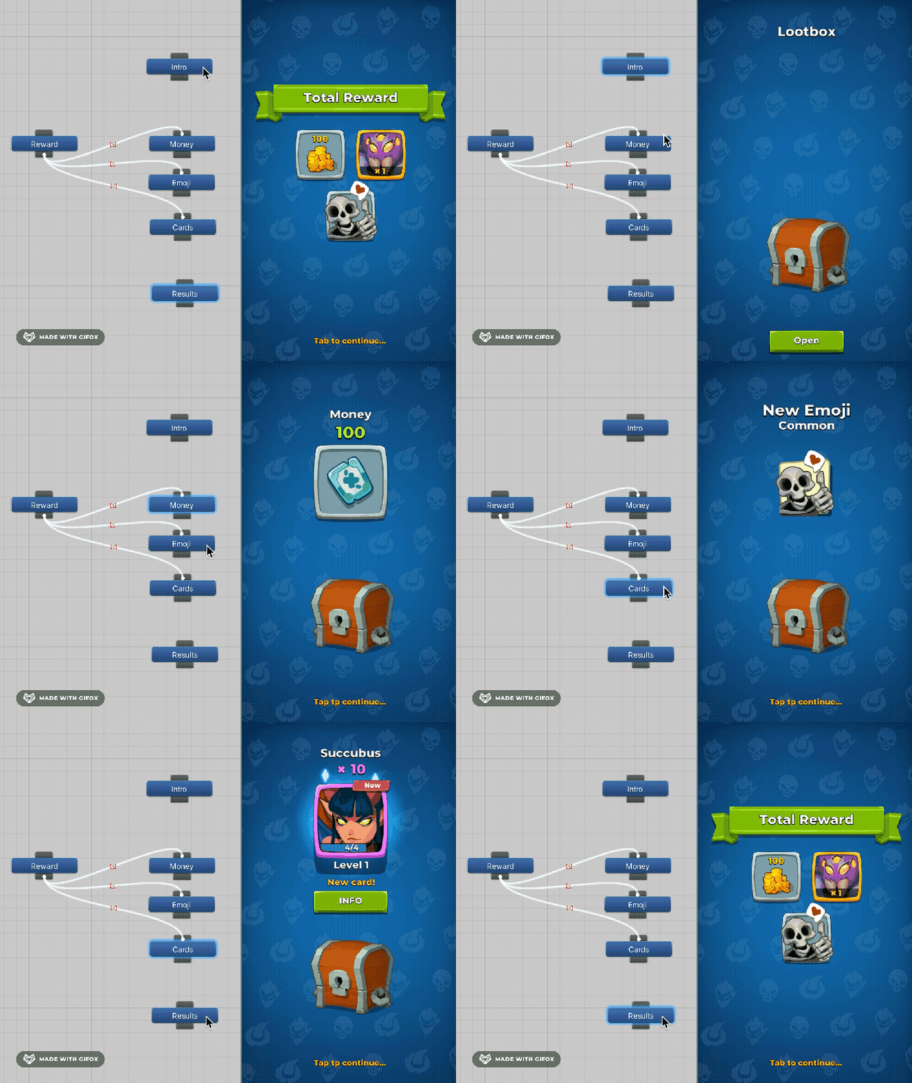
Actually, developing a UI based on states is incredibly convenient. So much so that, over time, it leads to another problem — as the project evolves, the list of states for a single window can grow to an unruly length, and thus becomes difficult to navigate. In addition, there are states that only make sense in the context of some other states. To solve this problem, Statful UI has another tool: State Tree. You can access it by clicking on the State Tree Editor button in the States tab.
Animated introduction of the chest (state Intro)
Looping appearance of three different types of rewards from the chest (states Money, Emoji, and Cards, depending on the Reward state, which triggers an animation of the reward appearing from the chest)
Display of all awarded rewards in a single list (state Results)
Parent states (in this example Reward) are applied every time child states are called:
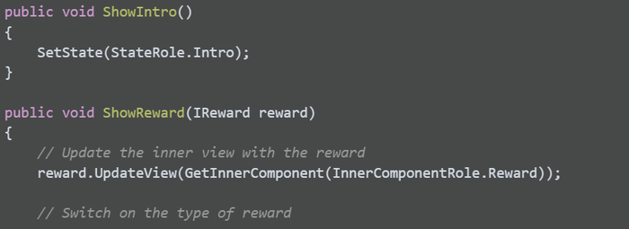
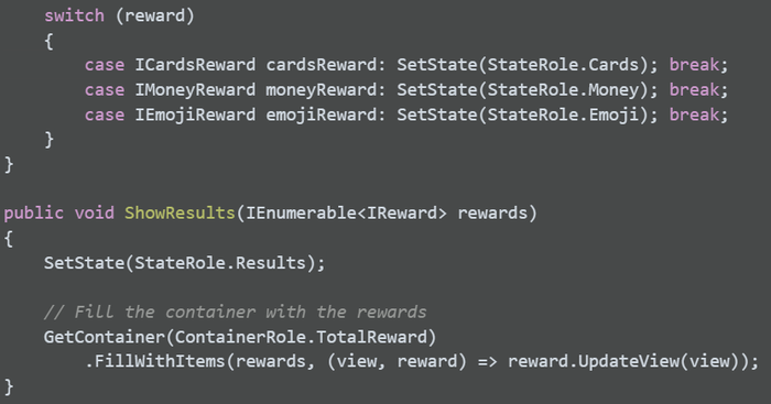
Managing a configured StatefulComponent comes down to a minimal amount of simple and understandable code that populates the components with necessary data and switches states at the right moment:
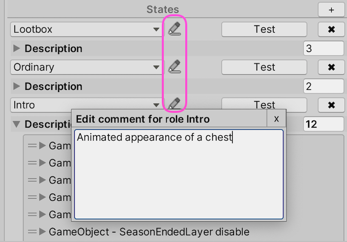
Roles are intended to provide a convenient and unambiguous way to name links and states for later use in the code. However, there are situations where describing a state would require a name that is too long, and it would be more convenient to leave a small comment about what this link points to, or what behavior the state reflects. For such cases, each link and state in a StatefulComponent allows you to add a description:
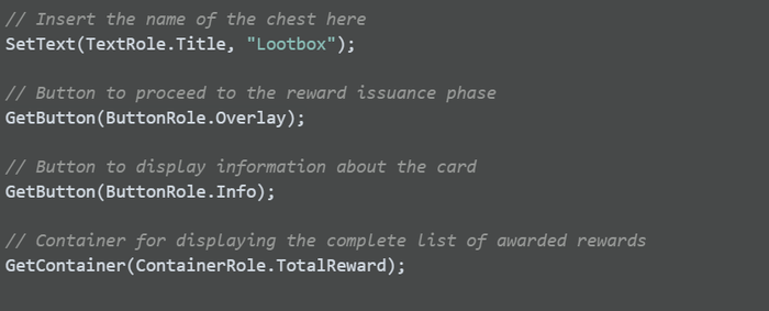
You may have already noticed the Copy API and Copy Docs buttons on each tab — these copy information for the selected section. In addition to those, there are similar buttons in the Tools tab — these copy information for all sections at once. When you click the Copy API button, the generated code for managing this StatfulComponent object will be copied to the clipboard. Here's an example for our rewards window:

When you click the Copy Docs button, the documentation for this prefab will be copied to the clipboard in Markdown format:
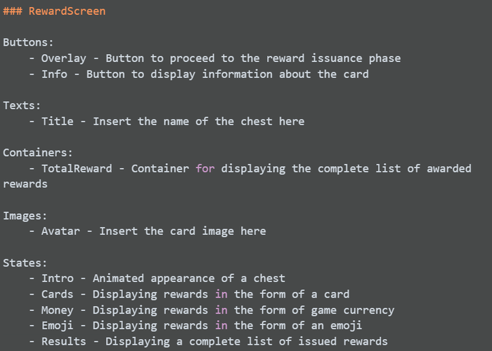
It's obvious that making a mistake when implementing this screen with such detailed instructions is quite difficult. You can easily maintain up-to-date information about your UI organization in the project's knowledge base.
At the same time, Stateful UI allows for delegating the creation of UI prefabs. In fact, state-based markup allows for fully testing the prefab's behavior before passing it on to programmers. This means that game designers, technical designers, or even separate UI developers can prepare prefabs. Furthermore, since an API is created between the code and prefab, programming and configuring prefabs can be done in parallel! All that is required is to formulate the API in advance. But, even if the task of configuring prefabs remains with programmers, using Stateful UI significantly speeds up this work.
As we have seen, Stateful UI significantly simplifies working with UI element states. Long cycles are no longer needed to create SerializeFields, recompile code, and search for references amongst a huge number of View class fields. In the View classes themselves, it's no longer necessary to write a large amount of code for repetitive operations such as turning objects on and off or changing text color.
The library allows for a consistent approach to organizing layouts in a project, marking objects within prefabs, creating states, linking them to UI elements, and providing an API and documentation for UI management. It also allows for delegating the creation of UI prefabs and speeds up work with them.
Expanding the capabilities of States, supporting new types of UI changes in Description, such as new types of animations, playing sounds in states, and so on
Adding support for color palettes for coloring text and images
Adding support for lists of items with GameObjects reuse
Supporting a larger number of Unity UI elements
Automating the unloading of added texts for localization
Implementing a Test Framework. Since we have exhaustive markup of our prefabs, we can create easy-to-set-up ScriptableObject-based scenarios in the following format:
Click the ButtonRole.Settings button
Check the text in TextRole.SomeText to be equal to "some value"
Check the image in ImageRole.SomeImage to ensure it is equal to a certain sprite
A tutorial system. Similarly to testing, the marked layout allows creating ScriptableObject-based tutorial scenarios in the form of instructions like "Show pointer on the button ButtonRole.UpgradeHero".
The project source code is available on GitHub. You're welcome to create issues or contribute to the library!
Read more about:
Featured BlogsYou May Also Like