Trending
Opinion: How will Project 2025 impact game developers?
The Heritage Foundation's manifesto for the possible next administration could do great harm to many, including large portions of the game development community.

Featured Blog | This community-written post highlights the best of what the game industry has to offer. Read more like it on the Game Developer Blogs or learn how to Submit Your Own Blog Post
After reading "The Long Tail" by Chris Anderson, I realized a few things about being part of an indie team trying to make a name for ourselves on the various app stores. Mostly it sucks, but it could suck a lot less.

"The Long Tail" by Chris Anderson (of Wired fame) is a book about marketplaces and power-law distributions. The basic concept is that when you can't stock a lot of variety (like at a mom-and-pop video store), you depend on hits (products that are very popular). When you are able to stock a lot of variety (like Netflix), not only are you able to offer niche products, but having them increases your overall business, even if you excluded the hits.
While reading, I couldn't help but think of the iOS app store, and the place occupied by my studio, and many others, somewhere along the long tail. Anderson points out that having variety works for the retailers, because consumers seem to be more willing to buy things which match their taste more precisely. He says it also benefits creators because your work could potentially be listed alongside the hits.
As far as I can tell, that benefit only kicks in when the marketplace has highly visible recommendations. Genius for Apps has been sidelined with an opt-in flow which makes it essentially irrelevant. That means that the only ways users have of matching their taste is with the games section's sub-categories, and word-of-mouth/press. Word-of-mouth only goes so far with a digital marketplace scattered actross meatspace, and only enthusiasts consult the games press (games almost never get covered in the mainstream press). This means that instead of 1 list of the top-20 hits, we have 19 of them. A little better, maybe, but nowhere near ideal.
People like to call the resulting difficulties "the discoverability problem." With no in-store experiences besides the top-20 lists and random app store search results (which have their own problems), people begin to get the impression that everything below the, for example, top 100 is crap. Well, crap is in the eye of the beholder (hopefully not literally), so how can the app store hope to supply enough selection for each user? How can Apple/Google take advantage of the long-tail economics, instead of acting as if they have limited shelf space?
Enter services with recommendation engines as first-class citizens, like Netflix or Amazon. There's no opt-in process, it's just part of the service. It's there on the front page when you log in, and after you buy something. It's this kind of filtering that benefits producers and consumers. Producers can compete within the relevant microgenres, instead of everybody competing with angry birds, and consumers get their tastes catered to precisely.
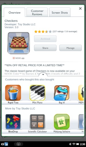
Consider the Nook app marketplace. A normal app market in every respect, except this is what you see after you buy a game:
Nook app store post-purchase

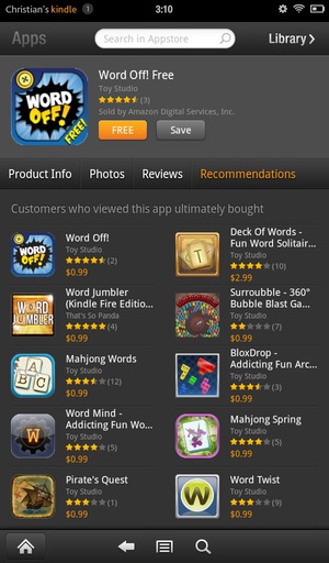
Kindle app store browsing
Thanks to Ryan Olsen for reading drafts of this.
UPDATE: Google Play just added recommendations!: http://www.droid-life.com/2012/08/30/recommended-for-you-section-appears-in-google-play-store/
Read more about:
Featured BlogsYou May Also Like