Trending
Opinion: How will Project 2025 impact game developers?
The Heritage Foundation's manifesto for the possible next administration could do great harm to many, including large portions of the game development community.

Featured Blog | This community-written post highlights the best of what the game industry has to offer. Read more like it on the Game Developer Blogs or learn how to Submit Your Own Blog Post
I'd like to tell you about the main issues about creating a game which fits a business card, and the solutions.


I needed a business card.
Soon after booking my tickets to EGX Rezzed I realized there were only a few old cards left. While I could just print more of those, they felt outdated. They were made three years ago and they represent a very different phase of my life.
It was not the first time I had poked around the idea of handing out a game as a business card. I remember checking the prices for printing Carousel to give at events, but the printers would only accept orders of large quantities and that made it very expensive and cumbersome to carry around. Worse of all, if it was cumbersome to the person I was handing it to, that would have ruined that first impression.
I wanted a simple game, which would not take long to learn but dynamic enough to provide different playthroughs. I wanted to prove it was possible.
The following were the main design issues, and how I solved them:
What will the players play with? Can the game be in the card itself? Sure, it could be a crossword puzzle which would reveal one of my contacts when complete, but that wouldn’t be that original and, frankly, it could turn out boring. It would also require some work from the person, and I didn’t want to create an obstacle.
Then I thought of using coins, but this idea was short lived. Even if they were used as tokens, I didn’t want money to be a part of this. Also, it would be too easy for the player’s coins to get mixed, and that could lead to heated arguments.
Then it dawned on me. Business cards! Just like me, the other developers will be networking. Some might be looking for publishers or teammates, and they will be handing out their cards to promote themselves and their games.
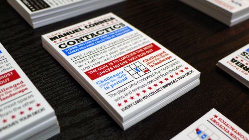
My card only needed to provide the rules for you to play, and the cards you collected would form your deck. It fits the networking theme. Better yet, if the winner got one card from the player, it can even facilitate it!
I couldn’t expect each player’s deck to have a unique look, so I used the card’s orientation to define that. One player pays their card in portrait and the other in landscape.

The cards can have so many shapes and sizes but I had to find a way to make them all fit. My solution was to create a system which would filter them into categories. You go down a list of features and you stop once one matches. Each category would have its own special property, which would take effect when you played it.
Initially I had a lot of categories, but I realized it could be really boring to go through the list, especially when learning how to play. The size of the card was also a factor which contributed to having only three (and an “other” category for unpredictable ones that don’t fit the list).
I couldn’t really predict the shapes and features of cards people would be handing out. I made a rough estimate by looking back at the cards I had been given at such events and from print shop prices. Even if these estimates were right, I had absolutely no way to predict which ones the people would have with them at the moment, so I left that open.
This turned out to be a good decision, because that brought deck building to the game! It gave the reward some appeal, and a great excuse to play more than once as your deck improves.
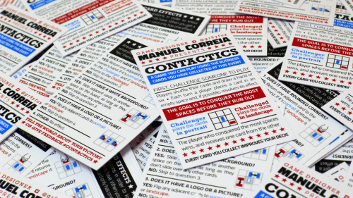
I wrote the rules down and instantly noticed they were a lot longer than I could fit on a card. I started searching out for alternatives (like foldable cards, which would give me four faces instead of two), but Sara Mena quickly mocked up a couple layouts which proved me it was possible. I then simplified the text and used icons to convey mechanics, making it more appealing.
This card represents what I like to do the most, and it was built around a solid core concept: More than just having ideas, I can develop them, use the limitations in place and work with what you have.
It’s exactly the first impression I wanted to convey!
Read more about:
Featured BlogsYou May Also Like