Trending
Opinion: How will Project 2025 impact game developers?
The Heritage Foundation's manifesto for the possible next administration could do great harm to many, including large portions of the game development community.
A 'One Page' is one paper long document which shows the main features of our project and will let us to stand out from the competence. Lets find out how to design one of these!

First of all, I would to explain that a ‘One Page’ is a document which shows the main features of our project in a brief, attractive and effective way.
On regular basis, this document is send or hanged to a publisher or investor who needs to know at-a-glance about the USP’s (Unique Selling Points) of our project. So we want to stand out and keep it simple to send a clear idea about the game, adding as content the essential information:
Concept: the sentence which explain the game/product brieftly.
Product info.: game genre, platform and target audience should appear here.
Summary: a more in-depth info about the plot and the objetives in the game.
Outline: it explains a bit more about the concept and dynamic of the game.
USP’s (Unique Selling Points): the main points which make our game different from the competition.
Content should be always composed of, at least, the concept, product info. and USP’s, but One Page responds to yours needs to communicate something. It is not always the same formula. Feel free to configurate it as you want, as long as it feels more efficient to communicate to your audicence.
This is about the content. But, what about the form? The form is nearly as much important as what we want to say. Our audience, investors and publishers, have no time for dozens of One Page that stack up in their email or several pitches that the have to heard along the day. Our objetive has no changed at all; we have to communicate our project effectively, so we should do it:
Brief: One Page needs to provide a quick and clear idea about the game in a page long. This does not mean that we should accumulate tons of info in one sheet. Better we be…
Clean and ordered. Readers’ eyes should travel easily inside the document, so consider carefully how you organize the pieces in the layout. We better respect the margins, spaces among paragraphs and lines. Here it is basic to transmit our ideas with an strong…
Visual Identity. Last but not least, this frame it is a great opportunity to stand out and leave a mark in the audience. Logo, screens and other art pieces should inform about our game, their values, its style and reinforce our message. All these will lead the reader to remember the project.
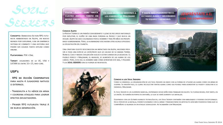
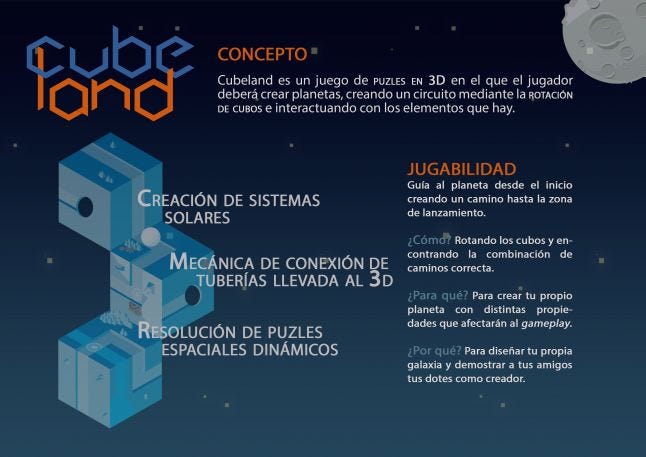
Here I provide you some examples of One Page documents made by myself. These cover the points we talked about some lines above, but they do not have the same content since they are different One Pages for different situations.

one-page-of-souls-seekers-no-rights

.jpg/?width=646&auto=webp&quality=80&disable=upscale)
For example, the first one was due to be send to a publisher, which means that I can write down more info. since someone will read it (or not!) in the comfort of his office or home. Second and third were supposed to be hanged out during a pitch, so they are more brief than the first one, since I will complement the One Page information with the talk.
The take here is that we have to adapt the One Page to the audience and its circunstances. It is not the same if our audience is composed of game designers that if only came to the pitch some investors. The former will expect a in-depth info. about the game and the latter will be OK with some high level info and what makes the game stands out from competence.
Finally, I am going to share some tips more:
Know your audience: do some research and learn about them. This will help you to know how they think and put into their shoes. Here you will chose the right approach to present your main idea.
Present a main and clear idea. Knowing who we are talking to will allow us to create a message more efficient to sell our game. Build the One Page around that idea and make the art pieces so as to support the theme (as you can see, in the second and third examples that I provided, both One Pages are themed with space and industrial motives, respectively).
Make it shine! One Page is pure marketing since its very purpose is to sell an idea. Use all kind of resources to make more appealing the message. I.e.: use laminated paper so as to be more durable and eye-catching; stands out the more relevant elements with glowing, for example.
They want to know more. Here business card has more use but, what if someone interested has lost it? Or maybe you do not have one yet! Let them come back to you again by adding a QR code to game’s site or a corporative email.
Register it. If you want to own your idea, make sure that you have registered everything and add some reference to it in the document. It could work fine a Creative Commons license just to prove it is yours.
Use your own stuff. Generates more value and the approach to the final idea is more convincing. If you cannot, avoid using registered material and get public domain photos.
Iterate. Get one first version; verify everything is OK. Ask for someone’s opinion and go over it again with possible improvements. Repeat this until your are satisfied with the result and it is fully understandable for your next reader.
I encourage you to check some more examples as this one taken from ‘Level Up!: The Guide to Great Video Game Design’ (a great book for learn game design, indeed) or this talk from GDC 2010 which I came up at the same time I wrote the article.
Please, feel free to share below any thoughts about the article. If you want to visit my site just click here. More interesting stuff coming out soon!
Read more about:
BlogsYou May Also Like