Trending
Opinion: How will Project 2025 impact game developers?
The Heritage Foundation's manifesto for the possible next administration could do great harm to many, including large portions of the game development community.
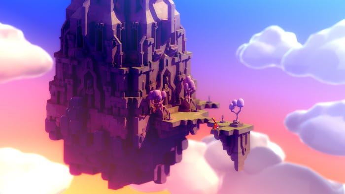
TUNIC follows a heroic fox on a grand adventure, where they will have to unravel an unknown world though a quirky in-game manual.

This interview is part of our Road to the IGF series. The IGF (Independent Games Festival) aims to encourage innovation in game development and to recognize independent game developers advancing the medium. Every year, Game Developer sits down with the finalists for the IGF ahead of GDC to explore the themes, design decisions, and tools behind each entry.
TUNIC follows a heroic fox on a grand adventure—one where they will have to unravel an unknown world though a quirky in-game manual.
Game Developer had a chat with Andrew Shouldice, the Primary Developer for the Seumas McNally and Excellence in Audio-nominated experience, to discuss how they worked to create a sense of exploring a world that you didn't understand, how lighting work would be one of the first details that really captured the game's emotional feel, and how the developer's childhood difficulties reading NES game manuals would lead to this wonderful journey.
Who are you, and what was your role in developing TUNIC?
I’m Andrew Shouldice, and I was the primary developer on TUNIC. I started the project in 2015 as Secret Legend and handled the majority of the design, programming, art, and animation.
What's your background in making games?
I’ve been making video games since I found out our family 386 had something called QBASIC on it, and I had been making non-video games before that. I’ve participated in a handful of jams like Ludum Dare and Train Jam, and worked at a casual games studio before starting work on TUNIC.

How did you come up with the concept for TUNIC?
The game evolved a lot over development, but the core idea centered around evoking a specific feeling: that of exploring a world you don’t understand—one full of systems and secrets that weren’t meant for you.
What development tools were used to build your games?
TUNIC was made with Unity, Blender, Adobe Photoshop, and various other tools. A plugin for Unity called Probuilder was used to make the simple, large-scale geometry of the world.
What interested you about exploring classic action adventure games? What drew you to recapture that feeling? What thoughts went into making it your own?
That feeling of exploration I mentioned is something precious for me. Being small but brave, and having a wide world full of treasure and mystery—it’s exciting and wonderful. I spent a lot of time thinking about that feeling and what things evoked it for me.
In retrospect, I think that was a valuable approach—trying to analyze and understand the desired emotional response, instead of trying to accurately recreate the visuals or structure of games that had inspired them.
The game world largely uses a language the player cannot understand. What interested you about doing this? What do you feel it added to the experience of exploring your world?
A key part of feeling like a world isn’t made for you is feeling like it was made for someone else. When I was little and I tried to read the instruction manuals for NES games the older kids were playing, it was clear that they weren't meant for me. They were complex and inscrutable—full of words I didn’t understand. There were illustrations of monsters and treasures I would never see in-game. It was entrancing.
It was kind of the perfect brain fuel: the cartridge needed to contain a functioning game, both technically and design-wise, but once you get past the FCC emission warnings and info about how to insert the cart, those classic manuals were free to be vague and evocative.
The hope was that filling the world with unreadable text would help convey this same feeling. The glyphs aren’t just in the manual, but extend into the game world, and even the UI. By removing one of the player’s most valuable tools, I hoped to help them feel a little adrift, and to let their imagination fill in the gaps.

What thoughts went into the visual design of the instruction manual?
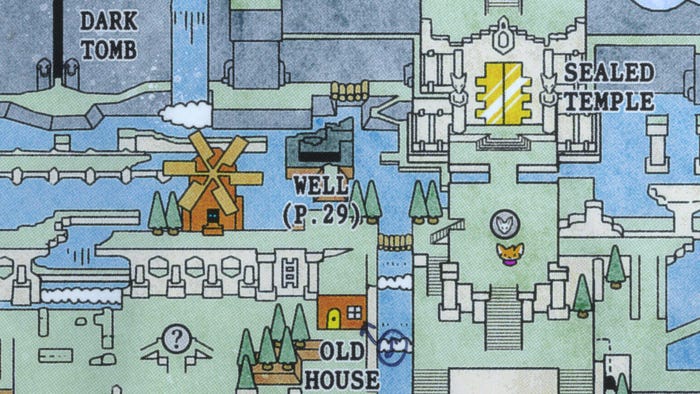
I pored over a fair number of instruction manuals to try to nail down a visual style. The first attempts were fairly direct emulations of classic booklets like the one for The Legend of Zelda. Although I love classic NES manuals like this, it wasn’t quite right; there wasn’t quite enough compositional detail. Final Fantasy’s Explorer’s Handbook has a lot of dense visuals but didn’t have the texture and line weight I was looking for. In the end—like most things—it took a lot of experimentation and iteration to land in a place I was happy with.
Players are exploring not just the world, but what they're capable of, mechanically. How did you work to create a sense of discovery with the player's capabilities? How did you weave hints into the world and actions to guide players without directly telling them?
The manual definitely helped a lot here. A full-screen tutorial popup feels deeply invasive and can ruin any sense of wonder, but getting to study a mysterious page feels like mystery-solving. Balancing gentle hints and more obvious direct communication depended mostly on how critical a mechanic was. Learning how to run? Not mega important: we could get away with only using a couple small references in the book. Essential techniques? Those got a full page, often with English/localized text to really drive the point home.
Another thing I found valuable was trusting the player. People like to experiment and love when they make discoveries via that experimentation. Giving the player space to explore—not just geographically, but mechanically—means that they are (I think!) more likely to internalize and "own" their discoveries and make use of them, compared to having the information presented more explicitly.
What drew you to work with Lifeformed for the game? How did their audio style suit what you were creating?
While first thinking about the ideas that would eventually become TUNIC, I spent a lot of time listening to the album Immerse by Lifeformed. It filled my head with ideas of exploration and discovery, and its synth-but-not-retro palette evoked a dreamy wonder in me that I still cherish. I would work on the game while listening to it, and eventually reached out to Terence Lee with a rough prototype asking if he’d be interested in working together.

What thoughts went into the music and sound effect design of the game? How did they work to further connect the player to TUNIC?
Audio Director Kevin Regamey and composers Terence Lee and Janice Kwan worked together to build a soundscape that gives TUNIC its soul. (I was mostly hands-off with this.) I feel privileged to have worked with such world-class artists who really understood the emotional target of the game.
What appealed to you about the visual style for the game? What made this look feel right for it?
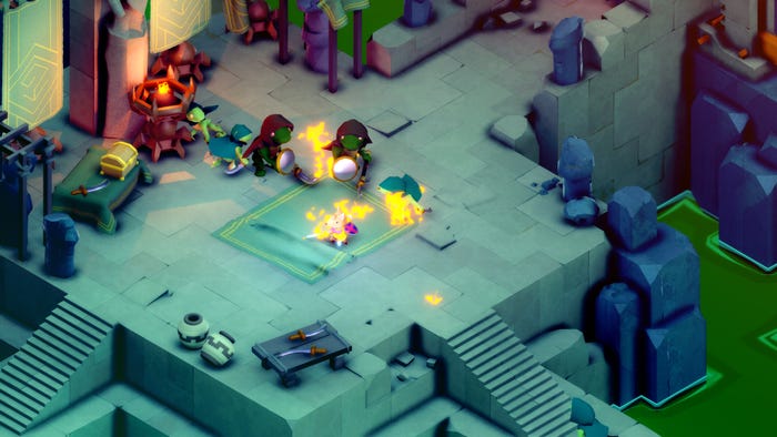
When I started work on the game, I wanted to aggressively limit the visual style. No textures; extremely low poly; highly cubist. The result was a simplicity that was really appealing to me—an honesty of form that made things immediately parse-able. However, it was limiting. As the game developed, it became clear that it was about a ruined world, and that the restricted style wasn’t quite able to capture that. It was hard to combine damaged and crumbling architecture with utterly austere surfaces; the balance of visual density was getting thrown way off.
So, detail slowly got added: Noise, ambient occlusion, and eventually fully hand-authored texture work. Striking a balance was challenging. Too much detail and it lost the low-resolution appeal—too little and it looked unfinished. It sometimes came down to agonizing between 9% and 10% opacity on a Photoshop layer.
TUNIC makes incredible use of light to establish feelings of mystery, danger, and tranquility. Can you tell us a bit about the choices and design ideas that went into working light into your world?
Long before development started, the very first noodling that would grow into TUNIC was with lighting. Realtime simulation of bounced light was something new to me at the time, and I loved the way it looked: the gentle glow from nearby surfaces would make something look simultaneously dreamy and more physically real. With some color correction to add richness to shadows and draw out detail, and a gentle screenspace gradient of additive glow to set the mood, I knew I had something I wanted to turn into a real game.
Read more about:
[EDITORIAL] Road to IGF 2023You May Also Like