Trending
Opinion: How will Project 2025 impact game developers?
The Heritage Foundation's manifesto for the possible next administration could do great harm to many, including large portions of the game development community.
Jon Ingold, the narrative director and co-founder of inkle, discusses the iterative process of turning Steve Jackson's beloved Sorcery! gamebooks into a series of well-received video games.

Jon Ingold is the narrative director and co-founder, with Joseph Humfrey, of inkle. They’re best known for IGF-winning 80 Days and the open-sourced scripting language ink. Jon was previously a lead designer at SCEE, and a writer and parser-based interactive fiction author.
Developer: inkle / Steve Jackson
Publisher: inkle
Initial Release Date: May 2, 2013
Platforms: iOS, Android, Steam
Number of Developers: 2 core people, 2 additional contributors, and 4 art / music contractors
Length of Development: 4 games over 4 years
Budget: ~ £10k / title, not including our own salaries
Lines of Code: Just over 60k significant lines of code (non-whitespace)
Development Tools: Xcode, Objective-C, ink
Downloads across the series so far: >1.5 million
About five years ago, Joe and I sat down in a West London pub with Steve Jackson, co-founder of Games Workshop and Lionhead, and co-creator of Fighting Fantasy (and a personal game-design hero of mine). We were showing him our early prototype of an “inklebook” -- an iPad-based choice-driven story made of “pages” which stitched together into a single flow via frequent choice points.
It was a lovely UI for a choice-based game, even in prototype form, and we had a strong scripting language underneath it -- the first version of ink. Steve listened, nodded, and told us to come back when we’d sold ten thousand copies.
A year later, after the release of Dave Morris’ Frankenstein, we met Steve again. The timing was perfect: the Sorcery! license, previously with another developer, had just become available.
We promised him the world: a full adaptation, with graphics and sound; a slick, Apple-friendly UI; dynamic characterization of the player character; strategic combat narrated in natural prose which would write “as well as David Gemmell”; a map with day-night cycle effects; an intuitive yet powerful gesture-based spellcasting system. Then we set about adapting Part 1, which was released in May 2013.
Not all of our initial promises came to pass: over the course of four years and four games, we iterated, throwing things away and developing in new directions. Overall, however, we grew in ambition, complexity and scope.
It’s a little tricky writing a retrospective of a four-game series. We’ve changed things from game to game, and we’ve been steadily back-porting features and fixes into the earlier games. The first game is much better now than it was on release. But here are five things that went well -- and went well four times over; and five things that went badly, that we never managed to resolve.
.jpg/?width=646&auto=webp&quality=80&disable=upscale)
When we first approached Steve, he took a chance on us. We talked a good game, I think, but we didn’t have that much to back it up with. He talked through a lot of our ideas with us before we started, but then he took a step back and let us get on with development. He didn’t micro-manage, he didn’t hassle us for updates or explanations of every decision we took.
He waited for the first, early build, and then gave us some considered feedback, but otherwise, he let us do what we needed to do. He put an enormous amount of trust in us to handle his IP -- and his fanbase! -- with the care and respect they deserved.
.jpg/?width=646&auto=webp&quality=80&disable=upscale)
Me and Steve in Steve’s library, holding a copy of the printed Spellbook.
For the first release, we played it safe. Part 1 is a tight adaptation of the original book, only expanding on hints dropped by the book and largely keeping the original prose, albeit expanded upon.
All the same, we were terrified: would the fan-base declare our version a heresy? Steve had agreed that we needed to remove dice-based combat, but would the fans feel that was a change too far? And our version had small choices every 100 words or so; many, many more than the book had -- but some were mere flavor. Would people find it a chore to play?
Thankfully, the response was overwhelmingly positive, and that fan support allowed us to start taking more risks, opening up and reshuffling events in Part 2, and then exploding the world entirely in Part 3, where we created two overlapping time periods and distributed the original content between them.
Both Steve and the fans got happier and happier. Here’s was a world and an adventure they loved 30 years ago, and it wasn’t just being repeated, it was being rejuvenated. It was being made into something they could get some kudos for knowing about. At least, we hoped that was how they felt!
As a Sorcery! gamebook fan myself (my first ever computer game was an adaptation of Part 4 begun when I was eleven, which I quickly abandoned when I realized I was going to have to type the whole thing in), it was that sense of making a great thing great again that made me excited to be working on the series.
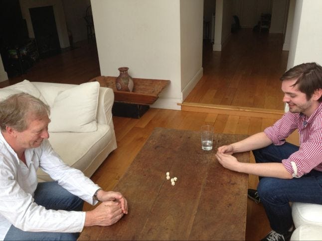
Steve and Joe testing Swindlestones
At inkle’s 3rd birthday party, somewhere between the launch of Part 2 and Part 3, Steve came and brought with him a signed first edition of the Shamutanti Hills, one of two from his study. At the moment, it’s sitting in pride of place next to 80 Days’ IGF award.
The single best design decision we took was “the map.” It began as a purely visual thing. We were thinking of the maps one sees at the start of fantasy novels, which offer a world to explore and discover, but which are ultimately disappointing, when the places marked never show up in the book. What if you could visit any of them? What if they all had stories to tell?
But the map has proved to be more than eye-candy. It is our progress meter, showing how far along you are. It is our proof of branching and consequence: we don’t need “the game will remember that,” since you can see that by taking the river, you’ve avoided the village.
It’s our strategic layer: where were you heading? What risks will you take to get there?
It’s our checkpoint system: to revert the game to a previous point, you simply rewind along the line of your journey.
Finally, it’s your end-of-game achievement: you can look back, and see how far you’ve come.
.jpg/?width=600&auto=webp&quality=80&disable=upscale)
The city of Kharé, with the player’s route marked out by markers.
The map became the heart and soul of the game, and as we adapted we used it more and more, moving as much choice as possible from the story layer to the map layer, and adding additional interior maps to buildings, so players could explore room-by-room.
Then in Part 3, we took the leap that truly puts the map first, by going open-world and throwing away the gamebook’s ‘always forwards’ structure. From Part 3 onwards, players could go anywhere they liked, by any route, and we were even able to add in direct map-manipulation gameplay, allowing the player to remix the landscape itself before setting off to explore what they’d made.
There are quite a few mechanics in Sorcery!, from the combat system, which is a mixture of rock-paper-scissors and the Prisoner’s Dilemma, to the gentle memorization required for spellcasting, to the spirit animal Gods that reflect your character. But none compare to the map. The map is what turned Sorcery! from a gamebook into a game.
As a small studio -- two people when we started the series -- we live and die by those who fill the gaps we can’t cover. Obviously, there was Steve providing the original game concepts, the world and its curious semi-humorous, semi-dark tone, and a whole lot of words. There was also John Blanche, whose bizarre, idiosyncratic original illustrations pop-up throughout the game, delighting old-school players who recognize every image.
But we’ve also been lucky enough to bring in some excellent people of our own, who’ve all left their mark.
First up was Eddie Sharam, who did the character art, and was given the unenviable challenge of bringing some of Blanche’s maniacal original characters to life, such as the Sightmaster:
.jpg/?width=646&auto=webp&quality=80&disable=upscale)
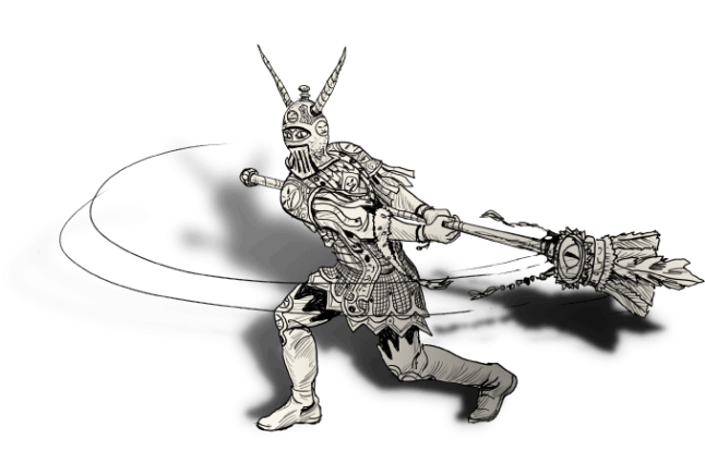
John Blanche’s Sightmaster, and Eddie’s version mid-combat.
Then there was Graham Robertson, whom we brought in to write a few sequences for Part 3 and liked so much that he wrote a good two-thirds of the basic content for Part 4. Graham worked remotely, and taught himself the darkest gizzards of ink scripting in order to write for the game’s open-world ad-hoc layout, while at the same time mastering the Jackson prose style and coming up with a few original scenarios that are the creepiest and/or funniest in the game. Should you find yourself worshipping a whale-head, being entranced by cats, or breaking a poor Goblin’s heart, you will have Graham to thank.
Iain Merrick, an ex-Googler and a very talented coder indeed, handled the Android and desktop porting, and has been doing technical buffing on all platforms ever since. Every now and then Joe and I peer at an aspect of the game -- most recently the swirling clouds in the prologue sequence -- and remark, “Has that got better somehow? Has Iain done something?” Perhaps he has, perhaps he hasn’t, but at this point we’re convinced enough to give him credit for pretty much anything.
But the special mention has to be for Mike Schley, our cartographer. (He does illustrations in general, but maps are one of his specialties.) Mike was an incredible collaborator across the series. His work defines the game’s core visuals: when you think of Sorcery!, you think of the map, and Mike’s work in bringing our world to life.
To give an example of what he did for us, here’s the Sorcery! 3 draft map we gave him (along with copious notes):
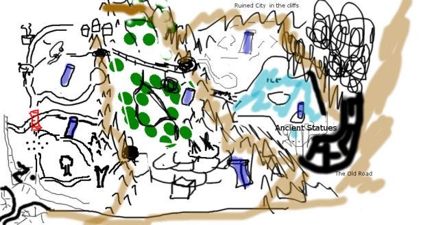
Our sketch map for the wilds of Kakhabad...
And here’s what he sent back:
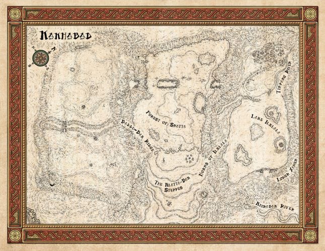
… and Mike’s version of the same.
“Post-Mike” became a phase of the writing, in between “first pass” and “beta”. We’d write the game, sketch out the map, get Mike’s version -- and then go back through, filling in all the interesting extra locations he’d invented along the way. Post-Mike was when, for example, we decided to let the player explore the more interesting-looking buildings of Kharé, take the shortcut alleyways he’d added, and visit the additional rooms he’d included in the building interiors.
Our final hire was composer Laurence Chapman, who wrote the tremendous theme for 80 Days. We brought him back to do themes for Sorcery!, including the parts we’d already shipped. We think the results are magnificent.
When we launched Part 1, the most common question (after “Android?”) was “Why didn’t you make the episodes available by in-app purchase?”
At the time, IAPs were new and exciting; people were just catching on to their potential to generate earnings on mobile. But it wasn’t widely understood at the time that IAPs work best for repeated transactions within repetitive game environments, rather than one-off episode purchases in non-repetitive narrative games.
We were worried that IAPs would “cheapen” the later episodes by implying they were “more of the same”, rather than delivering new, bigger and better adventures, and they’d limit our ability to on-board new players directly into the later episodes.
Looking back, this was something of a life-saving decision. As the games got more complex, they took longer to make, and so the chances of people still having Part 1 on their phones plummeted. Had we delivered our games via IAP, I don’t think anyone would have had the Sorcery! app at hand by the time Part 4 appeared, four years later -- and if they’d played and deleted, there’s no way we would have been able to get them to play through again to get back to where they were!
The IAP route would have stifled our visibility too. When Part 3 came out, it was the first in the series to net an Editor’s Choice slot on the App Store. That opportunity came about because Part 3 showcased new touch-screen-friendly mechanics. That slot would have been harder to secure for a simple content update.
Lastly, by the time we came to Steam and Android, promoting separate games gave us the opportunities to make the most of bundle releases, which is a core revenue stream for small studios.
That said, when we came to Steam, we did bundle up Parts 1 and 2 together into a single release, because we felt that Part 1 was no longer a great standalone experience, but more of a quick intro to the game mechanics -- a solid tutorial level -- and it needed something with more content to make it feel worthwhile. We’ve been pretty happy with that decision too.
That said, messaging how the series works has remained difficult. Saying it’s the Mass Effect model has helped, but that doesn’t always convey quite how much is carried over from part to part, or how much will play differently if you don’t load from a previous game.
Playing through from Part 1 to Part 4 should be a single, continuous, seamless adventure, with a steadily ramping difficulty curve; whereas picking up Part 4 on its own provides tutorial content, easier enemies, more liberal items and information -- but misses out on several big plot threads that rely on choices in previous installments. That definitely isn’t the Mass Effect model -- but there’s no good name for what it is!
When we began the company, our sole target platform was iOS. At the time, Apple was a clear market leader in terms of revenue, exposure and opportunity, and as a micro-studio we knew we needed focus. However, once Part 1 came out to good reviews we began to consider the options for porting to Android.
The “simplest” route would have been simply to rewrite the code-base, either in Unity or Java. But we were reluctant to undertake this: we knew that each successive game would bring with it new code, fixes to old code, and new features. We didn’t want to be maintaining several code-bases simultaneously.
Enter Apportable -- a company who offered the ability to compile Objective-C code onto Android devices. It sounded like magic, but like all magic, it was in fact simple hard graft. Software written in Xcode sits on top of a set of Apple-provided libraries, and the team at the company has rewritten a sizeable chunk of Apple’s UI Kit libraries in Java, so the same Objective-C code could run the same API calls on a different device.
We tried it out -- and it sort of worked. The idea was sound, but the parts of the Apple codebase they’d ported solidly weren’t the parts we really needed, and other parts we leant on weren’t there. It wasn’t good enough for us to ship the game with… but it was good enough for us to believe we could do the same thing ourselves.
It was Iain who undertook the significant technical challenge of replicating Apple’s beautiful UI-systems from scratch. After six months of silence, he proudly showed us a Nexus tablet running the intro screen of Sorcery. The text was rendering upside down, and when the clouds of the prologue screen loaded, they ran at about a frame a second. Still, it was working.
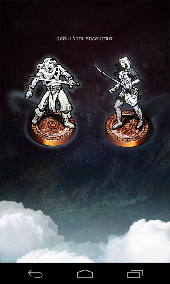
An early build of the Android version of the game.
A few more months, and we were down to tweaks and niceties. The whole process of porting Sorcery! 1 took around a year, but the payoff was fantastic: porting Sorcery! 2 took just a couple of months, just fixing up the new features, and Sorcery! 3 similar. Even better, when we fixed any bugs in any of the games, the fixes propagated into all versions of the game with a minimum of fuss.
But the real win here didn’t strike us for nearly a year more, when apropos of nothing we suddenly realized that the Java implementation we were using on Android would also run perfectly well on a desktop computer. Iain set about creating a Steam version of the game, and a few months later, we had it up and running.
Without the initial investment into cross-platform compilation, it’s likely that the Android and Steam builds simply would never have happened, or they would have been buggy and hard to maintain. As it is, however, we’re launching Sorcery! 4 simultaneously cross-platform -- without expanding our technical team, and without limiting ourselves creatively.
The original Sorcery! series was memorable among gamebook fans for its mechanics, but also for its unusual aesthetic. Inspired by hiking in Nepal, Steve Jackson blended an eastern flavor with the more traditional Tolkienesque tone of classic D&D to create something which felt recognizable but quite different. For our adaptation we wanted to draw out that eastern flavor, to try create a world that felt new, and unknown, and hence would be worth exploring. .png/?width=646&auto=webp&quality=80&disable=upscale)
Our initial mood outline document
We aimed for this in the visual style, for instance, by using prayer flags for the UI. For the music, we wanted some eastern instrumentation, and when Laurence Chapman wrote his first Sorcery! Theme for Part 3 we took the Crouching Tiger, Hidden Dragon soundtrack as a reference point. We even used a few Tibetan glyphs in the spell-casting system.
But somehow the whole package never quite came together. The map itself was a particular problem. It was difficult to avoid a stock fantasy feel -- a font here, and a glyph there wasn’t enough to capture a true sense of “otherness,” and though Mike added lots of details -- things like curved roof-tips in the city map of Kharé inspired by those on Chinese buildings -- the parts didn’t add up to a coherent whole.
Our original idea had been to use a more unusual color palette, and perhaps even a more abstract presentation akin to the landscapes seen on a Japanese scroll -- but these fought against the functionality and clarity of simply presenting the map as a map.
And of course once Part 1 was out, the style was set in stone, for better or for worse. Looking back now it seems quite heavy in places. Sorcery! was released at the same time as iOS 6, when skeuomorphism was still classy, and so our emphasis was on detailed material textures. Four years later that look hasn’t aged especially well.
The main positive from this was that the sense of a missed opportunity galvanized us to really do something different for 80 Days, and inspired a long visual design process that ended with that game’s highly-stylized-yet-elegant look and feel.
Our original idea for spellcasting was to make something that let the player feel empowered and magical -- something that allowed them to reach down into the game and do something to twist the narrative, change the story on a whim. We imagined some kind of gesture-based spellcasting that would have players learning glyphs for the spells, which they could apply at will…
It was a terrible design, that never made it past the discussion phase. How would the player know what gesture to make? Were there enough gestures to cover fifty spells? How would they know when a gesture would work? If they could cast any spell, any time, wouldn’t they just ZAP (lightning bolt) everything in sight all the time? How could we do more interesting narrative moments with magic if we had to cover *every* possible moment of casting?
What we did instead was closer to the original gamebook -- offering a choice from five or six spells at prescribed moments in the story. The allocation of spells is arbitrary -- there’s some narrative gloss about constellations and suchlike, but the reality is that we offer spells we think players might want to cast, or that they haven’t used for a while, or that might do interesting things in the current circumstance.
Ultimately, this was a good decision -- it gave us a stable set-up, and meant we could put in a lot of spells, and a lot of easter eggs, secret paths and jokes built around casting the more unusual spells. (Using “talk to animals” on attacking monsters is always fun, for instance.) But it meant the spells never felt quite natural; they didn’t integrate into the game as seamlessly as the map layer, or the combat system.
And the interface still took us a while to get right. In the first release of the game, spellcasting was done by lining up letters “underneath” the story, through holes in the paper on which the story was written. It was a nice visual effect, but was fiddly to use, and there was no space on the screen to add any tutorial text or contextual information. Players had to remember which spell was which, and what items were needed to cast them. Those were the rules in the old gamebook, but of course back then people cheated a lot -- for a computer game, it was simply too strict.
When we made Part 2. we revised this to the current “spell globe” system, which is basically just a pretty touch-based keyboard. We provide UI highlights to help players find spells by experimentation, and then we tell people what the spell they’ve found does, and what item it requires. Players never need open the spellbook at all and can just skim through different spells. But then, should it just be a list of choices?
I feel like we never quite hit the “best” spellcasting design. What we have is fun enough, and it’s still satisfying to cast a spell and watch its effects turn the story upside down. But it feels like something outside of the core flow, rather than something integral to it.
.jpg/?width=300&auto=webp&quality=80&disable=upscale)
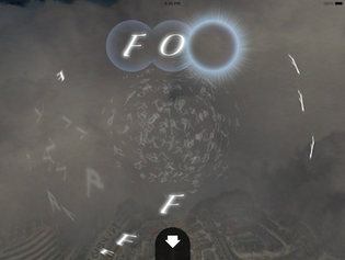
The old spellcasting interface, and the newer version.
Sorcery!’s gameplay trades between moving a counter across a map, and making choices within story sections. In one direction, this is seamless -- you draw a path to where you want to go, the character slides there, and on arrival up comes the narrative -- but in the other direction it’s always been a little clunky, especially when the encounters in a scene are optional. All too often, the story flow looks like this:
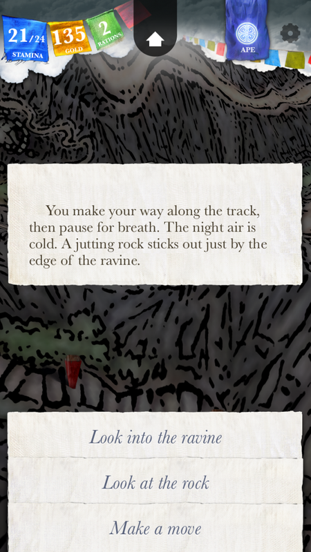
Story choices, and the dreaded “move on” option.
The first few options can be anything -- explore, investigate, try something, risk something. They can be exciting, mysterious, curious, intriguing… But underneath there’s always the dull thud of the “Make a move” option. And should you explore, it’ll probably still be there next choice -- and in the next location, and the next. And while sometimes we manage a nicer wording (“Keep climbing,” “Turn back”) the basic functionality is the same -- “stop doing this and go back to the map.
The choices presented by the story are a big part of the storytelling in a game like Sorcery! -- in fact, we try to write on the assumption that people will always read the options first, and then merely skim the text above for context. But what message does “make a move” send? It says, this is skippable. Move along, there’s nothing to see.
And then there’s what happens when you choose it. We generally try never to have empty paragraphs in the gameflow -- so if you choose “move on”, the game always tries to say something even though it has nothing whatsoever to say: “You move onwards.”, “You must keep going.”, ‘You should not stop now.” Even the times we manage to contextualize it (“You should keep going. It will be night soon.”) it still reads pretty badly.
The “move on” option is necessary -- especially when people might be replaying a game and wanting to skip past certain encounters and exploration that they’ve done before -- but it casts a dismissive tone over the whole game. We would have liked to find a UI-level way to achieve the same goal, but we never found a design that worked. A cross in the corner would have been missed, or seemed like a sub-option, implicitly “worse” than the real ones in the text. An icon rather than text would have been confusing.
If we were redesigning, we would be tempted to do something rather more drastic, like leaving the map and the movement flags visible during the story-flow, so the player could make choices or move on, directly, using the usual UI system for movement. But that would be difficult to make work with the screen real-estate of an iPhone.
The first Sorcery! episode was only the second game produced in ink, and it was the first to really test its logical and structural capabilities. At the time, the language had some hard limits and some bugs, that we worked around at the time rather than fixing in order to get the game done. As a result, the first part contained a few really poor scripting choices, which then proceeded to haunt us for the remaining four games, as we were forced to support old data structures passed from one part to the next. But we couldn’tupdate the older games without having to support two different save data formats!
The worst offender here was the weapon modifier system. Like any RPG, Sorcery! rewards the player with improved weapons. But this only happens once in the first book, and at the time, we didn’t realize it would be a fully fledged mechanic, so instead of building a weapon stat, when you gained weapons or armor, we simply altered your combat power statistic directly. That meant when, in Part 2, you were able to buy another sword and upgrade, we had to undo the first stat change and then apply the second, but we also had to deduce what the first stat change had been based on what was in your inventory… And then, what about if you’d damaged the blade along the way via story choices…?
And we carried on with this terrible, buggy, ad-hoc system for all of the weapons given to the player throughout the four parts. By Part 3, it was at least black-boxed into an outwardly friendly, internally hideous script file, but it still threw up a few hard-to-place, gameplay-breaking bugs during the testing of Sorcery! 4.
And while that was the worst such issue, it wasn’t the only one. There was the provisions counter, which included both named rations and generic ones, meaning when you chose to eat a meal we had to work out what kind of meal it might be, and then adjust the right inventory variables to keep up. There was the Gods system, hard-coded into a massive switch statement in the game code rather than a data file, that grew bigger and more twisted as we added more Gods, and began to hugely limit what Gods could and couldn’t affect (and that’s definitely not how Gods are supposed to be).
Each of these mistakes cost us some development time, and debugging time, but more critically they limited our scope. If Sorcery!’s weapon system feels underdeveloped or the UI for it is lacking, it’s because the script behind it is fragile and buggy.
In general, the Sorcery! games were a learning curve for us in terms of how ink could be used -- we were still ironing out engine bugs when Part 1 shipped and learning patterns for coping with large-scale branching in the storylines, and there were major ink features added during the development of Parts 2 and 3 that revolutionized what we could do (namely return values from functions, and ink “tunnels” -- sub-stories which include options and run, until returning to the point in the story where they were invoked.)
It would have been good to find more ways to throw our early design mistakes away and build better structures for the later parts. (And the places where we managed this, the pay-offs were huge: for instance, we turned the ink required to cast spells into a system rather than having each spellcasting instance be a copy-and-paste job, and suddenly the number of spellcasting opportunities for the player rocketed.)
The last point is almost a specific case of the above, but one that warrants its own section.
For the combat sequences, we wanted the game to “narrate” the action in live prose that reflected the game state -- what the monster did, what you did, what happened to your stamina and what happened to theirs. We figured that action sequence descriptions in fantasy novels are generally pretty generic anyway (“The ogre swung his club, but the barbarian ducked at the last moment, bringing up his dagger in response.”)
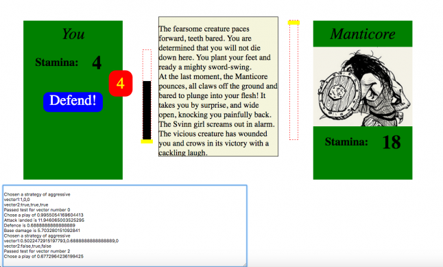
The combat prose generator / AI prototyping tool.
In some places, we achieved a pretty good result, and when the narration works, it’s magical: when you cast a spell of dizziness on a monster and the combat text reflects that, or when a pirate taunts you for missing his attack, it’s a lot of fun.
But getting it to work took a huge amount of mostly tedious effort, and polishing it was very difficult -- and the reason for that was that we wrote a special data-format and editor for combat text, rather than simply using ink.
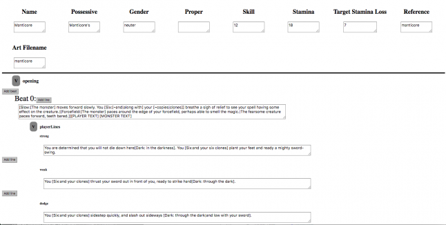
The combat prose generator tool.
When we made Part 1, we were still thinking of a game’s ink file as its “script.” The player had a position in that script, and moved through it, beat by beat. By the time we made 80 Days, ink had become a place to put all the game’s text, and we had engine code that was able to run content alongside of the main content. We could even peek ahead to see what a particular option might do without actually doing it.
But by then, the combat system had been built, and we’d made fight scenes for the first two games, and it was too late to change the way we were authoring content. (We would have to have gone back and rewrote all the fights for the first two games.)
So even though moving fight sequences to ink would have made them considerably better -- we could have produced much more interesting, varied and context-sensitive text, and redrafted much faster -- we didn’t make that transition. Instead, consciously or not, we put less and less combat into the game because it wasn’t worth the effort of authoring it.
A shame, really, because the combat system -- though somewhat divisive amongst players -- is something we’re pretty proud of. It’s a simple system, very easy to play and learn -- and easy to play without much attention if you just want to hack and slash your way through -- but there is enough depth that it’s continued to be fun to play, four games later.
The Sorcery! series will always hold a special place in the inkle pantheon -- Sorcery! was our break-out title that jump-started our company, both financially and in terms of our reputation and confidence. 80 Days took a lot of lessons from Sorcery! 2’s design -- and in turn, inspired several decisions in Sorcery! 3, and the whole series is influencing what we’re doing next.
The response from players has also been amazing. Sorcery! has never captured the limelight, and yet has still been pretty successful all the same, and it’s built a small but firm core fan-base who have played the games scores of times over, trying to rinse them of all their secrets and obscure moments.
That’s been hugely enjoyable to watch, and we’ve had a great time building specific Easter Eggs into Part 4 that only a few of the most dedicated players will be able to find. (For instance, the inclusion of Part 3’s ineffectual “God of Gods” Yb’ran was intended as a throwaway Curiosity jibe that removed itself before the end of that game, but of course several players found a way to keep him on into the next game… and so we built a storyline in response.)
But making a product with nostalgia value -- even one freely adapted -- is both a blessing and a curse. Sorcery! came with a ready-made market, and even better, some of the audience of ex-Fighting Fantasy readers have grown up to work in the games press. But at the same time, there must have been a lot of players turned off by the hint of the 80s D&D vibe. I’m still convinced there are a lot of people out there who would like Sorcery! if they realized all the things it isn’t.
When trying to describe our adaptation, we often reference Battlestar Galactica: the original 70s show and the reimagined series are very different shows despite sharing similar bones; but while the remake is not a nostalgia product, it could not have existed or really made sense without the previous version coming before.
The Sorcery! games are similarly strange -- both nostalgia games and cutting-edge interactive fiction; both cheesy and meticulously crafted. But those who read Steve’s original gamebooks will know that same description also applied back then. There was always more to the Sorcery! series than met the eye.
You May Also Like