Trending
Opinion: How will Project 2025 impact game developers?
The Heritage Foundation's manifesto for the possible next administration could do great harm to many, including large portions of the game development community.
What's the process for building a game out of cardboard? In this unusual postmortem, State of Play creative director Luke Whittaker lays bare the paper and glue creative process behind acclaimed indie game Lume.
November 14, 2012

Author: by Luke Whittaker
What's the process for building a game out of cardboard? In this unusual postmortem, State of Play creative director Luke Whittaker lays bare the paper and glue creative process behind acclaimed indie game Lume.
Lume is a puzzle adventure game with a world entirely handcrafted from paper and cardboard. It launched on Steam for Mac and PC in Summer 2011 and has since been released on iOS, Linux, Android, and the Kindle Fire and Nook. It was a finalist for the Excellence in Visual Arts award at IGF 2012 and won the Develop Indie Showcase Award in 2012.
In the game you play a character named Lume, who explores her Granddad's house trying to figure out how to restore the failed power system in various ingenious ways. The house itself is a model set about a meter long, which we built out of paper, cardboard and integrated miniature model lighting. We equipped a small studio with lighting and then filmed it by hand in HD. Later, this footage formed the environment of the game with the interactive character integrated and enabled the player to explore every part of the house.
We're an indie games company with a background in animation and Flash games. We've always been fans of a handmade aesthetic, a passion that began years ago through a simple appreciation of the emotional aspect of painting and drawing. It's turned out to be a fascinating area to explore in the world of interactivity.
The drive towards more technologically graphic solutions has actually meant that many games distance you from the world through their artifice. Even those striving for photorealism end up with a slight plastic sheen that keeps the player at arm's length. Not being so tech-focused, we were interested in seeing how we could engage players by drawing them into a world they could almost touch and one that's similar to the world we know.
LittleBigPlanet made the handmade aesthetic work beautifully on the PlayStation 3, but we weren't aiming to create something infinitely adaptable to the player's design. As such, we were freed of those technical challenges.
Our team wanted to create a world in which players could immerse themselves (like a good book) and included a narrative they could explore at their own pace and puzzles they could solve in any order; all while maintaining the tempting possibility of discovery. We wanted it to feel like you're being read a story; one where you're safe in the knowledge that someone is in control. But at the same time, it should feel like you're the first to hear it.
The desire was to make a beautiful puzzle adventure game where we could explore an interesting narrative, and bring together the best of all the games we love and work in a style and method that excited us. We didn't know quite what the style would be at first and experimented with various hand-drawn and Flash-animated examples. We'd recently made the game Headspin: Storybook (Flash and iOS), an interactive pop-up puzzle book that was designed to look like it was made from paper. Coming off this game, the thought struck us that perhaps we didn't have to fake it. Perhaps we could make something real; make it move and also make it interactive.
We did a number of visual tests (see Figure 1) to see if we could achieve what we had in mind. Once they worked out, we had an interactive character settled nicely into a moving background and realized we had to go with this idea.
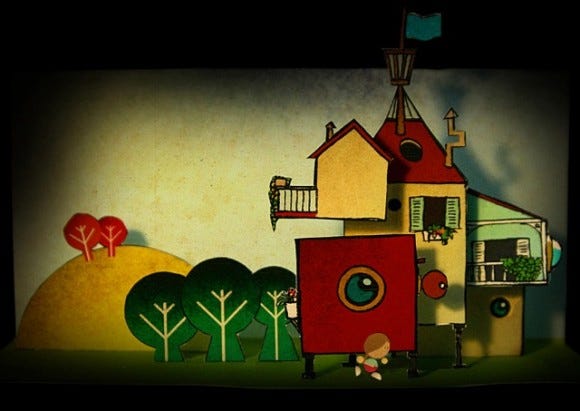
Figure 1: Design test
1. Ideas Stage
One of the goals of our production was to make sure we were enjoying the creative process as much as possible and creating the best experience we could. We wanted this project to be ambitious, idea-led, and something we'd love to see get made. To this end, we made sure we allowed sufficient time for conceptualizing and experimenting early on (see Figures 2 and 3), exploring ideas as they occurred and concentrating on things that intrigued us.
Thoughts on how we were going to distribute the game or even how big the game would be were far from our minds at this point. This approach ensured that if we did commit to making the game, we were committing to something that we cared about. It was something I'm very pleased with, in that we didn't compromise the vision at an early stage based on other factors that could've clouded our vision.
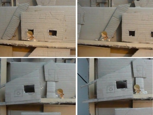
Figure 2: Early proof-of-concept tests
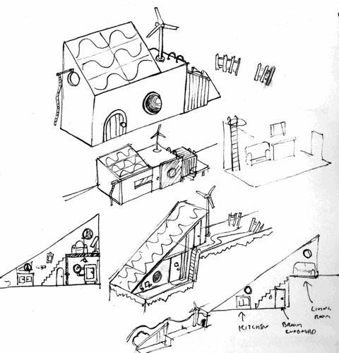
Figure 3: House and character concept designs
2. Style
The style is a major component of Lume. It was very important that we didn't see it as something that was pasted onto a mechanic, but something that was an integral piece of the game. Being a small team, where I was programming the wireframe (see Figure 4) while building models for the game at the same time, made the process of keeping the style integral a lot easier.
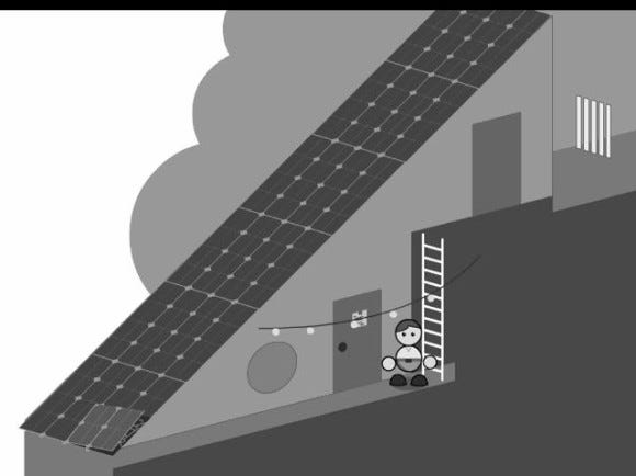
Figure 4: Wireframing in Flash
I knew, for example, where I could position objects and puzzles in my wireframe in a way that would make sense as a model. The vision I had of the completed model in my head meant I could work out the flow of the level design without needing to communicate with the various teams. I think it helped to create a style and a level of design that was both coherent and visually appealing.
It was also important that it looked like nothing else we'd seen before; it had to be a world you wanted to explore. Atmosphere and mood contribute hugely to the success of the world design. By making it out of paper and cardboard and lighting the model just as we wanted, we could shape this by hand on set. We were able to imbue a sense of warmth in the scene by warming the color of the lighting and drew attention to certain elements on screen by picking them out with lights hidden behind the windows.
Our lighting cameraman, Tom, came equipped with all sorts of gadgets and tricks to light the model, from tiny clip-on LED lights that could be attached to mirrors that bounced light around and gobos that added dappled effects.
The filming was all done by hand using a DSLR (see Figure 5).
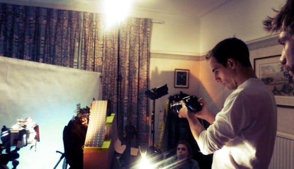
Figure 5: Tom filming the model
We had considered stop motion as an option, but it would have been too smooth. By Allowing Tom to do it freehand reinforced the handmade feel of the game. It's the wobble and what you could call "mistakes" that give it personality. But at the same time, Tom is a proper professional and also works for the BBC natural history unit. As we were filming he kept saying, "Sorry, that's got wobble in it again, I'll have another go," while I was saying "No, that's great! Let's keep it." I did have a go with the camera myself too, and it just increased my admiration for his work even more. I barely managed to keep the model in the frame.
This footage was integral to the style of the game. It was important we weren't just taking stills of a model but also moving through it (see Figure 6). That's where the real feeling of exploration was. For lack of a better word, it's the indefinable "something" that Lume offers. I'm pleased we discovered something here and it felt like we tapped into a rich seam.
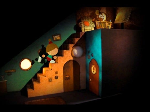
Figure 6: Moving through the world
3. The Way We Worked
Part of my ambition for this studio has been to cultivate an atmosphere where different ways of working are embraced and integrated into the process, if it has the potential to create something good. As I mentioned, we made sure we did this in the conceptualization stage and this very much set us off on the right track.
We also tried to make sure this ethos extended throughout the build. For example, if I wanted to spend a day experimenting with a puzzle design, I'd do that for a while before returning to the main planned schedule.
Sometimes, that would send us off in another interesting direction. We'd also have inspiration days, where we'd take the day off and visit a gallery in London and spend the time talking about the game.
It was important that we didn't feel wedded to our desks; if we weren't feeling productive, we'd go and work somewhere else. A lot of ideas, as most people will attest, don't happen in front of a computer.
For me, it's on my bike or in a cafe. It might sound like an "indie dream" stereotype, but a lot of the ideas were created in a cafe where there the pressures of a blank screen and internet distractions didn't exist. And then, of course, we'd return to the studio to do the production work. (See Figure 7.)
We've basically been very open to different ways of working, and this sentiment has laid great foundations for the forthcoming sequel, where we're designing a whole city. We're working with an architect for this, who brought up the idea of creating a cardboard "sketch" of the models where we could test composition, lighting, and camera angles; she can knock them out in a couple of hours.
We immediately saw the potential of this and have incorporated it into the way we're designing this world.
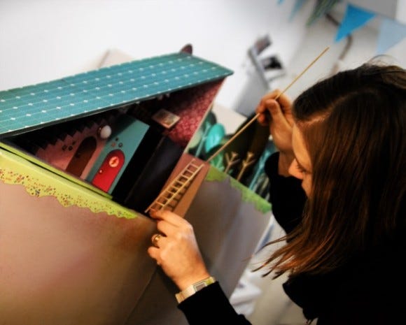
Figure 7: Building the model
4. Appropriate Technology
Logically speaking, if you wanted to make a realistic-looking game environment, you might go with a 3D modeling tool. But at our studio, the team's specialty has always been 2D animation. To engage in 3D modeling would have changed our entire way of working and necessitated having to deal with unknown quantities. This would have been too much to deal with, as we were trying to be creatively ambitious in other areas. Even though we ultimately stretched Flash with what we were throwing at it, it was great to work in an environment that we were comfortable with and allowed us the luxury of focusing on the details.
Using Flash also made sense from a financial point of view. We wouldn't need to license any new technology, and we'd be able to create versions which would run on PC, Mac, and Linux, all from the same source files. With the recent development and continued improvement of Adobe AIR, it proved to be a massive stroke of luck that we chose it. It meant that when we wanted to port the game to iOS, we could use the same source and save a lot of time and effort, while keeping the game identical. In fact, it enabled us to add improvements such as a higher resolution for iPad and new improved sounds and responses for touch controls. Since then, it's also enabled us to port to Android, Kindle Fire, and Nook with relative ease.
5. Story
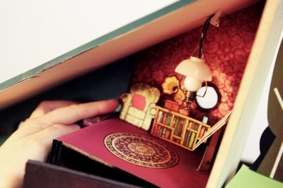
We were really pleased that we had created an environment where there was great potential for storytelling, whether it be actions you perform in the game or the history of the environment you're in. As we developed the game, we began to draw in all sorts of details that revealed elements of Granddad's character and the player's relationship to him. For example, there are many details dotted around the house such as framed photographs and a bookshelf with his reading material and design sketches (see Figure 8). We've developed an entire back story, which is slowly revealed in parts throughout the game and leaves enough unsaid so that there's plenty to explore in the forthcoming sequel.
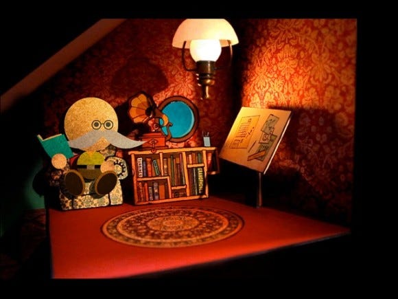
Figure 8: Grandad and his books
I'm really interested in the potential that games have for conveying a point of view without forcing it down a player's throat, and I'm excited that we've created a world in which we could explore this. A number of ideological strands run through the game on the subject of self-sufficiency, care for the environment, and family relationships, but they're designed to be so woven into the experience that they're inseparable.
We recently had a review on TouchArcade that put words to something which is never explicitly stated in the game: "[Lume] looks to make us proud of doing our best by the world and ourselves." It's both delightful and humbling to hear sensitive reviews like that and they put this sentiment in words better than I could. I think it goes to show what a great medium games can be for imparting ideas through action, atmosphere and storytelling. There's such potential for emotional engagement, and they can be the perfect embodiment of that old phrase "show, don't tell."
1. Technology
To preface, this was something we got both wrong and right. When I was creating the game for the Mac and PC in Flash, I didn't consider the mobile development at a later date, which I really should have done. Consequently, I didn't consider things like RAM use or optimization. Since all of my testing was done on desktops that could handle the game easily, these issues weren't even on my radar.
When porting to low-spec devices, it's not great to dump a lot of video into RAM all at once, so we had to reassess at times how the game was built. Now that we're working on the sequel, we've got the chance to make amends for my mistakes there, and we're building with the future of the game in mind.
2. Puzzle Refinement
As I have mentioned, our process involved prototyping before we went ahead and built the final game; this applied to all the stand-alone puzzles also. But in one case, we weren't as rigorous as we should have been when we transferred the game from wireframe to real models.
There's a book in the bookshelf that offered clues to a locked puzzle, which seemed to work fine in the wireframe. When everything was simplified and the book was more noticeable, the answer jumped out at us more clearly.
When we were building the final set, we added all sorts of details and made the book fit with the rest of the bookshelf nicely. However, this process made it became less noticeable and the player was subsequently less likely to find it.
The extra details that were a natural part of making a real life model of the page (the details around the borders, for example), became something of a distraction and sent players down a different line of thinking. We thought we hadn't changed anything, so we didn't need to worry about it. But it became apparent afterwards that people were being misdirected. In the future, we'll be making sure something like this doesn't happen and conduct tests at all stages even if we think a change isn't a major one.
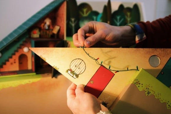
3. Getting the Most Out of Our Materials
We are really happy with how the overall model turned out, and the sense of depth that was created as you move around the house. But I would have liked to extend that same depth to the visuals of the stand-alone puzzles even more. Every puzzle you see was also built out of paper and card.
However, I think we could have gotten more for our money with this process. The models we built were reasonably flat, and so the main sense of depth came from the shadow underneath the raised planes of paper. For the next installment, we're going to make them "pop" a lot more and really make you feel like it's a physical object in front of you. The whole idea is that this should be as tactile as possible.
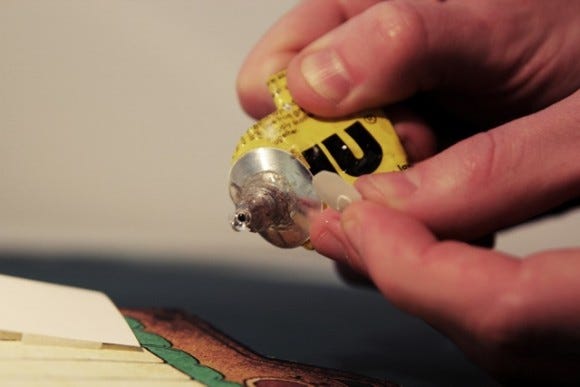
4. Underestimating the Technical Challenges
In developing this game, it was priority for us to be ambitious with our method. By its very nature, that meant that we couldn't plan for every outcome because we didn't know how it would pan out. A few examples of this happened when we filmed the model. For example, I wanted the player to move smoothly inside the house, with the front of the building fading away to reveal the interior. As such, I made the front of the house detachable. In my head, it all made sense.
While Tom was filming, we could swoop in and remove the front of the house and then he could zoom inside. We would then edit out the frames where we appear. But when filming by hand with a wobbly model made of card, it suddenly -- and somewhat unsurprisingly -- became a tricky prospect.
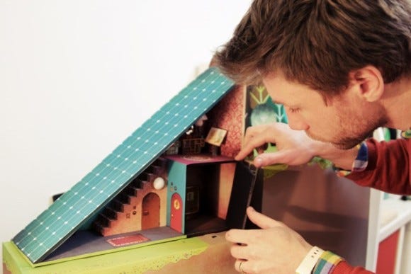
The front of the house had to fix tight enough to stay on. This meant it needed some jimmying to take it off, by which time Tom had subtly moved the camera while we'd subtly moved the entire house. Then we had to do the reverse when you exited the house, putting the front back on as accurately as possible to cut back to the outside shot. Needless to say, we couldn't perfectly match everything up, and it necessitated an unplanned day or so of After Effects work to merge the scenes together.
5. Lack of Marketing Planning
When we started this process, we weren't sure exactly where it would lead us. As the project grew, our priority shifted towards making this the best game we could. This meant that it wasn't until the game was nearly complete that we properly considered how we would market the game.
To a certain extent, we really couldn't plan, as we didn't know what distribution networks we would have to work with. For example, we wanted to get the game onto Steam, as we knew what a great platform it would be. But without the completed game, all we could have supplied was an abstract concept.
This was not ideal, as we believed the game really needed to be seen in the best possible light. We didn't feel like a tech demo would cut it in this case. As such, we held off and sent it only when it was 99 percent complete.
I still don't know which was the riskier strategy: doing as we had done, or sending the concept off early. In any case, it seems like we made the right choice. Steam picked up the game and has subsequently become a big part of the success of Lume.
It was only at this time that we were really able to start planning how we would get the word out and what other platforms and distribution networks we could bring the game out on. But in retrospect, we could have helped ourselves a lot by having this kind of thinking prepared earlier on.
Whether or not things went as well as they could in this regard, Lume sold very well and was profitable enough for us to begin work on the much larger sequel, which we're now deep into developing. It's been the ideal result for us.
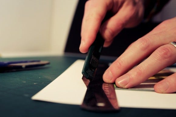
Making Lume has really allowed us to hit our creative stride as a small studio. We created a project and a working practice in which we could be both inquisitive and ambitious. By setting for ourselves realistic parameters such as making this a first installment, we could afford to experiment in other ways. The experience of making this game was enjoyable pretty much throughout.
We learned a lot throughout the process too, and we'll be taking these lessons to build on our way of working for the sequel, Lume 2. The game is many times the size of Lume, and we want to push what's possible in every way we can. We're keeping an openminded approach to the process and allowing it to adapt as we go.
As previously mentioned, we're working with Catrina Stewart, an architect who's brought her own methods of working to the process, and we've incorporated these accordingly. We're now building cardboard "sketches" of an entire city in our studio. These are rough mockups that can be made in a couple of hours and allows us to test things like camera angles and composition before we build them for real. We learned our challenges the hard way with Lume, and now we know that we've got to test, adjust, and retest everything before we start the filming.
Technologically, we're at a level now where we understand more of the possibilities and can increase the quality of the lighting, the camerawork, the resolution and the sense of three dimensional space. It will dramatically improve the beauty of Lume 2.
One of the finest lessons we've gained from making Lume is the knowledge that our hunch was right. If you build something you truly care for, and you invest that care in every part of the process, there will be an audience out there who will care for it too. It has given us the confidence to take Lume 2 to a whole new level of detail and beauty. It will be released sometime in early 2013, and we can't wait to show you more over the coming months.
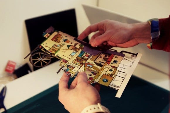
Developer: State of Play Games
Publisher: State of Play Games
Release Date(s):
PC & Mac & Linux: May 2011
iOS: February 2012
Android: July 2012
Platform(s): PC, Mac, Linux, iOS, Android
Links to the game:
Length of Development: 6 months
Number of Developers: 3
Number of Artists: 2
Development Tools: Flash Professional
Creative Tools: Flash Professional, After Effects, Photoshop
Budget: n/a (worked on in spare time around other client projects)
Paper cuts: 2
Times we accidentally cut through the wiring system with a scalpel: 1
Read more about:
FeaturesYou May Also Like