Trending
Opinion: How will Project 2025 impact game developers?
The Heritage Foundation's manifesto for the possible next administration could do great harm to many, including large portions of the game development community.
Though they'd never developed a complex story-based game before, Torus Games took on the challenge of working with Warner Bros. on Scooby-Doo! First Frights -- and in this postmortem, outlines how the small team delivered a Wii game that lives up to the ideas and ideals it started with.

[Though they'd never developed a more sophisticated story-based game game before, Australian independent developer Torus Games took on the challenge of working with Warner Bros. on Scooby-Doo! First Frights -- and in this postmortem, outlines how the small team delivered a Wii game that lives up to the ideas and ideals it started with.]
It's natural when trying to make a good impression to go that extra mile and overexert yourself, particularly when you're feeling a little uncertain about what lies ahead. We tend to overcompensate for fear of failure, and in doing so, often make the situation more complicated than what it should've been. This was the underlying tone for the Torus Games team going into Scooby-Doo! First Frights.
From day one right through to the day the title went gold, the Scooby-Doo! First Frights team were extremely passionate and enthusiastic about this great opportunity to work on an IP that for generations has been a part of a kid's diet of morning cartoons around the world. We were so proud to have been chosen by Warner Bros. to create the next iteration of Scooby-Doo! games and were determined to make it the best to date.
Warner Bros.' directions to us were quite clear: make a cooperative game for kids that they can play with their parents; give a fresh, younger representation of the Mystery Inc. gang in their early years of the sleuthing; and implement a blend of light combat and puzzle gameplay.
This seemed straight-forward enough -- but for most of us on the team, this genre of game was all new territory.
If not for the security of a solid team, many of whom have been at Torus for over 10 years, this challenge would've been a more daunting prospect.
At the height of development, a team of 64 (the largest in Torus' history) were heads down, tirelessly devoting every second into creating not just content, but in most part, new technology and asset pipelines to achieve what we see today on the shelves.
It's a mammoth effort on their part, and one that we look back on today with much pride. Scooby-Doo! First Frights is a great game. It's made for kids, and the kids absolutely love it, and that's what matters most to us -- our audience. The team learned a lot of lessons, and not just in the way we make games, but the essence of gaming itself -- that is, what makes a game fun. For these lessons learned we will all be very grateful, as we confidently venture into new projects armed with the knowledge gained from making Scooby-Doo! First Frights.
So herein lies some of those lessons and achievements gained during the course of development. These are a snapshot of the most pressing issues raised during our internal post-mortems on Scooby-Doo! First Frights. So let's start with the positives!
1. Given a long rope...
It's not often that a license owner of a highly valued IP allows a developer as much creative freedom as we had with Scooby-Doo! First Frights. Obviously, we had to stick to the core fundamentals of what makes Scooby-Doo! Scooby-Doo!, and to do this, countless hours of Scooby-Doo! TV series and movie viewing, reading and researching went in before setting pen to paper.
But for the environments, storyline, enemies and the direction of the game, Torus were given quite a long rope in creative license. This was a fantastic opportunity that the team relished. We were given strong support by Warner Bros. to ensure the spirit of Scooby-Doo! was genuine in all art, design and corny one-liners created for the title.
The prime objective from Warner Bros. was to present the Mystery Inc. gang in their earlier years. Our artists' younger character impressions, coupled with toon rendering within an exaggerated and stylized game world, created a new, unique setting for the Mystery Inc. gang without losing its ties to the original series.
We studied games of similar genre and game play direction to ours quite closely and picked out the pieces that we felt worked well, and were the main appeal to our target audience, particularly co-operative play, simple button mashing combat, destructible world objects and light puzzle. This became the essence of the Scooby-Doo! First Frights design, and is a success in that it reached our young audience (and Scooby-Doo! fans) as intended.
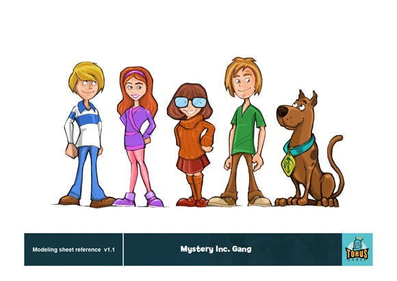
Concept for the younger Mystery Gang
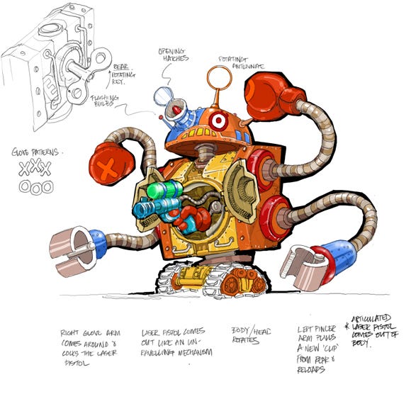
Concept for Giant Toy Robot Boss in Amusement Town
2. Bringing Scooby-Doo! to Life
We're very proud of the cinematic story moments in Scooby-Doo! First Frights. The quality of work by the animation teams, the writing, voice-talent and music, helped set the tone to deliver the spirit of Scooby-Doo! to the game. However, in the end, this is a game and not a movie. In total, we had 64 minutes of cutscenes in the game -- not a far cry from a feature length movie! (For more on that, see the What Went Wrong section "Size Doesn't Matter".)
We had a small internal animation team of only five people at its peak facing an enormous task -- to create 64 minutes of unique cinematic moments within a five month development window. Add to this a host of in-game animations, combat, and character animations, and you can only imagine the size of the mountain they were facing.
Needless to say, we brought in two contractor animators and enlisted the assistance of outside production company The People's Republic of Animation to get through the workload. And this is one of the great successes of Scooby-Doo! First Frights -- the quality of work reached by the animators under an extremely tight schedule was remarkable.
Even more of a success was the execution of the animation -- they captured each of the Mystery Inc. team members' personas beautifully.
The cutscenes take us back to how we remember the team (albeit a little younger), from Velma's articulate reasoning, to Scooby-Doo! and Shaggy's zany one-liners; the characters we all know and love are brought to life in First Frights.
And this success could not have been achieved without Warner Bros. introducing veteran writer Ed Scharlach, who helped bring the Mystery Inc. team to our TV screens in its earlier years. Receiving Ed's guidance and words of Scooby-Doo! was an honor for the team and helped shape the final scenes we see in the game today.
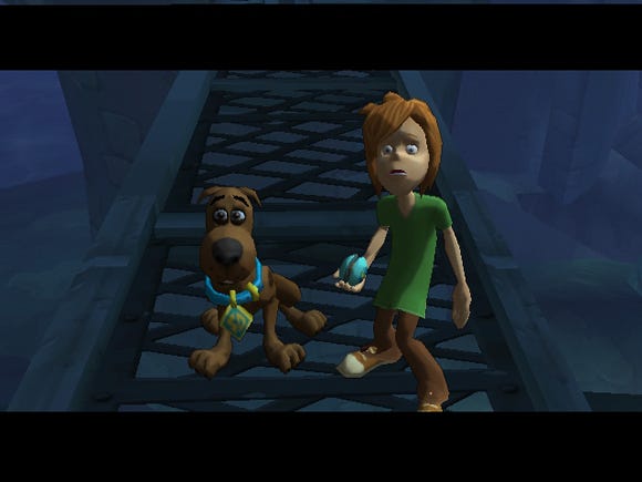
3. A New Era for Torus
Up until this game, Torus had produced mostly technically-driven rapid development games across most platforms. Scooby-Doo! First Frights was our first story and content-driven game, and this presented a new school of thought into the team. This wasn't just about the tech anymore -- it was about the game and the interweaving of the story through character-driven moments, combat, and achievements. It required much more thought to design and the application of design to our current technology, including the way we make games.
From audio to QA, design and art, every day presented new lessons. We studied from those successes in games released and held faith in the stability of systems already in place. For the team new to this genre and way of thought (content over tech), the challenges we faced have become tools for the future. We didn't execute the development of Scooby-Doo! perfectly, but we did so soundly for our first story-driven co-op game.
This game was a giant leap for Torus, and now that we stand at the summit looking back, every single person on the team has grown two-fold both professionally and technically.
4. Art-Design Relationship
One of the most positive moves made during development was the pairing of level designers to artists. They would sit together, eat together, live and breathe their level -- and it shows. Beautiful panoramas and vistas are scattered throughout Scooby-Doo! First Frights, all at 60 Hz -- quite a feat considering the small level art team and short schedule.
Here, the theory of "ownership" in work was reflected successfully. The pairings took great pride in their level. What looks beautiful may not always be functional, and vice-versa; hence why such a pairing works well. And whilst our levels are not perfect (see point three in What Went Wrong regarding length of levels), they're for the most part absorbing and intrinsic to the final quality of the game and the gameplay experience.
With only four level designers and four artists paired to create four unique worlds (game story chapters), what we see today in-game is a huge achievement for the level design and art teams.
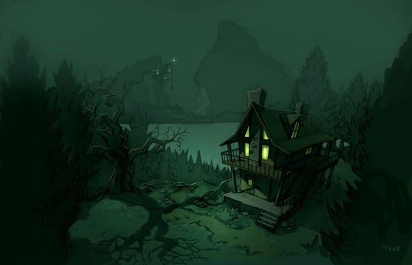
Concept art for Spooky Cabin
5. Clank! Squeak! The sound of new tech
Continuing the theme of a new era for Torus, Scooby-Doo! First Frights provided the outlet for the Torus tech team to implement long-awaited tools. The result of decades of experience, these tools laid the groundwork for the game, and included the implementation of two new systems: "Clank", our physics system, and "Squeak", our new sound engine.
"Clank" was brought on board for the first time in Scooby-Doo! First Frights with barely a hiccup. From swinging bridges to destructible objects and chandeliers, a dynamic, breathing world was brought to life.
It provided a scalable physics and collision multithreaded system that was lean on memory and provided the next stage of Torus' development tool kit that will continue to expand in the future.
Squeak was another success for the tech team during Scooby-Doo! First Frights in providing a scalable cross-platform sound engine. Not only did it provide a very stable audio solution, it also allowed for multiple streaming sounds and samples, multi-track music and designer driven sound behavior. Best of all, no more midi on DS!
1. The Dreaded Balance Between Time vs. Quality vs. Cost
Measure twice, cut once, as the saying goes. The pre-production period for a project cannot be underestimated in any way. It's not just a time for drawing a few pictures and scribbling out a design; it's the moment when the foundations and blueprint of the game for the entire development needs to be laid out -- and in detail.
Of course, you can't assume to know all at this stage -- games development has a lot more experimentation and unknowns going into production than other media. However, if you can plan for what you do know, and make accommodations (and contingencies) for what you don't, you can save yourself a lot of heartache, late nights and greasy pizza meals in the end.
Unfortunately, for Scooby-Doo! First Frights, our pre-production time wasn't utilized as efficiently as we'd hoped for. The period was mostly absorbed by the production of a vertical slice build of the game before heading into development. Our team at this time was also limited, and we were searching for additional level designers to bring into the team.
Whilst the vertical slice build did benefit us in many ways (establishing some core systems etc.), it detracted from time needed for planning. In the end, we delivered a great vertical slice (albeit too long at 15 minutes of complete gameplay) and we had set the bar high for ourselves -- very high.
Once we headed into production, and in reflection of the vertical slice build, we identified that the design was over-scoped; some cuts were made, but only so much could be done by that point. We'd made a promise to deliver the game as originally planned, but this is one area where our inexperience in developing a game of this genre showed as we progressed through development -- we underestimated the workload necessary to produce a game of this scope and content.
We were determined not to make shortcuts and to deliver the best quality game -- but this comes at a cost. If not for the spirit, commitment and passion towards the project from the team, the project could well have extended beyond the additional eight weeks that had been added to the project development schedule.
No producer -- no team member -- ever wants a project to be late. It's bad. We hate it. Warners were kind enough to extend the project to mostly accommodate for the content production (particularly animation and audio) slip. Quality versus Time versus Budget -- tilting to one side will affect all others, and you can't have the best of all three.
Having the time again, a separate team and schedule for the vertical slice build would run parallel to the pre-production team. This would have ensured that the time and resources required for the development of the game were available and more efficiently utilized for what they're there for in the first place -- planning, so that when it came down to the actual development, the path of production would be much clearer, with rework at a minimum.
But, as I mentioned, we were all mostly new to this genre of game, and underestimating the extent of content required, had eagerly jumped into the deep end.
Today, pre-production is still considered as the most vital stage of a project's development; however, a vertical slice (or demo build) should never impede on this time, nor affect the required workload. I would rather redirect development time back into pre-production and ensure greater planning and preparation, rather than play catch-up in the end. The game itself would be a lot healthier for it, too.
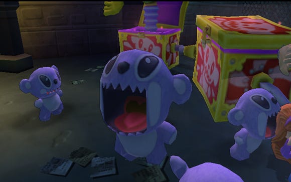
2. Enemy Roundabout: Repetitive Combat
The combat manager was one of the new systems to come on board for the title. Whilst the tech was developed early for vertical slice, it didn't receive a good workout until later in the project. Time was the enemy in this case, as a host of other new systems concurrently came on board (cameras, drop-in, drop-out multiplayer etc), and there was little time for the finer details you'd like to apply.
The final combat in the game felt repetitive and predictable; an exercise in button mashing. Whilst you do need to be mindful of young audiences and not over-complicate systems such as combat, it doesn't mean the most basic of combat managers is the answer -- you still need some variety to make the experience interesting for the player. For example, variations to the challenge or fight mechanic for different enemies would've given the overall game play more flavor and variety.
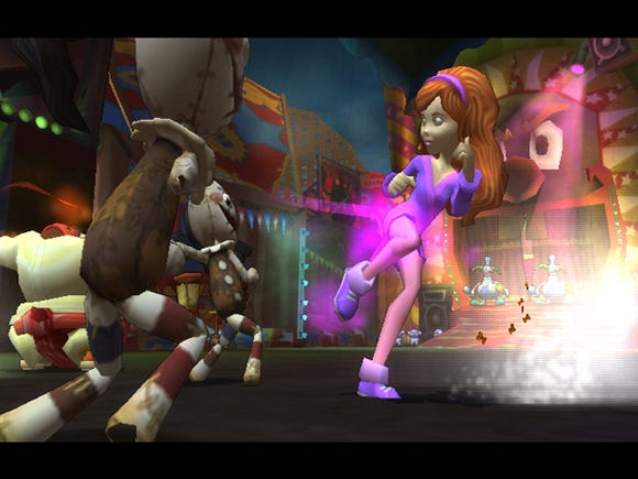
3. Size Doesn't Matter
The theme of overcompensating is most apparent when it comes to the general size of the Scooby-Doo! First Frights. This is not a reference to game play time, but rather the length of levels and cutscenes. Overall, both were far too long and didn't provide the balance between story and gameplay that we were hoping for.
The levels were long winding platforming paths that lead the characters from one moment in the story to the next revelation (or cutscene). Countless hours of art and asset creation would fly by in an instant as players traverse the level.
The reason why the levels are linear in Scooby-Doo! First Frights is due to our tech at that time not allowing backtracking between regions, hence forcing us into a single direct path through each level.
Through better planning and construction of design we could have made better use of level regions such that none would be considered wasteful.
No area should have zero reason for being there -- whether for combat, discovery or platforming, a region must have its place in the game world. We had a lot of empty spaces that were simply there as fillers between regions giving a false impression of game length.
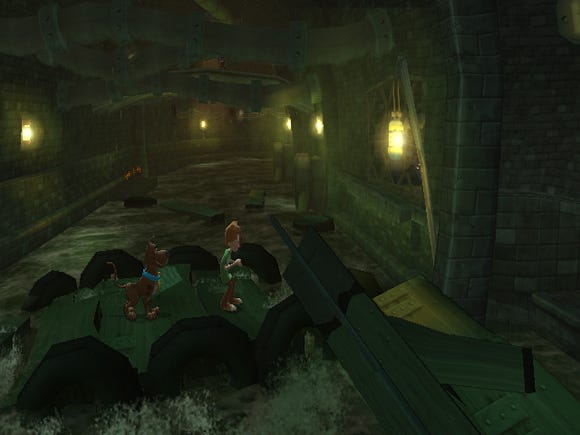
Some regions were too long and provided little challenge or gameplay. Areas such as the above (sewers) could have either been halved in length, or provide greater gameplay opportunities.
Cutscenes -- all 64 minutes of them -- were noted as a positive for their execution. We're very proud of how these turned out and players are enjoying them and the story immensely. However, they too were a victim of overcompensating. This is a game after all, not a feature film, and the game itself (and the player's actions within the game) should've been driving the story more, rather than relying completely on cutscenes to give player motivation and reason for their actions.
Finding the right balance is a challenge of planning and execution, and it's an area that we'll be improving on profoundly in games to come. We've learned a great lesson in this instance, particularly when it comes to continuity. Scooby-Doo! First Frights does have some holes, if you like, in the story, and the characters' motivation in the story and in-game were sometimes not as clearly defined to the player as they should've been.
As an example, in one chase scene we have Shaggy and Scooby-Doo! in the sewers, followed by a level with Fred and Daphne in the alleyways. In the next level, Shaggy and Scooby-Doo! are suddenly bouncing across a balloon parade, with no explanation to the player of how they got there or why!
These holes weren't unnoticed by the team. We didn't suddenly reach the end of development and go "Oh, hang on, that doesn't make sense!" We were quite aware, but with limited time and resources, could only fill in the gaps so much. We'd cater for story continuity through the use of voice-over moments (VOMs), however some instances did fall by the wayside. Again, it all came back to our lack of understanding in the execution of the story in-game, underestimating the workload, and pressures of resources and time.
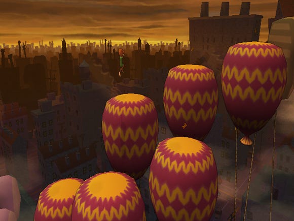
How did I get up here?
We look back on these story breaks in the game and realize that without continuity, the player must surely get a little lost not just in the development o f the story, but also in their character's motivation and position in the game world at that point in time. A balanced diet of story and gameplay blended into a seamless experience is high on our list of lessons learned for titles to come.
4. Too many hands...
When there's so much work to do, one of the first reactions is to throw more hands into the mix thinking that this will lighten the load. Not so for Scooby-Doo! First Frights First Frights. Rather, we found that increasing the number of people on the team to aid the workload inhibited the project, and placed great strain on the lines of communication. And it wasn't the larger, more obvious issues that placed pressure on the development schedule, but rather the culmination of micro issues.
Introducing additional programmers into the fold to assist the team led to too many people working on one portion of the code, and with the restrictions of time, they had no opportunity to understand the "big picture" before making changes; their micro changes would inherently break another part of code.
With this in mind, there is great value in pre-code design. Paper designing the structure of the code before writing one single line, and ensuring that it works in harmony with all other systems in the most efficient way possible, has become a new paradigm to the way we approach coding our games today.
It forces one to think before they code; to share their ideas with the relevant teams before implementing to minimize risk, and to ensure that no stone has been left unturned, or game mechanic unconsidered. The documentation also serves as reference to anyone new to the code and encourages more effective communication and understanding.
The ever-increasing code team also led to a breakdown in the structure of the team. The answer, in reflection, would have been to appoint sub-leads to manage specific areas of the game (e.g. A.I. puzzles etc.) to improve communication and understanding of each system and to promote ownership of the system.
Again, it all comes back to planning. The final game is solid, however -- a testament to the skill and dedication of our programmers and the stability of our tech and tools.
5. Gaming for Kids and Casuals
One of the toughest challenges we faced was ensuring this game was accessible by our core audience -- the seven to 10 year olds. The skill level even in this small age range can differ widely, and whilst we have made numerous kids titles in the past, we had not done so with the extent of combat and platforming found in Scooby-Doo! First Frights.
Warner Bros. and Torus held individual focus groups with our target age group to gauge levels of difficulty in the game, and to pinpoint problematic areas, and for most part in the end we got this right.
So why is this listed in the "What Went Wrong" section? In essence, the final game does still contain some rather challenging areas, particularly for platforming, in light of the audience.
Whilst the camera technology does have some bearing on this, the design of these areas left little room for error, and for a young audience, it can mean the difference between having fun and throwing the Wii remote across the room in utter frustration (which we DON'T want!)
Simplifying the jumping mechanic (the trajectory and distance of the jump), widening of platforms, and placement of camera to allow for a clear line of sight rather than dubious jumping angles that are difficult to judge, are obvious solutions to this.
Given that our camera technology was new, some level designers were new to this genre, and the pressures of a looming time-line, the fact that such areas are few and far between is testament to the team, and provides a lesson learned in spending more time during the level map and white-boxing stage.
We need to take an IKEA approach to all design: make it fun, simple (no extraneous design or clutter) and functional.
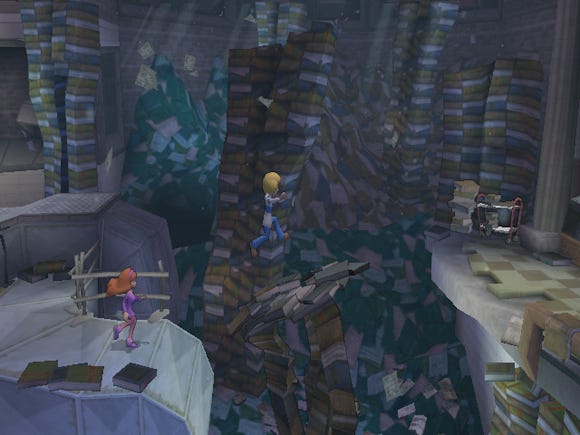
Some platform areas were challenging for the target audience, due to jump distances, camera position, and angle.
The Torus team are very proud of Scooby-Doo! First Frights. What was achieved and learned in the development cycle has shone a new light on our work practices, encouraged further development in personal skill set across all departments, and has handed us the confidence to move into new and broader ventures.
It's most likely that we won't get the development process perfect every time, but if for every project we can learn as much as we did on Scooby-Doo! First Frights, then the games we develop in the years to come are looking very promising indeed.
Developer: Torus Games
Publisher: Warner Bros. Entertainment
Platform: Wii, PS2, DS
Release date: 22 September 09 (US), 9 October 2009 (Europe, Australia)
Development time: 17 months
Number of full time developers at peak: 64
Hardware: Intel PC platforms, Nvidia GeForce cards, Nintendo Wii, Nintendo DS and Sony PS2 Development Platforms
Software: Maya, Photoshop, Premiere, Internal tools
Technology: Bink & Mobiclip (DS)
Cutscene Minutes: 64
Lines of Spoken Dialogue: 3132
Languages: English (US), English (UK), French, Italian, Spanish & German
Lines of code: ~215,000
Lines of script: ~100,000
Read more about:
FeaturesYou May Also Like