Trending
Opinion: How will Project 2025 impact game developers?
The Heritage Foundation's manifesto for the possible next administration could do great harm to many, including large portions of the game development community.

Featured Blog | This community-written post highlights the best of what the game industry has to offer. Read more like it on the Game Developer Blogs or learn how to Submit Your Own Blog Post
How can two similar games have such disparity in success? What stopped Ironpants matching Flappy Bird's overnight fame, and why did either succeed at all? We compare these games to reveal nuance in design, and the importance of focus on player experience.

Sebastian Long is a Games User Researcher at Player Research in Brighton, UK. Through playtesting and player experience evaluation, Player Research work to ensure games meet their designers' intent.

I'm sure ‘Flappy’ is not the most commonly-used F-word players use when describing Dong Nguyen’s brutally tough iOS title this year. Love it or loathe it, Flappy Bird caught the attention of many millions of players, hundreds of YouTube casters, developers and journalists alike, sending Nguyen deep into a media frenzy, resulting in the eventual removal of the popular game from app stores worldwide. 
Even before Flappy Bird made its unceremonious departure from the App Store, Ironpants, an almost identical game to Flappy Bird but featuring a subtly differing control scheme, had hit the market - but even with a simple formula for success to copy from and improve on, why did Ironpants not reach the same lofty heights as Flappy Bird? How can a clone be less successful than the original, even when the original has been removed from the marketplace?
As an exercise in game usability analysis and player experience evaluation, this article considers some of the factors that might have contributed to this disparity, in order to uncover lessons other titles can learn from these two simple, similar games.
Evaluating games for best practices is a task we perform routinely here at Player Research: extracting the best parts of competitor titles to inform the design of new games - especially for complex UI challenges like in-game stores, loadout management, or real-time feedback for complex or fast-paced games.
Despite both Flappy Bird and Ironpants being such simple games, we’ve identified a number of well-executed UI designs and game design choices, as well as some faux pas, which contribute to explaining the disparity of success, and which we feel other developers could learn from. Lets take a look...

Lets start with the basics. Flappy Bird’s visual instructions are perhaps the second-most iconic element of the game - and for good reason: they’re stark, effective and simplistic - exactly as much information as the player requires to start the learning process.
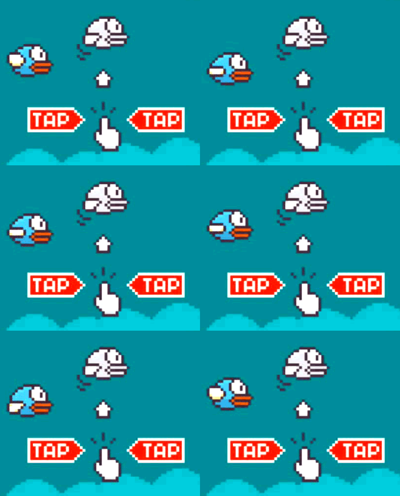
Using animations or stills of fingers can be the most effective way to communicate complex gestures. Showing these finger animations interacting with the game UI itself (e.g. Candy Crush Saga tutorial) or in a dedicated separate animation duplicating the in-game UI (e.g. Angry Birds tutorial) can lead to understandable and accessible text-free introductions to game controls.
Note the use of black and white in indicating a future state of the bird - this serves to better differentiate the animating player character and the assistive ‘future bird’ indicator. The monochrome bird also visually associates with the (similarly monochrome) hand, arrow and bird position, assisting to communicate its message: “your bird flies upwards on tap”. The ‘tap’ indicator is the only use of the colour red in the whole game UI - good for attracting players attention, and reinforcing the importance of the instruction.
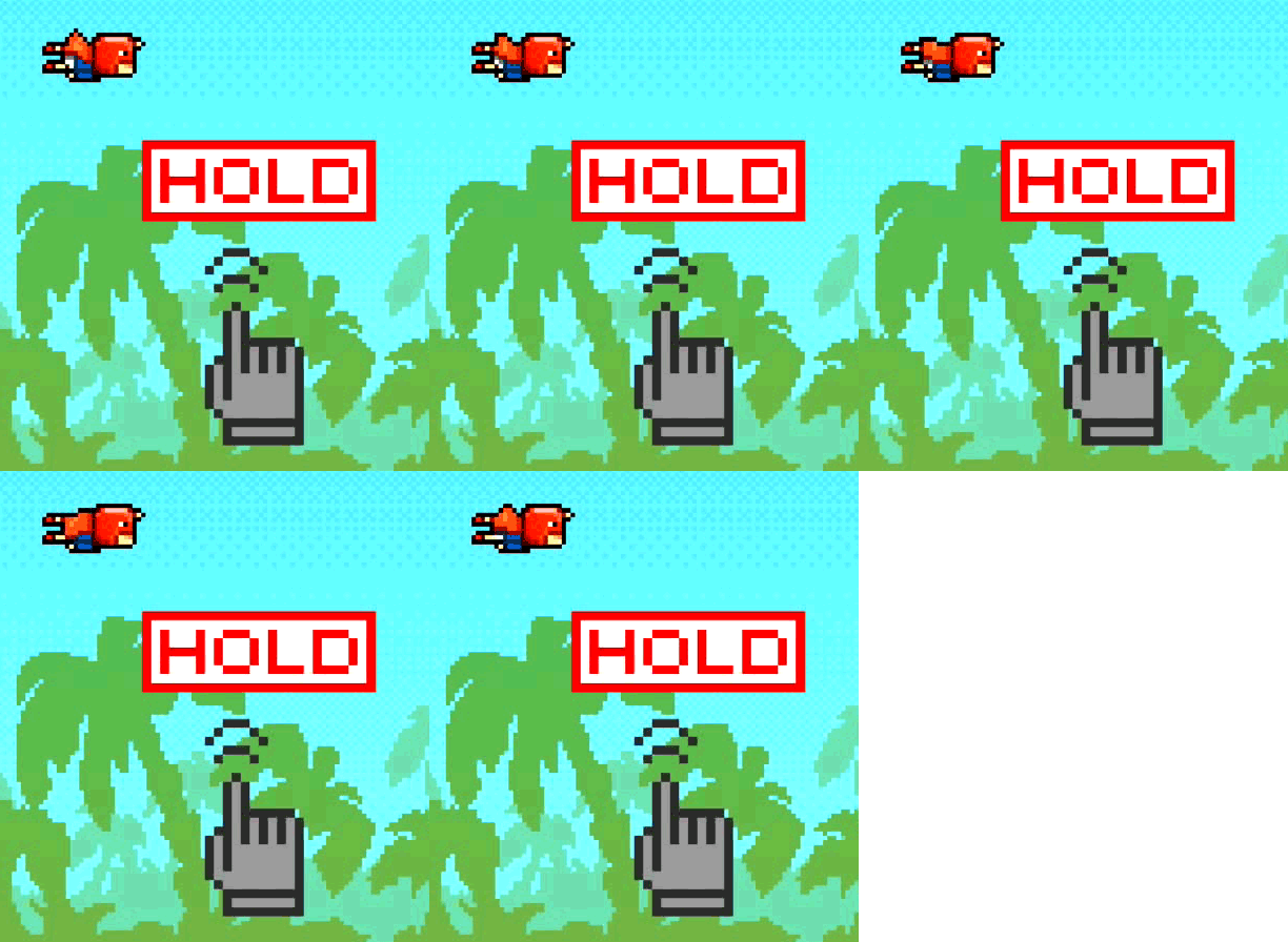
Consider Ironpants’ interpretation below. While similar, it lacks the instructional ‘future state’ character, therefore not assisting players in understanding the action that ‘hold’ will have - perhaps increasing the amount of time needed to experiment with the controls - keep this in mind as we move through the rest of Ironpants’ early experience.

The start of every Flappy Bird level is open and obstacle-free, giving players room to practice tapping between seven and ten times before facing their first pipe obstacle. Players have an opportunity to ‘find the rhythm’ for several seconds before they’re required to navigate the first pipe - helping to avoid too many first-pipe faceplants that will grate on new players, and diminish their ability to practice and master the core controls. This introductory section is entirely missing from Ironpants (see below), where the first obstacle appears immediately - resultantly I’d expect many first-time players’ experience to be unduly frustrating as they’re provided only a fraction of the practice time:
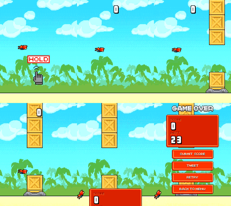
Note that in Flappy Bird, both the tutorial image and the introductory open section are repeated for every game - among other benefits, this facilitates a better pass-and-play experience: give the game to a friend and they’re offered the full instructions and a decent practice time, every time - no need for new players to root out a ‘tutorial replay’ button, or suffer a disruptively-steep learning curve (à la Ironpants).

With both games rich in frustration and failure, they both do well to minimise the ‘down-time’ between levels. Players die fast and often, but neither game prolongs the periods between play sessions with death animations, game over music, or even a significant choice for the player to make - any of these would provide the player with an easy exit opportunity. There are ~2.6 seconds between hitting the pipe and being shown the replay button in Flappy Bird - just enough time for players to acknowledge their death and retry. Unlike Ironpants, Flappy Bird doesn’t have the option to return to the main menu; the design is simpler and better: one button, one tap, one choice, “play again or walk away?”.
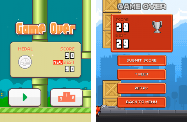
Compare the placement and design of the replay button in Ironpants and Flappy Bird (see above) - it is clear that Flappy Bird’s replay button has better visibility among the other buttons, and is larger (and therefore easier to hit, especially on smaller devices). Players of Ironpants, by comparison, will need to read through each of the options until they find ‘retry’, increasing the time and effort required on the first few plays. Being nested among other buttons, it also risks being harder to hit in a hurry.
Consider the impact on Ironpants’ early player experience of making it harder to retry, in addition to the increased number of deaths due to the lack of practice time and worse control instructions, and the addition of full-screen adverts after death (discussed later) - not a good start.
Both Flappy Bird and Ironpants benefit from a simple, numeric scoring system. It is easy to remember a simple highscore number - especially when you’re presented with it after every game (what a tease!). Just like Candy Crush Saga’s “Which level are you on?”, the question “What’s your Flappy Bird highscore?” becomes the dominant method of sharing progress. This isn’t common practice throughout other endless runner games - Jetpack Joyride offers a ‘distance travelled’ metric visible at the start of each game, but other endless runners like Subway Surfers and Temple Run have multiple measures of progress (multiplier and highscore, in Subway Surfers’ case) - meaning players have to remember both. When combined with the very large numbers often favoured by these games (my Subway Surfers highscore is 378384, for example), they’re hard to remember and hard to repeat - a mistake Flappy Bird and Ironpants avoid with often single-digit, hard-earned numbers.
The lack of a ‘multiplier’ mechanic also makes players scores more relatable and comparable between players - an admirable score of 90 in Flappy Bird means the player actually passed 90 pipes, not 30 pipes with a 3x multiplier - high scores reflect true performance, not manipulated game mechanics - better for both casual and social players.

Flappy Bird players are offered a medal at the end of each session if their score is high enough, following the classic bronze, silver, gold, platinum structure. Using this traditional medal schema renders the reward system understandable to non-gamers. Note that the game doesn’t disclose the specifics of the structure either (it is 10, 20, 30, 40, if you’re interested) - leaving it for players to explore.
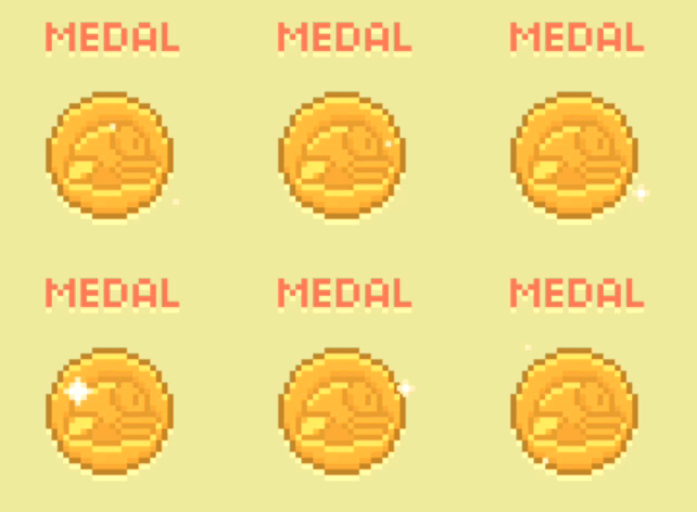
Ironpants, by comparison, offers no such reward system at all, relying instead on players’ own highscore as motivation to replay. While an entire article in itself could be written about these two differing approaches, personally I feel Flappy Bird has the right idea - the notion that I’m being graded against a predetermined performance scale - which in itself has the bar set moderately low, you get a bronze medal with a score of just 10 - I consider to be more motivating than trying to beat just my own high score in isolation.

No Intrusive Adverts
Playing any of Flappy Bird’s many clones will quickly expose the original game’s lack of obtrusive advertising, without full-screen ads or pop-ups, and utilising only top-mounted banners away from the players’ fingers. Despite offering fewer adverts, Flappy Bird was still rumoured to be making more than $50,000 per day from ad revenue alone at the height of its success.
Ironpants - by comparison - offers full-screen adverts after every few deaths, even during the potentially replay-rich early experience already discussed. Displaying full-screen adverts at time-critical moments will only contribute to players’ likelihood of exiting the app, and not coming back. Having full-screen adverts which cover buttons in the app also make it far more likely that players will accidentally tap on it - one sure-fire way to get players to quit your app prematurely is to simply do it for them by having them accidentally tap an advert and be whisked away to the App Store or browser.

Flappy Bird’s UI is consistently clean, readable and minimal - buttons are large when they’re commonly used, are placed in the easy-to-reach lower third of the screen, and have clear iconography - they’re everything a button should be. There is very little text at all: “Tap”, “Game Over”, “Medal”, “Score”, “Best” and “Rate” - again improving accessibility and suitability for young children, and lowering the barriers to entry.

The score indicator in both games is large, readable and uncluttered on the in-game UI - and supported by clear, discrete audio feedback in passing each pipe. It could be argued that the boxy font used in Flappy Bird is less readable than the one used in Ironpants. Flappy Bird’s version suffers less differentiation in the outer shape of the numbers - potentially making it less glance-able in the middle of a frantic session.

Note that Flappy Bird doesn’t take over the screen or distract the player in any way while playing - unlike the latest version of Ironpants, which displays an animated banner over the score when unlocking new costumes. Distracting the player from their task will result in players blaming the game for failure (rather than their own skill), which, in our experience, is a reliable way to have players disengage with your game - particularly with auto-runners.

Ironpants and Flappy Bird’s faceplant sound is short, clean and delightfully slapstick - perhaps even funny the first few times. As for passing pipes, a clear (and familiar) ‘buh-ding’ sound is played every time a player successfully flaps through one - being able to ignore the score by utilising audio feedback is a valuable addition in a game that requires a high level of focus on the gameplay. In Flappy Bird’s case It may have helped that this ‘buh-ding’ sound might be similar to the rewarding noise of a coin being collected in the classic Mario series, but in either case, for new players, this reinforces both the core measure of success, and the scoring mechanic: pass between the pipes.

And so we reach the critical difference between these games: the controls. Flappy Bird’s mechanic uses a ubiquitous upward ‘flap on tap’, while Ironpants favours a continuous upwards movement while a tap is held anywhere on the screen: a subtle disparity that makes all the difference.
If you’ve played both games (and now is the time to, if you haven’t already) you’ll immediately notice the difference in the way they feel - Flappy Bird is a much less frantic and more rhythmic experience than Ironpants, which requires what feels like a more rapid, nuanced and accurate input. In actual fact, it becomes clear when visualising screen interactions (see below) that the rate of input is broadly similar - only the type of input differs: in Ironpants, managing both the tap and release timing are required to navigate the obstacles, while Flappy Bird requires the player only to execute taps.

(Flappy Bird and Ironpants interactions over time (13s) - click for larger)
This critical difference is the dividing factor between these two titles. In developing an alternative control scheme to its predecessor, did the Ironpants' developers capitalise on their opportunity to improve on the Flappy Bird formula? Unlike many of the designs with poor usability listed throughout this article, there isn’t a ‘right’ and ‘wrong’ design for these control schemes - just suitability for differing audiences. Ironpants’ continuous input is a more complex motor-cognitive task than Flappy Bird’s discrete taps for upward movement, rendering it more suitable for a more game-savvy and skilled core audience.
It is this choice of a more complex control scheme, in combination with the failures in Ironpants' early experience, UI design, player reward and monetisation practice that lies the heart of Ironpants’ failure to reach the mass market engagement that Flappy Bird so famously achieved.
Would Ironpants have been more of a success simply by including Flappy Bird’s controls by default? I don’t think so. By failing to understand and (at the very least) copy the good practices in UI design and feedback that Flappy Bird got right, Ironpants would remain the inferior title. I note that the latest version of Ironpants includes a choice of control scheme - including the infamous ‘tap to flap’ - but offering choice will likely result in players blaming their choice of control scheme rather than their own skill or performance - turning the choice into another barrier to engagement. In failing to effectively understand, emulate and improve on the game design and UI design successes of Flappy Bird, I fear that Ironpants’ opportunity for equal success has probably passed.
For game developers, we know that comparing oneself to, and learning from competitor titles in terms of game design is a common task, but taking a step back and considering all aspects of the game - including the game flow, UI design, early experience and how other games have solved UI challenges, is an important and valuable step in developing a game of any kind - if so much can go wrong in a simple clone, then what issues lurk in your own creatively-unique projects?
Of course, one last question remains: what is my Flappy Bird highscore? I’ll let you scroll back through the article and find out…. :-)
Author's Note
I’ve based much of this article on a legacy version of Flappy Bird downloaded before it was culled from the store (I resisted the urge to sell my device on eBay), and the latest release version of Ironpants currently in the iOS App Store, ignoring some recently-added features like alternative control schemes. My apologies if, in doing so, I’ve lost version parity along the way.
This article was written by Seb Long, Games User Researcher at Player Research in Brighton, UK. With thanks to Alistair Gray and Graham McAllister, also of Player Research, for their contributions.
Read more about:
Featured BlogsYou May Also Like