Trending
Opinion: How will Project 2025 impact game developers?
The Heritage Foundation's manifesto for the possible next administration could do great harm to many, including large portions of the game development community.
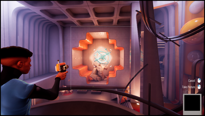
Shutter has players solving puzzles using a camera that can alter the shape and size of objects through messing with their perspective.

This interview is part of our Road to the IGF series. The IGF (Independent Games Festival) aims to encourage innovation in game development and to recognize independent game developers advancing the medium. Every year, Game Developer sits down with the finalists for the IGF ahead of GDC to explore the themes, design decisions, and tools behind each entry.
Shutter will have players solving puzzles using a camera that can alter the shape and size of objects through messing with their perspective.
ARTFX 2022, the development team behind the Best Student Game nominee, took some time to talk with Game Developer about what appealed to them about creating a world that can change based on how you're looking at it, the challenges of making a counter-intuitive mechanic feel approachable to players, and the unintentional humor that came from working with their mechanic.
Who are you, and what was your role in developing Shutter?
Macias: I'm Julian Macias, a technical artist from Quito, Ecuador. I moved to France to study at ArtFX. On our graduation project, Shutter, I was the programmer and producer. I was probably the person on the team wearing the most hats. My main work was programming all the mechanics and systems of the game and organizing our team, but I would work on whatever we needed the most at the moment like props, UI, level building, or animation.
Le Roux: I’m Thomas Le Roux, a game designer from Montpellier in France. I was the game designer and level designer on Shutter, our graduation project. I also managed the audio and music teams for the project. My main work was to conceptualize the gameplay, adjust the 3C, make the mechanics, and block out of the puzzles.
Medeiros: My name is Vincent Medeiros, concept and lighting Artist from France. I studied Art and Architecture at L’atelier de Sèvres and then moved to ArtFX to study Digital Arts. On Shutter, I was the art director, concept artist and lighting artist. I was developing the look and designs of the game as well as coordinating the artists of the team together to achieve our goals for the visuals for Shutter.
What's your background in making games?
Macias: I initially studied multimedia at UDLA in Ecuador with the goal of becoming an animator. I worked for a couple of years doing animation and applications for museums and art installations. I got more and more interested in making video games, then I found ArtFX online and decided to move to France to study there.
Le Roux: I started to study programming in Epitech but I didn't feel good because of the lack of creativity. After a while searching for what I wanted, a friend told me about ArtFX and Game Design. I immediately felt I was in the right environment.
Medeiros: I started creating my first video games at ArtFX.

How did you come up with the concept for Shutter?
Macias: Shutter is the combination of many ideas from all of our team. The aspect about the game that I really pushed was the "forced perspective" mechanic. I was really interested in Non-Euclidean mechanics from games like Portal, Manifold Garden, or more notably, Superliminal. I had just played Superliminal and I thought programming the perspective mechanic could be fun. To not make it the exact same, and given we had a character artist on our team, we decided to adapt it to third person.
Le Roux: Everyone wanted to make a game with a strong narrative purpose. With this, the idea of a reporter came up and we wanted to put the Polaroid camera at the center of the gameplay. So, the mechanic of the forced perspective was proposed with the challenge of making it work [in the] third person.
Medeiros: When we started to think about the game, we focused on a time period defined that was around 1960 - 1970. Following this, I talked about the Space Age era and how we could blend the unique designs coming from that time with brutalist architecture. After I came up with a few key concepts that drove the team, I also worked very closely with our Material Artist Allan Magagnosc to develop a graphic aspect through the textures of the game.
What development tools were used to build your game?
Macias: The game was developed on Unreal Engine 4.26. For all the art, each artist just used their preferred tools: Autodesk Maya, 3Ds Max, Substance Painter and Designer, Blender, Zbrush, and Photoshop. We used Github for our version control and Trello to organize our tasks.
What appealed to you about exploring the ways in which perspective and camera positioning can make something look different? In making a game about perspective?
Macias: Since the beginning, our goal was to do a short twenty minute game. This mechanic was uncommon enough to still be surprising for a lot of people. It is very amusing seeing people discover it and try to comprehend it. People will quickly make assumptions on how it works, sometimes being completely wrong.
Le Roux: The best feeling was to see the player understand the puzzle after searching for the solution and being surprised by how the mechanic works.
Medeiros: I think one of the strengths of video games is to let the players navigate through the art of it with specific mechanics. The gameplay of Shutter allows the player to develop their curiosity and discover the narrative space that we created.

What challenges did you face in getting the perspective-shifting mechanic right? In getting it to work in an intuitive way?
Macias: Making the mechanic intuitive was definitely hard. As a Non-Euclidean mechanic, it’s by nature counter-intuitive. We put all of our focus on making the player comprehension process smoother.
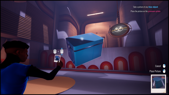
We initially thought of switching between third and first person when using the camera, but we realized this caused dizziness in many people, so we settled for just bringing the camera closer. To bring additional control to the player, we also added the idea of the character moving the picture closer or further away to change its perspective. These two things combined to allow the player to have enough control over the size of objects while remaining in third person.
We established a color code where all blue objects work with the camera to make the game kind of self explanatory. Our UI, while simple, helped accentuate this, always showing the input on-screen and highlighting the viewfinder and the object contour when it was correctly aimed.
Also, we needed to have good lights in the rooms to help the player place the objects with strong shadows when the player was moving them.
What thoughts went into designing puzzles that can be solved using this perspective-changing ability?
Macias: We built the game split in[to] sections around a central area where the player can come back to. Each section focused on progressively exploring a different aspect of the mechanic. For the first section, we focused on just the basic functionality of the camera, like moving objects and scaling them. As you progress, we make it more about interacting with the environment by finding codes and moving platforms to progress.
Le Roux: As you progress, you also need to mix up the mechanics to keep going; like using big objects to activate moving platforms.
Can you walk us through the design of one of your puzzles? How you conceived it and then shaped it to work within the game?
Le Roux: Let’s take the last puzzle of the first zone. The player needs to repair the gravity of the room and use a huge object to access the ending door.
First, I designed the room and the idea of the puzzle (make the player use big objects to cross a hole) on paper to see if the idea works well. Then I prototype it on Unreal Engine using blocks and planes. Here, there is also a little interaction linked to the story, so I added it to see if the whole thing worked. If it’s fun and not frustrating in the prototype phase, I can give it to my artists who will turn all the gray boxes into something wonderful.
Medeiros: At first we were developing level art with a set of modules that was developed for the whole game. After that first step was done, we started to create unique props and architecture parts for each puzzle. Sometimes we also had ideas for the art that could serve game design in a new way, so we had back and forth discussions with the game designers to come up with solutions and push the gameplay and art together to be their best.

Did the mechanics ever provide any interesting surprises while working on them? Create some interesting, impressive, or funny moments while working on the game?
Macias: We were always surprised and laughed at all the physics bugs we encountered during development.
A particular favorite of the team was a bug that may happen with L-shaped objects like the desktop computers found in the game. If the player positions one on the ground and runs towards it, it can be used to catapult the character around. While very specific, sometimes it may happen unintentionally and it’s very funny. We decided to adapt and keep interactions like this as features or for speedrunning purposes. We hope to see some people speedrun the game sometime. We had a lot of fun doing it ourselves.
Shutter's environments are striking to behold and get you into a photographer's mindset for capturing its beauty. What ideas went into designing this place?
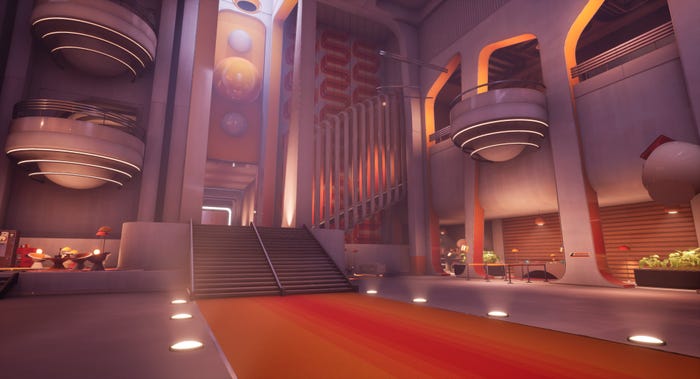
Macias: For the environments, we were heavily inspired by Brutalist architecture and space age design. We required big spaces for the game to work and this type of architecture lent itself well to this.
Medeiros: We created the environments with strong inspirations coming from two different art styles. In order to make it work together, we really played with the shapes of every asset in the game and got beautiful compositions of architecture and colors. The wild designs we had for reference helped us push our own designs and allow the player to get the best views of the game.
We also had to keep in mind that players can scale objects, so we created narration for each puzzle/space to help design the levels.
What thoughts go into giving the environments a personality and story without words? In making a location speak to the player? How did you work these thoughts into Shutter?
Medeiros: When designing the environments, we often had two paths: the main one for progression and secondary zones where we reward the player with additional details on the story. These secondary zones often had a darker ambience and were not as easy to notice, but with some element to still grab the attention of more curious players.
A lot of narration also went into the dramatic lighting of the game to the point where it was sometimes the center of the gameplay. We tried to support this with some environmental storytelling by placing details in a way that would help people imagine a deeper story.
Read more about:
[EDITORIAL] Road to IGF 2023You May Also Like