Trending
Opinion: How will Project 2025 impact game developers?
The Heritage Foundation's manifesto for the possible next administration could do great harm to many, including large portions of the game development community.
Experienced mobile developer Jeremy Alessi writes about how a simple side project turned into a surprisingly successful app -- covering both the original idea, the technical implementation, and business model.

Experienced mobile developer Jeremy Alessi writes about how a simple side project turned into a surprisingly successful app -- covering both the original idea, the technical implementation, and business model.
I think it's safe to say that every game developer has had a pet project at some point in his or her career. It's nigh impossible to be creative and not want to act on more than one project at a time. Such is the case with c.AR, an app with some game-like traits that combines augmented automobiles with photography.
One of the inspirations for this app is the "photo mode" feature of many big-name racing titles. In Gran Turismo, Forza, and now even Real Racing, players can snap dramatic pictures of their favorite cars and even enhance the virtual photos with a variety of filters and effects. Of course that's not to mention that automobile photography has a dedicated niche outside of the gaming world.
With c.AR, I wanted to bring these two worlds together and then add a bit of social "look at me" flavor. After all, many auto enthusiasts love to snap pictures of their cars but how many get to snap pictures of an exotic, let alone in their own driveway or garage?
With the concept firmly planted I began prototyping c.AR in earnest last year. A variety of technical issues delayed the app. However, things eventually came together and c.AR has since received a warm welcome on the iOS App Store.
As with any pet project, I thought c.AR would be easy. I didn't have big ambitions for it -- I basically just wanted to quickly drop 3D car models onto a camera feed. I had always been interested in augmented reality, and I had a bunch of car models, so it seemed like the perfect quick fit.
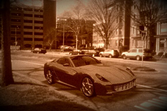
After a single night's work I actually did manage to get something up and running but it wasn't pretty.
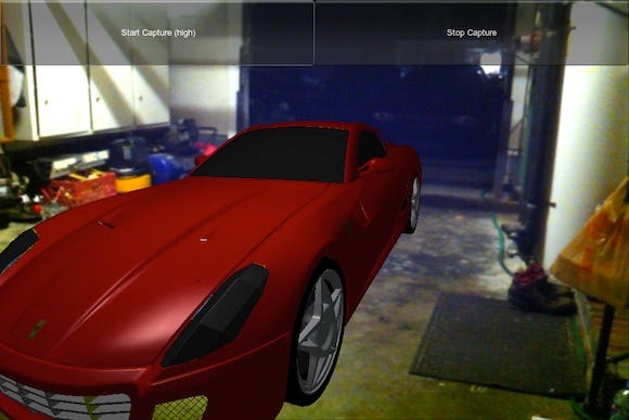
Of course I was pretty giddy at the prospects. If there's an equivalent to beer goggles for game developers, I certainly had them on that night. The shot above has so many things wrong with it that I cannot begin to count them. To name a few, though, there's no shadow, the real camera and 3D camera's field of views don't match, and the car's paint looks more like Campbell's tomato soup than the high-end gloss you'd expect on an exotic. Clearly, I wasn't going to be making my friends do a double take on Facebook anytime soon.
Of course, like I said, I had my game developer beer goggles on. As such, I went around taking pictures for the next week or so, trying to test the flexibility of the concept. Since this was a pet project, I kept it pretty close to the chest and only shared it with a close friend and my brother. Every now and then I'd email or text them a picture to critique. It was a lot of fun seeing if I could get something believable captured.
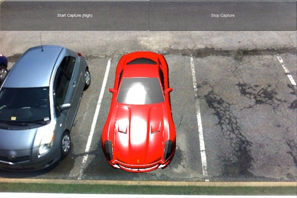
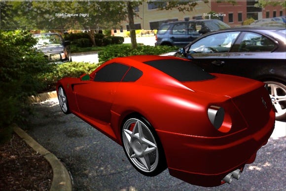
By "practicing" with the basic abilities of the prototype (transform and light intensity only) I was able to get better shots. However, the new feeling of getting something up and running eventually wore off and reality finally hit me. These shots, as much fun as they were to try and get, weren't good enough for anything besides my own amusement as a developer. I knew that with the limited resources I had for this project that the shots would never look totally real so I settled on "real enough to be entertaining."
To meet even that expectation, though, would still require a few tricks. I began by adding a shadow, which was the most obvious element missing from the earlier shots. Of course, the shadow made a monumental difference -- such is life at the shallow end of the Uncanny Valley, I suppose.
From there I simply began running down the list of obvious enhancements. The next element was a spherical reflection map for the paint. Next came transparent windows. With each 3D graphics feature, things got better and better. I just kept picking from the smorgasbord until I hit a wall.
Things were moving along, but there was something I just couldn't shake with all the shots. I began searching the web for any shots with similar angles to those in my growing library.
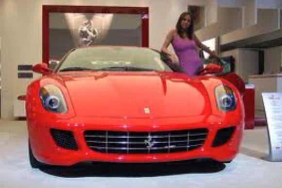
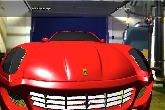
That's when it hit me! Never mind the ugly textures or jagged geometry. In the bumper shot I was standing roughly 2 to 4 feet (0.6 to 1.2 meters) from the front of the car and slightly to the passenger side, trying to get one of those dramatic shots. The proportions, of course, are completely out of control. My 3D game camera was not synchronized with the iPhone's camera.
All the shadows, reflection maps, and transparent windows in the world could not have made up for the false field of view problem. The iPhone camera has a field of view of 37.5 degrees. By setting the 3D renderer's camera to the same amount things started looking rather decent.
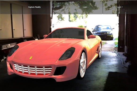
With a ground shadow, reflection mapping, some glass transparency, and the proper 3D camera field of view, things were fast approaching "real enough to be entertaining". The biggest problem at that point was aliasing. The jagged lines at the edges of the 3D model were just jumping off the screen.
Up until this point I had avoided the use of OpenGL 2.0 level shaders. I had good reason to. Prior to version 3.4, Unity had a bug that plagued the iPhone, which rendered any shader views perpendicular to the main viewport. In addition, there were still a lot of OpenGL 1.1 devices on the market.
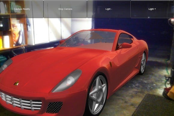
With the release of Unity 3.4, the perpendicular rendering bug was fixed, and the iPhone 4S was on the market. I started tinkering with the concept again, this time armed with some full-screen post-processing effects.
Just like that, the image quality again increased dramatically. With a cocktail of blur, bloom, and anti-aliasing effects, the model really began to blend into the photograph. The jagged lines that plagued earlier shots were now subtle enough to be entertaining, and I knew I was getting close to something that might actually see a release.
With friendly.fire performing well beneath expectations I needed to start sifting through my war chest for potential release candidates. At this point, my father in-law had been made privy to c.AR, and when I mentioned I might be close to getting it finished, he made a remark to the contrary. Well, of course that's all I needed to hunker down and get the thing done.
The first order of business was the interface, which was one element that had been so cumbersome that I hadn't actually let anyone else try the app. On the first night of development I had set up a multi-touch fiasco of an interface that involved an array of finger swipes so complex that I was sure nobody on Earth could have figured it out.
In the end I found that even without the complexity of multi-touch, swipes just to move or rotate the car were far too imprecise to line up the shots. What I settled on was a pretty simple but powerful UI setup that allows for a mode selection and magnitude.
For example, one option is "Pitch Car" to tilt the car up or down as if it were on a hill. Pressing the + button would pitch it one way and pressing – would pitch it the other way. This simple approach worked for anything whether it was a position, angle, intensity, opacity, or color. In order to speed up the process, I added one behind-the-scenes mechanic in the form of an accelerating rate of change to the buttons, so the longer they are held the faster they work.
Another huge issue with the interface beyond the UI was that the models were too high-detail to run appropriately on mobile. This problem required a few steps to solve. The first order of business was to optimize the models by combining geometric groups to use the fewest materials possible.
During this phase, many of the missing details from the cars were also added. Things like missing backfaces, wheel wells, and rudimentary undercarriages were appended to the base car models. Adrian Tysoe handled the modeling changes for the cars, which were originally purchased from TurboSquid.
Unfortunately, even optimized, the models were still beyond the capabilities of the limited mobile GPUs, so an intermediate step was introduced. Rather than attempting to manipulate a high-detail 3D model on an underpowered device, a proxy model was used to line up the car's transform. By substituting a low-poly approximation of the current automobile in place of the highly detailed final render model, we achieved the best of both worlds. Now the app ran at high frame rates during the positioning phase and delivered a final 3D model that was beyond the confines of typical 3D rendering capabilities on mobile.
In the final days of development the interface was working and the cars were neat but there was something missing. The final images were decent but they lacked variety. To counter this I employed a group of nine customizable filters that would overlay on top of the 3 automated filters running behind the scenes.
Initially, these filters were controlled on the same screen as the positioning setup, but at the last minute I made filter selection its own screen with back/next buttons to navigate between positioning and filter selection.
The problem with the filters was that they greatly reduced the frame rate of the app even when the high-detail model was not visible. By separating the filter selection from the positioning screen, I removed any frustration that might be caused by low frame rates. In addition, the filters took the visuals from looking okay to that level of "real enough to be entertaining" I was after. They also added variety to the app, which ultimately allows users to be more creative.
In addition to the technical aspects, it's interesting to discuss the business model I ended up with. Initially, I was going to just charge 99 cents to unlock new cars, but I was also eager to experiment with a consumable credits system. In the end, I went with the latter, and it seems to be working rather well.
There are three price tiers in c.AR. For 99 cents, users can acquire $100,000 of in-app currency. For $1.99, they get $400,000, and for $2.99 they get a whopping $1,000,000. Due to the way the pricing scheme is staggered, it makes sense to go for the $2.99 option, and far and away this is the biggest seller.
I chose an interesting path for purchasing credits. The primary car selection screen is very simple, and I didn't want to complicate that in any way. Users only see a car, a sale sign, a price, and a "Shoot" button. Pressing the button triggers an automated algorithm that either unlocks the car and begins the photo shoot, or prompts them to purchase enough credits to obtain the selected car.
The interface is so streamlined that there is little room for confusion, and by looking at the ratio of credit purchases, it's very clear that users understand they get a better deal by spending $2.99.
Due to the consumable nature of the in-app purchase system, any given user can spend more than $2.99 on the app. There are various purchasing paths, and some are surely more efficient than others. Some people will surely think about that and get more for their money, but in general the most important aspect of the business model (currently) is that the $2.99 purchase is the top selling option.
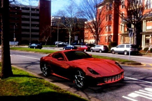
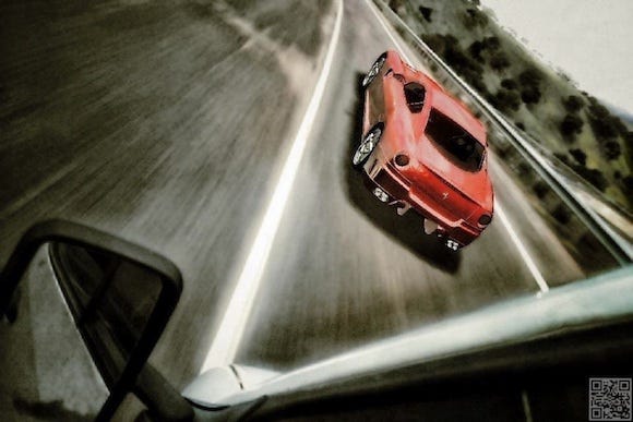
Upon release, c.AR found a good amount of success for a pet project. The app has ~200,000 users with ~100,000 joining during the first month and nearly 1,000 photo shares on Facebook. Below is one of the best shots posted by a Facebook user who appears to have used c.AR in conjuction with Instagram.
During its opening weekend, c.AR solidified a position in the top Photo & Video apps, and has since seen a surprisingly steady download curve. It should be noted that c.AR also appeared in the Games > Racing category, but due to the rules of the iOS App Store an app can only be placed into the top downloaded list of its primary category.
Had c.AR been listed primarily as a game it could possibly have been listed in two top downloaded categories, since games have sub-categories. The decision to list it as a Photo & Video app first and a game second seems to have been a good one, however, because games tend to spike and drop, whereas c.AR has extremely steady download rates, nearly identical from day to day.
Overall, c.AR has been an excellent experience. It turned out well technically, looking real enough to be entertaining. Reviews and community involvement have both been solid. Finally, sales have been very steady, warranting further developments.
Considering that c.AR was a pet project, it has been remarkably successful. Initially, it was a fun developer diversion. However, since release it's clear that people are interested in the concept and want more. In the near future, the app will receive a stability update (hopefully to use less RAM for rendering), cross-platform compatibility with Android, a reward system for social interaction, file handling enhancements, and more cars.
Finally, I'd really love to make the app truly worthy of the augmented reality moniker by allowing users to place markers and just walk around the car. The technology is there, but it wasn't a priority early on due to the level of user commitment required to utilize a true AR setup.
In closing, I have to say that perhaps the best projects are pet projects. This year I've been writing about a game called friendly.fire, which I had big plans for. It was carefully calculated, and time-consuming to create. On the other hand, c.AR was something that just rose out of a general interest of mine. I just thought it would be neat, but I did not necessarily think anyone else would care (certainly not hundreds of thousands of people).
In turn, c.AR became a bit of a test bed for newer techniques that I hadn't previously explored, and ultimately because of that, I suppose it ended up being fresh to other people. In the end, this left me with a new understanding of game development. Ideally, a game or other interactive media begins with an immediately familiar subject (in this case cars) but allows users to manipulate that familiar subject in a new way. To that end, I'll share three quotes (I might be paraphrasing here) which come to mind.
"Start with something familiar"
- Jim Tobin
"Be different"
- Alex Seropian
"There's no silver bullet"
- Jeff Tunnell
Obviously, there's no surefire way to create a successful game or app, or otherwise everyone would do it! However, if developers hook people with something familiar, surprise the audience slightly, and manage internal expectations success may just follow!
You May Also Like