Trending
Opinion: How will Project 2025 impact game developers?
The Heritage Foundation's manifesto for the possible next administration could do great harm to many, including large portions of the game development community.

Featured Blog | This community-written post highlights the best of what the game industry has to offer. Read more like it on the Game Developer Blogs or learn how to Submit Your Own Blog Post
Detailed comparison of how new genre RTS games like Rival kingdoms are attempting to innovate & improve over ageing counterparts like CoC, to refresh & build next generation of mobile gaming experiences.

.jpg/?width=700&auto=webp&quality=80&disable=upscale)
Detailed comparison of how new genre of RTS games like Rival kingdoms are attempting to innovate & improve over ageing counterparts like CoC, to refresh & build next generation of mobile gaming experiences.
I Believe UX design in a product is a voice, that stand for the end user. It must identify, pain points & cognitive friction which users might have experienced in the past in a similar product and also aim at pro-actively eliminating cognitive load for new breed of products as users become more familiar with existing digital experiences, we need to keep evolving the experience , making it better and refreshing.
"A look at some of the screens where RK does it better then CoC"
Is a critical aspect of any game, churn rates can be as high as 40-60%, in the first 1-2 minutes if we don’t get the FTUE first time user experience right.
"My personal observations from conducting usability tests."
Do not like lengthy tutorials.
Skip through text boxes & narratives.
Like to be visually shown a action (animated) then read about it.
Take pride in discovering features on there own rather then be handheld.
Are familiar with how most common mobile game features work (mental models). Remember players are evolving and maturing having used smart phones for a number of years now.
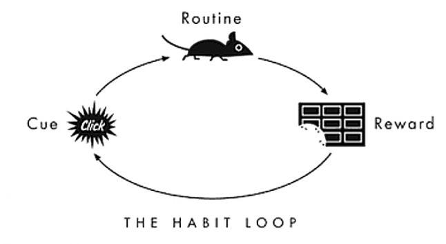 The purpose of a tutorial is to make players familiar with the habit loop which they can keep repeating to stay engaged. Let’s see how CoC and RK handle this.
CoC starts with base building (Tycoon Phase), the ROUTINE part of the habit loop not neccessarily the most engaging aspect of the game.
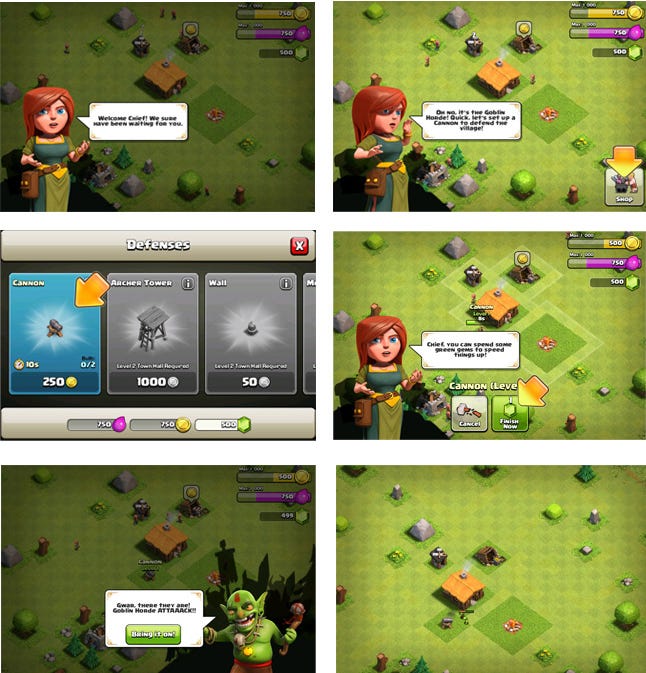
Players are spending time and currency making production buildings.

This is followed by a brief battle, which dosen't involve much of player input and it's back again to base
building yet AGAIN!
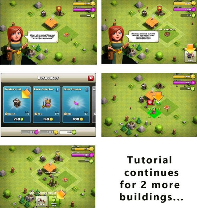
"In CoC players spends first 5 to 10 minutes of their gameplay in base building, the routine part of the 'Habit Loop' not necessarily the most engaging aspect of the game"
Well, you may argue. Om! You got to learn the ropes, right?
Perhaps yes in 2012 when the game was first launched you needed to teach the ropes in so much detail, but not now with every second RTS game having more or less the same base building mechanics well establishing this fast ageing mental model.
"With churn rates as high as 20 to 40%, in the first 1 to 2 minutes if you don’t get the FTUE first time user experience right."
Are you sure? This is how players should spend their first 5 to 10 minutes within your game?
By contrast RK starts with battle (action phase) which is more REWARDING part of the habit loop, player learns troop deployment, the battle makes players feel more engaged & powerful right from start.

This is followed by inheriting the base, that the player just conquered, which makes him feel, he earned and gets to keep his conquest/loots.
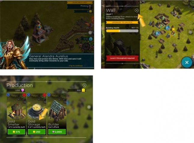
Notice the difference in number of buildings, CoC and RK give to the player during tutorial.
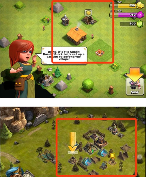
RK bestows a more advanced base, with troop portals, defence cannons, strong hold and walls to ensure, the player progresses faster, and spends more time in the battle phase rather than base building at first launch. Reducing grinding/core loop friction.
Second battle is followed by brief base upgrade, which also unlocks a achievement for the player, rewarding him yet again.
"While player is still building his base in CoC, in RK he
commences to his second battle learning the use of god powers."
Tutorial skips in CoC are paid for by the user, while they are free in RK. All players find the free skip generous and a more +ve expereince.
.jpg/?width=700&auto=webp&quality=80&disable=upscale)
During tutorial Player is rewarded gold & elixir in CoC.
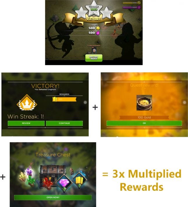
Battle Rewards + Achievements + Gacha streak = 3x Rewards
In Rk players first wins and rewards are multiplied for a more positive and rewarding experience, he gets battle rewards, immediate achievement reward and if you notice, the game is setting pace for Win streak which does random gacha drops, so the 3rd battle immediately after the tutorial gives player a win streak of 2 which gives him a additional gacha rewards.

"For today's mobile gamers, On boarding needs to be easy, fast
paced and a very rewarding experience or they will churn"
Notice how HAYDAY on boarding starts with the most rewarding part of theHabit Loop i:e Harvesting (Which is most fun & yield rewards) and not Seeding.
"In Hayday's on-boarding Seeding/Routine part of the
habit loop is taught after Harvesting/Reward part!!"

Supercell never applied this learning to RTS genre, Space Ape did!
As Players progress in these games, base building /customisation for better defence’s is important for strategy, cutting down losses, & progression. A lot of Target Audience, especially advanced players in this genre care deeply about base building.
A look at some of the screens where RK does it better then CoC
.jpg/?width=700&auto=webp&quality=80&disable=upscale) Edit mode in CoC allows you to select a building...
Edit mode in CoC allows you to select a building...
.jpg/?width=700&auto=webp&quality=80&disable=upscale) ...and move them around ONE by ONE
...and move them around ONE by ONE
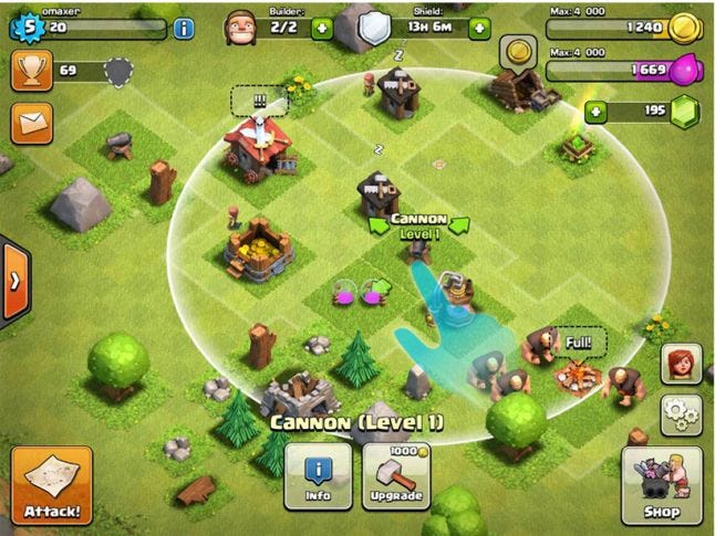 You can also tap on a defence object to see it’s attack range.
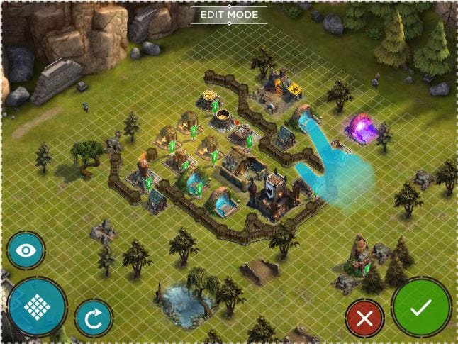 Press & hold on any building in RK activates a dedicated edit mode. Which has additional selection options for quicker base editing.
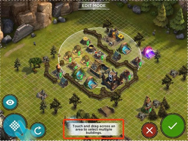 Multi-select button allows you to select multiple buildings at one go. You can them move as a large group for faster customisation.
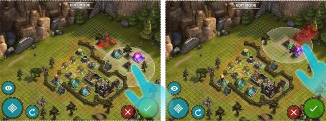 Ability to select multiple objects and move them together is a great asset as your base grows, from a defence and strategy point of view.
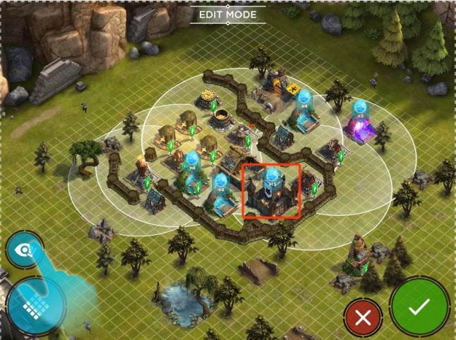 Clicking on the Eye-Icon, shows the attack range of ALL MY DEFENCE STRUCTURES together, you can see in one glance my stronghold is not well protected, in CoC & Boom Beach I need to individually tap on each defence structure to get an approximation of my defence overlaps.
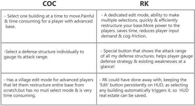
Just the fact that RK is providing advanced base editing options, understanding the friction & pain points of base restructuring in existing games is a clear indication of how the Devs. care about and are committed to improve player UX.
Crafting core gameplay experience for a mobile audience, which has a gamut of varying attributes and expectations, involves offering multiple paths of progression, be it for killers, Achievers, Socialiser ,or less skilled players.
It’s becoming all about catering to a wider funnel of players. GLU Mobile FPS games like Deer Hunter 2014 and CK: Sniper prove that even hard core genre like FPS can be tailored to mid-core to casual audience by offering multiple paths of progression & easing cognitive load.
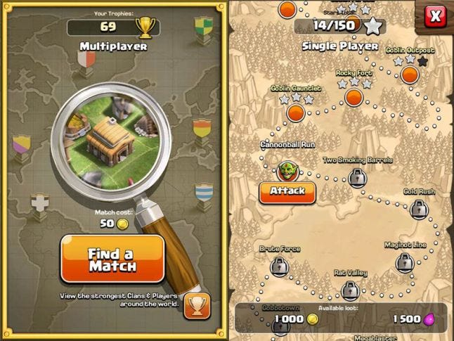
Map in CoC only allows players to play single player or PvP
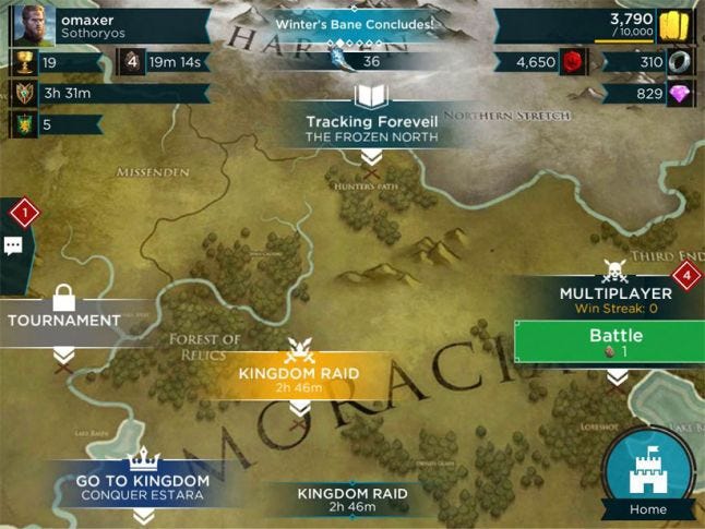
RK map allows players to pursue multiple paths of progress as per their preference and inclination. PvE, PvP, Clan & Social,Narration driven episodic missions, tournaments.
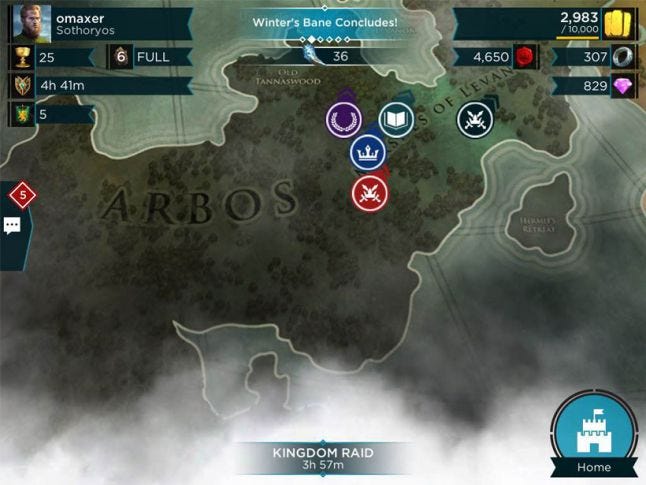 The map has a more free flowing, exploration/discovery feel. it also has floating navigation pins, which appear once progression nodes are off screen, players can reach the nodes in just one click by tapping on the pins and never feel he is lost on the map. this feature is present in EA’s Minion Paradise as well.
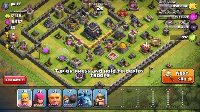
In CoC one of the main core loop friction arise from the fact that players can not make informed choices, the game finds PvE and PvP bases randomly and once on that screen player can not change his troop types or powers unless he surrenders. Which is a strategy blind spot and players complaint about it. In Boom Beach the ability to scout before attack is a improvement, but it still mean input effort on players part to go back to base and change his troop types, multiple screen transitions and delay in battle time.
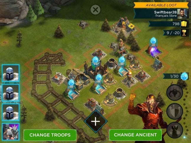
In RK the devs. thought about this strategy blind spot. The player can not scout the enemy but has a pre-battle screen where he has the ability to change his troop types and Titans/god powers if he wants. This helps players strategize by gauging their enemies map, and knowing what they would need to counter enemy defenses. They can now make informed strategic choices without surrendering, or transitioning back to base.

Another pain point in CoC & to a extent in BB is players have to painfully wait for the war to get over (some times 1 to 2 minutes), once they have exhausted their units and powers. Players helplessly watch AI units destroy or get destroyed. It breaks immersion, mobile players have a very short patience threshold and can quit the game at this point.
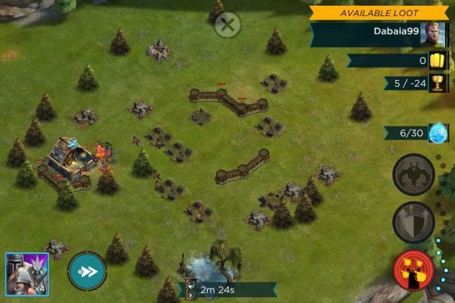
RK tries to address this issue by providing a fast forward button, Player can quicken the pace of his victory or loss outcome, and move on to progression rather then helplessly watch over. This gives players more control and utilise their play time better.
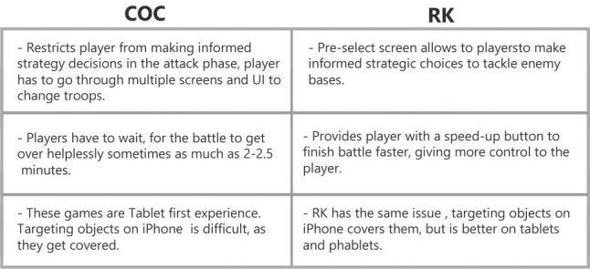
SUMMARY:
RK on-boarding starts with reward part of the habit loop which will engage and retain the players more.
Base building & Edit mode UI gives more tools and power to the player to efficiently and quickly organise their base.
Battle phase UI allows players to make informed decision and gives more control over their strategy by being able to change their troops and powers by gauging enemy weaknesses.
Both CoC and RK have limitations when it comes to small screens as they are designed for a tablet first experience.
To define next-gen mobile experiences, best of both games should be adopted and UX should be improved wherever these games fail to deliver in areas like better target selection in small screens, HUD optimisation on small screens and keeping information more precise and contextual
If you liked this post, you can check out my other Game UX Deconstructs
Read more about:
Featured BlogsYou May Also Like