Trending
Opinion: How will Project 2025 impact game developers?
The Heritage Foundation's manifesto for the possible next administration could do great harm to many, including large portions of the game development community.
Working on a twin stick shooter for iOS? This article goes in-depth into the right techniques for honing this difficult-to-get-right control-scheme on Apple's touch-only devices, and examines many popular games' approaches.

[Graham McAllister, director of user experience studio Vertical Slice, examines the conundrum of creating a twin stick shooter for the touch-only iOS, breaking down the dos and don'ts, and examining a number of popular games to see what approaches work best.]
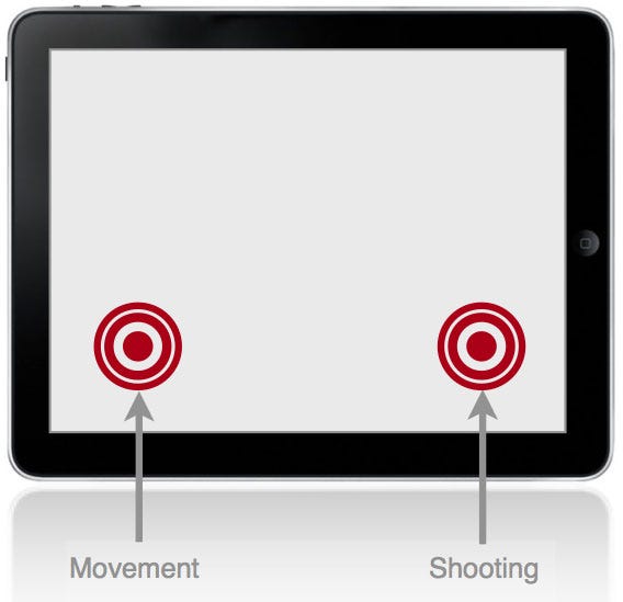
Twin stick shooters are a genre of game which use two controls, typically operated by the thumbs. One control dictates the character's movement, the other the direction of shooting.
Importantly, these can be operated independently, i.e. it's possible to move in one direction, and shoot in another.
The camera angle in these games is either from directly overhead, or overhead and from a slight angle. The games are essentially 2D, i.e. there is no forward (or z-axis) movement.
Movement is almost always on the left-hand side, shooting on the right; some games allow the options to switch this for lefties. This layout is also consistent with twin stick shooters on Xbox 360 and PS3.
Minigore on iPhone introduces the controls very clearly.
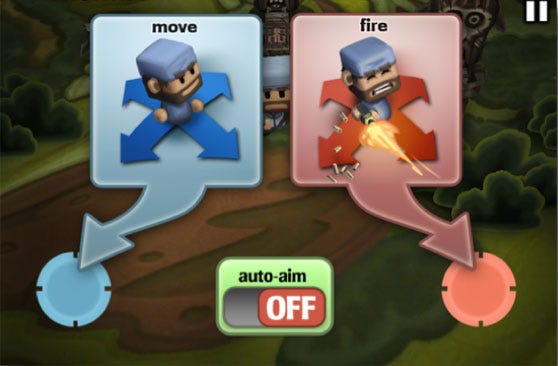
With only two touch screen controls to implement, you may think that all twin stick shooters are created equal, however it turns out that subtle changes in design can greatly affect the player experience.
No standard definitions exist to describe the interactions we're about to introduce, so we'll try to keep them as descriptive as possible.
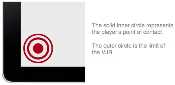
Most of the terminology will be defined when we introduce the four components, however they all have one feature in common, the virtual joystick region (VJR hereafter).
Within this region, thumb contact is registered as control input, if the player's thumb touches the screen outside of this area, it is not registered as player input.
There are four main design decisions to consider when implementing the controls for your iOS twin stick shooter.
Static or dynamic controls
Controls always visible
Controls active outside the VJR
Play to border
These four components are combined to form alternative control implementations.
Before we take a look at the main varieties and show examples of games which use each particular combination, let's describe the four components.
For clarity, our examples will focus on the movement control, but all comments apply to the shooting control also. Each component is really a design decision with two options, so we'll cover each alternative.
Static Controls. This approach fixes the location of the touch controls, typically they'll be within easy thumb reach of the corners of the iOS device.
Later we'll see how component three, Controls Active Outside The VJR, extends the usability of the static control approach.
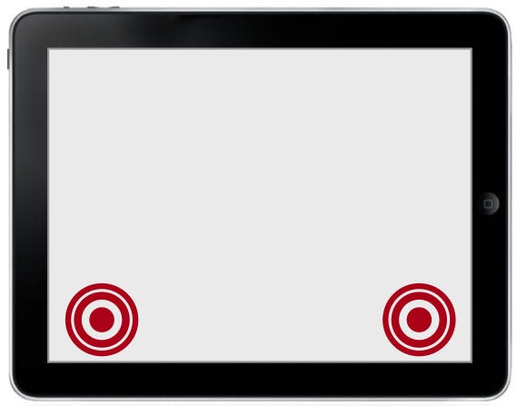
Static controls - fixed at corners of the device.
Dynamic Controls. This approach centers the controls at the point where the player touches the screen, i.e. the controls can change spatial location depending on where the player's thumb makes contact.
Crucially, however, there is one important factor in how dynamic controls are implemented, which brings us on to the second component.
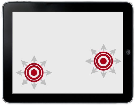
Dynamic controls - controls center where the player taps.
Dynamic controls can be displayed in one of two ways: Always Visible, or Display On Touch.
Always Visible. The always visible approach draws the VJR where the player touches the screen, and keeps the controls displayed there even if they remove their finger.
Depending on the spatial location of where the player makes contact next, the technique will decide whether to draw a new VJR, or retain the original (we'll clarify this in an example shortly).
Deciding whether to make the VJR always visible or not is more than just a visual feedback issue.
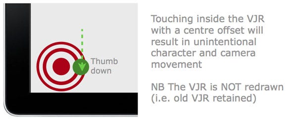
If the player lifts their thumb from the screen and the controls remain drawn, then the player has to put their thumb back again in the exact same spot, otherwise it can cause undesirable player and camera movement.
Let's see how this can happen in more detail by looking at a simple example of the player touching the screen, lifting their thumb, then re-touching the screen again.
Step 1 - The first touch
Let's assume the game has just started and the player is about to touch the screen for the first time. When they make initial contact, the VJR is drawn for the first time.
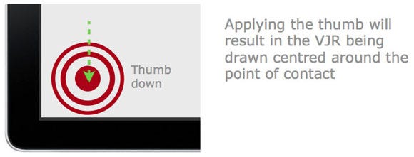
Step 2 - Thumb release
At some point the player is likely to lift their thumb from the screen, at which point, the always visible approach will keep the VJR drawn.
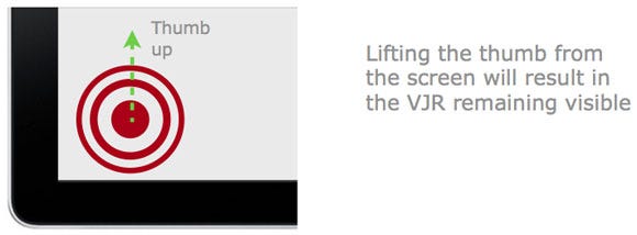
Step 3 - The second touch
When the player reapplies their thumb to the screen, one of two possible scenarios can occur.
Scenario B, in particular, is the cause of many user experience issues with twin stick shooters.
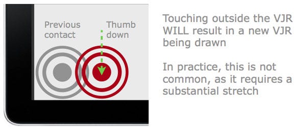
Step 3 scenario A - touch outside the VJR
If the player's thumb makes contact outside the VJR, then a new VJR will be drawn with the new point of contact as the centre.
In other words, if the distance between the previous and current points of contact is greater than the radius of the VJR, a new VJR will be drawn.
Step 3 scenario B - touch inside the VJR
In this case the player's thumb makes contact within the current VJR, resulting in the character starting to move in that direction. Of course it's possible that the player's thumb may make contact in the exact centre of the VJR, in which case no movement would occur, however in practice this is unlikely.
It is this offset placement that makes fine control difficult, leading to player frustration. Also, depending on how the camera has been implemented in the game, any character movement could also cause camera movement. This means that this control combination will not only result in difficulty with fine control, but also cause camera shudder.
Camera shudder and unintentional movement are particularly noticeable in cases where the player wants to move one direction, e.g. left, but their thumb touches the right side of VJR to begin with.
Display on Touch. The alternative, and more common approach, is to only display the VJR when the thumb is in contact with the screen.
So if the player lifts their thumb from the screen the VJR is hidden. When the player makes contact again, the VJR is drawn at the new location.
Using this approach, the player's thumb is always at the centre of the VJR, leading to smoother and more predicable control.
Let's look at the same example as before, only using the Display on Touch approach.
Step 1 - the first touch
For the initial touch, the situation is the same as with the Always Visible approach.

Step 2 - thumb release
This step is the key difference, and benefit to this approach. When the player lifts their thumb, the VJR is hidden from view (not drawn).
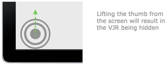
Step 3 - the second touch
As the VJR was hidden from view on thumb release, this means that wherever the player touches next will always be the centre of the VJR.
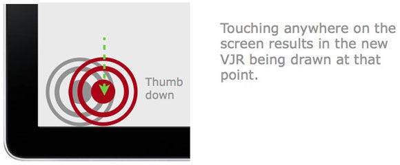
This leads to predictable (intuitive) player controls.
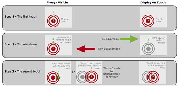
The key differences between the two approaches to implementing component 2. (Click for larger version)
For dynamic controls, when the player initially touches the screen, the VJR is typically drawn as a circle centered around the point of contact (there are exceptions; we'll come to those later).
The player can then make a sliding gesture to direct movement (or shoot) in the desired direction.
However, as long as the player does not lift their finger off the screen, it is common in most (but not all) games to be able to continue to use the controls outside of the VJR.
This means that the controls will continue to work until the player's finger is lifted, e.g. dragging left will move their character left etc, however when lifted, they will have to start again by touching within the VJR.
Impact on static controls. For static controls, this means that it is only the initial touch that is required to be within the VJR, after that it's possible that the player's thumb could drift across the screen.
For static controls, the downside of controls being active outside the VJR is that if (when) the player lifts their thumb from the screen, they have to shuffle their hand back to the VJR in the corner of the screen.
Impact on dynamic controls. For dynamic controls, this hand position "drift" has less of an effect on the player, as if their thumb loses contact with the screen, they can simply reapply it anywhere on the screen and the VJR will be redrawn at that point.
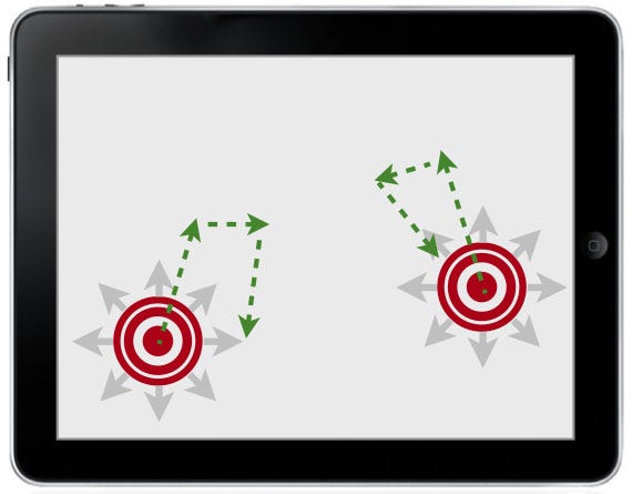
Players can move their thumb outside of the VJR and still have control.
As we were saying earlier, for dynamic controls the VJR is drawn with its centre point located where the player's thumb makes contact with the screen. However there is one exception to this: border cases.
Border cases. In most circumstances, when the player's thumb makes contact with the screen, there will be enough space such that the entire VJR can be drawn so that it fits on-screen.
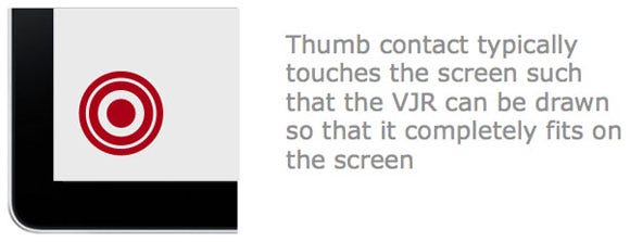
But what happens if the player's thumb makes contact close to the edge of the screen? In these cases there is not enough space to draw the full VJR, so the designer must make a decision between two approaches, Fit and Centre.
If the player touches the screen near to the border, draw the VJR such that it always fits entirely on the screen.
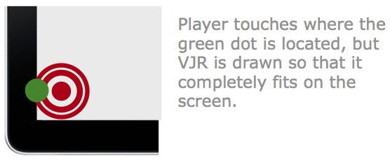
This approach has the disadvantage that if the player makes contact close to the left hand edge (for example) their character will move left, whereas it's possible that they were just making contact with the screen and had intended to go in another direction or simply wanted to stand still.
Ultimately, this approach can lead to unintentional player movement.
Centre the VJR at the point of contact, regardless of whether it's near an edge or not.
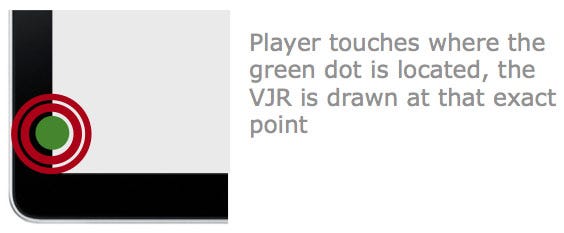
This approach is probably the better design decision as it more closely matches what the player will expect from the controls. In other words, it is more intuitive.
It also has the advantage that the character will never move off in an unintended direction as the VJR is guaranteed to be centred around the point of contact i.e. the centre point is a null input, a 'do nothing' instruction.
Now that we've detailed the four main components that affect the controls of a twin stick shooter, let's take a look at how these have been implemented in iOS games.
Each game will use a combination of the four components, but as we'll see, some combinations lead to a better gameplay experience than others.
We'll now compare five of the most popular twin stick shooters on the iOS platform. All comments relate to the iPad versions.
Revolt
Max Adventure
Meow Meow Happy Fight HD
Age of Zombies
Geometry Wars: Touch

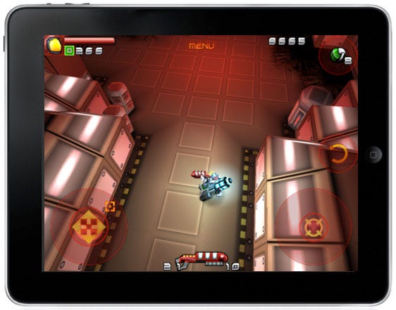
Quite a few complaints on the App Store relating to the controls of this game.
From our viewpoint, the static controls make it difficult to control the character smoothly, also causing frequent camera judder.
Changing to dynamic controls would certainly have improved the user experience.
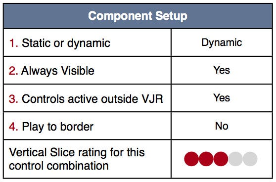
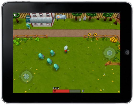
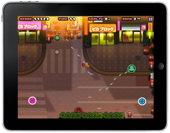
Although the comments on the App Store do not criticize the controls, there are two design decisions here that could lead to unintentional player movement.
1. Play to border is not used, so if the player touches near an edge they will move in that direction, even if they wanted to stand still.
2. The game makes the somewhat unusual decision of using dynamic controls but permanently visible. This means that if the player lifts their thumb but makes contact within the VJR (i.e. a small movement), it will likely result in unintentional player movement. Hiding the controls on lift would have solved this issue.
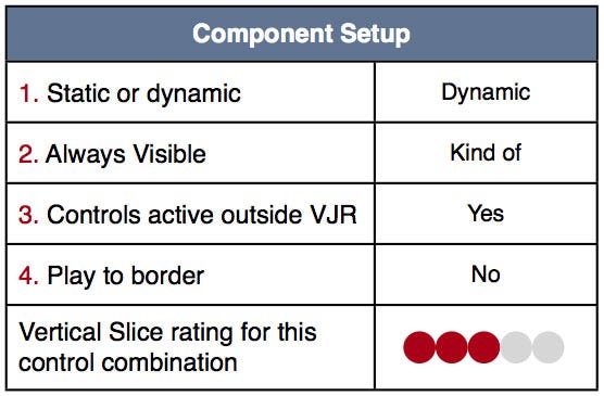
A variety on the permanently visible theme here, the VJR has a small core which is permanently visible, then it expands when touched.
The main problem with their implementation is that when you lift your thumb and reapply it, you'll almost certainly start moving in a random direction.
The reason for this is that the sensitivity of the small core at the centre of the VJR is too high.
To solve this issue, a small "dead zone" (inactive region) region around the permanently visible core would have allowed players to tap the screen without moving unintentionally.
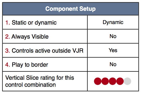
These controls feel great, using dynamic VJRs which are hidden when not touched make for smooth and intuitive gameplay.
This combination is almost ideal, but not quite. As the controls don't let the player tap close to the border without moving/shooting in that direction, means it's still possible to move unintentionally.
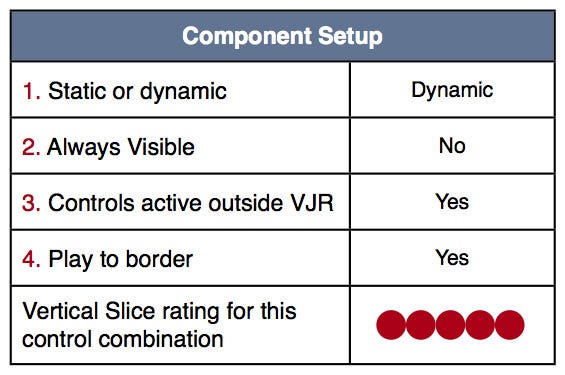
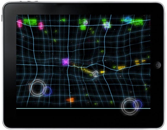
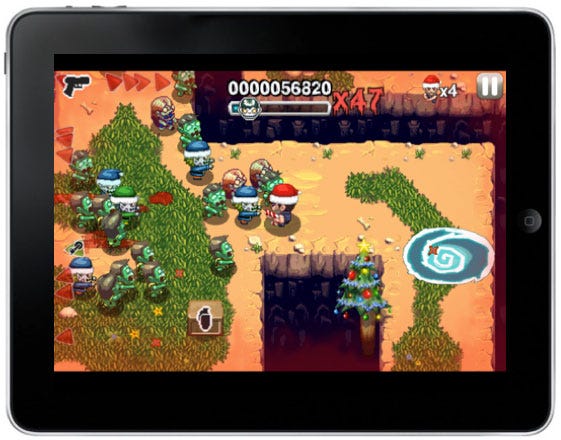
The controls for the iPad version of Geometry Wars are quite simply divine. They apply best practice in each of the four components to deliver a smooth and satisfying player experience.
Incidentally, the iPhone version uses a variation on a static approach, nowhere near as polished as its big brother on the iPad.
As a result of analyzing a number of the current twin stick shooters, it emerges that the best combination of the 4 design components in terms of both usability and user experience is:
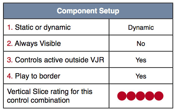
Advantages of this component combination:
Removes unintentional player movement
Removes camera shudder
Delivers intuitive controls (matches player expectations)
Caters for different sized hands / grip position
Now, we're not saying that this is a hard and fast rule, but you'd need to have some pretty good reasons to not design your twin stick shooter with this component combination.
I'd like to thank Seb Long and Pejman Mirza-Babaei for their invaluable feedback during the writing of this article.
Read more about:
FeaturesYou May Also Like