Trending
Opinion: How will Project 2025 impact game developers?
The Heritage Foundation's manifesto for the possible next administration could do great harm to many, including large portions of the game development community.
Veteran designer and Tomb Raider creator Toby Gard explains how to enhance the reality and player interest of even a very basic game's design, with a level design case study of the awesomely named Kung Fu Zombie Killer.

[This is the second part of a three-part series of articles by veteran designer and Lara Croft/Tomb Raider creator Toby Gard, dealing with level design in action adventure games. Part 1 described Level Flow Diagrams, which act as the core of the level brief provided to a team by the leads. Part 2 describes a process of expanding that brief into a detailed level plan of the awesomely named Kung Fu Zombie Killer.]
This stage of the process is most often carried out by a cross-discipline team of designers, artists and coders, who will expand the level brief into a detailed level plan, but this process can equally be the next step that an individual designer takes when designing a level solo.
Delegation and teamwork are vital given the scale of modern console development. Without them, leads become bottlenecks that slow development and sap motivation.
The current trend is towards agile development whereby scrums are given ownership of individual problems. This has many advantages over the old waterfall methodology, but there is one pitfall to watch out for with peer-only teams.
If a group of peers go into a room with the goal of making design decisions, the tendency won't be towards a design that everyone loves, but rather towards the design that everyone least hates.
The psychology goes this way:
 1. Person X suggests a new idea that he thinks might be mint. It's not a complete idea yet, but he believes it has a kernel of goodness that could make for a unique piece of gameplay.
2. Persons Y and Z who have not seen anything like this idea before quickly point out all the flaws in the idea.
3. Person X, whose idea still needs nurturing, responds defensively, firing off hastily-thought out solutions that people also don't like.
4. The idea is shut down and the group moves on. If person X brings it up again, people are going to think he is beating a dead horse.
5. Next, Person Y suggests something that he has seen in a game before.
6. Person X and Z both remember that being pretty mint in that other game, and they know it can be done, which means low risk.
7. Everyone feels good as they write the tired, overused mechanic/scenario up on the whiteboard.
8. Repeat.
There is little to no way to get vision from a peer-only group unless they have worked together long enough that they are all on the same wavelength.
There are two potential solves to this:
1. Separate brainstorm and decision meetings.
2. Employ a group design method I tested at Crystal Dynamics called a "The Thunderdome" (as coined by Mr. Ron Rosenburg.)
A "Thunderdome" gives each member of the level team the same deadline to propose a complete, individual solution to the entire design problem (in this case a paper map.) Once that (tight) deadline is up, the whole level team comes together and shows their individual solutions to their teammates, and everyone discusses the pros and cons of each one in a respectful way.
Then the team (and the lead) cherry picks the best ideas from all the proposals and merges them into a unified team plan.
This is the equivalent of forcing lateral thinking techniques in an individual. Humans naturally solve problems by brainstorming solutions until they find one that works, at which point they generally stop thinking about the problem. Lateral thinking techniques push us to go beyond that first working answer and try to find three to five more, to see if there is a better solution out there before moving on.
When each individual in a "Thunderdome" creates their own solution, I guarantee that none of them will be the same, and the group will have multiple working solutions to pick from instead of one compromise solution. Of course this is not in the agile way -- which probably makes me a heretic who must be burned or something.
With the Level Flow Diagram in hand, the next stage is to fill in the details.
This is the time to explore the level's stories because from them, the juiciest parts of the level's design will emerge.
Regardless of the narrative of the game, each level has the potential to tell many layers of its own background story. Even an empty office has the potential to tell little stories that transform it from a dull set of plain rooms into a real place through artfully placed builder's tools, scrounged furniture, used cups, and discarded rubbish.
But the real power of level stories has nothing to do with set dressing; it is in their ability to provide you with context-relevant gameplay scenarios that the story-based method really shines.
To make the level real to the player though, first it must be real to you.
I would argue that the power to immerse the player, to absorb his attention completely, is the common attribute of the greatest and most successful games.
Gathering and studying reference is critical to creating immersion for the player. It is something that the entire team should do, not just the artists.
Everyone stores simplified constructions of reality in their mind; schemata that codify the critical features of the world around us. We use our schemata to recognize and interpret everything we experience.
We also use those same simplified representations of reality to recreate it through art. Because no two people use precisely the same critical features to build their schemata, every person's art has a unique look, filtered through the lens of their uniquely simplified representations of reality.
While schemata allow us to rapidly process the deluge of information we receive each day, they come with the cost of a blindness to data that does not fit with them. That data gets stripped away and left unprocessed. Because we rely on them constantly, we tend to trust them implicitly.
But the fact that no two people have precisely the same schemata is all the clue we should need to realize that they cannot be trusted at all.
When we are creating worlds in games, immersion is only possible for the player if we can convince the players that the space is authentic (whether stylized or not.) If the critical features on screen don't match up with the critical features of the player's schemata, then he or she will not be fooled by it.
So as game makers we must have really precise schemata to convince the widest selection of players.
When designers or artists rely on their standard schemata to judge their own creations, they are mistakenly assuming that others will judge their work using similar standards as they do. This can be particularly egregious when people from one country try to reproduce locations from another.

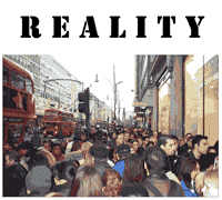
American dumpsters sitting in the back streets of Paris or French road signs on the streets of Chicago might seem acceptable to the developers because they do not mismatch with their very simple schemata of those distant locations, but these contextually inappropriate placements will be laughably inaccurate to people really familiar with those places.
Given that games are released worldwide, it is difficult to overestimate the damage to audience immersion and perception done by poorly researched levels for a large percentage of your audience. Remember, it's your worldwide reputation on the line.

Street Fighter meets Pikmin in this zombie-filled romance beat 'em-up.
Blurb. When the living dead smash up his martial arts studio, Wu Shu master Ken Kong must punch, kick and chop his way through the zombie apocalypse while gathering humanity's remaining survivors on his quest to save the You Tube celeb of his dreams.
Style. '70s exploitation movie visual themes mixed with a Japanese anime-inspired visual language. Highly stylized over-the-top combat, unrealistic physics, fun gaming conventions reign over realistic game rules.
Fluid Environmental Kung Fu. Think Jackie Chan: Ken Kong picks up and uses everything around him to dispatch his zombie foes.
Whether he is slamming doors into their faces, or ripping off one zombie's arm to bludgeon another to death, Ken Kong's simple multi-lock, rhythmic fighting system turns combat into a bloody storm of body parts and flailing fists.
Protect the survivors! As Ken Kong saves the living from the living dead, they join the crowd that follows him, urging him on to greater feats of martial prowess. Different types of survivors can either bolster Ken Kong's abilities or can be applied to tasks throughout the game:
Police - Shoot any zombies they see.
Nurses - boost to Ken's health recovery.
Martial artists - increased survivor resilience.
Workmen - repairs.
Geeks - hacking.
Civilians - Cheering (boosts Ken's damage) and fortification building.
Etc.
The more there are of a given type of survivor, the better the crowd's abilities become. The crowd will stay together and can be ordered around by Ken, but they must be protected from being bitten by the zombies or the whole crowd could become infected.
Secure each level. Ken must shepherd the survivors to a location that can be fortified so that they will be safe.
This could mean securing the entire level, or just one section of it. The crowd itself does the fortification, barring doors and boarding up windows. The more survivors there are, the faster repairs are done. Essentially they are closing enemy spawn points, and Ken must stem the flow of enemies while the fortifications are in progress or the crowd will be eaten by zombies.
Theme. While the film Planet Terror is a good starting point for the mock '70s horror exploitation movie feel, Kung Fu Zombie Killer has a more lighthearted Viewtiful Joe feel at the same time.
Motivation. Ken is in love with the YouTube vlogger jenna126xyz. In fact, he is her only fan. Throughout the game, Ken forces everyone he saves from the zombies to sign up as fans of jenna126xyz in an attempt to win her heart.
Given the ludicrous nature of this game concept, it might at first seem that there would be little point in rigorous research or fictional development, but I contest that there still is.
Even a world with a silly premise will resonate more fully when effort is made to realize it in its entirety.
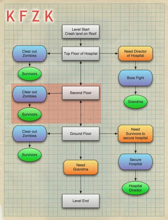
After watching jenna126xyz's most recent tearful videocast, Ken Kong is now trying to rescue Jenna's grandmother from a hospital overrun by the undead.
Key:
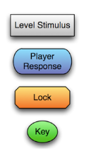
The idea is that you see Grandma almost immediately, but can't get to her without the Hospital Director's keys, found near the end of the level, giving you an objective and a goal. The Hospital Director, on the bottom floor, will not come out of his secure office until the building is secure, forcing your secondary goal (save the survivors) before you can open the way to grandma.
A Boss fight is worked into Grandma's room, and once that is done the level can pretty much end -- a fairly bog standard level flow.
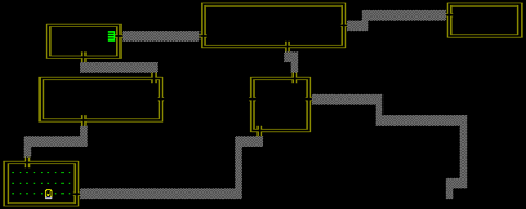
The section of the level we are going to focus on is the Second Floor, highlighted in red on the Level Flow Diagram above.
A hospital is hardly an original setting, especially in this context. Hospitals are obligatory whenever there are zombies around: Silent Hill, Resident Evil, Left 4 Dead, and Planet Terror are just the tip of the iceberg. So the challenge is to walk this well-trodden ground and still make something somewhat fresh. The key to that is to look around you.

When deciding how to tackle this hospital level, it would be tempting to begin by looking at the many other examples of hospitals in competing games, and while it is useful to learn what has already been done, it wouldn't help us get original ideas for this particular level.
You are likely to be able to rattle off a list of areas from your head that you would expect to find in a hospital, from waiting rooms and restrooms to operating theaters and canteens. Most likely the overriding impression you will have in your mind will be long, seemingly endless hallways with single or multi-bed wards off them.
But when you actually go to a hospital, there is so much more to see. There are gift shops, libraries, kitchens, rehabilitation areas with gyms or pools.
There are auditoriums, children's play areas, janitorial closets, elevators and their associated maintenance areas. There are courtyards, roof gardens, underground parking lots, and changing rooms for the doctors and nurses, with lockers and showers.
You also see just how many more off-limit areas there are than public ones. Some are secured with passkeys, others with ordinary locks.
These locked doors lead to record rooms, office spaces, drug and equipment storage rooms and all manner of other administrative areas. Their doors are either solid or have very small reinforced glass windows.
For our purposes that means there are many places where people could potentially survive a zombie attack, along with lots of opportunities for us to realistically gate the player.
A great deal of research can be done from books, movies, and the internet but nothing can replace personal experience. While not everyone can go to the pyramids or an abandoned space station whenever they feel like it (unless you're Richard Garriott, of course), most people could visit an abandoned or ruined place near them (as long as is safe to do so) that will evoke a similar mood and mystery on a smaller scale.
The key is you must look, in order to find inspiration.
There is nothing more amateurish than arbitrary architecture, by which I mean spaces obviously only built for the player by the game designer. Whether it is a city street or an ancient ruin, it is the designer's job to build spaces with a fictional purpose as well as a gameplay purpose.
When a player enters a temple that has no space for worship, or a tomb with no burial chamber nor rhyme nor reason behind its layout, he or she will not be convinced that they are exploring a real place. The worst starting point for a level is a series of featureless, functionless boxes joined by corridors into which gameplay is inserted from a list of gameplay goals.
Levels built that way may as well be randomly generated.
Looking at real spaces for inspiration will bring the physical rules of building construction to the forefront of your mind, it will inevitably bring truth to your work and give you ideas that you would not otherwise have thought of. You must design the spaces of your level primarily for the people living in the game world and then adapt it for the player.
Even if you are creating an outside space, studying ordinance survey maps to see how real world topology looks and going for a stroll in the hills will let you turn a bland height map into a believable outside space.
The difference between a height map that has been pulled up and down randomly, and one that appears to have simulated real weathering is enormous.
(click for full size)
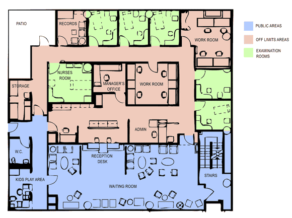
I'm going to use this section of a hospital floorplan, based on a general admissions unit from a real hospital, to show how one floor of the level might be constructed through fiction.
First off you can see that while the majority of the areas are not designed for the public to wander around, access to them is relatively easy. For instance, the admin area is easily accessible by climbing over the reception desks from the waiting room, even if the two doors were closed and locked.
The only rooms that are likely to be kept locked at all times are the workrooms, the records room, and the storage room. They would most likely have keycard or combination locks so that staff could relatively easily get in and out but patients couldn't wander in willy nilly.
The examination rooms would most likely have been unlocked when the zombies arrived, but along with the nurses room, the manager's office and the W.C, they could have been locked by survivors trying to escape the living dead.
There have been an untold number of physical key card puzzles in games, and almost as many broken-down elevators. The hardest challenge in design is avoiding the clichés when trying to disguise the keys and locks in the levels.
The reality is that without unique abilities, there is little that hasn't already been done a hundred times when it comes to player gating. The standard options have been so thoroughly explored, re-dressed and reskinned, that many games these days have simply begun to do away with them altogether.
Games like GTA let you go almost anywhere and attack problems from any angle. Their gates are metagame gates; the beginning and end of missions, the opening of new city areas. They don't struggle to mask the opening of the game world in fiction -- they make it very clear.
I'm not arguing for one way or the other; both can be done well or poorly. In this game, I'm using NPCs as keys; they are keys that can be eaten by your enemies. If your keys die, then you won't be able to achieve some (or potentially any) of your goals.
Now that we have a better understanding of our location, it is time to look to any ramping documents and decide what sorts of scenarios have to be fit into the level.
Kung Fu Zombie Killer's NPCs are also used as the game's help system, pickups, power-ups, quest givers, quest items, achievements, secret items, traps and puzzles. They are ultimately flexible from a gameplay point of view, but even better, they add life and narrative to the game.
We want to place the following in this section of the level based on a ramping plan:
NPC's to save:
A security guard - who shoots zombies and has a security pass
~2 doctors - who heal the crowd and lower chance of crowd infection
~4 nurses - who increase Ken's health
~18 civilians - who contributes to Ken's damage bonus by cheering
Items to use:
toilet
letter openers
sinks
heavy swinging lamps
dishes of scalpels
table lamps
windows
flower pots
wooden chairs
head-height glass cabinet doors
Zombies to Kill:
Tons of them.
Kung Fu Zombie Killer is a beat 'em-up, and most rooms on our floor plan are probably too small to fight effectively in. The rooms can be scaled up to an extent without becoming ludicrously oversized, but it is a general note that as games lean towards more believable spaces, there is a greater need for better camera and animation systems to cope with confined spaces.
When working into realistic spaces the first thing to do is work out how much you want to modify the physical flow from room to room. This comes down to how linear or open you want a level to be. For the sake of this example we are going to funnel the player fairly heavy handedly just to illustrate some of the ways it can be done.
(click for full size)
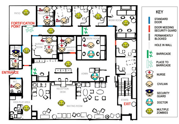
In this case I used two standard techniques; the permanently blocked door and the hole in the wall. The fiction for these changes is fortifications that are so drastic that they can't be undone, and walls that a large number of zombies have burst through. These two types of permanent changes to the floor plan can dramatically change the way you move around a realistic space.
The first step is to define the primarily play path. I have funneled the player in a big circle all the way round to the storage closet above the entrance, where the security guard is hiding with a nurse.
The security guard is necessary to unlock the door on the east wall, the only way through which you can reach the staircase and exit this floor.
The barricades can be disassembled by any survivors if you approach from the side where the crosses are.
The fortification point is this floor's zombie spawner. Ken has to fight on the patio while the survivors build the barricade, before jumping back into the building at the last second. The more survivors Ken has released, the faster that the barricade can be built, but the player needs to make sure that there are no (or few) zombies left inside the building because the survivors are vulnerable while fortifying.
Everything else is fairly self-explanatory; there are four bonus civilians and a nurse that can be unlocked from the manager's office if the player backtracks with the security guard, lots of zombies to kill, and a second barricade that can be dismantled to create a shortcut if backtracking is necessary through this space.
The simplest examples of level stories are told through the "forensic" placement of art; bloody hand prints on the walls, discarded children's toys, and overturned tables and chairs. They don't affect gameplay, but they provide mood and richness to the level.
Those small forensic clues can be expanded to full narratives describing the fates of characters you may never meet in the game.
For instance, you might find graffiti scrawled in blood on the walls describing somebody's final moments, but finding a room with its doors off its hinges, a toppled pile of tables and chairs just behind it and a fat, satisfied-looking zombie sitting in a puddle of blood, tells a similar story while also offering you the chance to respond.
This level is filled with possibilities for those details and they can all be pulled out of the backstory of these survivors.
For masterful use of storytelling through set dressing, look at Fallout 3. Every area had its own stories to tell from depravity through to insanity, all laid out in the artful placement of everyday objects.
As I sculpted the play path I wanted, I was coming up with the following back story:
Zombies first came into the waiting room from the stairwell. The security guards managed to fight them off and managed to permanently block that door.
Meanwhile, two patients ran and locked themselves in the toilet.
Next, zombies started coming in through the entrance. The hospital staff moved everyone out of the waiting room and barricades were set up trying to secure the admin area.
Meanwhile, the zombies in the stairwell manage to smash through a wall into one of the examination room. Another permanent barricade was set up, and just to be sure, a security guard locked the next examination room's door as well, just to be safe.
By this point zombies have started climbing over the reception desk and break through the right hand door into the admin area. Everyone evacuated further back into the offices except one doctor who hides under a desk. A nurse was already hiding in the manager's office, and she let four patients in as the zombies swarmed the admin area.
The rest of the survivors ran towards the patio, but a mass of zombies smash their way in through the patio door and the survivors find themselves surrounded. Groups crush into any nearby room and lock the doors behind them, leaving some unlucky people locked out in the corridor.
Almost the entirety of this story -- plus the stories of the other humans that didn't survive this attack -- can be carefully laid out in the artwork.
The upshot of using this method will be a sense of authenticity during play that you cannot achieve any other way. While players may not consciously pick up even half of the detail you are putting in, they will feel it. They will be drawn into your world in a way that more laissez-faire methods simply cannot achieve.
The more questions you ask, the more stories can be hinted at:
Is there a reason that the security guard ends up with that particular nurse in the storage room?
Is there a reason why one nurse has access to the securely locked manager's office?
Who shut the door of the North East workroom, shutting the zombies in there with a group of (now dead) nurses?
Now, were I a member of a level building team, the map I've created above and the back story that goes with it would be presented along with all the others: one from each team member. They would be reviewed by the whole level team, who having all thought it through deeply, are now informed critics, under the watchful eye of the lead that wrote the Flow Diagram.
Each design would be unique and all would have their plusses and minuses. No one design will be so perfect that it will be better than everyone else's in every respect. I know there would be better ideas on the table than mine because I work with talented people.
But perhaps some of my ideas would be end up being selected and they would go into a final level layout that would be better than anything any one of us could do alone. Fact.
And that's magic.
Research thoroughly; there are many people who will know if you skimp.
Always visit a real location for inspiration.
Always start from an architecturally sound floor plan.
Sculpt the play space with events that occurred before the player arrived.
Define the back story through the design and let them feed each other.
Write down the back story so that as the design is realized on screen; all departments can express it through art, animation, and sound.
[To read Part 1 of this three-part feature, click here.]
Read more about:
FeaturesYou May Also Like