Trending
Opinion: How will Project 2025 impact game developers?
The Heritage Foundation's manifesto for the possible next administration could do great harm to many, including large portions of the game development community.
In factori, players send the simple letter I through an ever-evolving assembly line to craft new letters and words. Here's how the team at Star Garden Games brought the idea to life.

Factori is an adorable puzzle game about crafting letters and words out of the letter "i". Each of the game’s little factories will bend, merge, reflect, or rotate the letter until you’ve built it into the shape you want, and all while building a happy, charming assembly line of factories to do so.
Game Developer spoke with the team at Star Garden Games to learn about the thought process that got so much alphabet mileage out of the letter "I", the way they created a visual appeal in simply watching your factories chugging along, and how this all came together over forty-eight hours for the GMTK 2021 Game Jam.
What inspired the play style of factori? What gave you the idea to create all the letters of the alphabet by starting with the letter "i" and then making changes to it?
Since factori was originally made for the GMTK 2021 game jam, we had a prompt to get us started: "Joined Together". We were struggling to choose between a few ideas, one of which was a factory building concept inspired by Mini Metro. But the idea was missing that unique hook to make it stand out. After milling over a second idea about joining letters to form words, we realized both concepts could be combined into something cool. And factori was born.
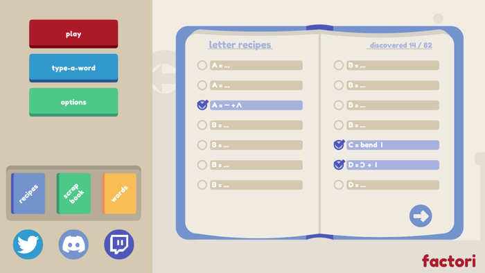
We started a spreadsheet with all the ways that letters could be manipulated and combined to make new letters (aka "letter recipes"). When you think of letters as component shapes, "I" is the most fundamental—a straight line. Well, depending on the font you use. So "I" made perfect sense as the building block.
What challenges came up from designing gameplay around reshaping letters with factories? Into making words with what you create?
The biggest challenge was coming up with enough recipes for each letter so that if a player thinks a combination should work, then it will. Predicting everything players will try is impossible, and game jams don’t leave much time for playtesting. So, we added as many variations as we could. There are several ways to make most letters, but we had to make sure each recipe was unique. Players have been super helpful in coming up with more recipe ideas on our Discord and in the Itch comments.

What thoughts went into designing the tools/mechanics for players to work with? In making their usage clear to the player?
The mechanics were mainly driven by two things: the drag and drop interface, and the letter recipes we plotted out in the brainstorming phase. At times, we were tempted to add more factory types to give more options for manipulating letters, but "rotate, reflect, bend, and merge" gave us everything we needed and kept the scope reasonable. Each of those mechanics is represented by a factory building. We used big bouncing symbols and consistent color-coding to help players quickly learn what each building mechanic looked like.
What difficulties come up when you're trying to use visuals to clearly communicate complex systems? In making some complicated feel much simpler using visuals alone?
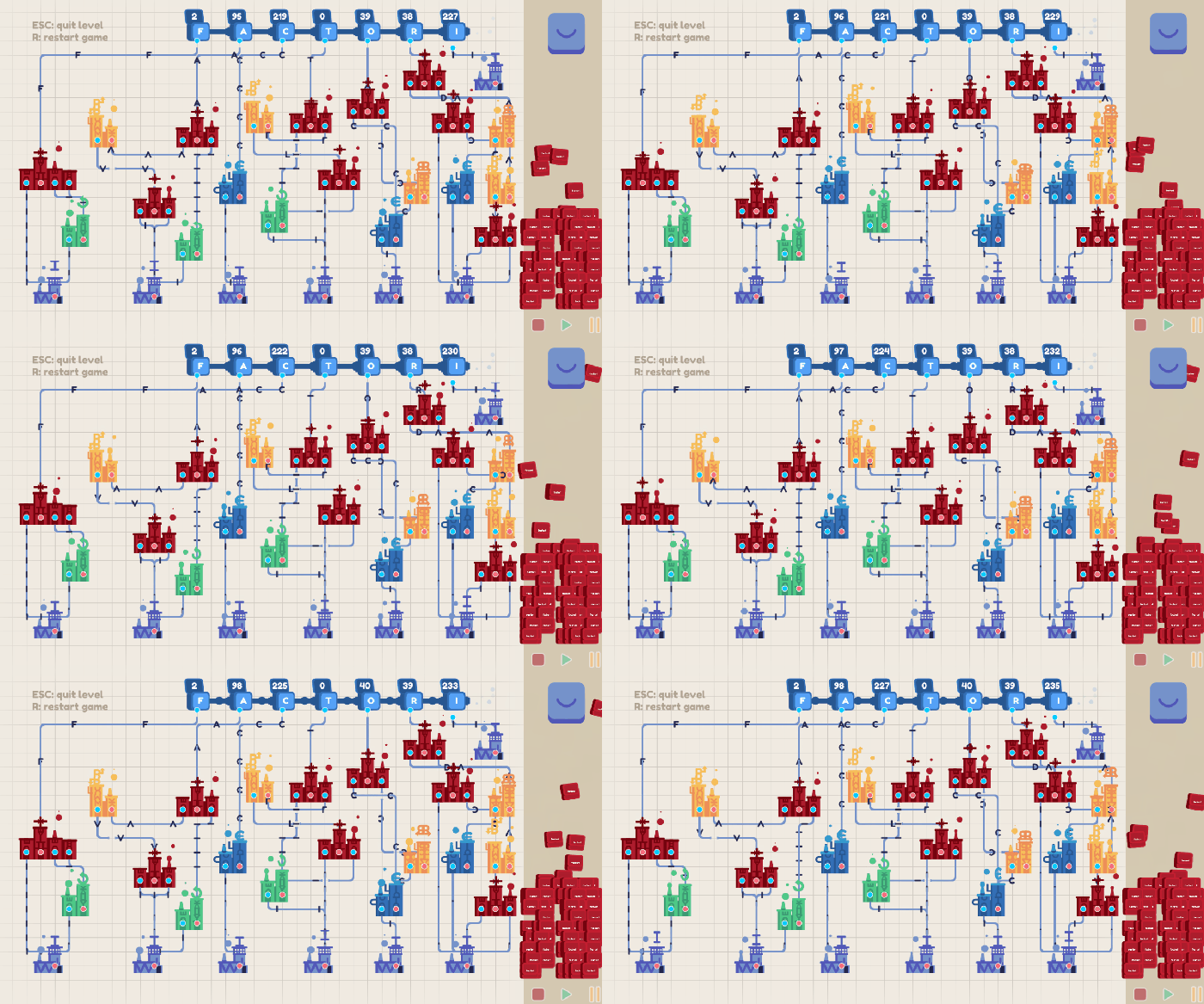
Luckily, drag and drop interfaces are super intuitive for most people. We tried to keep the visual focus on the most important elements—connecting factories is represented with clearly visible lines on a minimal background, with brightly-colored buildings and moving letters. It was important to visually show the letters changing as they move through the pipeline so you can see how the mechanics are working.
Factori has a unique advantage where we don’t have to teach a lot around the puzzle solving. Most people familiar with the latin-alphabet language can conceptualize how letters are shaped, and then once they understand what the buildings do, they can experiment!
Factori is very cute to watch in motion. Do you feel "cuteness" in the visual style brought anything unique to the game? To how it is received by the player?
Thanks! We put a lot of effort into the visuals of connecting factories together. Small touches like the nodes magnetically pulling to the edge of the building, or lines rearranging as you drag buildings around, add a lot to the cute factor. In game jams, we’re typically rushing to squeeze in audio as the timer is running out, but it has such a huge impact on the game feel. The bubbly "pop" sounds complement the satisfying and simple visuals.
Can you take us through the process of creating the competition metrics? How you created challenges for players to work through using your systems?
As we tested the game, we noticed there were multiple ways to optimize levels. Some players like making their chains faster, while others would try to use as few factories as possible. And, of course, many people don’t care about optimization. We liked having these levels of freedom for those who just wanted to beat the levels, but when releasing 1.0 we also wanted to reward players who enjoyed optimizing a certain aspect of the game. So, we added scores based on buildings placed and cycles metrics.
We anonymously record scores on AWS servers so we can show players how they compare against others. Since factori has a virtually infinite number of levels, that gives you something to work towards without requiring manual score targets for every level. It also lets you see if you’re the first ones to make a word, which is fun.
The game makes use of a vivid, clear visual style to help aid in gameplay. What ideas went into this particular visual style?
A basic tan background lets us use bright colors for interactive elements like the buildings and buttons. We used letters to make up a lot of the art: the buildings are constructed from letters, as are the "word arts" you can collect by building special words. Since the game is so abstract, we don’t have to worry about pesky things like "environments" or "reality". All the visuals are in service to the mechanics, with clarity and appeal in mind.

Part of the appeal of the game is in watching those assembly lines chugging away. What were you thinking as you created these animations? In creating animations that had appeal to just sit and watch?
Yes, a big part of the joy of a factory building game is admiring your creation at the end. For more complex words, you end up with this mess of buildings and connectors weaving all over the screen like some kind of colorful motherboard. Or, for some players, a perfectly organized map of optimized chains. Either way it’s beautiful, of course. We wanted a sense of rhythm and production, so we had the letters move in increments along the path, and all of the buildings bounce to give life to the game.
This game was originally put together for a 48-hour game jam. Can you tell us a bit about the process you set up to create this game in such a short window?
We tend to spend a lot of time in the ideation phase (about 3-5 hours). As a rule, we usually throw out the first few ideas we come up with. That helps us to set our game apart with a less direct interpretation of the theme.
The three of us have done many jams together at this point. So, once we're in development, we're able to work fairly independently on each of our pieces. We sync up about halfway through the jam to merge the sprites from the artist and the systems from programmers. From there, we move on to levels and polishing.
Factori's development cycle was different. The systems development took much more time than with previous jams (connecting factories in an intuitive way and addressing the edge cases turned out to be really challenging). This made us worried about finishing on time, but luckily the levels were very easy to add once the systems were in place.
As a part of the polishing phase, we tried to make the tutorial/onboarding as seamless as possible for the player. For a jam, the tutorial is usually just slapping some text and icons on an art layer in the early levels. For factori, we were in full panic mode in the last 30 minutes of the jam throwing it together. But we got a bunch of compliments on the tutorial, so it seems to have worked.
We try to do game jams in a healthy and sustainable way (breaks throughout the day, sleeping decent hours). Jams can pressure people to crunch, which is a bad habit to form, even if only for a weekend. We wrote a little devlog about taking a game jam to full release here.
Read more about:
FeaturesYou May Also Like