Trending
Opinion: How will Project 2025 impact game developers?
The Heritage Foundation's manifesto for the possible next administration could do great harm to many, including large portions of the game development community.
The developers of Wargroove share some insight behind the game's game design, tooling, and technical implementation to help other strategy game developers.

Last month Starbound developer Chucklefish released the turn-based strategy game Wargroove on Steam and the Nintendo Switch, quickly amassing a community of mapmakers and earning praise for its beautiful pixel art.
Shortly after launch, Chucklefish CEO Finn Brice and tech director Rodrigo Monteiro were kind enough to drop by the GDC Twitch channel for a chat about the making of Wargroove and what lessons carried over from its side-scrolling predecessor.
Since some of those lessons seemed applicable to other developers working on turn-based strategy games, we decided to transcribe parts of our conversation for you below.
Read on for a look at why Wargroove's mapmaking tool is so important, how Chucklefish makes tiny pixels work on large (and small) screens, and how the team approached its expansive unit design.
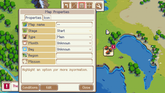
Monteiro: I think that quite early into development of the game we decided we needed some kind of tool to just make our own maps and we thought ah, maybe it’s gonna be nice if it’s inside the game itself.
So we made a simple map editor but then at some point we decided wouldn’t it be cool to just give it to the community and give them the full power, but I think that in doing that it allowed us to make tools so powerful that it allowed us to make those very diverse game modes ourselves quite easily because none of the game logic, rather none of the mission logic is scripted or anything. It’s all made by content creators because we wanted the users to be able to do the same. It became very easy for us to make all of these kind of varieties.
I think it’s probably one of the best decisions we’ve made in this project.
Brice: I think actually a big part of this is what we learned from Starbound.
Monteiro: That’s true.
Finn: On Starbound we simply didn’t have enough tooling. Producing a lot of the stuff in Starbound was very very painful. So very early on we decided ok we needed the right tooling. Also I think it’s fair to say that we’re always thinking about, even outside of the game, mod-ability and customizing a game to take it further and give it more life. So just exposing those tools to the community was an obvious choice.

Monteiro: And while making the tools we took inspiration from things like Staredit, the map editor from the original StarCraft game which, back in the day, people made amazing maps with that so we were like oh if we can make something with that level of power then we know people will be able to do cool things.
Brice: We spent a lot of time talking about Staredit...from my point of view, StarCraft was one of those things that sort of passed me by a bit actually. So when we started discussing this and you brought up Staredit, that was my first real look at it. I think I’d loaded it once or twice before then but never really…and within sort of 10 minutes I felt like ok I understand the entirety of this tool and I’m coming up, just in my head, because I understand this tool, with creative ways I can use this and generate sort of new ideas or new gameplay or whatever it is.
So yeah, from someone that’s actually fairly new to Staredit it was actually really easy to understand and really powerful. And that just kept me thinking about cool things I could do with it and it was quite exciting. And I think it’s probably fair to say that sort of exciting “What will people make with this” is what we wanted to achieve with Wargroove.
Brice: I think that it’s fair to say that we started with a smaller group of units and then we approached each unit as a means of introducing a new type of gameplay that we felt was either interesting or there was a gap for or something like that. Ah, what’s a good example here?
Monteiro: Maybe the mage?
Finn: Yeah, yeah sure. Some of them are really obvious. Like the mage was we needed an anti-air unit. But then there are other ones there I think are less obvious. Particularly...one of the things we’ve done in Wargroove that I think is maybe the most interesting part of the whole game is the critical hit system. Which gives every unit a unique means of scoring bonus damage. With the knights it’s if they move a set number of tiles or as another example, the spearmen crit if they’re next to other spearmen.

So the spearmen as an example. We felt it would be interesting if, that for a relatively high cost, you could actually build walls, but we didn’t want to introduce walls as a concept. So we came up with this unit that was very slow but would generate critical hits when they stand next to each other to introduce that aspect of gameplay and then in turn we came up with other units to counter that aspect of gameplay. And we hope that every unit has a sort of semi-interesting gameplay requirement behind it.
So it’s never just a unit exists purely as a counter, but you also have to play with that unit in a very different way. We’re requiring different things of the player. And when we started thinking that way it actually becomes a lot easier to think up these units and also to balance them because you start thinking ok, we think that there’s this niche for the player to play in this particular way, how difficult is it to achieve something with that, therefore how powerful should the unit be and how easy should it be to counter etc. So that was sort of the thought process behind it?
Monteiro: And then in regards to ground, sea, and [air], because the main gameplay happens on ground we knew that a lot of the variety had to be on ground. Right, because the...win conditions [are on the] ground, of course. But then that would mean that if we balanced the air and the sea units in the same way, they would just not be worth it. So the sea units are really cheap for their power because they’re constrained to the sea, and the air units are quite powerful but they can be also countered in this way.

Brice: Yeah, so one of the things we did for research is we spoke a lot to various strategy games communities, obviously the Advance Wars community, but also other people who are really into this type of game and one of the things that emerged which was quite funny because obviously it’s quite thematic but apparently it’s a constant is a big problem with turn-based strategy games, in general, is that often naval combat sucks.
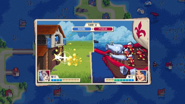
It’s just not fun, or it doesn’t achieve very much, or whatever it is. So when we approached naval and to a maybe slightly lesser extent but same thing the air combat we said immediately ok, although these are constrained to these different areas of the map, let’s make sure there’s one overall goal that makes them worth it. So with naval combat the first unit that we introduced was the warship, that is really devastating to the ground units. But then we built the entire gameplay around maintaining ownership of a warship. So if you’re winning in the sea the reward is that you get a warship, and you get to use that to--
Monteiro: to do half damage to--
Brice: Yeah! Extend that to the air and the dragon. If you win in the air, then you get a dragon.
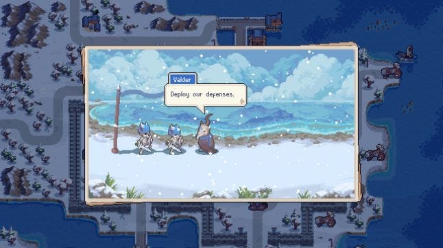
Monteiro: Yeah so, Wargroove actually has a fairly… It’s more sophisticated rendering than one might assume goes into a pixel art game. Like the water in particular, there’s a lot going on. If you move a unit in front of a water tile, you can see its reflection on the water, you can see with all the boats for example, and there’s the rippling and distortion. When dealing with pixel art the effects have to be more precise. So it’s kind of a different way to approach shaders of course.
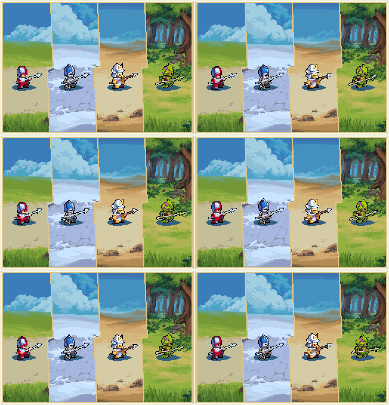
There’s nothing on the complexity of a triple-A game or a realistic 3D game, but you have to be sure that a lot of the effects that you do don’t damage the pixel art. So a lot of work was working with pixel artists to make sure that the water effects look right and still look like pixel art and doesn’t just stand out on top of the animation and even things like the pallet swapping for the units involve a lot of consideration with the team to make sure that all the units look good on all the different colors.

There is actually quite a bit that went into it. And even from like a tooling point of view we wanted to make sure that the job of the artists was as easy as possible so we went to the things like integrating the native format of Aseprite, which is the program that we use here for pixel art, directly into the pipeline so they don’t have to massive export and other things, because…how many frames of animation do we have in this game? Like 15,000 or something like that?
Brice: It’s a lot of animation.
Monteiro: Yeah, it’s a lot of animation.
Brice: I think for my part I think we did a really good job, and you did a really good job, and the programming team did a really good job, of empowering the artists on this project. I think pixel art, in general, gets this kind of reputation of being perhaps a cheaper alternative to 3D art. That’s just not the case. I think if we were to go back and make this game in 3D it would‘ve been an easier experience.
You know, pixel art requires so many hand-drawn frames of animation that it can be very slow and very expensive and then difficult to reskin afterward. Each of the factions for instance needed to be entirely reanimated. It can take a very long time and to those ends the integration with our tooling with external applications like Aseprite was incredible. For example, Aseprite has a really good export format and I believe we load .ASE files directly right?
Monteiro: Mmhm.
Brice: And in turn, that means the artists when they’re doing an animation they can just say 'ok hold this frame for this many seconds, hold this frame for this many seconds,' they can tag various frames for use in particular animations, all without sort of exporting sprite sheets or anything like that.
It’s a fairly modern approach to pixel art I would say. I think when people see pixel art they expect it to be done in sprite sheets and big long images with multiple frames of animation in it. But we’ve kind of left that behind with this project.
For more game developer interviews and curated GDC talks, be sure to check out the GDC Twitch channel.
You May Also Like