Trending
Opinion: How will Project 2025 impact game developers?
The Heritage Foundation's manifesto for the possible next administration could do great harm to many, including large portions of the game development community.
Toge Productions UX and UI engineer intern Adlan Arvyanda Ramly explains how they improved the user interface, user experience, and general usability of chatty barista simulator, Coffee Talk.

Adlan Arvyanda Ramly is a UX/UI designer, AR/VR developer, HCI Researcher, hobbyist game developer and artist who has recently been interning as a UX and UI consultant for Coffee Talk developer-publisher Toge Productions.
This summer, I had the chance to be a UX/UI Engineer Intern at Toge Productions, an indie game studio & publisher based in Indonesia. Other than consulting & giving feedback on UX/UI to 5 other indie games published under Toge Productions, my main task was helping the Coffee Talk team’s development by improving the user interface, user experience, and general usability of the game.
In this article, I will explain my initial thoughts of the game design, followed by what I completed during my internship, and concludes with what I have learned during my internship.
Coffee Talk is an interactive visual novel about listening to people’s problems and helping them by serving a warm drink out of the ingredients you have as a barista of a coffee shop. It is a game that tries to depict our lives as humanly as possible, while having a cast that is more than just humans. The game features visual aesthetics that are inspired by 90s anime, classic pixel art adventure games, and lo-fi chill hop music.
Tales of people around the alternative Seattle, a city where elves, orcs, mermaids, and other fantasy creatures coexist together with humans in a modern world
Branching story lines where the decisions do not come from the dialogue options you choose, but through how you treat and serve the customers of your café
90s anime inspired pixel art visuals and chill vibes inducing color palette to help you immerse yourself in the game’s world
Selection of jazzy and lo-fi music to accompany the late night warm drinks and talks activities
An experience to make you think, feel, and help rest your body and soul
Mohammad Fahmi, the writer & game designer, is a coffee enthusiast. In his free time, he loves to visit coffee shops and try different kinds of coffee. He hopes to create a game that is both relaxing and introspective, a visual novel that allows you to talk to visitors and hear their stories as you mix coffee ingredients for them. Social and philosophical undertones of the game’s narrative are also shown as the main conflict existing in the game’s world.
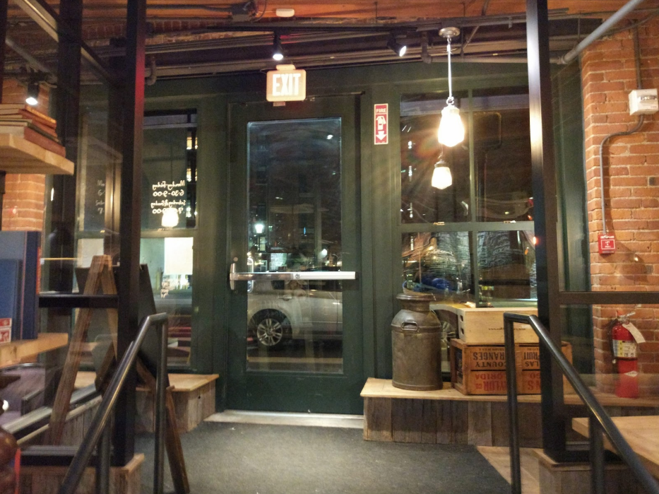
Caffè Nero, a coffee shop in Boston as a reference
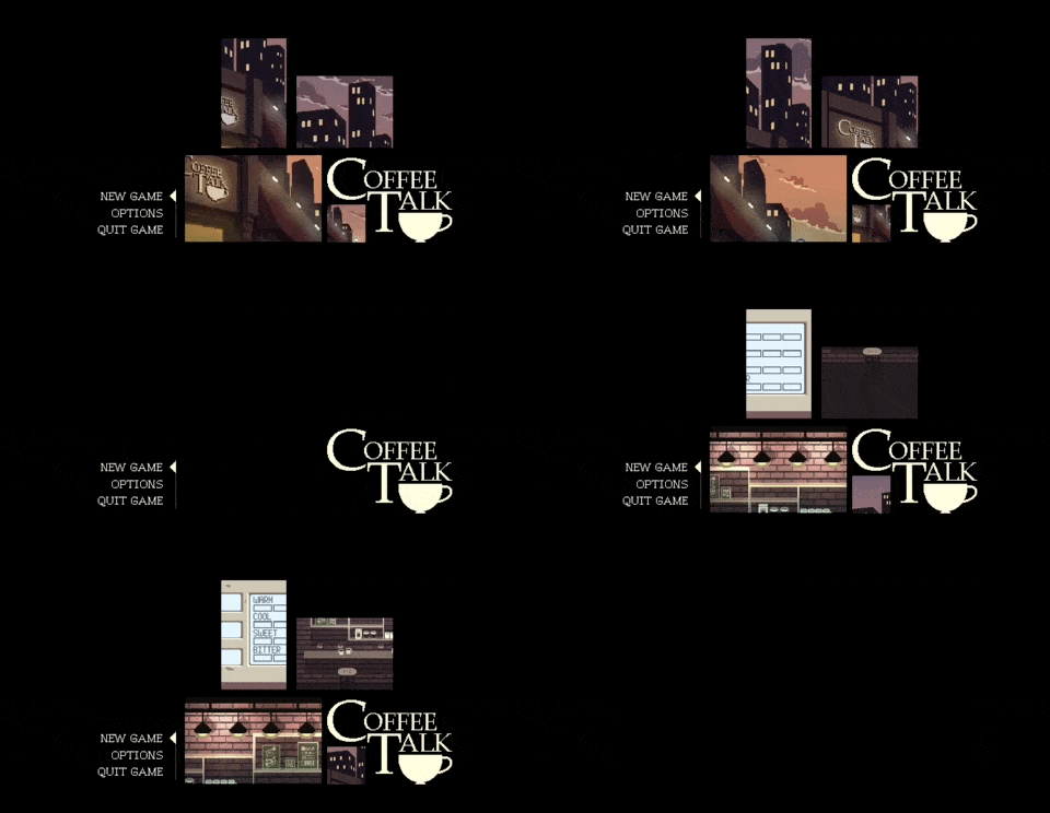
The title screen
Ambience is an important aspect in a game that allows players to be fully immersed into the experience. When I played this game for the first time, I can already feel the cozy and warm atmosphere of this game from its title screen. Although I don’t usually play visual novels, the use of colors, the background music, and the opening scene really motivated me to try this game.
The best way to craft this atmosphere is through Color Psychology. Color influences human perceptions & emotions which can affect a person’s mental or physical state. However, keep in mind that colors might work differently for people from different culture and backgrounds.
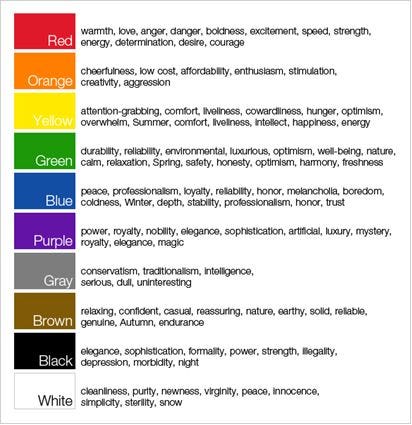
A table of colors and their associations
Color Psychology builds up Coffee Talk’s ambience. Coffee Talk uses a brownish color palette that emits the game’s relaxing, warm, and casual atmosphere.

Coffee Talk’s color palette
The character designs are highly influenced by 90s anime, such as Cowboy Bebop (1998) and Neon Genesis Evangelion (1995). Characteristics of the character designs can be seen through their use of thin outlines and grainy colors. I find the utilization of classic anime art style very interesting because it brings the warm mood of nostalgia. There is a study that shows that nostalgia can bring warm and fuzzy emotions which is synonymous to the game’s overall mood.
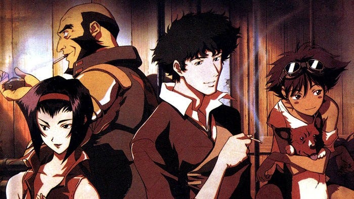
The main cast of Cowboy Bebop, see you space cowboy…
The soundtrack is based of lo-fi jazz/hip-hop music. Lo-fi (Low-fidelity) is an aesthetic of recorded music in which the sound quality is lower than the usual contemporary standards and utilizes the imperfections of the recording production. The raw orchestration gives a sense of mellow and warm ambience that is complimentary to the game’s atmosphere. The soundtrack is composed by Andrew Jeremy Sitompul, which will be released soon on Spotify & iTunes when the game is released. It also works as a great background music for studying or other tasks that require extra focus!
The infamous lofi hip hop radio that pops up on your Youtube Recommendations
One interesting aspect of this game is the use of skeuomorphic interfaces. Skeuomorphism is a design of an object that inherits the physical appearance of their real-world counterparts. It was highly popularized as Apple’s design system during Steve Jobs’ era.
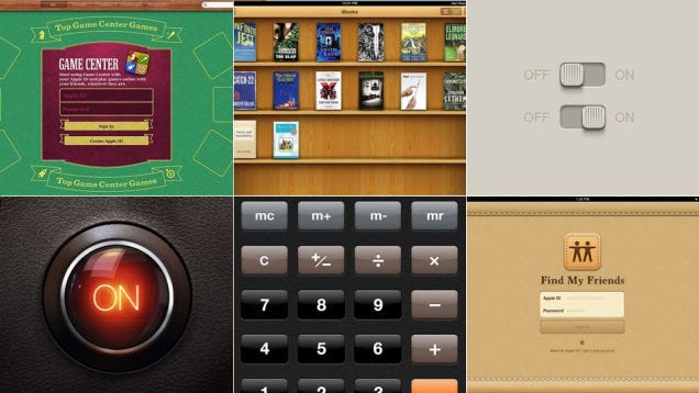
Skeuomorphism in early iOS versions
While skeuomorphism is considered outdated in interface design, as designs are moving toward flat and modern aesthetics, it is still prominent in games. The brewing system UI is one of the best uses of skeuomorphism in games that I would say is the main highlight of the game.
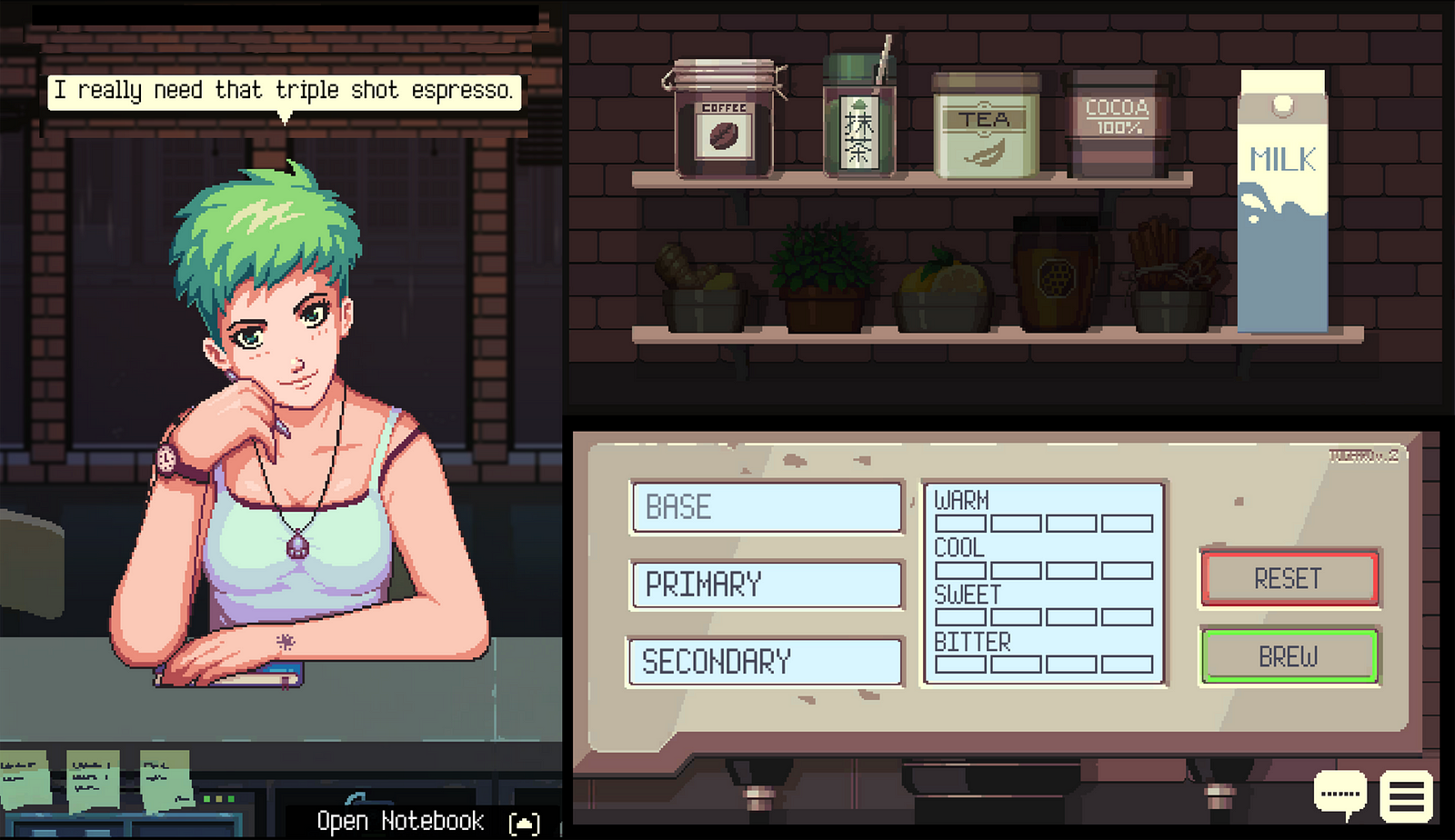
The brewing system UI which features a skeuomorphic cupboard and coffee machine
I love the aspect of taking ingredients from your cupboard into your coffee machine which emulates the experience of being a coffee shop barista who serves coffee to their customers. This interface allows more players to be more experimental in combining ingredients.
Suppose the system’s user interface is designed in a very practical, yet efficient manner: a drop-down menu that represents each component. Yes, it is more efficient and reduces cognitive load, but does it still emanate the “feel” of brewing a real coffee? Do you still want to experiment different kinds of coffee? Does it break the immersion of the coffee-making experience?
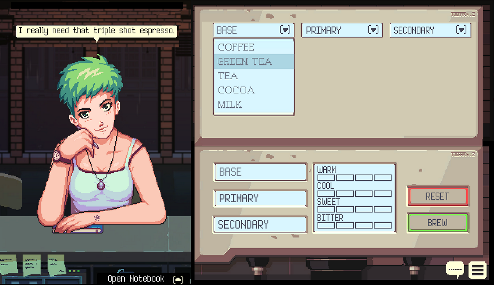
A rough rendition of a hypothetical brewing system UI that is “more efficient”
Being familiar with designing user interfaces for mobile applications and research tools, I realized designing user interfaces for games is a bit different. I learned that when it comes to building user interfaces in games, not only functionality or aesthetics come into play. It needs to convey an experience that fits the atmosphere with determined stylistic choices.
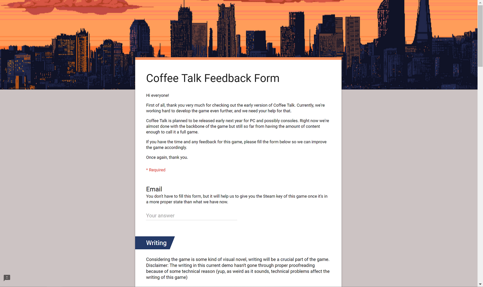
Feedback survey form
Before my internship started, the team had just received survey results from their initial feedback survey which was made on Google Forms. The initial feedback survey contains a lot of useful questions regarding each aspect of the game which includes writing, art direction, game mechanic, user interface, and music. The survey also asks what are their first impressions of the game, what they think & feel about the experience, and what improvements could be made for the following iterations.
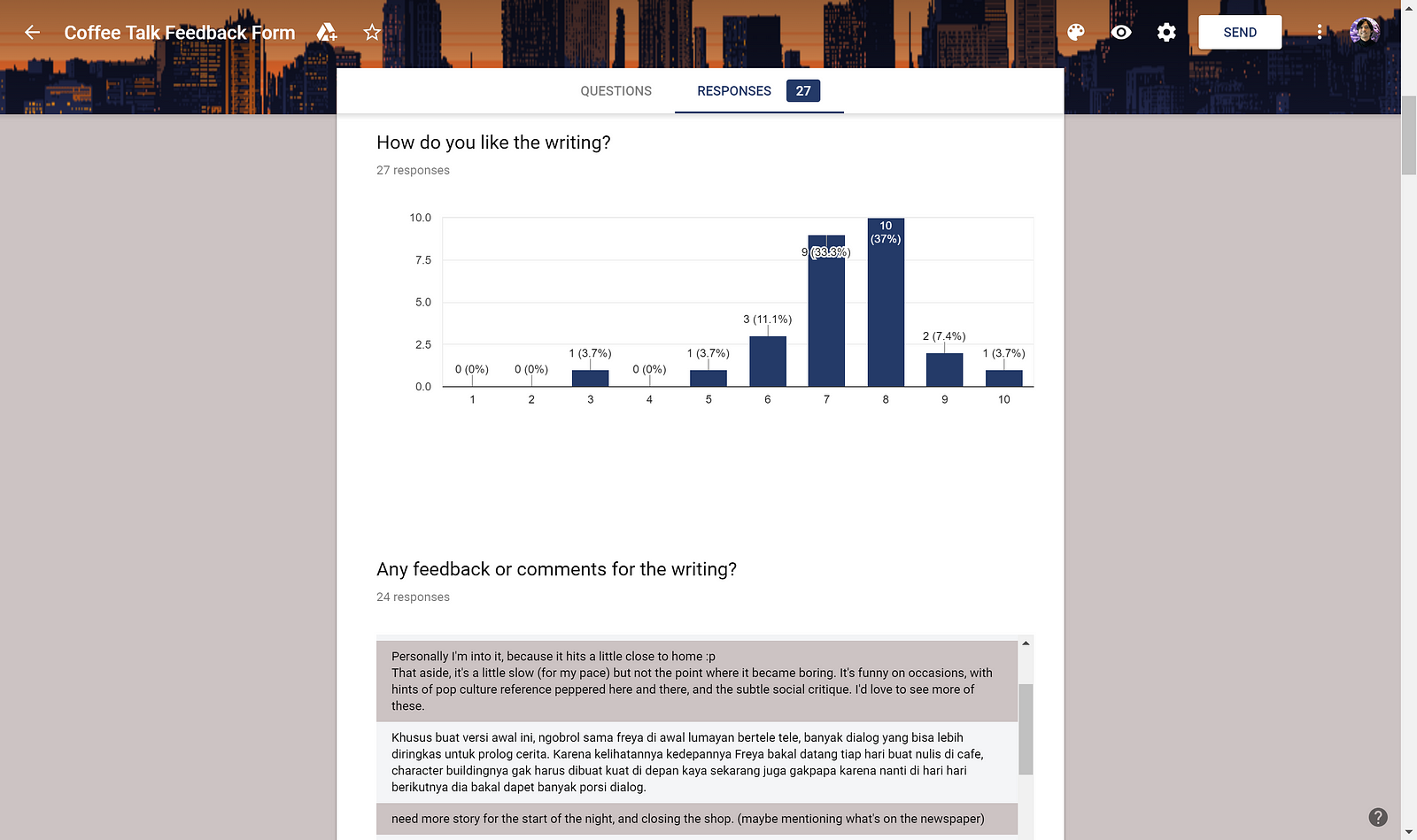
Feedback survey results
Based on 27 respondents, I checked their initial thoughts about the game, their current difficulties with navigation, and their suggestions to improve the current existing user interface and experience design. I also wrote some notes about the aspects that can be improved when I played it for the first time.
For the following section of the article, I will explain the design improvements during my internship based on the initial feedback survey.
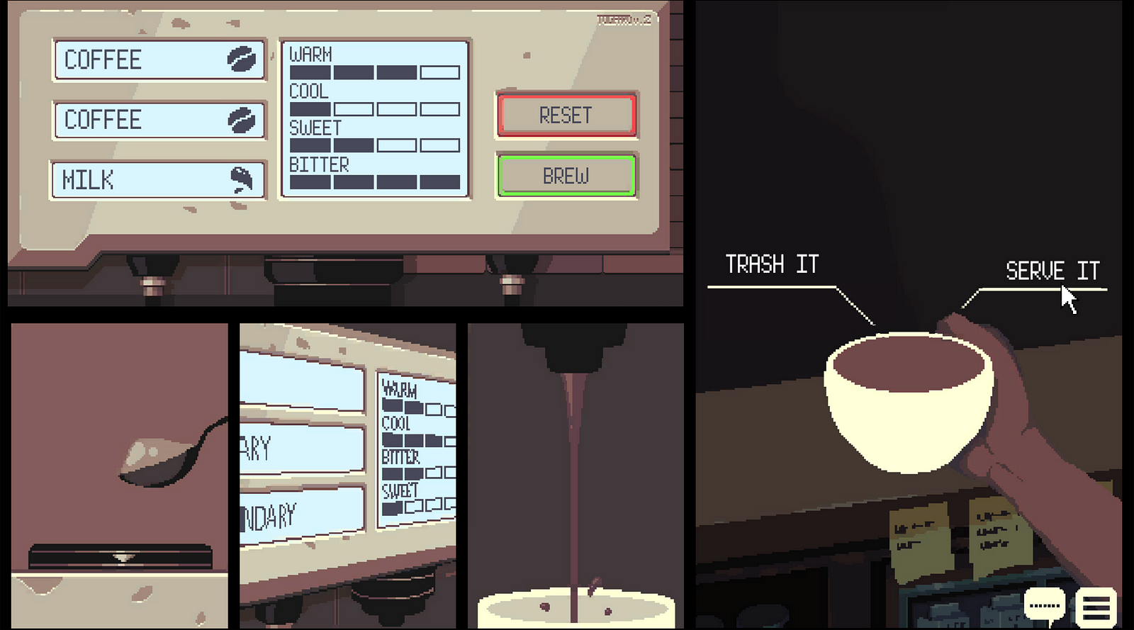
First iteration of the brewing UI
“The interface is okay, probably a little clearer direction on the brewing mechanism. I also had no idea what drink I just made”
After you brew a drink, you have to select “Trash It” before you can brew another coffee. The problem you can see here is that most users will press the “Reset” button first instead of selecting “Trash It” on the right panel. This is caused by the lighting on the previous panel, which it seemed to look like it is still active.
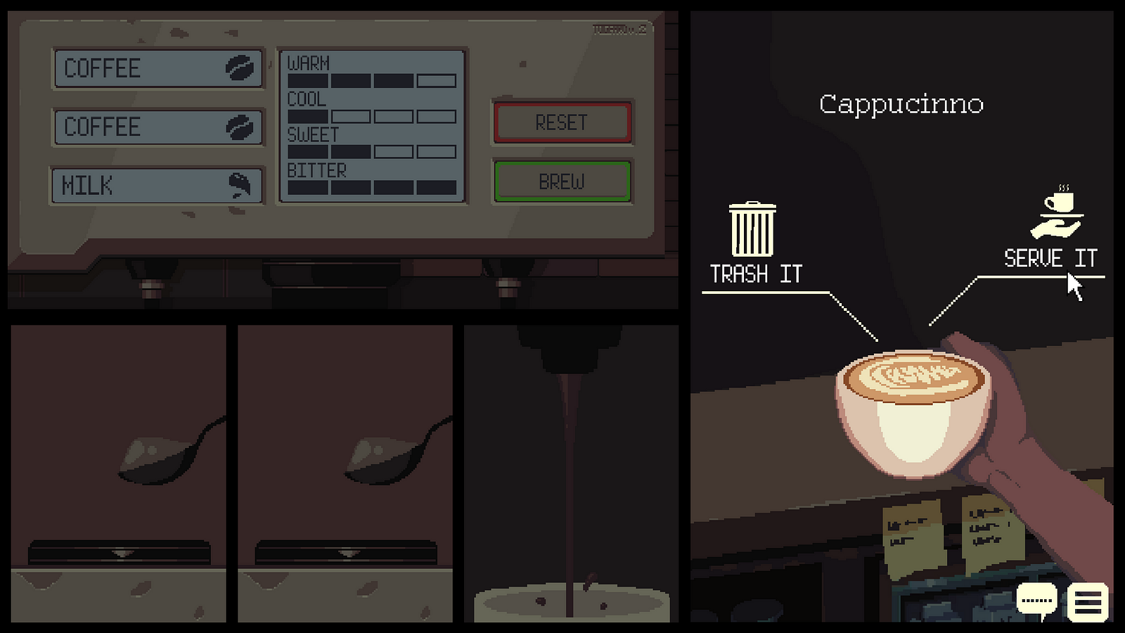
Second iteration of the brewing UI
Contrast & brightness matters when determining the interactivity of an object. When the brewing session has just finished, I decided to dim the lighting on the previous panel to imply the “Reset” & “Brew” buttons are inactive. I also created icons to easily distinguish between choices and prevent mistakes in making choices. Micro-interactions are also involved when hovering on a choice, it will bounce once and the icon gets a bit larger.
To see what the players made after they brew a drink, I put the name of the drink as an indicator of the drink’s type. Thanks to our artist (Dio Mahesa) and programmers (Frederik Lauwrensius & Jovan Anggara), the brewed drink’s visual is also shown dynamically generated based on the ingredients used instead of one static image that is used for all drinks.
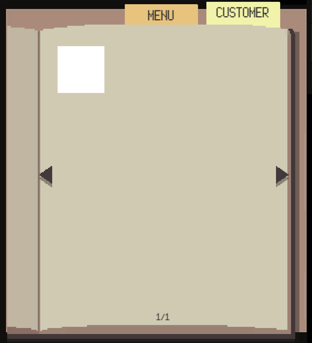
First iteration of the customer page, still not developed yet
“The story needs depth and I want to know more about each character’s backstory. Would be great if I could keep track of my progress if it’s going to be a branching story”
The notebook is a feature where players can read recipes and learn more about the cafe visitors. When designing this feature, I asked myself: “What do the players want to know about a character?” When I meet a person for the first time, I want to know their name and their face. After recognizing a person, I want to know what they associate, specifically with their hobbies and interests. After I know them for a long time, I can learn about their backstories.
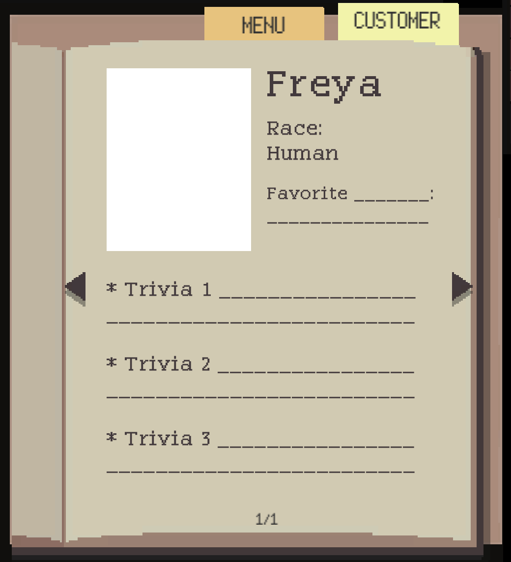
The actual first iteration of the customer page layout
The name of the character is the title of the entry, followed by their portrait on the top left corner, their race, and their favorite things. There are 3 snippets of paragraphs of their backstory, which will be unlocked throughout the game if the player is consistently correct in brewing drinks based on each character’s request. This is useful to make the players feel motivated in knowing a character’s backstory. After planning the layout on Photoshop, the layout is ready to be implemented on unity.
On later iterations after my internship ends, the notebook is replaced by a smartphone, which allows players not only see recipes and customers, but also check the game’s current events with the News application and change the background music with the Music Player application. The customers are now presented as user profiles on a social media application.
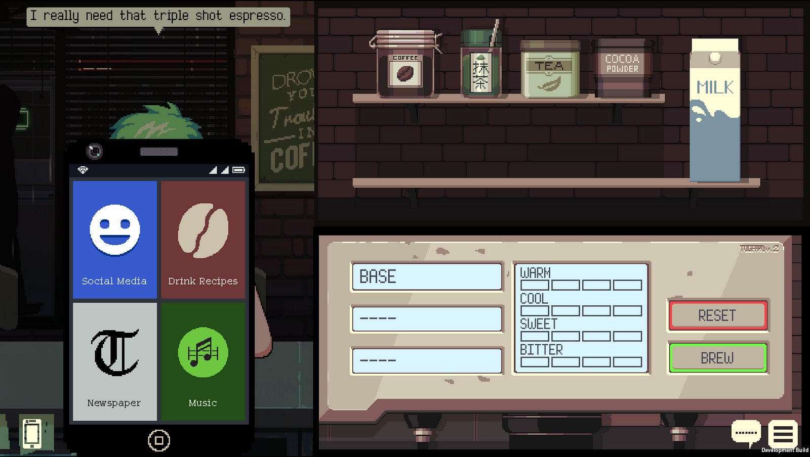
The smartphone feature that replaces the notebook
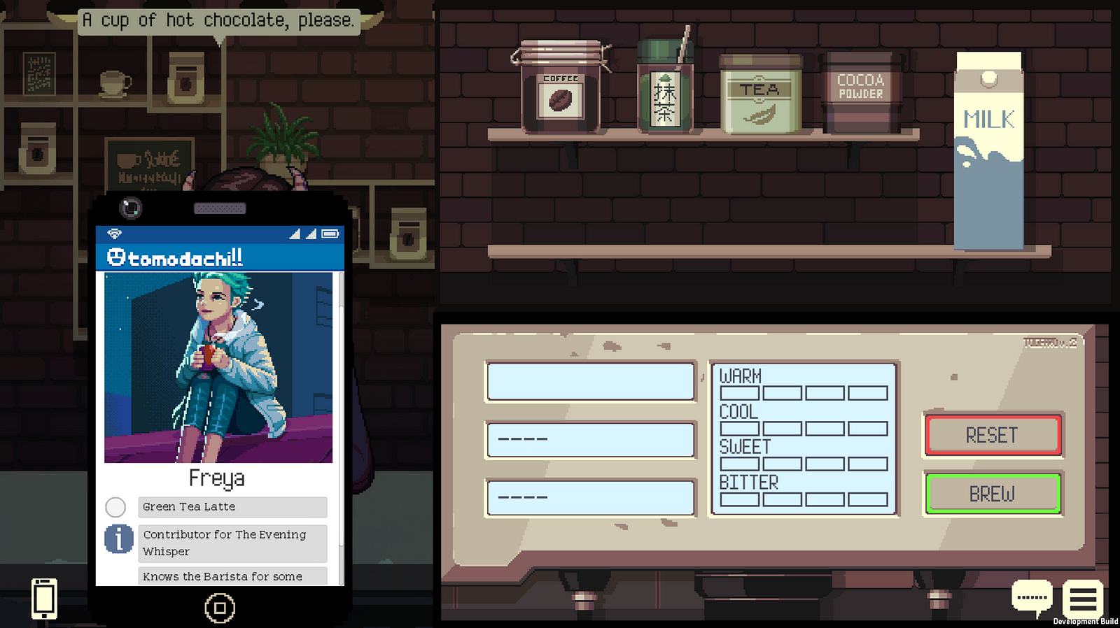
The customers are now represented as user profiles on social media
The studio is currently planning to publish the game for multiple platforms: PC & Nintendo Switch. Maintaining an optimal, consistent, and ergonomic controls for different ports is very important. Since they are planning to release more ports in the future, I decided to create one universal controller interface instead of creating different controller images for each consoles. This interface can be found under settings for controller configuration where players can map the key layouts. If players are unsatisfied with the current controls, they can change it to their needs.
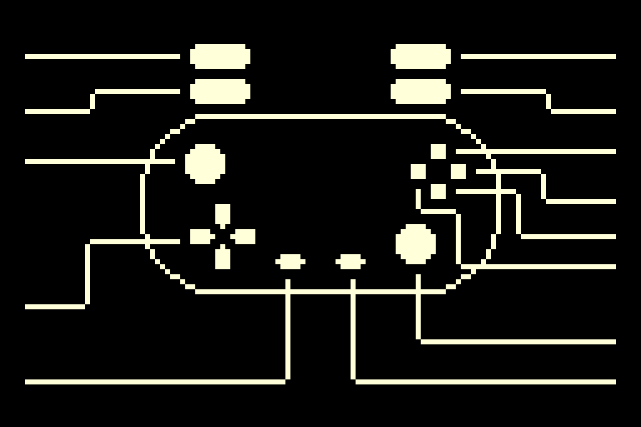
A universal controller for the controller configurations UI under Settings
I also created a controller layout document that contains controller mappings of different consoles, which serves as a guide for the programmers to map these functionalities to each key of the controller.
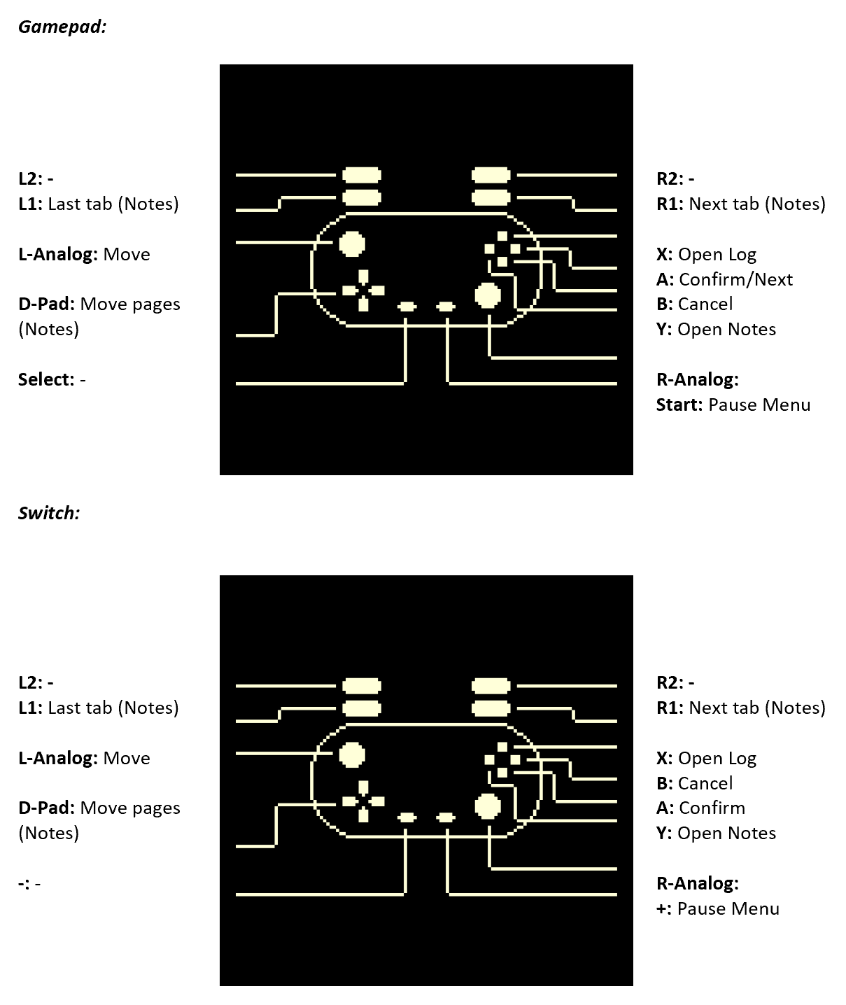
One of the pages from the controller layout document
“There is not much variation on the characters’ personalities, would be more interesting if I could talk to different kinds of people in this game”
We had an issue in writing the story when the character’s personalities are too similar. My role during my internship doesn’t include being a writer for the game, but I could give suggestions on how to create a diverse cast based on their personalities. My suggestion was utilizing MBTI (Myers Briggs Type Indicator), a system of how people perceive the world and make decisions which is heavily based on the conceptual theory proposed by psychologist Carl Jung.
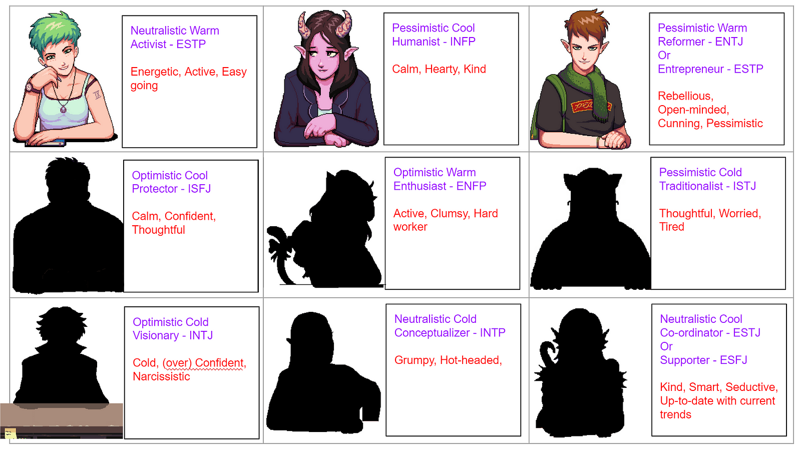
Mapping out each character’s desired personality type. Characters designed by Dio Mahesa
The Myers Briggs Type Indicator Scale (MBTI) might not be the best tool for identifying a real person’s personality type since it lacks identifying cognitive functions, but I find it as a great tool for fictional character creation. We created a table by mapping out each characters with their desired personality. It turned out to be a great approach in outlining different character personality types.
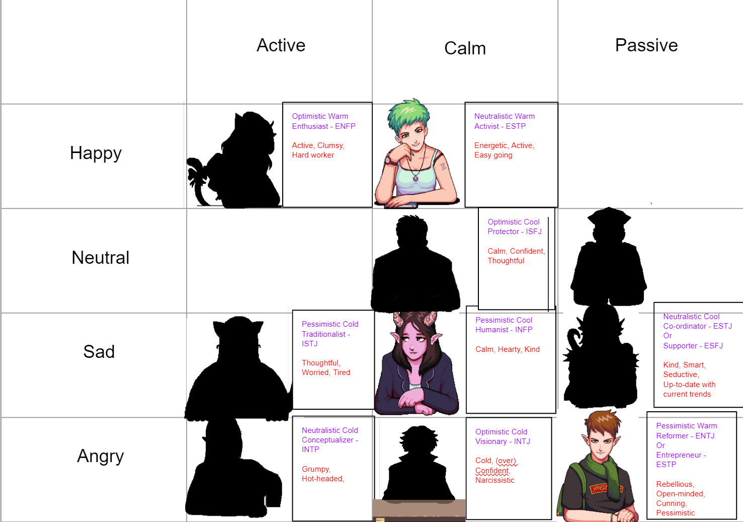
Categorizing characters to a higher level alignment system
After mapping out each character’s personality, we decided to create an alignment chart where the characters are seen in a more general perspective from their emotional tendencies and decision making. This is a great approach to see a bigger picture of the characters’ personalities. You might ask why the characters who don’t appear in the demo are shown as silhouettes? The character designs & roles might change throughout the development, but eventually you will see them soon after the release date!
“Was very confused about what I was expected to do at the beginning, would have been useful to have some directions to the brewing station better.”
A tutorial system is useful for navigating new players to understand concepts of the game. A lack of tutorial would cause new players unable to play the game properly.
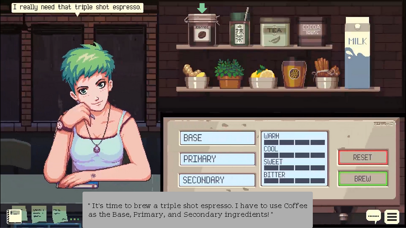
A tutorial being shown as the barista’s monologue and a pointer that navigates through the UI
I have an idea of executing the tutorial as a diegetic monologue of the barista and pointers for navigating the buttons. A tutorial system that utilizes diegetic monologue would be perfect for this game because it retains the immersion through in-game narratives instead of a regular tutorial of how-to-do-tasks. Just for early-game brewing sessions, the recipe for the drinks are shown in a monologue as a “training wheel” for new players. Eventually, the recipes for all drinks are not shown in a monologue because experimentation is a part of the gameplay. Unfortunately, I couldn’t finish this task because my internship time is over.
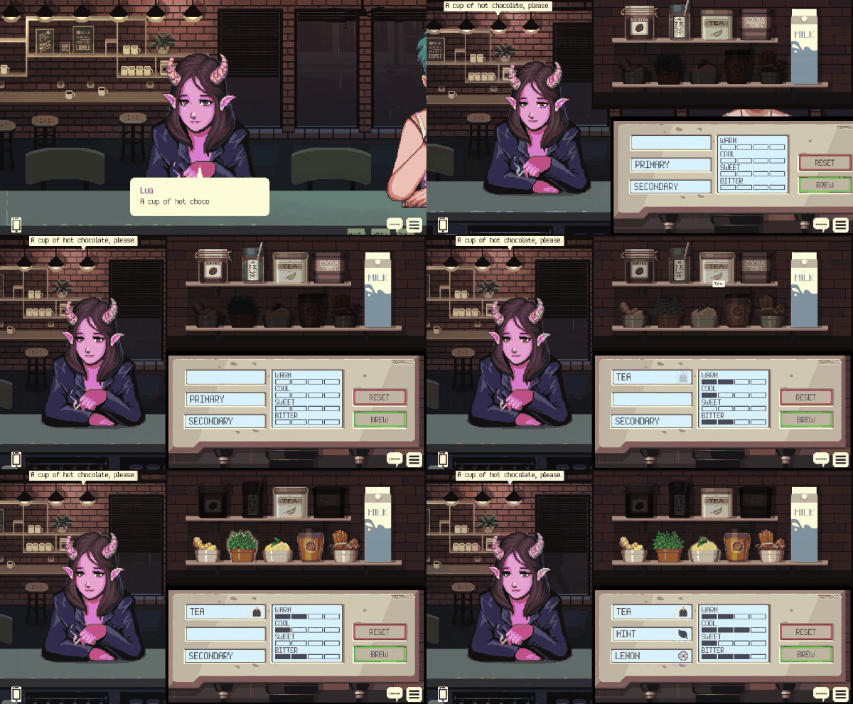
The brewing system UI after some iterations. Programmed by Frederik Lauwrensius & Jovan Anggara
Weeks after my internship has ended, the demo has been released on itch.ioand Steam. The game received a lot of new feedback and reviews from players:
“Talk about soothing games! Makes me feel like everything can be solved by combining the right ingredients into a warm beverage, & I want more!”
“This was a cool game so far! Great job! It is really chill to play with a great premise! The writing, art style, and music all fit together nicely.”
“This game is relaxing and has a great storyline about the characters and the city!”
I am also quite surprised that the game got featured in an article on Kotaku, Rock Paper Shotgun, and Paste Magazine.
“Coffee Talk grounds you in a place and makes you feel comfortable. You’re just working a shift and shooting the sh*t. It’s not glamorous, but it feels right.”—Kotaku
“There’s a particular vibe to a good coffee shop; a chill atmosphere where people catch up with one another and enjoy a good hot drink. Coffee Talk captures that same vibe” - Rock, Paper, Shotgun
“Coffee Talk feels like the kind of game that you could think of as your own refuge space, and that sort of experience is just as valuable as any big budget mega-game that sells itself on maximum interactivity or realistic graphical fidelity.” - Paste Magazine
Toge Productions was also invited to attend 4 international game conferences, including PAX West & Busan Indie Connect. Unfortunately, due to some circumstances, the game cannot be showcased this year. On the contrary, the game is currently participating as an entrant in Indie Games Festival 2019.
Choosing an internship in an indie game studio over a bank company was the best decision I made this summer. While other friends of mine can brag about how big the company they are working for, I am really grateful that I was working with a lot of friendly and inspirational people. I got the chance to apply my UX research skills and provide feedback for high quality upcoming games before they are released. I learned the best practices in creating a well-structured script organization in Unity, a technical art preference guide, and a comprehensive game design document. I also learned a lot about game development & production, not just in theory but also how the industry works.
When it comes to building user interfaces in games, not only functionality or aesthetics come into play. It needs to convey an experience that fits the atmosphere with determined stylistic choices.
I wish them good luck in brewing this astounding interactive visual novel. For updates, you can follow Toge Productions & Coffee Talk on Twitter. Please take a shot of our serving by downloading the recent demo on Steam or itch.io!
Now, I have to finish my degree in the US for my last semester, as I’m still stuck in a limbo of indecisiveness between getting a Master’s degree or finding a full-time job here as an international student which is difficult.
You May Also Like