Trending
Opinion: How will Project 2025 impact game developers?
The Heritage Foundation's manifesto for the possible next administration could do great harm to many, including large portions of the game development community.

Featured Blog | This community-written post highlights the best of what the game industry has to offer. Read more like it on the Game Developer Blogs or learn how to Submit Your Own Blog Post
It's possible to make design decisions that turn players away, but it's also possible to make art and writing decisions that cause similarly negative reactions.

Earlier this week I talked about design choices that, if made irresponsibly, will push players away from your card game. This week I’ll talk about how decisions involving art, writing, and flavor can cause similar reactions.
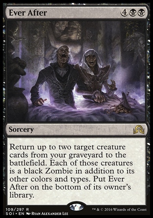
Games are a combination of system design and artistic design, and somewhere between those two things sits something very important: flavor. Flavor in the context of games doesn’t refer to taste – it refers to how a combination of art and mechanics can create a representation of something else. For example, the flavor of the discard pile is that it represents a graveyard or crypt, because it’s where your creature cards go when they “die.” In Magic: the Gathering the discard pile is actually called the graveyard! Returning creature cards from your discard pile (or graveyard) is often portrayed as necromancy, so cards with this function will have names and art that depict the raising of the dead.

This representation forms the flavor of the card. Now that we’ve defined that very important term, let’s move on to the meat of this article.
If your design, art, and flavor aren’t in sync, you can end up with something disjointed and muddled.
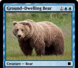
In Magic: the Gathering there is a keyword mechanic called Flying. Creatures with Flying can only be blocked by other creatures with Flying or creatures with another keyword called Reach. The flavor of Flying is that creatures with it can fly over your grounded enemies. It goes without saying that creatures with Flying are things that can fly, like birds, dragons, flying machines, and levitating mages. But what if you opened up a pack of Magic and found this card:

Notice something strange here? How about the fact that a card that represents a grounded bear somehow bears the mechanic of Flying? Bears don’t fly! Especially ones specifically named “Ground-Dwelling Bear”! But it’s spelled out clear as day: this card has Flying. That’s a rule of the card and you can’t ignore it, no matter how badly you might want to.
What would happen if this card actually existed? I’d wager it would elicit one of two reactions. Players that pay attention will note that it has Flying and be utterly confused. There’s something uncomfortable and dissonant about the design that’s just unpleasant. Players that don’t pay attention will simply assume that the card doesn’t have Flying, which leads to them making mistakes because the card doesn’t function the way they thought it did. That’s because by the time they’ve read this much of the card -

- they’ve already made assumptions about it. Bears of the ground-dwelling variety do not fly, so obviously this card won’t have Flying. Except it does.
When you create a mechanic like Flying that has a very clear and very specific flavor, you need to commit to it and fully represent it through art, writing, and design. Otherwise you’ll end up with something confusing or just plain weird.
As I allude to above, players have certain assumptions or expectations that they bring with them. It’s important to keep these in mind, because those assumptions and expectations color their perception of our games. For example, what do you think of when you hear “Western”? In the context of genres, you probably thought of deserts, saloons, six-shooters, and cowboys. So what if I showed you a card that looked like this:

Original art by Roman Tishenin
It’s called Wandering Vaquero and it’s a cowboy creature so…is it a cowboy? In my own fantasy world, simply declaring it one makes it so, because it’s my own fantasy world. But if I want people to buy into my fantasy I need to conform to certain common ideas, which this card most certainly does not do. The game recognizes it as a cowboy and I can shout “This is a cowboy!” as loud as I want, but pretty much everyone who sees this is just going to say “Nah, that’s a pirate.” This matters to designers because flavor, as I established earlier, is about representation. It only works if you and the player both agree on what it is that you’re representing.
Another very important thing to note here is that people’s internalized ideas aren’t always accurate, and they can be informed more by pop culture than reality. Almost everyone would agree that the image above doesn’t represent a cowboy, but this isn’t a cowboy either:

Cowboys were herders that tended to cattle, not gunslingers that challenged mustachioed villains to duels at high noon. In fact, Clint Eastwood’s character in The Good, the Bad, and the Ugly wasn’t even a cowboy in the film – he was a bounty hunter. Yet when people think of cowboys, many probably picture his character, or maybe even this exact image (speaking of which, the image url calls this a cowboy)!
Players have prebuilt notions about how things work, and it’s really hard to change them. In fact, people are generally more likely to reject uncomfortable new ideas than to accept them. While we should aim to deliver fresh experiences, we also need to be aware of the previously formed expectations that players bring. Trying to move away from or subvert these preconceived ideas may seem like a good way to break the mold and stand out, but if done improperly it’ll confuse and disorient players instead.
Games are a marriage of art and design, and they are given depth by the flavor that those two disciplines jointly create. While you can and should leverage this to create designs that go beyond mechanical value and express emotions, develop characters, and tell stories, you’ll run into problems if these different elements aren’t synchronized. If you’re on a small team, look beyond the boundaries of your assigned role to ensure that your designs appropriately match the accompanying art and writing. If you’re on a larger team with well-defined roles, be sure to communicate and collaborate frequently with your teammates throughout the entire development process. Your life as a member of a collaborative team won’t just be made easier – you’ll produce better work too.
Read more about:
Featured BlogsYou May Also Like