Trending
Opinion: How will Project 2025 impact game developers?
The Heritage Foundation's manifesto for the possible next administration could do great harm to many, including large portions of the game development community.
In this postmortem from Game Developer Magazine's June/July 2012 issue, get the autopsy on this spooky, little-known Kinect title.
October 24, 2024

[This postmortem for Haunt was originally published in the June/July 2012 of Game Developer Magazine. The original text has been restored in full, along with select visuals. To see the article in full, visit the .PDF at the GDC Vault archives.
You can also read a 2011 Haunt pre-launch interview with PaRappa the Rapper co-creator Masaya Matsuura.]
In September 2009, Microsoft Studios approached us at NanaOnSha (Parappa The Rapper, Vib-Ribbon) with a request to make something with a wacky, universal appeal using its new Kinect motion-control technology. We put five pitches together (each more wild than the last) before they informed us that they were most interested in Haunt, a light hearted first-person adventure game set in a haunted house. It took us about nine months to get from that initial pitch to signing the project, by which time the core concept of the game had changed significantly. And since NanaOn-Sha doesn’t keep any fulltime programmers or artists on the books, we also brought U.K.-based development studio Zoe Mode onboard to implement the project. What followed was a 12-month development cycle jam-packed with blood, sweat, and tears unlike what any of us had ever experienced before. Was our mission successful? Well, that depends on what criteria you judge success by—but there are certainly plenty of aspects of Haunt that we can take pride in, and some real takeaways to share.
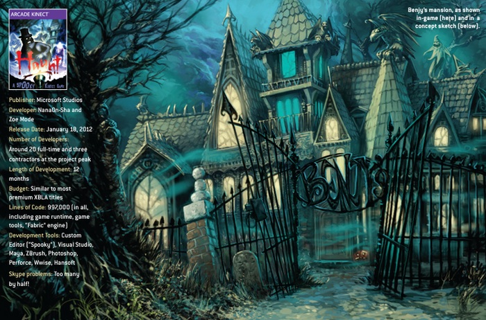
Image via Game Developer Magazine, June/July 2012.
With so many parties involved, it was hard to maintain a coherent vision for Haunt. In effect, we had three creative centers—us in Tokyo, our publishing team in Washington, and the Zoe guys in the U.K. One of NanaOn-Sha’s guiding philosophies is that in order to have games with cross-cultural appeal, you need to have staff from different backgrounds (Parappa’s character designer was American, as was the lead programmer for Vib-Ribbon), and this project certainly fit the mold—indeed, it was our most ambitious yet in terms of multinational collaboration.
Of course, this approach isn’t without its downsides. Haunt’s development was anything but smooth sailing, and we faced creative disagreements at every milestone. This may sound like more hassle than it’s worth, but we really believe that creative conflicts are a great way to tease out unique products with that elusive “universal” feel. Also, we had been reading a lot of articles about failed collaborations between Japanese and Western studios, so we were determined to prove that when done correctly, a multinational partnership can make a game better.
Looking at the final product, we really feel that Haunt comes across as a “borderless” title. Haunt doesn’t feel specifically Japanese, American, or British, and it has its own vibe as a result. From the very start of the project, we knew that the game wasn’t realistically targeted at the Japanese market, so anything overtly Japanese would have been a big risk. We did actually sound out several Japanese studios to collaborate with before settling on Zoe Mode, but we weren’t convinced that any of the other developers could grasp what a Western audience would expect from a “haunted house” experience. We needed our development partners to be able to synchronize creatively with us in Tokyo and understand what our U.S. publishing partners would expect. Zoe nailed it on its first pitch, which meant that we could focus on implementation issues instead of endlessly debating core philosophies.
From a practical perspective, there were several things that helped us pull this off. First of all, we hired a Japanese-English translator who translated almost all of our email into each language for the entire project. This meant staff wouldn’t lag behind on certain issues, because they wouldn’t have to read in their second language. Second, we held frequent video conferences, because face-to-face contact helped ensure subtle things didn’t get lost in translation. We also visited Zoe Mode whenever possible to make an effort to get to know each other and understand our cultural differences. Finally, we made sure that we “clicked”—if you don’t have good chemistry with your partners, it’s harder to keep everyone on a unified course.
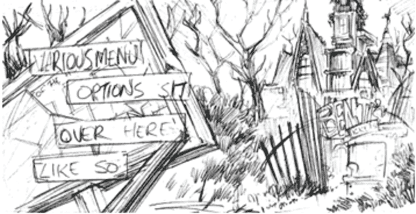
Image via Game Developer Magazine, June/July 2012.
When we were pitching the game to Microsoft, two crucial issues came up: the camera and the navigation system. We were pretty confident that for a game that relies on atmosphere and spooks, a third-person camera just wouldn’t cut it. For us, Kinect was an opportunity to get players closer to the screen, experiencing things firsthand. If your avatar looks scared when you aren’t scared, it kind of spoils the immersion. Navigation was an altogether different beast. We ended up with an implementation very similar to our initial vision, in which the player uses his arm to point his flashlight and pan the screen, and walks in place to move forward.
Navigation has been a tricky issue for Kinect, even after 18 months on the market, but we were convinced that in order for Haunt to be a spooky, immersive experience, players needed to physically drive the in-game movement themselves. Every movement forward is a step toward a potential scare, and we really wanted players to feel that anxiety, which we felt would be stripped away by any automove alternatives.
Designing and developing a system in which the player walks in place and points with his arms might sound simple, but it ended up dominating Haunt’s development, and took up about 15 percent of our total resources.
Microsoft was concerned that players would find walking around corridors a chore, so we tackled this in a few different ways. We balanced the parameters so that a minimum amount of movement was necessary to drive the player forward; we implemented an “autoturn” option so that the camera would automatically turn around corners, which was much more complicated than it sounds but definitely worth the effort in the end; and we increased the amount of distractions, such as small scares and wandering ghosts, to break up the monotony of wandering around empty corridors.
Despite all this effort, which we hadn’t planned for in our initial budget, we were never able to fully convince our publishing partners that our navigation system was the best it could be, and every time they saw a different first-person Kinect title that used alternative methods, we would feel pressured to follow in line. It was a big risk and a big creative judgment call on our part to stick with it, but we feel that this has been justified by the number of reviews praising the system compared to the equivalent scorn poured on Haunt’s peers. Indeed, I’ve yet to come across a review that knocks Haunt’s navigation system, and considering the generally harsh approach to reviewing Kinect games by the traditional game press, this praise was hard-earned.
Just one week after we had signed the contract, we were informed by Microsoft that Haunt would be featured at the 2010 Tokyo Game Show, which was just three weeks away—and that we needed a video for the announcement. It was a great marketing opportunity that we didn’t want to pass up, but coming up with a high-quality video that would be reflective of the final product in just over two weeks was a real challenge. However, it really served as a catalyst for all of us to define the aesthetics of the title very early in development, and after TGS we seldom had any concerns about the visual style of the game.
During that period, we held Skype meetings with Zoe almost daily. Microsoft wanted Haunt to have a “Disney’s Haunted Mansion” feel to it, and given that brief we attempted to forge a visual identity that was charming yet with a cheeky darkness to it. Our influences included the classic Italian horror director Mario Bava, Twin Peaks, and Pan’s Labyrinth, which were all pretty “serious” properties. But we knew that as long as the content was sufficiently mild, the game wouldn’t be too scary for our target market.
The only disadvantage to our aesthetic choice was the cost. It took a lot of resources to get the visuals to release-quality levels, and even then the rooms in Haunt are relatively bare. We now understand why most Xbox Live Arcade titles are 2D or controlled perspective 3D; when players are playing through a first-person perspective, they can’t help but compare you to mainstream retail titles, even if your art budget is minuscule by comparison.
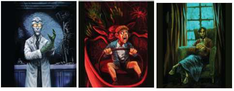
Some of Haunt's in-game paintings. Caption/Image via Game Developer Magazine, June/July 2012.
By choosing Zoe Mode as our development partner, we were choosing a team with a long experience in camera games, due to their work with Sony’s EyeToy. This turned out to be a massive advantage. After some early experiments, the tech and design teams determined that in order to get the most out of Kinect, we should modularize input systems, rather than layer them.
Haunt has very few occasions in which you can do more than one interaction simultaneously. Most of the time, you either do a specific gesture, or you don’t. As soon as things get more complicated than this, Kinect gets into slippery territory. Sometimes the player will run into false positives, where the system thinks that the player has done a specific gesture he didn’t do, or false negatives, where the player thinks he’s done a specific gesture but the system doesn’t register it.
These issues tormented us when we developed Major Minor’s Majestic March for Nintendo’s Wii, but we handled it much better in Haunt by managing the number of inputs scanned at any one time and then doing whatever we could to reinforce the results to the player. The more plural and complicated the gestures are, the more likely false negatives and positives will frustrate players. This is made doubly dangerous in first-person games, where players don’t have onscreen avatars to visually synchronize their movements with.
The one major exception to this in Haunt is navigation; the system simultaneously monitors feet and knees (to move players forward) and arms (to point the flashlight and access the Xbox Guide). These actions are mapped to different halves of the body, so we could treat them as separate modules instead of layering them and relying on the system to distinguish them.
Kinect is a paradox. It’s labeled a “natural user interface,” but many issues prevent most ideas from being implemented in a straightforward manner. We had to do all kinds of hacks to make things feel natural, or as close to natural as possible, and taking this modular approach meant that we were able to test them in isolation.
Problems that might ruin your amazing Kinect idea may stem from technical, cognitive, or cultural issues. Our technical issues generally involved balancing lag and smoothing—Kinect’s skeleton tracking jitters heavily, but the more you smooth it out, the more lag you get—and inaccuracy (the false positives problem mentioned earlier, as well as the large percentage of players who don’t calibrate their Kinect properly). Cognitive issues came up when Kinect was unable to map things 100 percent to the real world equivalents due to various limitations—such as the fact that you can’t walk forward much when playing Kinect because you’ll run into the TV. Our hack was to have players walk in place, but as this isn’t a 1-to-1 implementation, players are bound to experience some cognitive confusion.
Finally, there are cultural issues; players can interpret things in different ways. We found that many American players wanted to perform walking with minimum effort, with tiny real-world footsteps amounting to large game-world footsteps, so we implemented the minimum footstep height possible given Kinect’s granular accuracy. If the distance is too small, we’d get false positives, and the camera would move forward in the game even when players were standing still. By the middle of the project we were pretty savvy about Kinect’s capabilities, and we could eliminate ideas that sounded great on paper but would have been crippled by its limitations.
In the future, technologies like Kinect will (hopefully) become more accurate and reliable; from a player’s perspective, there’s a massive difference between 90 percent reliability and 99 percent. If that happens, game developers will be free to create more action-oriented, high-octane experiences.
But for a spooky game like Haunt, which encourages slow, deliberate movements, the current technology was a sufficient match.
Looking at the legacy of NanaOn-Sha titles, one of our hallmarks is the way we use voice talent. For the Parappa titles, we used musicians, not actors, to voice the characters. Their performances were never going to win any Academy Awards, but their flat deliveries had a certain charm— and the character models in Parappa were technically flat, too!
For Haunt’s vertical slice stage, we were using the partner of a Zoe staffer to voice our game’s only speaking character, mansion owner Benjamin Muldoon. The actor was very gifted, and gave a thespian, ultra-English performance with some gusto that many on the dev team were quite proud of.
However, for NanaOn-Sha founder Masaya Matsuura and me, something wasn’t quite right. Benjamin Muldoon—or “Benjy,” as we called him—is a grubby old geezer who came to riches by surreptitious means. And he’s trapped inside a painting. He has intentionally crude animations—his mouth flaps open and his pupils roll, much like a Terry Gilliam talking head in Monty Python. It was pretty cheesy, and we loved it. Sadly, the crude, flat Benjy character just didn’t match the hyper-animated performance of our thespian friend, but we weren’t sure what to do until one day, when we were talking with (Double Fine founder) Tim Schafer at a GDC party in 2011.
Tim invited us on a tour of Double Fine’s studio the next day, and after the party I suggested the notion to Matsuura of Tim playing the part of Benjy for Haunt. He loved the idea, and it really seemed like a NanaOnSha thing to do. After the tour the next day, we popped the question to Tim, and after some moments of wild, inner panic, he said “Sure! Fuck it. Let’s do it!” and we never looked back.
We’re very happy with Tim’s voiceover—his dry, flat performance is a perfect fit to the 2D painting his character inhabits. But it was a real challenge to get the performance just right; working with nonprofessionals requires that you focus the workload on their strengths and minimize the weaknesses.
The first thing we did was allow Tim to rewrite the voiceover script. The original was written by British game designers (myself included), so in order to get a natural-sounding performance, we knew the script had to be in his voice. He wasn’t required to do any accent or place his vocabulary in a certain time or place. It was 100 percent Tim, with the freedom to take on Benjy’s malevolent mindset—which he tackled with relish.
The second key element is that we had to do a couple of re-recordings—Tim would tire as the day went on, and the more we tried to cajole him into tapping into more energy, the more tired his performances became. Doing re-recordings not only gave him a chance to re-energize but also allowed us to check the lines in isolation and weed out required pickups (of which there were plenty!).
Third, we found that the recordings went much better when someone 100 percent familiar with the game was able to attend the session and give some direction. This isn’t easy on an XBLA budget when 5,000 miles separate parties, but we managed to time a session to coincide with E3, which was truly worth its weight in gold.
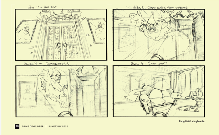
Image via Game Developer Magazine, June/July 2012.
There was one point of contact at Microsoft, Zoe Mode, and NanaOn-Sha, and generally this worked well. Having one point of contact helps to focus discussions, but sometimes it would clog up development.
We would get feedback from our publisher’s top-level management, but by the time it had reached the coder or artist responsible for the implementation, it would have gone through up to five middlemen. This led to a feeling that the feedback was practically an order, rather than a suggestion or topic for debate. In the other direction, when we had to explain certain contentious development decisions—such as our choice of navigation system—we were never really able to take full control of the issue, and subsequently no parties ever felt satisfied.
This was compounded by several management changes at the publisher during development, many of whom we never had an opportunity to meet with, speak to, or even email directly. We had to re-justify our navigation system decisions several times during development, but even then we could tell that the top brass weren’t satisfied. Having to repeatedly make the same arguments proved to be a real distraction, and there was a real sense of frustration and helplessness about not being able to control our vision. We should really have flown to the publisher HQ to communicate our vision and passion for the project and just hammer out these differences, but in the end we never visited and instead these troubles festered throughout the latter half of development.
Our failure to resolve these differing opinions on the navigation system really shook the publisher’s confidence in the project, which ruined any chance we had of getting marketing support at launch.
When we first pitched our projects to Microsoft in 2009, we did not distinguish between retail and XBLA. Microsoft liked our concept for Haunt and suggested that we pitch it as an XBLA title. The problem was that our initial Haunt pitch was envisaged as a title focused around user-generated content, with players creating their own haunted houses, doing their own monster animations via motion capture, and so on.
By the time the project was signed, we’d scaled this down massively but were still promising “unlimited replayability” as one of our core pillars as a legacy of that initial concept. Half way through production we were forced to cut that pillar, and the end product features almost no replay value whatsoever. We cut tons of items from our burn list at several points, since it was the only way we could hit the quality bar with the resources available.
This was a major letdown, and most reviews specifically point out that Haunt is a short experience with low replayability, which has cost us some Metacritic points for sure. At the time, we were hoping that games such as Limbo had made the prospect of quality-over-quantity titles more acceptable, but this ended up not being the case for us.
From the start, we were committed to using Kinect not as a tool to emulate Wii party games but as a way to bring the players into deeper experiences. For Kinect titles, where a significant amount of resources will be spent on refining the input methods, perhaps this “deeper” form is better off for retail titles, because on our limited XBLA budget, we found that three hours of quality left us with zero room for replayable features.
Perhaps the only thing saving Haunt from utter disaster was Zoe Mode’s use of Scrum. Throughout development we were able to rapidly reprioritize our focus and iterate on things until they felt right. The scope kept on dropping, but the quality remained high.
I would definitely suggest that any dev team embarking on its first Kinect project plan to at least double the usual contingency into its budget. There’s no avoiding the fact that to make an idea work with Kinect, all kinds of tweaks and workarounds will be required. In order to make room for this we had no option to cut, cut, and cut again.
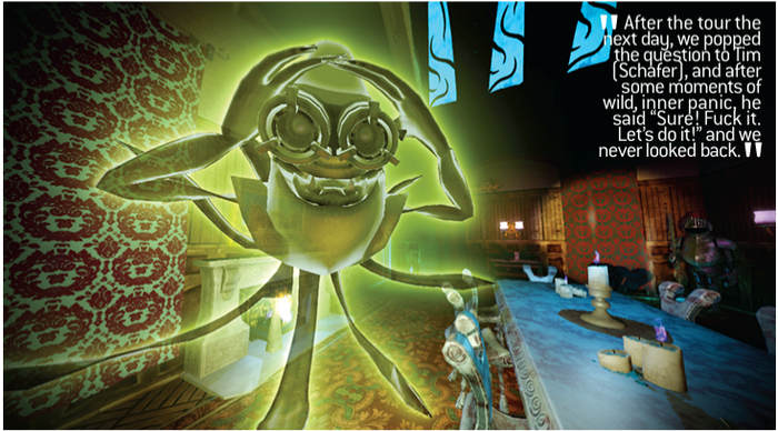
Image via Game Developer Magazine, June/July 2012.
Haunt was something of an experiment on several fronts. It was originally part of an initiative to get Japanese creators involved with Kinect, but our specific brief was considerably wider. As was the case with Parappa, Microsoft hoped that Haunt would be a title that appealed to both core and casual gamers.
During development, the primary focus shifted like disturbed tectonic plates. At the initial pitching phase the goal was clear—get casual Kinect owners to “dip in” to XBLA—but at kickoff, in order to fit in with Microsoft’s keynote theme for Tokyo Game Show 2010, we were announced as one of a batch of titles intended to appeal to “core” gamers.
It was never clear which group we should specifically target, so we did our best to appeal to both, and we ended up making Haunt easier than core gamers preferred. Having said that, we’re pretty happy that the game does indeed have “universal appeal,” but upon releasing the title, it was evident that XBLA was truly the domain of core users. Should Haunt have been targeted more at those core users? Should it have been a retail title and marketed specifically to the mainstream? We never really addressed these issues by the time the game shipped. Instead, we were hoping that the game would create a new market, but we hadn’t done any spadework to create that niche.
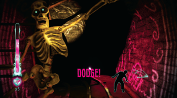
Image via Game Developer Magazine, June/July 2012.
At NanaOn-Sha, we don’t have any aspirations to self-publish. We focus on making games, and we’re happy to let our publishing partners take care of marketing and community aspects.
Haunt wasn’t specifically envisioned as an XBLA title, and we never really adapted our mindset to developing an XBLA game. Microsoft told us on a couple of occasions during development that it wasn’t responsible for marketing XBLA titles, but I don’t think we ever fully took that to heart. The fact that just weeks into the project we were being showcased at TGS perhaps gave us the impression that there was actually room for some marketing assistance, but to be brutally honest, Haunt faded almost completely out of the public mind after that initial showing.
I’m not sure if people in the West are really aware of this, but it’s very difficult to gain mindshare in the West from an office in Tokyo. Out of sight, out of mind. Haunt was never really a part of the conversation in the Western press. Our only real chance to recapture some mindshare was TGS 2011, but we bungled the opportunity. Not only was this TGS notable for its scarcity of Western press, but we had only a single booth that we had to share with two other titles, and most of the time, it didn’t even have a Haunt sign. Furthermore, our demo featured a level from the middle of the game that was too difficult for newcomers, and the atmosphere of the title was drowned out by the din and glaring lights of the show floor.
Overall, we were semi-aware that marketing was kind of our responsibility, but a number of issues stopped us from really tackling it. We had no in-house expertise in this area, and we all preferred to spend our time making games. Also, we hadn’t budgeted for it, so we couldn’t afford to bring in any specialist resources to help. Finally, any marketing that we wanted to do had to be vetted by the publisher. Put all these together and we had a genuine heads-in-the-sand issue that truly came to bite us when the game was eventually released.
Usability testing and playtesting is vital when you’re working with something as analogous as Kinect. How you initially envision the game, how it’s implemented, how Kinect reads players, and how players perceive what they’re doing is all part of an opaque game of telephone in which you’ll inevitably have to make tweaks and additions to make the game as user-friendly as possible.
Sadly for us, our attempts at usability and playtesting were too few, often flawed, and occasionally detrimental.
Our first usability session came after we produced our vertical slice fi ve months into the project. It took place in Washington, and none of the dev team were able to attend, which was a real shame, because certain problems arose that we didn’t anticipate. We didn’t instruct the session manager to calibrate the Kinect sensor before the session, so the Kinect mic didn’t register any sounds by the player, which broke parts of the level. It was so frustrating to watch the videos and be unable to do anything about it. But we took what lessons we could from the experience.
Perhaps the biggest lesson from this session was that you cannot take for granted players’ understanding of text prompts in the game. Some were interpreted in ways we would never have imagined; one of the attack gestures is labeled “thrust,” meaning players should stab at the ghost to hit it, but one player interpreted it as a pelvic thrust! You can imagine this issue worsening once it was localized, so to hedge the problem we included 3D arrows indicating direction of action for all gestures. Even with this, some players were still performing unexpected gestures, so we also added bodypose silhouettes where we could. Ideally we’d have animated these for maximum clarity, but it was beyond our scope.
After that usability session, we brushed ourselves off and thought, “Never mind, we’ll be more thorough in our preparations for the next one.” Unfortunately, that was to be our fi rst and last true usability session of the entire project. We were unable to secure further access to the usability team, so in the end we resorted to doing impromptu sessions ourselves using staff, friends, and family. It was better than nothing, but by the time we got around to this, there wasn’t really enough time to make changes based on the results.
During the same period, in lieu of any true usability or playtesting, we received occasional feedback from assorted Microsoft employees in Redmond, but it never seemed to correlate with our own data. In the end, usability ended up becoming a political tool for our debates on the navigation system, when it would have been far more useful to focus on the minutiae of the game to improve the moment-to-moment experience.
From a purely selfish perspective, we’re quite happy with Haunt. We managed to release a charming title, with a unique control scheme and a memorable voiceover, and we did it all in just one year.
Our biggest mistake was a failure to convince our client that the final product was worthy of marketing support, and our inability to compensate when they didn’t come to that conclusion themselves. Now that the product has been on the market for a few months, and the Metacritic score is comparatively high for a Kinect title, we’re starting to see those reservations thaw. The next step will be to talk about where Haunt fits in the overall strategy, because as a digital title, there is still plenty of time for promotions, and some exposure around Halloween could still reap some dividends.
Any title that is unique—and doesn’t fit logically into your client’s portfolio strategy—will always be a risk, and only the customers can decide the outcome of Haunt’s destiny. In the meantime, I’m certain that NanaOn-Sha will continue to make innovative, trend-bucking video games. After all, that’s what publishers always ask us for!
You May Also Like