Trending
Opinion: How will Project 2025 impact game developers?
The Heritage Foundation's manifesto for the possible next administration could do great harm to many, including large portions of the game development community.

Featured Blog | This community-written post highlights the best of what the game industry has to offer. Read more like it on the Game Developer Blogs or learn how to Submit Your Own Blog Post
Color is one of the most powerful tools you have when you’re designing a game. When used properly, color sets the tone of a game, tells you where you are, and where you need to go. But knowing where to start when creating a color palette can be difficult.

This article was originally posted on Kongregate's Developer Blog.
Color is one of the most powerful tools you have when you’re designing a game. Colors can be engaging, helping to direct your players to whatever you think is most important. It can also be used to give subtle clues about the characters and their world. When used properly, color sets the tone of a game, tells you where you are, and where you need to go.
But knowing where to start when creating a color palette can be difficult, so let’s break it down and go through this step by step.
Whether you intend it or not, the colors you choose have meaning and that meaning changes with context. The study of colors and how they are perceived goes back a very long time. Much of modern color theory comes from historical context and deep cultural significance. Being aware of this allows you to use colors to your advantage or to subvert your player’s biases entirely in new and creative ways.
Red: Strong emotions like love, lust, anger, as well as warmth.
Orange: Joy and enthusiasm as well as frustration or freshness.
Yellow: Happiness or cowardice.
Green: Nature, envy, sickness, or greed.
Blue: Calm, cold and corporate, or masculine.
Purple: Royal nobility, quality, and luxury.
Black: Mystery, evil, or grief.
White: Sincerity, good, cleanliness, holy, purity, or mourning.
Your game’s color scheme is a great way to set the tone and ambiance of the world your players will interact with. Which color scheme is right for your game really depends on what kind of experience you’re making and the story you’re trying to tell.

Left: “Firewatch,” Right: “Team Fortress 2”
The colors you think of when you imagine the fall and a sunset. Warm palettes can be associated both with warmth and comfort as well as aggression, so depending on how you use them they can signal that it’s safe or that it’s time to go to war.

Left: “Mirror’s Edge,” Right: “Portal”
Turns out the future is blue, or at least something bright and cold. Cool color palettes are often used in science fiction games to depict an uncaring and sanitized future. When paired with bright touches of warm color this aesthetic can be very effective.

Left: “Red Dead Redemption,” Right: “Metro 2033 Redux”
The end of the world (both geographic and metaphorical) is brown, gray, and lifeless. However, because of the more muted color palette, bright colors really stand out and can be a great way of highlighting important information for your players.
You’ll notice in the Metro 2033 Redux screenshot that, despite how small it is, your eye immediately goes to the character’s wrist. The blue light denotes your stealth status and the numbers are your ammo count. These are two very important pieces of information that are integral to your survival, and they stand out in stark contrast to the duller world that surrounds them.

Left: “Batman: Arkham City,” Right: “Far Cry: Blood Dragon”
Noir (and the visually related cyberpunk) is all about the high contrast of deep shadows and bright highlights. It’s specifically about the texture and color of light, about using it to highlight important information for your players in a dark and dangerous world.
For example, in Far Cry: Blood Dragon the world is mostly cool tones of blue and purple in deep shadow. Important locations and dangerous creatures often have bright neon lighting both to draw you in and warn you of their presence.

Left: “Dolly,” Right: “Inside”
Color use as minimalism, both of these aesthetic styles focus on a very restricted use of color for dramatic effect. When paired with another color theme it can be extra striking and engaging.
Something to keep in mind is that these are just generalities and that some of the most interesting color palettes come from breaking these conventions. Just like your game probably doesn’t conform to only one genre, you should mix and match color palettes to get the right feeling.
When choosing your color palette, consider what purpose you want the colors to fulfill. Thinking in this way can help you decide how high contrast you want your colors to be, what mood you want to evoke with them, and what you’re trying to convey to your players. All of this is part of the decision-making process.

Left: “Bioshock,” Right: “Super Hot!”
The most common use of color in video games is for wayfinding. Using colors with a high amount of visual contrast draws attention to certain directions or items. However, you can always take it further.
You could take your cue from Super Hot! and only place the most important objects in a high-contrast color, leaving everything else utterly desaturated. This puts key objects in sharp focus, drawing the player’s attention more strongly than a lower-contrast color palette.
Or you could use the dramatic lighting cues of a noir aesthetic (such as in Bioshock) to create an oppressive atmosphere that pulls your players forward into the light. People naturally head towards the light, and if you mix a dark and foreboding palette with a bright and warm one for key objects and directions, players will naturally want to move towards them.
Whatever direction you take it, remember that it doesn’t have to be a simple highlight. It can inform the story and the world you’re creating for your player.

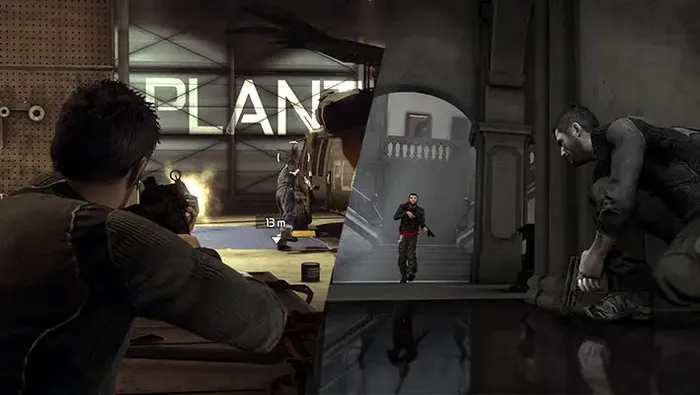
“Splinter Cell: Conviction” using color to visually differentiate between combat and stealth.
It’s important for your players to know when they’re safe in a game and when danger is imminent. As a game designer you have a lot of tools at your disposal, and color can often be a subtle (or not-so-subtle) clue that a player’s circumstances have changed.
In shooters it’s common for the screen to go red, or black and white, when the player receives a lot of damage and is in danger of dying. The Splinter Cell franchise turns that paradigm on its head and desaturates the color around the player while they’re safely in the shadows, only showing them in color if they are discovered or otherwise break stealth.

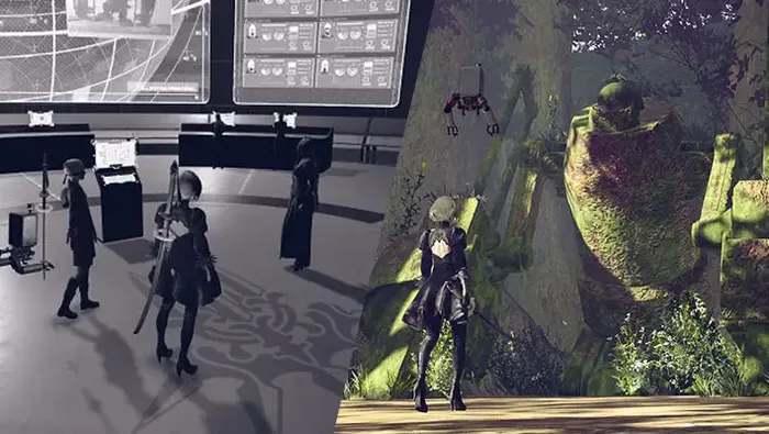
“Nier: Automata” using color to imply deeper meaning as to the true nature of its world.
While not as common in video games as it is in other mediums, color is a great story development tool. A recent game that plays with this concept is Nier: Automata. It uses color, and the lack of it, to show the dichotomy between what the character believes to be true and what they experience. At the home base it feels mundane and lifeless but when you’re exploring Earth it appears to be vibrant and full of life.
Sometimes you can just jump right into Photoshop and start throwing colors on a canvas to see what sticks. That’s perfectly fine and can give you a solid, holistic palette. If that works for you, just make sure to layer up the colors and run through the layer blend modes. It’s a great way to find complementary colors that are high contrast but don’t feel out of place.
If you prefer a more directed approach here are some useful tools:
Both of these tools allow you to generate your own color palettes as well as providing you with a library full of user-created color palettes for inspiration.
They also offer the ability to generate a color palette from an image. A technique I often use is to take a photo from the internet (usually a landscape or street photography) and run it through one of these tools to get a starting point. From there I tweak the resulting palette to better fit the tone I’m looking for.
Another great tool for creating more complicated color palettes. If you’re stuck, take its random palette generator for a run.
Based on the WCAG 2.0 initiative, ACM is a great way to make sure your color palettes are fully accessible to people with visual impairments. This makes it a great second step once you’ve created a color palette for your game.
Both film and photography have been playing with color for over a century now, and they have a lot to offer in how to use color. Here are a couple of great YouTube videos diving into those topics to help get you inspired:
Color in Photography:
Color in Film:

Doug is part of Kongregate's design team as a front-end developer. His first job title was “The Admiral of The Internet” and it is believed the quality of his work is directly proportional to how insane his beard gets.
Read more about:
Featured BlogsYou May Also Like