Trending
Opinion: How will Project 2025 impact game developers?
The Heritage Foundation's manifesto for the possible next administration could do great harm to many, including large portions of the game development community.
“The game was envisioned as a hand drawn shooter. As gameplay and weapons evolved, so did our idea of the artist -- a high school kid who was extremely creative, but not terribly skilled artistically."

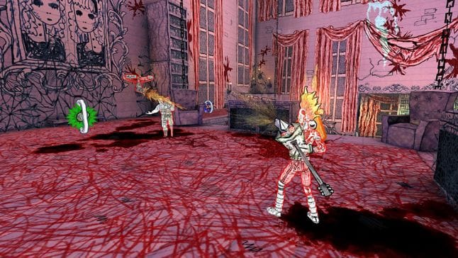
Drawn to Death, the brainchild of David Jaffe, The Bartlet Jones Supernatural Detective Agency, and SIE San Diego Studio is a game that is defined by aesthetic choice and artistic direction. But the distinctive art style evolved over time, according to Steve Merghart, art director at The Bartlet Jones Supernatural Detective Agency.
“The game was originally envisioned as a stick figure shooter,” Merghart says, “and was always intended to have a very rough, hand drawn look that could incorporate whatever bizarre and creative ideas that the 'artist' came up with. But as the gameplay and weapons evolved, so did our idea of the artist; eventually we settled on a high school kid who was extremely creative but not terribly skilled artistically. In the game, when a player summons 'the Hand' for a super powered attack, it’s that artist’s hand that appears.”
The result is an incredible blend of the stark style of games like Mad World with the line drawings and artistic flair you’d expect to find inside the sketch book of a teenage Megadeth fanatic.
Molded to fit an arcade-y third person arena shooter, the art serves the action in fun, novel ways. When the murderous, maniacal teddy bear you’re controlling (complete with massive bloodied chainsaw) launches an explosive AoE attack at foes on a platform below you, the radius is telegraphed in a bright, lurid red dome made up of shaded panels and wavy lines that would look right at home in a college ruled notebook.
“We all remember that classmate that would draw in class all day, filling their notebook with amazing doodles even if they weren’t very well executed. A lot of us actually remember being that kid, which is why the art style seems to ring so true for so many players. As far as our ‘medium’ is concerned, we tried very hard to make it look as if the notebook doodles simply come to life exactly as drawn on the page. So in essence, they are made of mostly ballpoint pen scribbles.”
The “high school kid with an art kit and overactive imagination” extends all the way to the game’s palette, which Merghart says was thoughtfully limited to what you might find in a teenager’s backpack.
“We envisioned that the kid had a couple of different colored ballpoint pens, mostly blue and black, but also a red one and maybe a green one. For real splashes of color, it’s not a stretch to imagine that he also had a couple of highlighter pens in the backpack. We intentionally limited the artist’s art supplies because from a narrative point of view we didn’t want this kid to come off as very artistically talented. “
While crafting bad art is a fairly easy process, Merghart says the real challenge came in manufacturing lots of bad art with consistency. “We initially joked about simply hiring high school students to draw all the art, but the technical requirements for making reliable and consistent game art quickly ruled that out. The one thing we need to be able to do when making this game is replicate the artist’s art style over and over and over. Creating art for a 3D action game that is intended to look badly drawn by one specific artist is surprisingly hard to do!”
This meant the team needed to find experienced, highly talented artists that were also capable of drawing at a much more primitive level than they were used to, and doing so consistently and at the same reduced level over and over, across months or years of development.
“It’s a bit like needing someone to sing a song very badly, but in exactly the same way for every showing of a Broadway musical. You end up needing an extremely talented singer with amazing vocal control, which is essentially how we’ve staffed our art team: A small team of amazing artists with an amazing range of art style control. From the concept artists, to the modelers, to the VFX artists, to the animators, everyone is able to put aside their individual styles and channel the angst-ridden musings of this creative high school kid. “

The approach to this kind of regressive art engendered some interesting experiments.
“We’ve had right handed concept artists try to draw with their left hand, texture artists holding the pen in a kindergartener’s stabbing grip, and our VFX artist struggling to find the balance of classic game effects and crudely hand-drawn splats and explosions. The one thing that no art director ever thought he’d have to say is, ‘That looks way too nice! Draw it again, only crappier.’ With a million apologies to my amazing art team, that was an almost daily occurrence.”
Throughout the art’s unique evolution though, Merghart emphasizes that the team never lost sight of their real goal: making a video game that was as fun to play as it was visually interesting.
“Fun and rewarding gameplay has always been the guiding principle for Drawn to Death from its inception. The art style has gone through significant evolution from a stick figure shooter, to flat paper dolls running around a paper level, to the high school notebook scribbles where we have now, but the goal of making a fun-as-hell shooter with the moves and depth of a fighting game has never wavered.”
But their bizarre art design did mean a lot of room for experimentation, and that no concept for weapons and equipment was off the table, regardless of how surreal or ridiculous. “It’s been extremely amusing and gratifying to watch some of the crazier concept designs inspire some truly off the wall weapons and abilities. We have a monkey that rides on your back literally throwing poop at your enemies, a coffin that catapults out a fat, bloated, exploding corpse, and a shark-headed ninja that summons smaller explosive sharks to wreak havoc on the battlefield!”
After the design had been mostly cemented and a lot of the original artwork generated, implementing it was a completely different challenge, one that ended up generating some very unique (and ambitious) potential solutions.

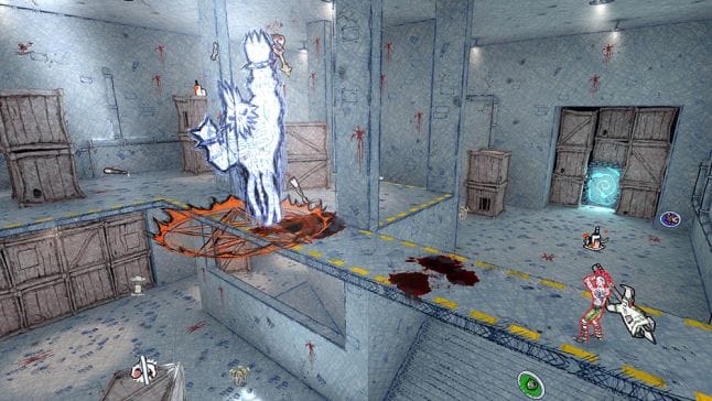
“Production art had a different set of problems to overcome, as our original goal was for the game to have an actively scribbly look to it as if it was constantly being redrawn. From double and even triple texture maps that would cycle to give the characters a very animated look to complex toon shaders that would draw and re-draw the scene for that squiggly look. Environments added a new twist as we initially wanted the game to appear as if it was taking place on a piece of lined notebook paper, flattened out and with no lighting. We quickly learned that so much white on the screen was giving people headaches, so we began looking for a lighting scheme that would make our 3D environment fit our highly stylized vision. We settled on a very controlled set of environment textures where the mip maps are actually individually drawn, and the shadows are built from layers of scribbled textures.”
As is so often the case, reality intervened and put the brakes on some of the more inventive approaches, but Merghart says the core design was retained. “Ultimately, limitations of the engine ruled out some of the more ambitious methods, but Drawn to Death still holds true to the creative director’s vision.
You May Also Like