Trending
Opinion: How will Project 2025 impact game developers?
The Heritage Foundation's manifesto for the possible next administration could do great harm to many, including large portions of the game development community.

Featured Blog | This community-written post highlights the best of what the game industry has to offer. Read more like it on the Game Developer Blogs or learn how to Submit Your Own Blog Post
This article shares insights in the design approach taken and the lessons learned from making an augmented reality application using Unity. The lessons pertain to an award winning phone application and looks at the result from an MDA framework perspective

[As posted on http://sassybot.com/blog/dear-stranger-post-mortem-augmented-reality-and-an-mda-perspective/]
In the course of last year we, SassyBot Studio and Mattia Traverso, created an application called Dear Stranger. I have written a little bit about this before on our blog but the experience and lessons gained were otherwise largely left undocumented. What you read in this blog is my perspective on how we approached making Dear Stranger. Dear Stranger was the result of a 72 hour hackathon/game jam. Even though it has been quite a long time since we created this application, I have not yet taken the time to explain exactly what Dear Stranger is and how it was made. In order to make sense of it all, I will explain the event that motivated us to create Dear Stranger, the thought process behind creating it, and how it exactly works.
Hack the Park!
In June 2014 an event called Visual Design Week XS was organised to promote visual culture in Breda, The Netherlands. As part of this week a hackathon/game jam called 'Hack the Park!' was organised. This event was a competitive challenge with several constraints as well as a reward for the winning team. Some of the constraints were:
72 hours to create either an application or a game based on the theme 'Hidden Garden'
Up to 3 people per team
The use of augmented reality using Vuforia is mandatory and will need to use a provided target image
Needs to run on a smartphone
Design constraints are great for coming up with unique concepts and can help narrow the focus for new and refreshing concepts. It can also reveal possibilities that were otherwise not considered feasible.
The thoughts behind Dear Stranger
When you get to work with technology that is different from what you are used to it is often the challenge to imagine what the technology enables you to do which would otherwise not be possible. Of course you can use an existing game concept and make that work with new technology but is that really exploring the possibilities of that technology?
Some of the new possibilities that we arrived at included making use of the connectivity and mobility of the smartphones. Additionally, some phones have very cool tech such as gyroscopes, advanced cameras and powerful hardware. However, we knew that if we decided on using too much exotic tech that we could exclude certain users from using the app. Furthermore, in the case of gyroscopes we have noticed that this is not yet that reliable on different devices.
Keeping all of these things in mind we started brainstorming all kinds of crazy ideas. Eventually we landed on the idea of letting people leave hidden messages in plain sight. Considering the time and tech constraints we felt that this concept was simple in mechanics, could be executed nicely in terms of aesthetics, and would allow some interesting dynamics to emerge for its users. Furthermore, after getting the minimum viable experience up and running during the jam we were able to quite easily expand and polish onto this core concept. The concept finally evolved into the simple notion of having a public, but hidden, message board with a unique and fitting presentation. We called it, Dear Stranger.
Dear Stranger from an MDA framework perspective
Allow me to pitch to you the application that we created. "Dear Stranger is an augmented reality application for smartphones that lets the user leave a single message per day in the form of a flower. Users can read messages left by other strangers and tweet those you think are great. Explore a garden of thoughts and conversations as you see it grow over time." While we developed this application with user experience in mind I can't help but notice that Dear Stranger lends itself nicely for an analysis using the Mechanics-Dynamics-Aesthetics (MDA) framework (R. Hunicke, M. LeBlanc, R. Zubek - 2001). To explain this framework briefly,
Mechanics: The rules
Dynamics: The player's response and interactions being constrained by these rules
Aesthetics: The player's sensory experience such as the look and feel
In the case of Dear Stranger this would look a little similar to this.
Mechanics: The application starts working if the software recognizes the trigger image required by the augmented reality system. When recognized, the user is prompted with instructions on first use. After having confirmed reading these instructions, the user can post a single message of 126 characters per day. The user can read and tweet messages. The time slider indicates what messages are shown based on the date and time of initial posting per message. When the software loses track of the trigger image it stops working, indicating that the system requires the image target to function.
Dynamics: The user response was to share personal experiences, greet others via Twitter, or set up little stories by responding to other messages. Using the time slider, the user would get interested by the appearing and disappearing of flowers. This possibly led to the reading of messages and inspired the user to respond. When exploring the limits of this application we found that users would sometimes carefully abuse the limitations to leave messages in strange places, such as up in the sky, behind the image target or behind the assumed starting location of the user. Another way the application was used is to make a picture of the image target and fool the system by having it recognise the target image on a display device rather than in the intended real environment.
Aesthetics: The application informs the user by using a minimalistic font that it requires an image target. When acquired, a stylized wooden sign is fitted over the image target formed out of tree trunks and leaves. Using text and images, the sign explains the concept, how to use the app, and where the presumed limitations of the app lie. The application then shows stylistically designed flowers, containing messages, on the screen with the camera's real-time result as background. When tapping on a flower it opens a fitting general user interface (GUI) allowing the message to be read, tweeted, and closed. Each flower indicates, with colored and animated feedback, which flowers have been read or tweeted. An also minimalistically designed GUI in the bottom of the screen informs the player of the ability to scroll through the messages in time ranging from 'Day 1' to 'Today'. When scrolling this time slider, flowers will pop out of the ground or sink back in depending on when the message was posted or planted. The flowers and sign are enhanced by illusions of shadows and particles are used to simulate fireflies. Soothing music plays throughout the application and sound effects are prompted when the player interacts with the flowers or buttons on the interface.
Behind the Scenes
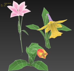
This application was developed using Unity3D 4.6.3f3 and made use of a plugin from Qualcomm called Vuforia. The models were created in 3Ds Max and the textures were hand painted in Photoshop CS6 using a Wacom Bamboo drawing tablet. The interface assets were also designed using Photoshop CS6. The flowers are coloured using vertex paint in 3ds Max. We used a custom shader in Unity3D, limiting us to 300 vertices per flower. The reason for staying below that specific vertex count is so that we can make use of dynamic batching which is a blessing for performance on mobile devices.


Textures were, for the most part, placed on a couple of texture atlases before implementation in Unity in order to save memory and processing power. Player feedback on the flowers consisted of an animated sprite, aimed at the camera, that changed animation behaviour or colour depending on whether it was read or tweeted. Extra attention to detail was spent on animating the GUI by scaling when prompted, sliding text in from the side, and briefly highlighting a button to indicate it was pressed. An orthographic Unity camera was used to render the interface on top of the augmented reality layer. More about layering cameras can be read in our Elimu post-mortem.

We limited the user to 126 characters so that we had 14 characters left to add " #DearStranger" allowing us to comply with Twitter's character limit. To store and pull user messages we used a database that would keep track of what the message contained and when it was posted. Using these dates we could set up a normalized slider that ranges from first posted message to the last posted message. To make the placement of custom text easy we used a small script that allows for word wrapping. When typing a message the application will use the keyboard provided by the smartphone's OS.
Hopefully this article has given you sufficient insight in how Dear Stranger was created and some of the though processes behind it. If anything is unclear then I am happy to elaborate.Please get in touch via @tinovdk with any questions and I'll help to the best of my ability.
[Update] Added credits and a disclaimer
Read more about:
Featured BlogsYou May Also Like