Trending
Opinion: How will Project 2025 impact game developers?
The Heritage Foundation's manifesto for the possible next administration could do great harm to many, including large portions of the game development community.
Ideally, accessibility is a primary design goal, not an afterthought. Here's how playtesting helped Whitethorn Games refine the process.

Game Developer Deep Dives are an ongoing series with the goal of shedding light on specific design, art, or technical features within a video game in order to show how seemingly simple, fundamental design decisions aren’t really that simple at all.
Earlier installments cover topics such as how art director Olivier Latouche reimagined the art direction of Foundation, how the creator of the RPG Roadwarden designed its narrative for impact and variance, and how the papercraft-based aesthetic of Paper Cut Mansion came together with the developer calls the Reverse UV method.
In this edition, Brian Wilson, creator of The Forest Cathedral, walks us through the thought process and procedure around the game's accessibility options.
Hey everyone, my name is Brian Wilson, and I’m the creator of The Forest Cathedral, a first-person environmental thriller set on a remote island. Playing as scientist Rachel Carson, players will slowly uncover the effects of a pesticide by using advanced environmental technology to solve 2D and 3D connected puzzles.
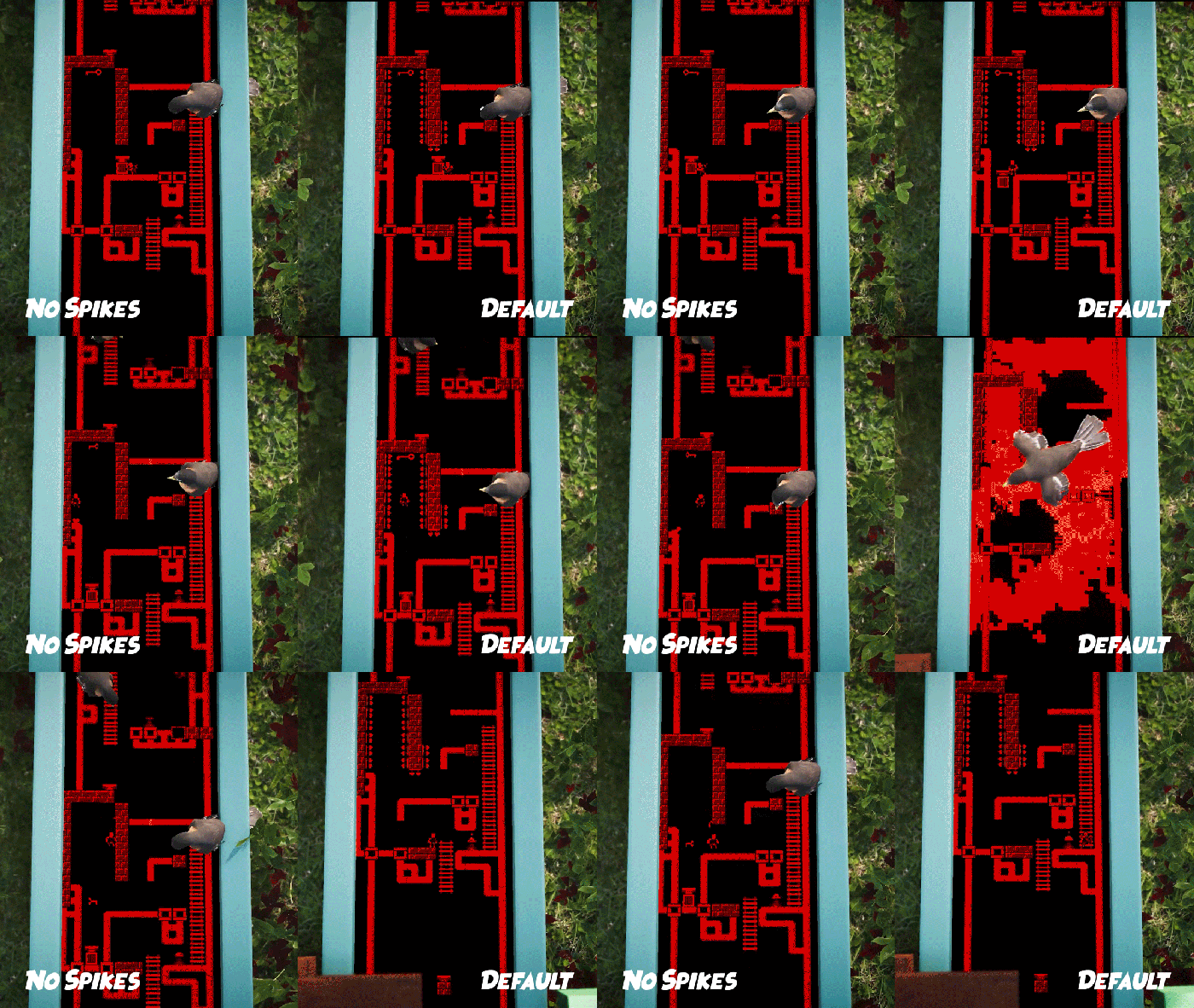
On the right, the game's default gameplay. On the left, No Spikes Mode.
2D platforming is at the heart of the game, but a series of precise jumps and dashes aren’t for everyone, so this was my first call to action in terms of accessibility. Controlling the Little Man, a tiny person inside of the terminals, players will have to jump, dash, wall-cling, and attack their way through the levels. Deadly spikes are filtered throughout the 2D world, giving the game its initial challenge. As an indie, my resources were limited, so I was looking for the “easiest” way to get the most done. Adding an option to turn the spikes “off” was a no-brainer because I knew there would be people more interested in the story and less in the platforming. This option accomplishes so much because The Forest Cathedral is inherently a difficult platformer—a game I set out to make, but it also allows me to reach a wider audience at the same time.
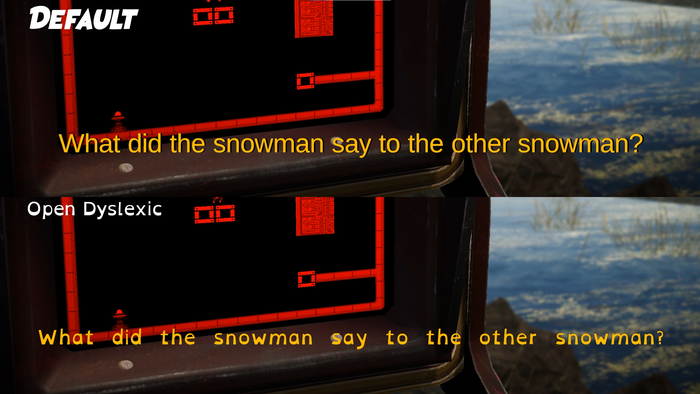
A comparison shot between fonts before and after implementing OpenDyslexic.
Next, a typeface option called OpenDyslexic was added to the game after reading an article about Overland developed by our friends at Finji. OpenDyslexic is an open-source, free-to-use typeface designed against some common symptoms of dyslexia. At first, OpenDyslexic only changed the subtitles typeface, and I was totally proud of that. A lot of these implementations start with questions like, “Why does the font of the menu, UI, or in-game journal not change as well?” and you’re like, “Oh yeah, why doesn’t it?” So now OpenDyslexic changes the UI, menu text, and in-game journal.
Admittedly, subtitles—in general—were added in as a patch to my first game, Where the Bees Make Honey, and not something it started with. It's important to realize we all start somewhere. By building our toolboxes, we, as developers, can create new standards for the industry at large. Each game will require accessibility options or features tailored specifically for it, as well as standard ones. The more information that’s shared, the better, because games are for everyone, and we want everyone to enjoy them.
Speaking of that toolbox, more “industry standard” options and sliders were added for look sensitivity, game volume, and inverted Y-axis because I knew I had those in Where the Bees Make Honey. I was able to add some standard options, as well as options specific to my game—but what if I told you that wasn’t enough?
Hi, I’m Britt Dye and I’m the Usability and Accessibility Specialist at Whitethorn Games. It’s always ideal to incorporate accessibility from the beginning, but that’s not always possible. Brian was working on incorporating some accessible design and features with the tools he had from the beginning, but accessibility has many facets and it can be difficult to notice all the barriers your game may have. That’s where I come in—to support developers and help round out a game’s accessibility through reviews and testing to the best of our collective ability.
When I first began to work on The Forest Cathedral, it was over two years into development, and as a publisher, we come in at different points in development all the time. Working retroactively on removing barriers means some items might be more or less feasible within timelines or constraints of the game, budget, or resources. The Forest Cathedral being a little further into development meant we had to get creative with some of the solutions to stay within these limits.
I began with an initial review, in which I played through the vertical slice available at the time. I highlighted potential usability and accessibility issues that might prevent players from experiencing the game as intended. Among other items, issues like only being able to use an analog stick during platforming, no keybind remapping, the need for rapid button presses and precise reaction times, and potential readability issues with the journal, were found and reported during the initial review of The Forest Cathedral.
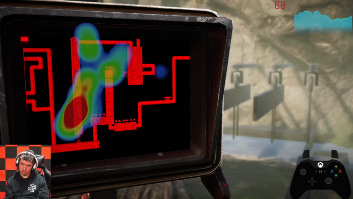
A screenshot from the playtesting process.
While Brian and lead programmer Phoebe Shalloway were working on some of the usability and accessibility issues reported in the initial review, I began recruiting for playtesting. I try to make the recruitment phase as transparent as possible. I include the accessibility details for the test itself in the initial email, which lets testers know what’s going to be expected physically, cognitively, [what] social settings [they might be testing in], among other details. This way, they can determine whether they’re comfortable before they make a decision to come in and test.
The Forest Cathedral was actually the very first game we did a playtest for. I had just set up the lab and processes by which I could recruit and record tests. The tests are run with 3-4 participants, each at a separate time. I use game capture, a heart rate monitor, eye tracking, input recording, and a camera and microphone. These help me gain insights into difficulties players may encounter, where they get stuck, and how they might try and solve these issues. I ask them to talk aloud if they feel comfortable, which helps me gain insights into the thoughts or feelings the players have while playing. Playtests are watched and recorded in-house, and I interview players afterward.
After an analysis of the playtests, we noticed some barriers for players. One major accessibility issue that was brought to light was wall jumping and quick response times. Even with the spikes turned off, actions that needed quick response times were difficult to perform for players with physical or cognitive disabilities. Even though reaction times were a potential issue during the initial review, the playtests showed us where and how these manifested more concretely, which led us to brainstorm potential ways to remove the barrier.
We wanted to get rid of the barrier caused by precise timing and precision, but we weren’t sure how to do that yet. We tossed some ideas around, like having the Little Man jump farther, having Little Man “stick” to walls to give players time to think while not having to press multiple buttons, a slow fall or float, or removing the need for wall jumps or precise timing by adding boxes to jump on. Each of these ideas would take different amounts of resources. After discussion, we decided the slow fall or float option would be the best way, considering the constraints in place. It would give players extra time to think or react, as well as alter the gameplay enough to remove the most oppressive aspects of the barriers while still incorporating the challenge Brian had intended with the level designs.
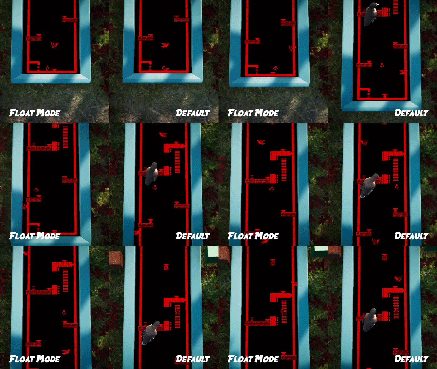
On the right, the game's default gameplay. On the left, Float Mode.
Between the no spikes and float modes, you can use one, the other, or whatever combination that suits your playstyle. Since the Little Man is now able to reach places that were previously filled with spikes (if they are turned off), some edits and iteration were required. And while I know this sounds obvious, literally, all efforts towards accessibility made The Forest Cathedral a better game.
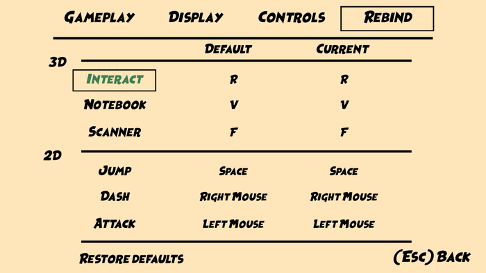
A screenshot of the rebind option in the menu.
In addition to gameplay options, rebinding was also something we wanted in The Forest Cathedral. Rebinding allows players to map actions to buttons or keys they find comfortable or intuitive. It’s one of those options that lets players customize their experience, but can be difficult to implement after the fact. In The Forest Cathedral, there’s also a button map to show players which actions were bound to keys as default, so we wanted this map to reflect any changes made to rebinds. Phoebe worked really hard to implement rebinding and the dynamic button map. It required a lot of iteration and testing to make sure it was implemented to our satisfaction.
Game development is an iterative process in all its aspects. Accessibility is no different. It was important to us that the accessibility features and options weren’t just implemented but implemented well and working. Along with the QA team, we tested all the gameplay options on every level, as well as testing all other accessibility options throughout the game to ensure the features were working well and polished. Accessibility wasn’t just an afterthought we stuck on the tail end of development without testing. We wanted the experience to feel polished, however someone chooses to play.
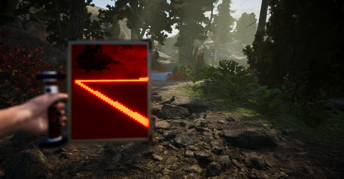
A screenshot of the in-game scanner, called the iRGB.
The Forest Cathedral is all about contrast—2D platformer vs. walking-sim, crunchy pixel art vs. smooth foliage, blood red 2D worlds vs. lush green 3D ones. The red and black 2D worlds started as an artistic choice, but by taking out unnecessary background art, I was able to declutter the whole thing and increase visibility with high-contrast monochrome.
A handheld scanner called the iRGB is used to capture specimens and help players navigate the 3D world. The scanner can only see “certain” things, which is by design both for technical and accessibility purposes. The scanner sports monochromatic visuals like the 2D worlds, with the only way to differentiate objects being brightness. This fits into the game's narrative and also prevents me from relying solely on colors.
The Forest Cathedral is one step forward in indie accessibility, and we hope it adds momentum toward the growth of the games industry. As industry standards evolve and accessibility becomes incorporated into game design, it’s important for developers to share information and build our toolboxes. The journey of The Forest Cathedral wasn’t a perfect one, but it is one we’re proud of, and we hope that our efforts help make it playable by so many more people than it might have been. The Forest Cathedral will be coming to PC and Xbox in early 2023—but you can stay updated with the game by wishlisting it on Steam and following Brian on Twitter @BlanketsWilson and Britt @BritStrike.
List of accessibility features
The Forest Cathedral contains two types of gameplay: a 3D visual novel (referred to as 3D) and a 2D platformer (referred to as 2D). Settings can be adjusted for different areas of the game.
General Settings and Saving
Settings and Pause menu accessible at all times during gameplay
Gameplay Difficulty
2D Difficulty options are able to be turned on and off at-will through the Settings menu. It does not require a new save or restart to implement them.
2D - Option to Turn Off Spikes which removes all deadly spikes
2D - Option to toggle on Float Mode which reduces the speed at which the 2D character will fall
2D - Checkpoints during platformer happen at regular intervals, allowing players to restart from a checkpoint if they die
Input and Button Presses
PC - Has mouse and keyboard and full gamepad controller support
Rebinding is supported for most actions
Button map available at any time in the Settings menu for default keybinds
Player key rebinds will be reflected in button map
3D - Camera sensitivity adjustable
3D - Can invert camera controls vertically (y-axis)
2D - Character is moveable using thumbstick or D-pad
Haptics
No haptics
Tutorials
Gameplay Mechanics onboarding for both 3D and 2D gameplay takes place in a separate tutorial zone with checks, buttons prompts, and text
Audio Accessibility
Max volume adjustable
Text and Reading
UI text and menu text are written in a high contrast bold typeface by default
Subtitles and journal text are written in high contrast and sans-serif typeface by default
Option to change all in-game text to OpenDyslexic, a sans-serif typeface
On-Screen Movement and Visual Effects
Option to replace flashing static screen on terminals with a black screen
No motion blur
Heads-up Display
Key bind prompts viewable on-screen when needed for progression
Player key rebinds will be reflected in button prompts
You May Also Like