Trending
Opinion: How will Project 2025 impact game developers?
The Heritage Foundation's manifesto for the possible next administration could do great harm to many, including large portions of the game development community.

| Picture Perfect: Exploring Photography Games | ||
| Every day this week, Game Developer is serving up a gallery of interviews, deep dives, and more digging into the evolution of Photography in video games. | ||
| Browse Latest Articles | Submit your Blog | |
Selecting the criteria for a good picture is a persistent photo mode challenge. What happens when you relinquish critique to the player?
September 19, 2024

Game Developer Deep Dives are an ongoing series with the goal of shedding light on specific design, art, or technical features within a video game in order to show how seemingly simple, fundamental design decisions aren't really that simple at all.
Earlier installments cover topics such as the starkly stylish art direction of Bloodless, how GOG updated Alpha Protocol for modern digital release, and how Ishtar Games approached the design of a new dwarf race in The Last Spell.
In this edition, Nerial level designer Finn Carney describes the complicated design process behind critically assessing live footage and what happened when they relinquished critique to the player in The Crush House.
In The Crush House, you play a camerawoman for a reality TV show, and a lot of what reality TV entails plays to our studio Nerial's (Reigns, Card Shark) established strengths: narrative branching and complexity, characterful interactions, a roguelike-ish structure. However, none of that prepared us for the central mechanic of filming, nor were there many external references for filming as a mechanic (shoutouts to Michigan: Report from Hell). The reason for that, it turns out, is because it's a very complicated mechanic to pull off.
Photography as a mechanic has evolved a lot over the years; we wanted to credit in particular games like Umurangi Generation and Dead Rising for informing our thought process. However, the thing about photography mechanics, as opposed to filming mechanics, is that you only ever have to analyze and grade a single frame at a time. Filming requires you to analyze and grade dozens of those frames every second, and then to display all that information to the player in a way that is at the very least parsable, and ideally actually fun. Again, complicated.
Early in production, the concept was for the player to both record and then edit footage. And while conceptually very cool, it was also a technical nightmare. This was primarily because recording footage, with decent framerate and at a reasonable quality, required a lot of memory, and disk space overhead from the video card. Then it came to actually trying to analyze and catalog what was filmed. One system we tried was to buffer the last few seconds of film, determine if anything "interesting" happened during that time, and discard it if not. But how we could tell if something was interesting, or what "interesting" even was, was extremely difficult to determine.
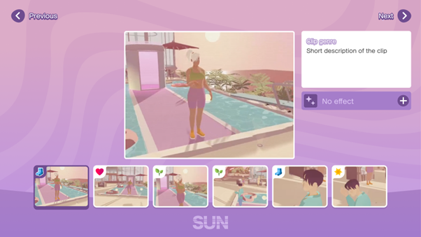
Image via Devolver Digital.
Moreover, from a pure player perspective, we realized it was nearly impossible to provide feedback to the player during both the filming and editing phases, as they were only graded on their final edit. Once the show had aired, you'd just throw a mountain of feedback at the player and hope they could parse it.
Solving this meant cutting the editing phase entirely, which in turn reframed the entire show as a livestream. This provided great relief at the technical level and a diegetic way to provide real-time feedback via viewer numbers and comments. But this process also pointed to perhaps our biggest design issue.
We at no point wanted to define what "good" or "bad" TV was, as especially in reality TV, that definition can be so variable. However, we also knew the fail state of the game was having the show canceled, and that meant rating the player's footage. These two ideas felt both contradictory and necessary for a long time, until we focused fully on the idea of the audience themselves. Or, more specifically, multiple audiences.
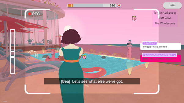
Image via Devolver Digital.
Having multiple audiences, each having their own satisfaction criteria and identities, suddenly absolved us as developers of having objective opinions about what constituted "good" reality TV. In fact, this system enabled us to allow for nearly any type of reality TV viewer's opinion to be represented (if in a heightened form). More importantly, it was fun! We coined the terms "Thirsts" that needed to be "quenched" to simplify the language (leading to the senior programmer in charge of implementing this system, Ben Obikoya, to utter the infamous phrase "Thirst-Person Shooter"). And further, giving audiences emojis and comments not only provided hints for their thirsts, but further defined and differentiated them.
As the design was honed in, we also needed to tackle the technical problem of determining what the player was actually filming. Where this started was Viewership Tags, or VTags, that represented any information we'd want to detect when on camera. On the simple end these were things like "Butt", "CastMember" and "Lighthouse" which were emitted by Filmables, initially just simple sphere colliders parented to the relevant object.
But given that this system couldn't account for objects being hidden behind other objects, alongside the fact that our cast and house are not wholly composed of spheres, we knew we needed a more accurate representation of the camera's view that we could analyze. Lead programmer Neil Goodman took inspiration from an old mouse-picking algorithm that renders each object in the scene a different color and then checks the color of the pixel underneath the mouse to identify the object.
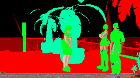
Image via Devolver Digital.
So, at a low frame rate (5fps), the game was rendered to a small (320x180) off-screen texture using a special shader. The shader used a solid red color for objects of no interest, and the green and blue channels were used to encode the unique ID of a Filmable object. For transparent objects, we would apply small levels of red to objects behind them, as it wouldn't adjust the underlying blue/green values. Thus, by reading the texture back from the GPU and iterating over every pixel, we could not only determine which filmables were the screen but even other metrics, like how many windows they were behind or how much screen space they took up.
Yet as we answered these major technical and design questions, finer points lingered, like how we should stop players from just filming the same content over and over again or how we should stop some audiences from being inherently easier to satisfy than others (there aren't always fistfights, but there are always butts). Our greatest problem was communication. A sea of iteration bridged us between our pre-prod version and our latest, yet what had never received specific focus was how the player would understand any of these systems. We realized that in all our attempts to "solve" this mode of gameplay, we had forgotten to fully consider the player's expectations and understanding.
Thus, UI designer Emma Morin and game/level designer Finn Carney took on landing the final iteration. To start, the decision was made not just to strip back as much of the iconic "camcorder" UI as possible, but essentially nix the idea that anything needed to be "diegetic". This was a strange and new system, and we needed space for comments, cast tasks, icons and subtitles. Anything gained by trying to give it a grounded aesthetic would be lost when none of it was legible.
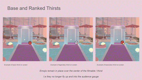
Image via Devolver Digital.
And on the opposite side, any thirsts currently being satisfied now had a big, juicy, pulsating icon of the relevant audience put on top of them, along with the player now given points for every second they filmed it (prior to this, the player had only been given points after fully quenching a thirst). This does encourage players to squeeze as much into every frame as possible, and in turn, can cause a decent amount of screen clutter. But if players expect to be rewarded for something, we decided they simply should be. Who were we to tell them they were filming too much?
Extra systems were added as a means of smoothing out the balance. A quenched thirst would be "drained" for a short period of time, encouraging players to find other shots to film. "Overflow" had points players continued to gain for an already satisfied audience go to currently unsatisfied audiences instead. The "Swap Out" mechanic meant audiences with no points would be replaced by a random new audience with a lower point threshold. Finally, the "On Fire" mechanic gave the player extra points for satisfying multiple audiences at once, providing not just the material encouragement but the juice to encourage players to adopt the kind of maximalist filming style the game best rewarded.
As we dialed in these final changes, our focus shifted, ironically, to what the entire system centered on: the camera itself. We had specifically been avoiding focusing on it til the game loop was settled enough to ensure its functions were relevant to our final design. Some mechanics were easy to decide on (is there any camera game without a zoom?). Others, less so. For example, Depth of Field.
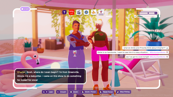
Image via Devolver Digital.
Some photography games have manual depth-of-field sliders, and some members of our team really wanted one for The Crush House, especially as many early thirsts centered on focus. But given the rapid pace of the game, players were prone to, at best, ignoring it entirely or, at worst, accidentally getting stuck with a blurry screen for the rest of the game. Thus, we shipped with only our auto-focus feature, with thirsts changed to ignore focus level so that the player wasn't punished for something out of their direct control.
A major element that was only prioritized near the end was how objects were framed. We decided that position in frame was not necessarily a "fun" gameplay mechanic (see: every complaint about Pokémon Snap requiring you to center your subject in frame). Instead, we used the proportion of screen pixels that filmables contribute to assign a framing size. This not only meant that we could have a threshold for minimum framing size, and thus only generate VTags for objects that the camera could meaningfully see, but it also opened the space for thirsts that required things being especially large in frame, like close-ups on faces, art, or butts.
Our Target Lock feature, which allows players to essentially "lock on" to the cast, stemmed from accessibility concerns. We knew the game would attract players who might not usually play first-person games, and allowing them to essentially "orbit" around cast members let them focus on movement and framing without needing to be adept at camera control. As an extra fun fact, leaning as a part of Target Lock was nearly cut multiple times. It was only because our first press demo resulted in multiple journalists specifically mentioning our Film Students "Dutch Angle" thirst that we kept it in, despite that being the only thirst to utilize that feature.
There were a lot of dead-ends and U-turns as we honed in our approach to filming in The Crush House, but if our learnings could be summarized, it'd be this:
On one hand, especially when exploring new modes of gameplay, the easiest option is often the best one. Whether it was making actually recording and editing footage fun and technically feasible or finding an objective score for art, if a problem feels too big, it probably is. Every step we took to cut down these big issues not only saved us from the dev hell of never being able to solve them, but opened up massive new opportunities in our filming gameplay to explore.
Equally, always think through the lens of the player. An intricate and perfectly thought-through system, or a deep level of control over every aspect of a system, doesn't matter unless the player can understand it and have fun with it. Figure out how your player is meant to interface with your game first, then design complexity within what they can meaningfully engage with.
None of us are under any illusion that we solved filming as a gameplay mechanic. In fact, we all have plenty of critiques about how the final design landed. But all of us are proud for having meaningfully explored the possibility space of this genuinely challenging to design but also just really fun mechanic, and in turn we are all deeply looking forward to whoever tackles it next.
You May Also Like