Trending
Opinion: How will Project 2025 impact game developers?
The Heritage Foundation's manifesto for the possible next administration could do great harm to many, including large portions of the game development community.
Putting a new spin on a beloved franchise meant paying close attention to detail.
Game Developer Deep Dives are an ongoing series with the goal of shedding light on specific design, art, or technical features within a video game in order to show how seemingly simple, fundamental design decisions aren’t really that simple at all.
Earlier installments cover topics such as how indie developer Mike Sennott cultivated random elements in the branching narrative of Astronaut: The Best, how the developers of Meet Your Maker avoided crunch by adopting smart production practices, and how the team behind Dead Cells turned the game into a franchise by embracing people-first values.
In this edition, lead game designer at Sumo Nottingham, Steve Kirby, breaks down how the team took an iconic IP and turned it into a horror game.
When The Texas Chain Saw Massacre film was released in 1974, it was met with heaps of controversy, as director Tobe Hooper and writer Kim Henkel’s macabre masterpiece shocked the world. Filled with tension and unease, the film immediately gained a huge, incredibly loyal fanbase and has gone on to generate a swell of sequels and spin-offs and now, almost 50 years after its release, a video game.
When we were approached by Gun Interactive in early 2020 about making a game based on The Texas Chain Saw Massacre movie, they had one rule: it has to feel like the movie.
The team at Gun are huge horror fans, so the pressure was on us to prove our slasher skills were up to the challenge. When you’re working on an IP that is so beloved with a legacy spanning five decades, there are certain rules you have to follow, and, yes, you have to become a bit obsessed.
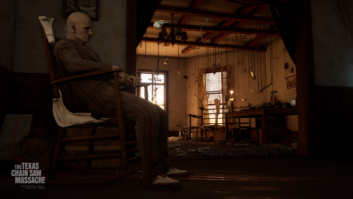
You don’t create a game based on an iconic IP without knowing every single inch of the set. By undergoing thorough research, we were able to create places and people that felt real.
The whole team at Sumo Nottingham started to do their homework—with many of us watching the film every single day—and something became apparent: the more you watch, the more you realize it’s so much more than a popcorn slasher. Not just killing for the sake of it, the notorious Slaughter Family weren’t killers without a cause; they were a bunch of people (admittedly with some interesting dietary choices), who—through circumstance and upbringing—found themselves in a situation where they needed to kill: it’s eat, or be eaten.
In the early days, we started to identify what made it feel so different from your traditional ‘slasher’ film—it’s not blood, guts, and gore throughout or packed with jump scares; instead, it’s almost gore-free, which we decided actually makes it all the more uncomfortable. It’s an unnerving watch with a ramp-up of tension, with a deadly combination of character situation and the Texan sun blazing down, leading to a pressure cooker forming. It starts out fine, then begins to bubble, simmer, and boil until it gets to the point of explosion, just as the final payoff comes in to save the day.
So, we had our IP, we had our core gameplay loop, and we had our themes. We started to get to work on creating a game that would transport players to the fictional Muerto County in the heart of Texas in the spring of 1973—when the events of our game take place.
Our teams poured over reference material—the original film is almost 50 years old, which provides a lot of challenges to identify crisp details, but the team at Gun had really put the work in to uncover behind-the-scenes footage and photography—which showed us locations not shown in the film for us to utilize in maps, what the cast and crew were wearing to help us with our character design, and backgrounds packed with stunning summer flora so we could make a start on environments.
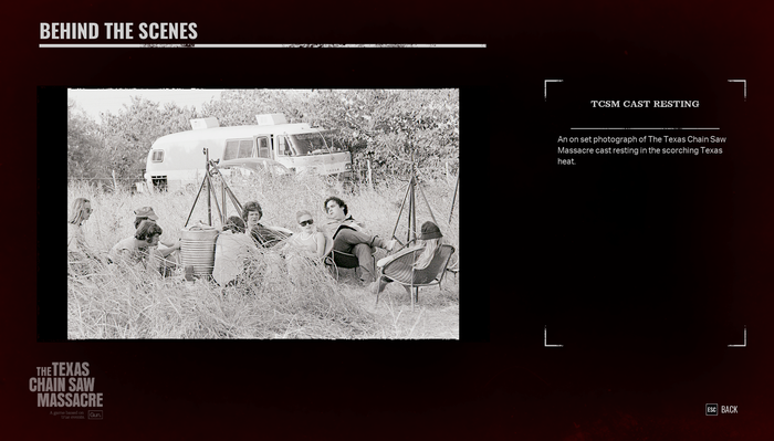
Behind-the-scenes photography was uncovered for the development of this game. Players can unlock these images, plus original concept art and more, by playing the game.
The team at Gun traveled from their HQ in Kentucky over to Texas and began to create what would become an epic media library. They visited the Family House (now a BBQ restaurant) to get close-up imagery of the floorboards, the curtains, and the layout. They visited the Gas Station (also now a BBQ restaurant—are you sensing a theme here?) and got shots of the locks, the power sockets, and the metal used throughout. These details might sound trivial, but getting this level of detail was crucial for us to recreate the scene faithfully.
And so, it began. Our teams got to work on extensive research, doing lots of very weird Google searches and attending Monday morning meetings where you hear the phrase: “Did anyone have any thoughts on the creepy children's laughter used in the tunnel?”
The original film is over 50 years old, which provides a lot of challenges when it comes to identifying crisp details, things in the background, and items out of frame. Luckily, the horror-loving team at Gun was able to uncover lots of behind-the-scenes footage and photography, which gave us an insight into both locations not shown in the film for us to utilize in maps, the outfits of the cast and crew to help us with our character design and a snapshot into backgrounds packed with stunning flora for us to work into our environments.

Some of the imagery captured by Gun on their research trip to Texas for the game. They visited different locations at varying times of day to capture light, materials and more for the dev team to recreate.
Our teams also poured over any reference material they could get their hands on, including photography from research trips, and imagery we’d collected from periodicals, catalogs, films, archives, and books spanning from the late 1960s up to 1973. With the film being so iconic, there’s also been a huge amount written about the making of the film, including Chain Saw Confidential, written by the original Leatherface, Gunnar Hansen, which provided a lot of behind-the-scenes information, and we got to work with Kim Henkel—the co-writer of the original movie—on ensuring we were pitch perfect throughout development.
Throughout development, we had to master a fine balancing act of creating functional spaces that were faithful to the film. As a design team, we were trying to create spaces that could accommodate lots of characters running around without them getting stuck or running into too many obstacles, while the art team wanted to replicate original spaces to feel authentic and purposeful.
One room where this balancing act really came into play was the kitchen. The original corner unit had been beautifully designed by the environment art team using the exact dimensions of the film kitchen, for which they’d managed to locate the exact makes and models of units to determine the size. It was the perfect replication of the film scene—complete with low sun streaming through the streaky kitchen windows over a grimy sink, with flies buzzing around rotting meat in every direction… but unfortunately, when you tried to run Leatherface (the largest character model in the game) around, he would get stuck between the sink and the butcher's block due to the size of his collision pill. Lots of micro-adjustments, marginal dimension changes and lots of calculations later, the team was able to create areas that would allow two characters to pass without compromising the look and feel of the film locations.
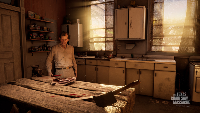
The team had to perform a fine balancing act to create authentic and true-to-life spaces without compromising the mobility of the characters. The table in the center of the kitchen was meticulously crafted to be the perfect size to allow characters to pass while containing all of the details fans of the film will recognize.
In the movie, you travel through the Family House and visit the iconic Red Room, the Kitchen, and the Hallway, which all had to be identical to those in the film. After months of inspecting the movie frame-by-frame, we were able to recreate these locations and pack them full of detail for keen-eyed fans to find. Take, for example, the pink color used on woodwork throughout the upstairs of the Family House, which is the exact same shade as seen in the film—painted this color in an effort to brighten the space due to the children who lived in the actual house at the time of filming being terrified of going upstairs to bed at night—an accidental detail but one that makes the house feel all the more creepy.
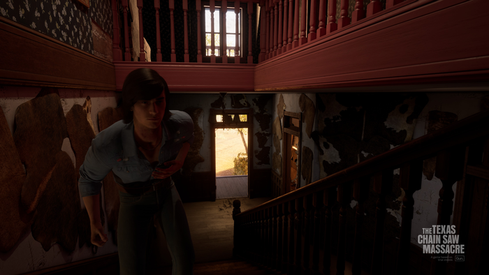
The pink woodwork was an accidental detail in the film, but one which makes the family house feel all the weirder.
The creative challenge, though, was creating the spaces you don’t see in the original film and giving them purpose while still feeling like they’ve been taken directly from a cinema screen.
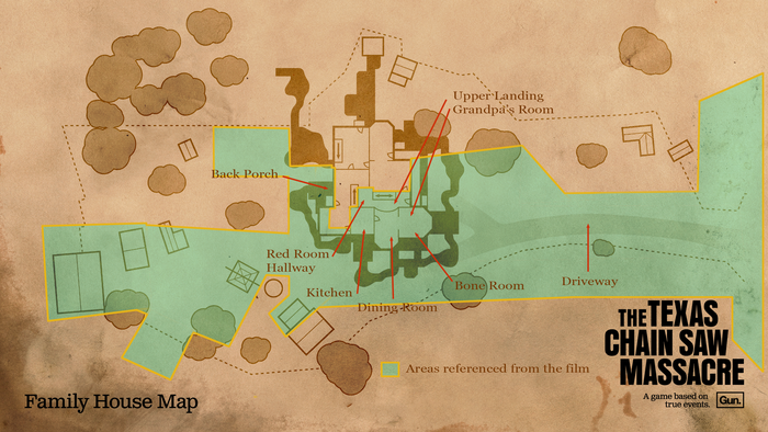
The Family House map from the game. Highlighted in green are the areas you see in the film, showing what the team had to create from scratch versus what they were able to reference from the film.
A key location in the game that is never seen in the film is the basement. This is where you start your Family House journey as a Victim, and it’s packed with shadows, hiding spots, and crawl spaces. Knowing that the family would likely want to keep their affairs ‘underground,’ we upped the blood and gore in this space compared to the rest of the house, something the film’s art director—Robert Burns—was restricted from doing due to the desire for a lower rating and a modest budget. We imagined Leatherface residing in this space as well as it acting as a storage space for the family to keep their meat, so we added in a gore chute that funnels straight from the kitchen above, so when the family is preparing their meals, they don’t have to carry their carcasses outside where other people might see.
Other locations you never see in the movie include bedrooms for the Hitchhiker and the Cook—where do they rest after a hard day of work? Our artists wanted to give them spaces that reflected the personality of their occupants—adding small pieces of environmental storytelling to reflect their character quirks.
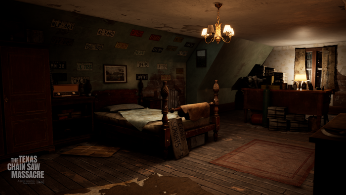
The Cook in the movie is the owner of a Gas Station, so it would make sense for his room to be full of old license plates, complete with a ‘Closed Sundays’ sign for when he wants to take the day off.
In Hitchhiker’s Room, we wanted to create a space that showed his creative and artistic side. The character is shown to have a camera in the film, and we actually had the opportunity to create the lore for this prop by making it something he obtained from Maria, who is one of Johnny’s Victims before the events of our game (spoilers: you can find out more about this interaction in this minigame) and the reason Ana and her friends end up in their situation. To reflect this love for photography, we converted his bathroom into a dark room—despite the fact he owns an instant camera—which really helped lean into the madness of the character, that he’d set up a space to display his ‘trophy’ pictures like a photographer would (fun fact: the photos found in his room are actually the photographs from Gun’s research trip to Texas).
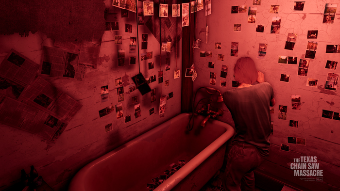
The Hitchhiker adding one of his images to the wall of his ‘dark room’. The photographs seen here include pictures taken by Gun Interactive on their research trips to Texas.
In addition, at the start of the film, you see a gruesome sculpture in a cemetery later revealed to be the handiwork of the Hitchhiker, so we wanted to litter his space with work-in-progress creations, practice sculptures, and pots of raw material.
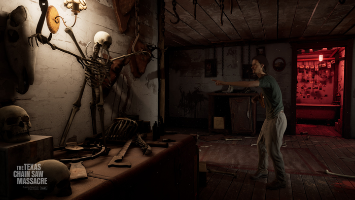
The Hitchhiker’s flair for sculpture can be seen all over the Family House, but his unfinished or ‘work in progress’ pieces are kept in his bedroom where he can work on them.
While the film takes place in the summer of 1973, the events of our game unfold slightly earlier in the year, during spring. This meant our art team had to delve into a world of flora to create a more verdant landscape packed with seasonal flowers, such as the Indian Paintbrush or the Texas Blue Bonnet. This welcoming greenery, in turn, grants the player a huge sense of relief as they escape the oppressive, dark, and horror-filled family house and make their dash to escape.
Additionally, we were able to use Gun’s immense library of reference material, plus all of the imagery we’d collected in research. All of this helped us to create characters and environments that felt wholly authentic and real for the player.
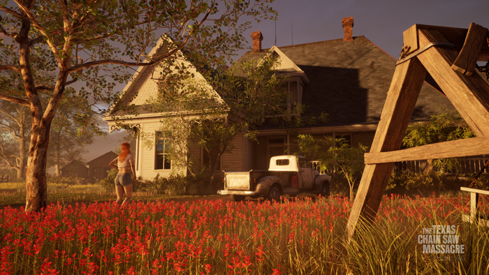
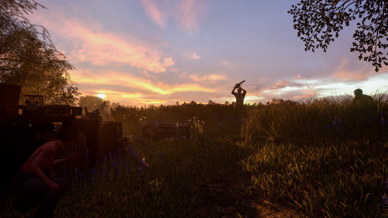
The ‘welcome escape’ to greenery. The red flowers seen above are Castilleja Wildflower, which are native to the Southwest of America and have their prime growing season between April and July.
When it comes to the design of the characters we had the task of creating a set of brand-new, never-before-seen characters in our gang of five victims. Each was crafted with a unique personality and back story and designed to reflect this—with fashions drawn from archive photography of Texas teens, magazines, and catalogs. Each character, whether that be Connie and her farm girl roots, Leland and his high school jock good looks, Ana and her Latina heritage, or Sonny and his smarts—has customization options that get increasingly flamboyant but all grounded in the aesthetics of the time.
We knew from the start that audio and music would play a huge role in building the tension in our game, from the slow build of the music, which culminates in a dramatic chase, the wave of pulsating bass as a killer approaches your hiding spot, or,
crucially, the roar of the chainsaw.
Between our audio team and the team at Gun Interactive, they managed to source a vintage exact make and model of the chainsaw used in the movie. In Nottingham, our audio director was busy revving this vintage find (and likely terrifying his neighbors) to capture the levels while our animator via Zoom took to swinging his Dyson vacuum around in the garden to get a feeling of how a chainsaw being thrown around might look and sound. Would it have been easier to buy a chainsaw from a local hardware store? Definitely. But as Wes Keltner, the CEO and president of Gun, said: “We could have gotten a modern chainsaw, but that’s not the correct chainsaw, and it doesn’t have the same sound profile.”
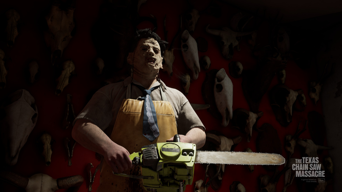
The chainsaw used in the film is a modified Poulan 306a, which is instantly recognizable by its green coloring. The filmmakers covered up the brand with a piece of black tape, and fans of the film can spot that detail replicated in-game.
This, combined with vintage synthesizers, the sound of scraping metal, clips of human screams, and the actual clucks of our audio director’s friends’ chicken, led to a soundscape that is not only authentic but absolutely terrifying. There is truly nothing to set your heart racing and palms sweating as when you hear that chainsaw howling from across the map.
When you’re working with an IP that is so beloved, classic and iconic, every single small detail matters. Nothing is throwaway, and a die-hard fanbase will notice if you don’t give it the love and care it deserves. It’s been truly incredible to see players discovering all of the details in the game, and speaking with fans of the movie since it released, we’ve really felt the passion that they feel for this franchise—they live and breathe it. As a developer, if you don’t do the same, then you aren’t giving the source material the respect it deserves. There are truly no half-measures in this game, and we hope people enjoy it.
Please note: No chickens were harmed in the making of The Texas Chain Saw Massacre… the same cannot be said for our animator’s Dyson.
You May Also Like