Trending
Opinion: How will Project 2025 impact game developers?
The Heritage Foundation's manifesto for the possible next administration could do great harm to many, including large portions of the game development community.
"There is a special feeling in making a document for your game full of nice art and writing and holding it in your hands when you're finished."

Game Developer Deep Dives are an ongoing series with the goal of shedding light on specific design, art, or technical features within a video game in order to show how seemingly simple, fundamental design decisions aren’t really that simple at all.
Earlier installments cover topics such as how indie developer Mike Sennott cultivated random elements in the branching narrative of
Astronaut: The Best, how the developers of Meet Your Maker avoided crunch by adopting smart production practices, and how the team behind Dead Cells turned the game into a franchise by embracing people-first values.
In this edition, Nic Tringali, director of The Banished Vault, tells us about the decision to make a manual for the game and how it was designed to accommodate multiple learning styles.
The Banished Vault, a strategy game of exploring space on an interstellar gothic monastery, is designed around a manual. The manual is an integral component of the game, and we made it to better teach players and alleviate many production issues around tutorials. I am Nic Tringali, the game’s director and part of Bithell Games’ Lunar Division, and in this deep dive, I'll be expanding on the design of the manual and the reasons we decided to make one.

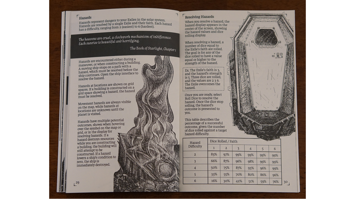
Image via Bithell Games. The final print version of the manual.
While obviously, our overall goal is to teach players the game, my starting point came from production considerations: we had a tight schedule with a small team, and a game with some unusual rules would benefit from tutorial iteration. My experience making typical tutorials —where snippets of on-screen text point to various parts of the game—was that they are both time-consuming to make and usually require waiting until late in production to be created. Waiting months to take one big swing at the tutorial felt like we were setting ourselves up for disaster.
Separately, I also don't particularly like these kinds of step-by-step tutorials. They can have a lot of potential points of failure: players can bounce early preferring to learn at their own pace, have their mood soured by a long tutorial, can end up unable to return for information they missed or did not internalize. I also think the interrupted text snippets can prevent players from fully retaining the information.
While these points were strong in favor of trying an alternative, a manual was also simply something I wanted to do. I've personally dabbled in making card games and other print work, so this felt like a natural progression to improve my skills with a larger project. My hope was a niche strategy game found an audience more willing to invest time into learning a game before playing. Even though it was early in production, it felt like the right decision.
So, with the manual started, the first immediate production benefit was showing an early version with the first internal tests. Typically, early testing relies on intuitive learning of the interface and/or a 'quick start' information sheet in lieu of a tutorial. For us, this initial document was simply the first iteration of the manual. This has an additional positive side effect for the game's design as well—explaining how your design works in detail can help illuminate gaps or weaker areas.

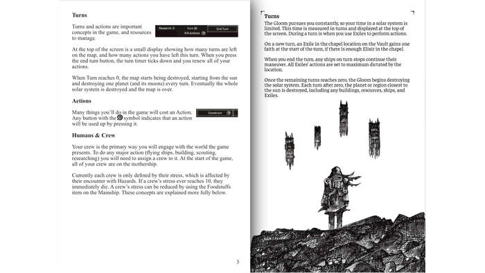
The first draft of the manual, and the final version of the same rules. Image via Bithell Games.
As the structure of the manual evolved over about a dozen iterations until launch, we settled on combining multiple approaches to teaching the game. While it's hard to definitively categorize them and they aren't mutually exclusive, we saw our categories as: building muscle memory for the game's rules and interface, self-directed trial and error, just give me the numbers, and let me read all of it.
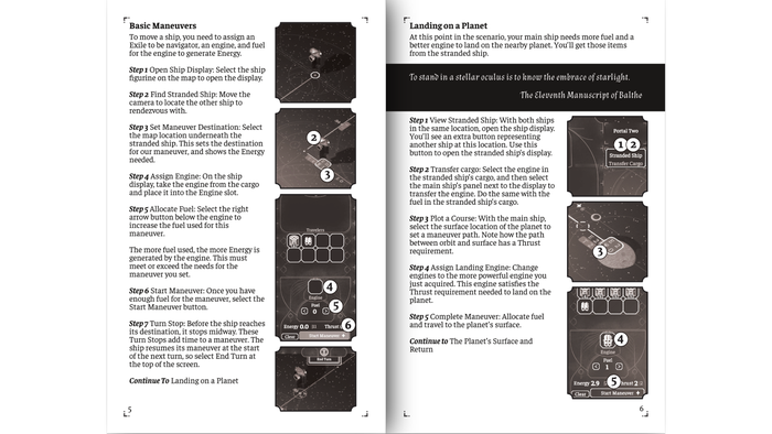
The muscle memory category uses a step-by-step method, similar to but not exactly like what I was trying to avoid. The game starts with two scenarios to teach the player how to move ships around the solar system and construct buildings to gather resources. The interface in these scenarios is limited to only the essential information the player needs, and the instruction walks players through exactly how to complete them. These are the vital actions the player will be doing throughout the rest of the game, so the scenarios help build their muscle memory and interface awareness. That the instructions are contained solely in the manual also shows the player that the manual is an integral part of the game and not supplementary material.
Even though the content is basically identical to the ‘floating window and pointer’ style, the presentation makes a big difference in the player's experience. Seeing the text on a sheet of paper, one gets a quick sense of how long and dense the material is just by seeing the number of pages and how much text is on each page.
When the same information is drip-fed via a solely in-game method, it feels longer because of the continual interruptions. With a page of text, the player can read ahead, reread a missed portion, or skip something they find obvious or trivial. This starts to mitigate the unsolvable problem in interface and tutorial design that you can’t perfectly anticipate what logical leaps (whether correct or not!) a player might make. Showing them a straightforward page of text allows them to read everything at their own pace.

The step by step walkthrough of the tutorial scenarios. Image via Bithell Games.
The last step of the tutorial scenarios, and a bridge to the rest of the manual, is a kind of 'shallow waters' solar system. This is a complete solar system but without every concept of the full game, like hazards or unique regions. The player can access the entire manual, and the first spread they see is an ‘overall strategy’ guide to complete any solar system. From this point forward, they are on their own.
The Game Concepts portion of the manual explains all the various components to the game, and forms the basis of the self-directed trial and error method of learning. Some players prefer to try to get as far as possible in the game and only look up information as needed, and this is for them. The goal for us as designers is to place all the relevant information about a specific concept of the game in one place. In some cases, we duplicate information or point to other sections of the manual when two big concepts are tightly linked.
The next rough category of learning method is when players get an immediate understanding of the game strategy and just need the details to put it together. The manual's final section is the Reference section, with breakdowns of all the various in-game items and buildings the player has access to. This info is on tooltips in-game, but the condensed version in the manual is easier to read and for planning. Eventually every player will settle into understanding the game and only refers to the Reference section as they play.
Lastly is a small contingent of players who will read the whole manual before playing. While we're careful to signal that this is unnecessary, it's certainly possible! The overall structure of the manual is designed to be read normally, with the tutorial scenarios preceding the game concepts so that players will definitely know the scenarios exist before choosing to read the whole manual.
In general, we want to provide as many tools as possible to players entering the game. The style of writing is also both direct and supportive—the game itself presents a harsh world, but that's not the goal for the instructional material.

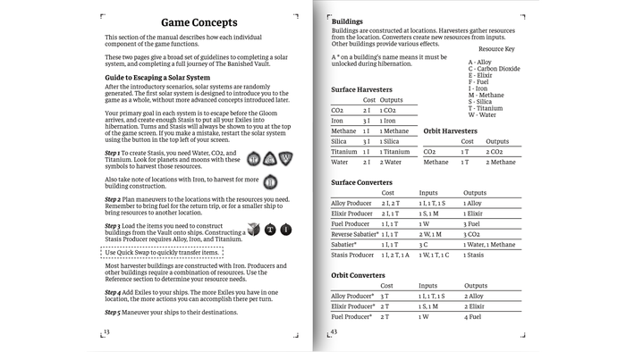
Example pages from the Game Concepts and Reference sections. Image via Bithell Games.
For the physical production, at the start, we simply kept in mind that it might be possible and tried not to paint ourselves into a corner. The production relied on Kindle Direct Publishing for a print-on-demand service that was straightforward and widely available. Print-on-demand removes many of the overhead and ongoing costs of producing, storing, and shipping books, and so was a natural decision for us. Overall, the physical side of things went very smoothly since we had many things in place, and it's a nice feeling to show the physical proofs alongside demos of the game.
To wrap up, the studio is very happy with how the manual has come out, both as a method of teaching players the game and in its own right as a supporting text. It does require a lot of work to plan and execute, but if you're considering making one, I encourage you to give it a try! The benefits of starting early, fast iteration, and decoupling from the game itself are tangible. Putting together multiple teaching methods in one place can help the player learn an unusual game better than a traditional tutorial. I would personally love if more indie strategy games created manuals, and to eventually have a collection of my own! There is a special feeling in making a document for your game full of nice art and writing and holding it in your hands when you're finished.
Read more about:
Deep DivesYou May Also Like