Trending
Opinion: How will Project 2025 impact game developers?
The Heritage Foundation's manifesto for the possible next administration could do great harm to many, including large portions of the game development community.
'Why can't I jump over that wall?' In this intriguing design article, Sidhe's Griffiths (Gripshift) spans Halo to Half-Life to examine usability-related issues - and solutions - for frustratingly invisible and unbreakable barriers in games.

['Why can't I jump over that wall?' In this intriguing design article, Sidhe's Griffiths (Gripshift) examines the usability-related issues - and solutions - for frustratingly invisible and unbreakable barriers in games.]
Throughout our everyday life, we come across barriers and boundaries which prohibit our movement. We instantly recognize them and know what we need to do when we come face to face. Some barriers we can easily circumvent; a door, for example, temporarily blocks our way until we open it and step through to the other side.
Games are the same. When we are in the game world we come across barriers which block our path and force us to turn around or open them up and step through to the other side. The problem with barriers in games is that they are sometimes not that distinctive.
What happens when we cannot tell the difference between a "friendly" barrier (one which we can interact with in some way) and one which is so unmovable that a nuclear missile wouldn't make a dent? More importantly, how does the player feel and what do they do to overcome this?
This article looks at the various techniques used by game developers to blockade our paths and, from a usability perspective, what it means for gamers.
Gaming technology is incredible. With new hardware advancements, developers are bringing us bigger and more exciting worlds. We often have the opportunity to roam for miles or to actually walk through entire cities, exploring seemingly every nook and cranny.
But what happens when there are areas in the game that developers don't want us to get to? Usually there is some kind of barrier that halts our progress or, alternately, an element of the story of the game which explains our inability to continue onward.
These boundaries are needed for a number of reasons, not least of all due to the fact that no matter how good our technology is, we simply cannot create a truly open-ended world. It is just not possible at the moment.
Boundaries also help us learn areas of the maps, because if everything was open to us at once then it would likely be simply too overwhelming to take in. By opening things up slowly to the player, we are introducing a gradual learning curve.
Another use of the barriers is to simply stop us from trying to go down certain areas of the game which simply don't exist. We can't have the players running everywhere because this means we have to create massive environments when it's simply not needed. So to overcome this we simply create barriers that halt the player's progression in certain areas.
However, it is with these barriers and boundaries that a problem lies with game design usability. Unbeknown to players they actually rely heavily on two key principles in the field of Human Computer Interaction, or HCI: visibility and affordance.
In HCI texts, visibility and affordance applies to the controls that users can see. Donald Norman defines visibility as "Controls need to be visible which implies that there is good mapping between the controls and their affects. For example, the controls on a driver's dashboard have good visibility whilst video recorders have not." 1
Affordance is a technical term that refers to the properties of objects and how they can be used. A door "affords" opening. However, in HCI, what is more important is perceived affordance. This entails what the person thinks can be done with the object. Does the door suggest it should be pushed or pulled?
So how does this translate into games and game design specifically? Well for our discussion, we are looking at the game-world itself - the actual environment - and therefore we need to ensure that the players are always able to see their path through the game.
We should never have a situation whereby the player ends up at one point just sitting there, scratching their heads and unable to figure out where to go. This is not the same as a game which requires the player to figure out where to go.
---
1 - Preece, J. et al. Human-computer interaction. Addison-Wesley Publishing Company, Inc., MA, 1994
But what kind of barriers and boundaries are we talking about, then? Well, throughout the game the player is drawing upon real-world experiences and will instinctively know, without the game having to tell them, whether a barrier is passable or not; a large brick wall, canyon, or cliff face for example.
These are barriers that tend to make sense to the style of play and when they work well, we see something akin to that of figure 1, where the player can clearly see the boundary and immediately understands that it cannot be passed or what must be done to circumnavigate it.
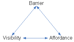
Figure 1 - Good relationship between barrier, visibility and affordance
So what about other barrier types? If we again look at our real-word experiences, a player can come up to a doorway in a game and instantly know that it should open and close. How it does this - i.e. pulled or pushed - is irrelevant in current games.
If a player comes to a clear pathway, then this path affords continued walking - as it does in real life. However, the problem we have is when this affordance breaks down and what was expected by the player does not happen.
Yet, the question needs to be asked - if the player does come up to a barrier which breaks the affordance rules, is it really that important? It's not as if the game is technically broken at all. The answer is an indefatigable "yes". What we find happens is that the player starts carrying out a trial-and-error routine, and when that fails the player will start to become frustrated at the game itself - something which should be avoided at all costs.
In figure 2 we have a scene in the excellent Halo 3 whereby the player is at a bunch of rocks. The game allows the player to jump onto the first rock and because the next rock is of a similar height, it offers the affordance that we can jump onto it and get past.
However the game does not allow this and the player spent a good few minutes jumping up, falling down and retrying over and over to get past.
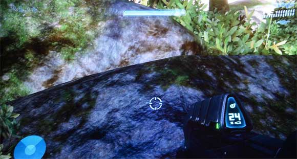
Figure 2 - Impassable boundary in Halo 3
So now we have an apparent path which is visible to us. Because the game allows the player to jump over objects and allowed them to proceed through a preceeding area in a similar fashion, the player now has a mental model as to what can be done.
So, in the player's eyes, these rocks afford being able to be jumped on and passed. However this affordance has simply broken down and only serves to frustrate the player.
What we now have is shown in figure 3.
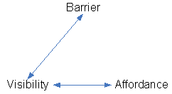
Figure 3 - Breakdown between affordance and barrier
The player is able to see the barrier and attempts to pass it but for no explained reason, this barrier is impassable. The danger of what might happen next can be seen in figure 4.
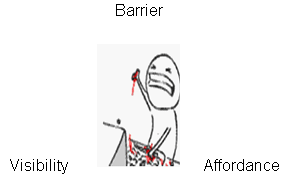
Figure 4 - No more relationships between barrier, visibility and affordance
What has happened here is that the player now has a harder time seeing the difference between any of the barriers simply because they are unsure as to which ones they are able to interact with and which ones they are not. The player now has no real idea what they can and cannot do and will often spend many a frustrating moment trying out pointless things - derailing the flow of the game and distracting the player from the full experience the game offers.
In figure 5 we have another example of how the player's passage can be blocked by the classic invisible wall. This example is from a scene from the superb Battlefield 2. What we have here is an area which is identical to a number of other places on this type of map.
There are a number of trees, but there is clearly a path in between them to the other side. In fact, simply to get to this point the player was required to navigate through a path which looked identical in every manner.
However, upon reaching this point, the player comes to an abrupt halt and is unable to proceed. We engaged a test player to test this environment. He attempted to get past it in various ways, including crawling through the path, but the barrier held.
During the play testing session we conducted, the player responded extremely negatively and stated that it was things like this he hated in games - which often means he would not buy them as a result.
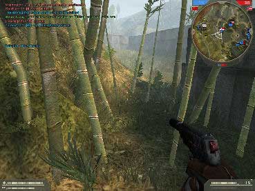
Figure 5 - Breakdown between affordance and barrier in Battlefield 2
These invisible barriers fail both the visibility and affordance rules completely. Firstly, by simply being invisible, it by definition means the player cannot see the barrier, and when the player comes across a barrier like this, there is no legitimate explanation as to why their character meets with resistance.
Naturally, the concept of visibility is instantly thrown out of the window. But what about the affordance rule? Truth be told, how can something which apparently does not exist afford anything? Here, we have a complete breakdown in the game, because how is a player expected to understand why this area suddenly, and for no reason, does not allow passage?
These two examples have shown barriers which are meant to keep the player in a certain area but fail (as credible barriers) simply because of how they break the player's expectations about what can or cannot be done.
Our next examples are those which can be interacted with in some way. For our first example we shall look at the humble doorway in games.
As stated above, doors afford being opened and closed and yet repeatedly in games, we come across doors that do nothing but stand there. What happens when we have a high number of doors in the game and only one of them opens? Do we force the player to try every one of them?
A game which suffered from this was the ground-breaking GTA III. Here we had a vast open-world with an unimaginable number of doors, but the vast majority of them did not open - just the shops and the areas you were allowed to go into.
Surely this in itself contradicts the term "free roaming"? And yet I've observed players repeatedly going up to these doors, trying to see if there might be one that is able to be unlocked.
Two other examples of games with frustrating doorways are Max Payne and Buffy the Vampire Slayer. In the Buffy game, there is a school level with corridors of locked closed doors. However, only a few open - and the difference between them is in no way apparent. It's a matter of trial and error.
Max Payne was even worse than Buffy. Here we had a game with a high number of doorways - again many identical - but very few actually opened. The game, again, failed to clearly show to the player a clear difference between the two - an issue much more pervasive than Buffy's single level.
In these two examples, we see a very simple but extremely common issue which causes a breakdown in affordance. We have areas which the player is meant to go through but if we do not give them the visual ability to quickly identify which is which, they are consigned to simply trying out each and every door in turn. A player's patience can only last so long.
Our next type of barrier is the one which is only in place temporarily because the player is required to destroy it in order to proceed. For our example we will be looking at the fantastic Half-Life 2, Episode 1, and Episode 2.
There are certain areas of HL2 which let the player down by becoming trial-and-error sections that can often see the player trying unsuccessfully to get past certain areas. In figure 6 we see a barrier that can be destroyed. The player knows this because other barriers with identical properties were found earlier on in the game.
However, in figure 7 we now see the exact same barrier but with a piece which is unmoveable. I spent ages trying to find more breakable pieces of wood here but to no avail. My thinking was; "Well, I can break some - why can't I break the others?"
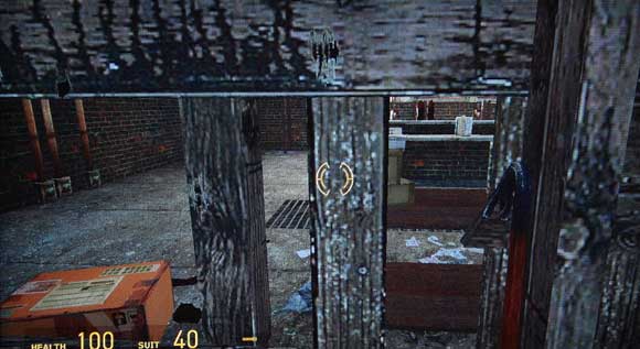
Figure 6 - Breakable piece of barrier in Half-Life 2
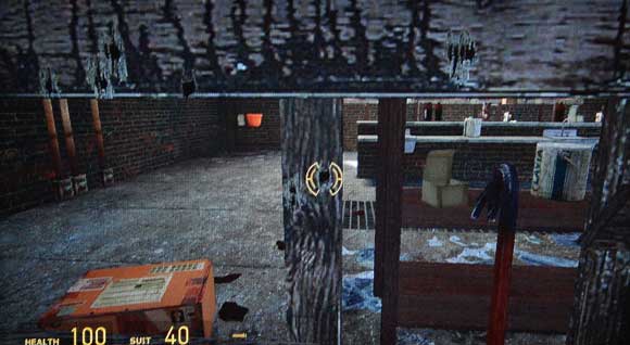
Figure 7 - Unbreakable piece of barrier in Half-Life 2
What has happened here is that these barriers initially gave us the affordance that they could be destroyed, but when the exact same barrier is suddenly found to be unmoveable, the consistency within the game breaks down completely.
Also, figure 8 shows us a barrier which is nearly identical in every manner but this time is completely indestructible. How is the player supposed to know this?

Figure 8 Completely unbreakable piece of barrier in Half-Life 2
There is a danger that when this happens, the player will be too frustrated by inconsistencies to want to try and experiment within the game, and we may end up in a situation whereby the player finds himself stuck - but could quickly get by if they destroyed a barricade.
How can we expect the player to know which one is destructible and which is not? They know that something like this was breakable previously, so again the player is relying on the breakable affordance of the barrier.
The next type of barrier we can often find in games are ones which are used both as a level boundary and as an in-game interactive barrier.
The best example I can think of for this is the tremendously successful and acclaimed Call of Duty 4. What we have in figure 9 is a barrier which the player can jump over. We know this because the game explicitly informs us that by pressing space it can be jumped over.
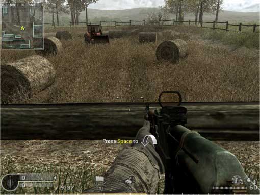
Figure 9 - Jumpable barrier in Call of Duty 4
During quiet periods in the game this is relatively easy to see, but when the player is running away from a hail of bullets and the screen is flashing red, this message becomes almost impossible to process and simple to miss altogether.
So where does this barrier fail, then? If we look at figure 10 we have what appears to be the exact same fence, but this time it is acting as the boundary to the level and the player cannot jump over it.
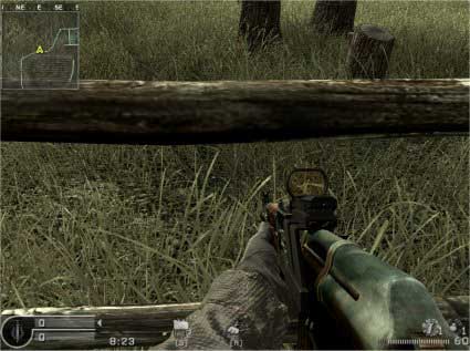
Figure 10 - Non-jumpable barrier in Call of Duty 4
How is the player able to differentiate between the two? As stated, it is easy for players to miss on--screen prompt, and players could find themselves in a situation where they think one action is possible, only to find that it is not. We can easily envisage a player running through an area in the game, seeing what appears to be an opportunity for cover only to end up hammering at the jump button to no avail.
Our final barriers are intertwined with one another in some respects. Firstly we have the barrier which, to the player, makes little sense because they restrict movement with the simplest of objects.
We also have the "hold until needed" barrier which appears only when needed, usually as if by magic. The reason they are intertwined? Well, they're both difficult to comprehend, to be quite frank.
Let's firstly take a look at the barrier that, from the player's perspective, seems to make no sense. While our invisible barriers, unlockable doors and unbreakable barriers are frustrating, there is something almost infuriating about coming across an object that stops us simply because it is there to stop us.
A good example of this is the intriguing adventure game Lost: Via Domus. At the start of the game the player has to explore the beach and is able to happily walk over a number of objects.
However, if we look at figure 11, we can see that the player is simply blocked by a small pile of debris and luggage.
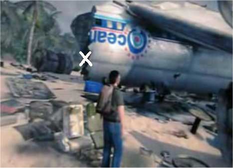
Figure 11 - Unbelievable barrier in Lost: Via Domus
This begs the question, how can the player be blocked by some luggage? This is even more frustrating because the player has to walk around the entire debris to get to the section marked with the white X. Why should the player be blocked in this fashion?
If, in real-life, we come across a suitcase which is in our way, we can either step over it or simply move it to the side. This is not the case in the game. By blocking the player in an area with nothing more than a small scattering of luggage simply makes the experience unbelievable.
This type of barrier fails both visibility and affordance rules. It fails on both accounts simply because it does not look like a barrier, so why should the player even consider it to be one? At no would anyone consider a small pile of luggage a credible barrier.
These should be avoided when designing our games simply because it is so out of character as to likely be ridiculed by the player.
Our other barrier, the one which magically appears, has been around for a long time and is found in games such as Kameo and 2008 top seller Devil May Cry 4, amongst many more. I'm talking about the barrier which simply appears out of nowhere so that the player cannot escape and must stay in this area and defeat the bad-guys. Successful removal of the said bad guys results in the barriers vanishing and the player is free to continue.
Kameo has a forest level where giant branches suddenly grow up from the ground and then go back in it when the bad guys are dead (good job the branches know all of this!) whilst Devil May Cry 4 has magically appearing red webs, as seen in figure 12, that halt progress. Again, this vanishes when everyone is killed.

Figure 12 - Mysterious red energy blocking your path in Devil May Cry 4
Do we really need these kinds of barriers? By now players tend to simply roll their eyes when these appear because it's such a cliché.
From a usability perspective it is detrimental to the play for three reasons:
1. The player knows what is about to happen, there is no longer the element of surprise
2. The player is now constricted in an area which seconds before was not constricted. Why?
3. The flow of the game becomes very disjointed
I personally cannot think of one reason why we should be using this style of barricade any more. Of course there may be times we wish to ensure the player is constrained within an area, but let us make it part of the environment and narration.
We want the player to always feel immersed within the game and by breaking up the flow such as this will see the player lose that immersion and lose any suspension of disbelief they actually held within the game.
A good example of how this type of barrier was done very well is the fantastic Gears of War. Here we have earthquakes which create huge chasms in the roads. Sure, this is all very convenient, but it works, it is part of the game and it fits in well to the game's overall style - of a world heavily damaged by the war with the Locust.
The one thing we have learnt about barriers is that they need to be consistent within a game. If we are to create a plausible game world, then we need to ensure players are instantly able to differentiate between what they can and cannot do.
We do this every day in real life. For example, if you come across a small railing, you can simply step over it, but if come to a huge wall then it's safe to say that unless you are Spider-Man, you aren't going anywhere.
This in itself poses an interesting dilemma. What if you do have a game where the main character can behave like Spider- Man. How do you go and define boundaries, in this instance?
Spider-Man can walk over any object, so simply creating an impassable wall will not work here and, as such, a feasible alternative would need to be devised. Simply having a wall which is suddenly - and for no reason - impassable is not going to go down well with players.
So how do we go about making plausible boundaries within a game? Well, let us make them so that they fit in with the game and that players are able to instantly tell that they are unable to proceed any further for a reason.
Players should be able to tell if a barrier is destructible or not and doorways ought to give the indication that they can be opened. The dreaded invisible barriers need to just (excuse the pun) vanish altogether, while senseless boundaries can easily be modified to fit in with the game.
If the environment is going to block the player, why should we allow them to work themselves halfway through an impassable boundary, and give the impression they can surmount it? Stop players right at the start before they spend frustrating moments thinking they can achieve what is impossible.
Of course, this may simply come about through a quick case of trial-and-error, whereby the player walks up to two different types of boundary and finds out by interacting with the barrier which one allows passage or not. However, because they look different, the player now has a good frame of reference and is able to quickly tell the difference the next time it is encountered.
Next time you play a game, no matter what it is, take a look at where and how you are held back in certain areas. Does it make sense? Did you just come across something similar a while back that let you pass and if so, how does it now feel to be caged in and trapped by the exact same thing now?
Our game design should ensure that we treat the player to a great game on all levels. Simply blocking their way with a barrier that makes no sense is not going to achieve this. Not only will this make the game seem unrealistic, it will also have a detrimental effect on the style of play.
Players will become fed up at trying to hunt for that one "breakable" barrier in a sea of barriers or the one door among a corridor of identical doors which will open up into another part of the level.
I'm sure we've all come across that odd little quote from players who point out a neat little feature in the game that they played - something that was unexpected. This is what creating meaningful boundaries will hopefully achieve.
It is an addition that attempts to imbue the player with a sense that the game is built around them and that everything in it is there to ensure that the player has a good time. After all, isn't that what really counts?
Read more about:
FeaturesYou May Also Like