Trending
Opinion: How will Project 2025 impact game developers?
The Heritage Foundation's manifesto for the possible next administration could do great harm to many, including large portions of the game development community.
Now that it’s been superseded by Nintendo Switch, it’s clear which Wii U games made the best use of its idiosyncratic two-screen design. Affordable Space Adventures is a clear standout.

Now that it’s been fully superseded by Nintendo Switch, it’s clear which of the Wii U’s games demonstrated the best use of its idiosyncratic two-screen design.
The crown among them wasn’t a game made by Nintendo, and it wasn’t made by a large team. And yet it emerged so perfectly honed for its host system that it’s pretty much impossible to imagine it working on anything else.
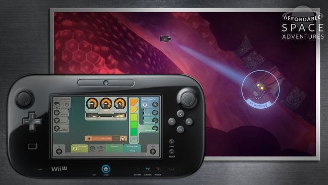
That game is Knapnok Games and Niklas ‘Nifflas’ Nygren’s Affordable Space Adventures, released in 2015, in which players pilot a little spaceship through the hazardous caverns of an alien planet. Designed entirely for local play for between one and three, it presents on the Gamepad’s screen a set of engineer’s controls and gives each player a different responsibility for the ship’s systems, transforming your couch into a fragile cockpit.
There are lights and sensors to swing around and peer into the gloom, and there are two engines, an electric and a fuel one, and settings for their power output. There are gauges showing heat buildup and the noise and electrical interference your vulnerable craft is generating when certain systems are operating. There are landing gear options and anti-gravity and flight stabilization configurations, and there’s a big off switch.
It’s product of an old idea that’d lodged in designer Nygren’s mind about making an engineering game about flying a spaceship that was inspired by Steel Battalion, the classic 2002 mech game for Xbox. Steel Battalion came with a huge controller covered in controls for all its functions, and its appeal was in learning all its systems, from the correct way to start it up to going into battle (and not dying: if the complexity of its controls wasn’t enough, it also featured permadeath).
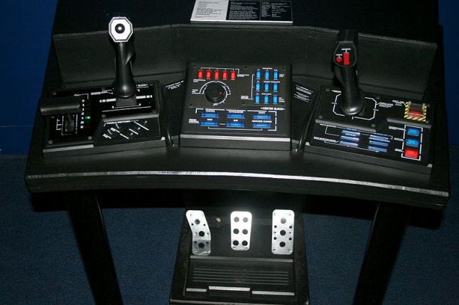
Steel Battalion
“When the Wii U was announced, immediately I paired it up with the game idea I had,” says Nygren. He had to finish making his game Knytt Underground first, but when he was ready to take it on so was the developer he shared studio space with. Knapnok had just finished Wii U party game Spin the Bottle: Bumpie's Party and was up for helping make this weird two-screen game, and it brought with it a good relationship with Nintendo.
At this very early point, Nygren’s vision was much closer to the solitary pleasures of Steel Battalion, with the aim of making the ship’s systems as real-seeming as possible. But when the team decided they’d apply to the Danish Film Institute for funding, they realized they’d do better if they re-seated the concept a little.
“We kind of picked up that [the DFI] were especially interested in funding multiplayer games where family members could sit together and play,” says Nygren. “This was never my idea for the game; it was something we said to them so they would give us funding.”
And so Knapnok, which had lots of experience and talent in designing local multiplayer, came up with the idea that different parts of the ship’s functions could be delegated to different players. “And it turned out to be the best part of the game,” says Nygren. “I mean, it worked perfectly with what the game was already about, so you end up with the same metaphor, like you’re all in the living room, sitting together in a spaceship.”
Dividing up the ship’s controls to two players was pretty straightforward. One could be the pilot, flying the ship with a Wii controller, and the other with the Gamepad could be the engineer. “With three-player mode it got a little more tricky,” says Nygren, who admits that it’s best to play in pairs. “We couldn’t find the perfect way to split it for three people.”
The third player gets to control the directional scanner and light and shoots flares. Nygren feels it leaves them with too little to do, but for many group setups the division of labor is perfect because it caters to differing playstyles and experience levels. Direct action-lovers can pilot, level-headed puzzle-solvers can play engineer, and the less skilled or experienced, whether a partner or younger child, get to control the lights and scanner.
Besides, the team found their assumptions of how players would take to the game challenged when the game was demoed at events. “I always thought engineering was going to be pretty complicated, that it would be the parent’s or teenager’s role because it needed a lot of information to figure out,” says Nygren.
“But it turned out at Gamescom that teenagers, maybe 15 to 18, had a terribly difficult time with the game because they assumed that they knew how everything worked and they didn’t pay attention. When we got 10 and 12 year olds, they would put so much attention into it and would figure all these things out. I really didn’t think they would, but they made excellent engineers.”
What Nygren regrets, however, is that he wasn’t able to include in the final game a feature he’d put into the original “terrible” pitch prototype: a drone which players could fly around separately from the ship. “It would have made three-player mode way more fun,” he says, blaming his then inexperience with Unity for not being able to get up to speed in the early days of the project.
“I don’t know why I was so scared about programming in C#; I had the idea it would take forever for me to get good at it,” he says, explaining that they wasted lots of time trying to find tools that could help him. It turned out that if he’d simply picked up scripting and a little 3D modeling he’d have been fine, and now he’s moved to Unity entirely, having just released a solo game, Uurnog, with it. “The biggest realization was that I shouldn’t be afraid of picking up and learning.”
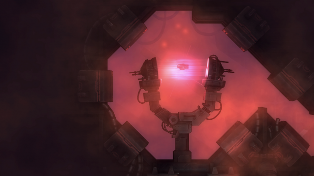
Nygren approached Affordable Space Adventures’ level design by ensuring they’re playing in singleplayer first. Its challenges are often based on trying to avoid being detected by enemies, which means minimizing the ship’s heat or electric signatures while flying, as well as solving and executing physics puzzles in the world itself. It had to be possible for a player to pilot and tweak engine settings at the same time.
One thing Affordable Space Adventures does very well is making players have to react to new situations, giving them enough time to react, but not so much that they don’t panic a little. An area towards the end of the game, for example, inflicts the ship with EMP blasts that scramble the engineer’s settings, causing them to need to hurriedly reset them to avoid being killed. But because a sound builds up to the blast, the players can prepare to react swiftly.
“That stuff is always my favorite because it creates tense situations but it doesn’t feel unfair,” says Nygren, who’s also proud of a scenario right at the start of the game which he designed to teach players how to scan EMP mines in order to see their detection ranges.
“The last mine has a much bigger scanning distance than all the others, which is a fun joke from my end because players go a little too close to it to scan it, and we arranged it so a lot of players are just inside the circle when they finish scanning, and so they realize the bubble is much bigger than they expected and then they get hit by the blast. I like the reactions of people to it, regardless of whether they succeed or fail, because everyone gets so scared.”
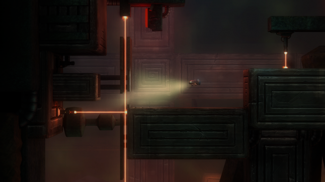
But the main innovation in level design for multiple players is actually that Nygren was careful to always include a spot to set the ship down, giving players a chance to discuss strategy for the challenge ahead, and what everyone’s role would be. “Something else that really helps is that we made sure you have a big turn-off-the-engine button, to always give the player the opportunity to turn off the engine so it’s impossible to be detected.”
The off-button also provides a good opportunity for trolling, killing the engines just as the pilot is maneuvering the ship through a gauntlet of threats, and also gives the engineer some agency when the pilot refuses to listen.
The horn plays a similar social role: the whole crew can toot it. “I made sure the honk actually generated detectable sound, and I love it when people press it when they’re gliding past an enemy and they die immediately. We think that’s super hilarious.” And then, since the scanner makes a blue light and aiming the flare throws out a red one, the game also recognizes players trying to make the ship act like a little police car with a siren sound.
As important as all these features are, though, it’s the UI on the Gamepad that really enables the depth of the engineer’s role. Having created the prototype’s interface, Nygren claims nobody could understand it at all because it was so cluttered with analogue sliders and information that displayed how much heat, sound and electric each function was contributing to the ship’s signature.
“I was ready to give up and make the game simpler with just on-off switches because I didn’t think there was a way to communicate that much information,” he says.
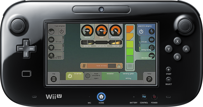
And then Knapnok artist Simon Nielsen came on board and immediately fixed it. His concept was one of symmetry, displaying the ship’s engines on either side of the screen and with equal numbers of sub-systems below them. “It made so much sense,” says Nygren.
“I had to make some changes to the ship because the two engines didn’t have the same number of parameters, but it was no trouble.” And by having one central location for the signature gauges, Nielsen’s design stripped a lot of visual noise away, but displayed the granular information with a single tap.
Designing a single game for two screens and multiple local players isn’t an easy prospect, but Affordable Space Adventures shows little evidence of the challenges its developers faced. It’s at once charming, light and funny, while elegantly weaving tricky puzzles with interesting interplays between its different roles. It saw that two screens was a chance to bring an atmospheric game out from the screen and into the room.
Affordable Space Adventures drew a line in the sand for two-screen games which, with Wii U’s demise, might never be crossed. That’s both a fantastic achievement, and rather sad.
You May Also Like