Trending
Opinion: How will Project 2025 impact game developers?
The Heritage Foundation's manifesto for the possible next administration could do great harm to many, including large portions of the game development community.
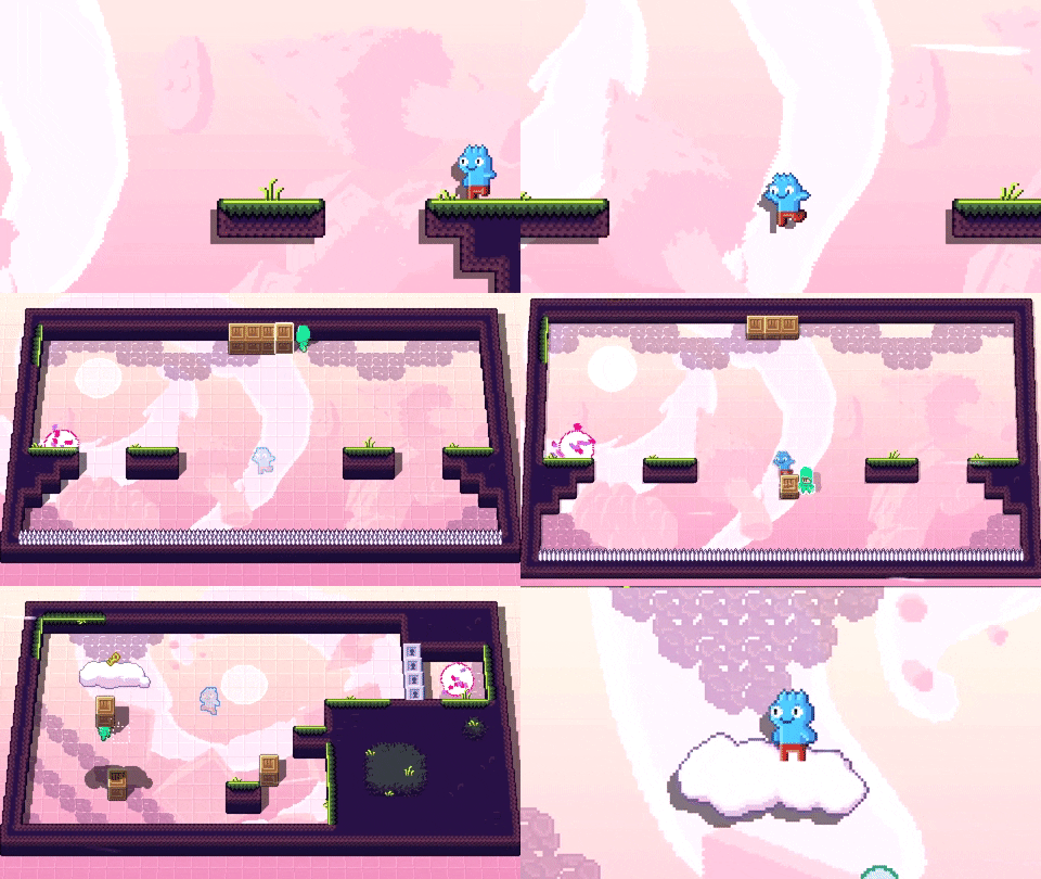
Puzzle platformer Toodee and Topdee offers an interesting perspective on a classic genre. Here's how developers Dietzribi turned a Ludum Dare prompt into this perspective-swapping puzzler.

Toodee and Topdee is a puzzle game that requires players jump between 2D and 3D to solve its challenges. Two different characters exist across each plane and, with your guidance, they’ll help each other out in a variety of ways. Each plane comes with its own difficulties, though, requiring players think across both dimensions if they’re to get through.
Gamasutra sat down with Dietzribi, developers of Toodee and Topdee to talk about the interesting elements that came out of designing puzzles in two perspectives, the challenges that come from underestimating player creativity in puzzle-solving, and how they designed the tools and modifiers that would make the game more approachable to players of various skill levels.
What was the inspiration for Toodee and Topdee? How did the concept come about?
In 2018, we participated in a game jam (Ludum Dare 41) and the theme was "combine two incompatible genres". We brainstormed some ideas and landed on using the same level geometry for both a 2D platformer and a top-down game. Three days later, we had the original jam version, which got great feedback, and we loved it. We knew we had to get back to it for a commercial version at some point!
What drew you to the idea of having puzzles on two different planes? That required players to use different perspectives to solve them?
In previous jams, we already made 2D platformers and top-down games, so we were already pretty familiar with how they work and the level design. When you're looking at the level editor of a 2D game for a specific level, it's pretty hard to tell at a quick glance if it's from side view or top-down, so we thought it might work.
Originally, we just thought about how cool it would be to see the flat tiles extrude out to become those top-down walls you see in old-school games. Then, when the first proof of concept was working, it was a matter of thinking of mechanics that would fit the "two perspectives" idea. Even in the jam game, we came up with a lot of cool ideas for levels using a pretty limited amount of mechanics.

What thoughts go into designing a puzzle that needs players to work across two planes to solve it? Into creating the different rules for the two perspectives?
The process was always us thinking about something that would look cool and make you go "woah!" when you switch perspectives, and then see if we can come up with levels that would be interesting for that. Usually, we're trying to think of something that will incorporate both characters, even though some levels "bench" one of the characters and let the other one do all the work.
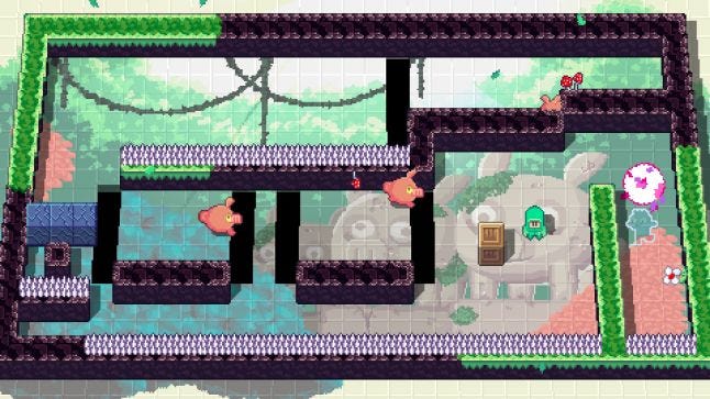
When we think of how something will behave in a certain perspective, we're trying our best to make it feel natural and make sense, as well as being cool and satisfying. So, for example, the pig enemies, in 2D mode, act like classic simple side-scroller enemies that walk horizontally back and forth. When you switch to top-down, the gravity shifts and the wall becomes the floor. So, now they have 360 degrees of freedom walking on that plane, and they chase Topdee around. You switch back and they fall down now that the gravity is towards the bottom of the screen again.
When we design levels we have to think on how to utilize these properties to create interesting problems and solutions.
How did this unique puzzle solving style affect the visual design of the game?
The fact that there are two perspectives make us always think: “How's this going to look in both modes? Are we going to have to create duplicate assets? One for each perspective?” Because of that we kept things simple, and used a lot of procedural animation.
We also have this cool "tilt" effect for when you swap between the perspectives. This was actually added about after a year of development. One day, I thought that it might be a cool effect to try, just to see how it feels. The second I saw it happening, I knew it had to stay. It made everything a lot more obvious, and it just made sense. You can still toggle it off in the graphics menu, though! It is a little bit easier to understand the grid when it's off.
How did this style inform the mechanics of the game? The actions players would take while solving puzzles (moving blocks around, rules shifting with perspectives, dealing with enemies that move differently in different perspectives, etc)?
We always prefer readability over beauty. Since there are so many things going on and so many moving parts, we wanted everything to be as readable as possible at a glance. We also decided not to have any camera movement or zoom effects; the entire puzzle is on the screen at the same time. You see where the characters are, where the exit is, where the keys are, etc.
Additionally, we tried to make the game teach you the mechanics by letting you experiment. We only teach the most basic controls with speech bubbles in the intro chapter, and we let the player play around with the different elements in the game in self-contained levels. There's also practically zero punishment for death - the restarts are pretty immediate and you can get back into the action.

Can you walk us through the design of one of the puzzles? How do you put a puzzle together and created these multi-level challenges?
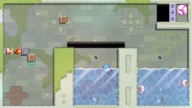
So, I'll take a simple one. This is one of the levels in chapter one where breaking platforms are first introduced.
The breaking platforms work like they do in all the side-scrolling platformers you know. When Toodee lands on them, they start shaking, and a few moments later they break and disappear. In Topdee's perspective, they are just regular walls, and Topdee can't break them.
But now we got a bonus interesting property to them- if Topdee is blocked by breaking walls, Toodee actually has the advantage in this situation, because Toodee's weight can break these platforms and free Topdee.
I could've taught that in an easy way by having Topdee completely blocked with the only exit being by breakable platforms. Then, the players would see that they are stuck, would switch to Toodee to break the platforms and free Topdee, and they would be done. But I wanted to make it more interesting.
We started this level when Topdee is in control, and is blocked by breaking platforms, but also by a hole. There is also a wooden box in Topdee's reach that can be picked up and dropped into the hole to create a bridge, and that's what most players do on their first playthrough. Then Topdee can pick up a key and get into the portal. But the portal is high, and Toodee can't reach it.
At this point, players would already jump on the breaking platforms and learn their properties, and now they are stuck. They know that they need a box, but they already used it, so at this point they are sometimes trying to press the pick up button in order to get the box out of the hole. Which is another important lesson - it's impossible!
At this point, they already know what they have to do, so they restart the level, but this time they free Topdee by breaking the platform instead of sacrificing the box. Now, they can use the box to get Toodee into the portal, and the players now actually had to solve a puzzle in order to advance, instead of just getting taught the mechanic.
What unique challenges came up when designing puzzles this way? How do you feel they're different from puzzles that only require one perspective?
I think that most puzzle games have their own unique mechanics and have their own design challenges. I'm not sure it's really unique to Toodee and Topdee, but when I think of a puzzle it would usually work in my head, but when I went to implement it, I would see you can work around it and miss the point.
I would have to iterate many times and let people play to see that you have to figure out what I planned in order to beat the level. Sometimes it didn't work! As a designer, you have an idea in mind and you have a blind spot for other people's creativity. However, if I saw an alternative solution that was meaningful, or cool, and sometimes cooler than my intended solution, I wouldn't change the level.
Sometimes however (and this kept happening even until days before the release) a playtester would find a trivial way to beat a level, even though I designed a very complicated puzzle. These I had to fix.
It's also challenging because you have to keep thinking about the other characters’ abilities. So, if, for example, I block Topdee from getting a key by a hole, I need to remember that for Toodee the holes aren't an obstacle. Or vice versa, if a key is too high for Toodee to reach, Topdee can just walk there. I always have to remember these things in the back of my head so I can design in advance to block these abilities so a level won't become trivial.

Some of the game's rules can be changed in advance to make things more accessible or more/less challenging. What thoughts went into choosing what could be altered?
I talked to some people with disabilities to gather their opinions based on the limited demo that we had, (the demo didn't have any difficulty modifiers). Also, I've playtested the game (A LOT) and I wanted to have features that would make it easier for me to blaze through the levels, like "god mode" which makes it impossible to take damage.
I've had fun with it and decided to keep it in the options. I know that now that I don't have as much free time as I used to as a kid, when I play a game, if I get stuck in at a certain point and get frustrated, I'm always happy when I can just toggle some difficulty option to pass that part, and then continue playing as usual.
The game is also too hard for my 6-year-old nephew and niece, so I was very happy to see how much fun they have with it with all the difficulty modifiers turned on. The boss fights are especially hard, and many people get frustrated since the boss has 3 phases, and if you get hit once (by default) the entire fight resets.
I decided that instead of giving checkpoints for each iteration, which would make the boss fight stakes a lot lower, and in my opinion a lot less rewarding, I decided to have, in addition to infinite health, multiple health points. So the player can choose between 1-5, and infinite health.
It is also possible to make the game slower, let Toodee jump mid-air (which I hope would let people with slower reflexes have an easier time with the platforming), let Topdee pick up blocks from afar (Telekinesis), or pick up metal blocks (Super Strength). All of these make most of the levels trivial, but I find it more fun than just letting people skip a level. It is also very fun to play through the entire game with those features on, and people in our Discord server are already thinking of having a speedrun category for using all the difficulty modifiers.
You May Also Like